Not the best of photographs I am afraid
The sky is much pinker than the picture shows but try as I might, I can’t stop the camera leeching out the background colour. Also too much camera distortion making the posts lean inwards which I will try to correct on the finished version
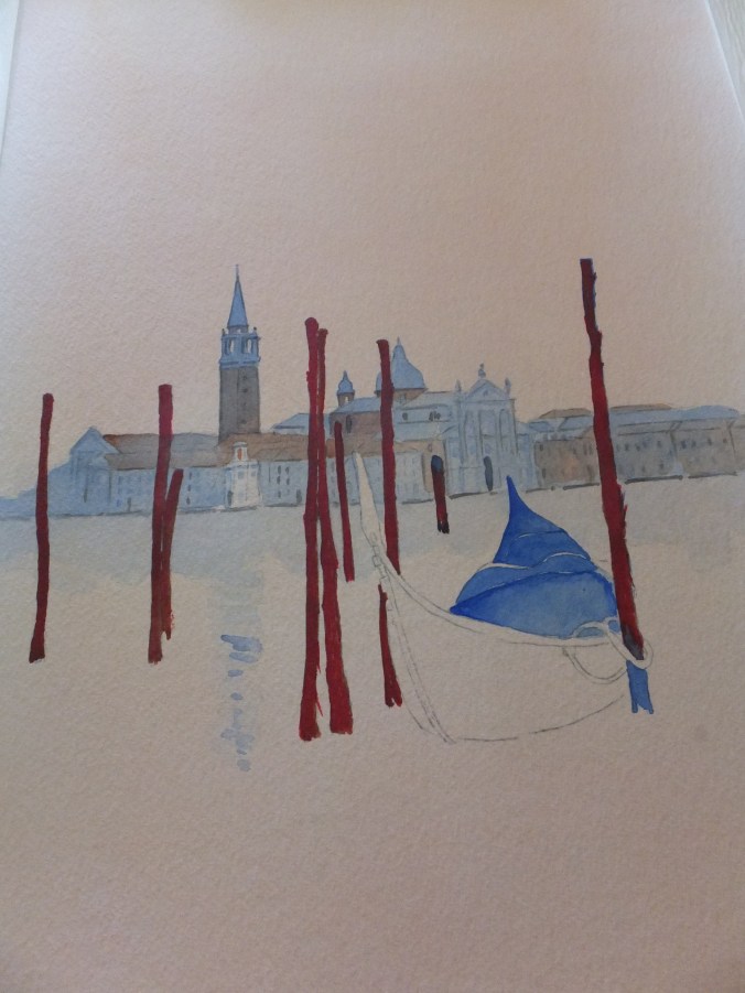
What I did to colour match the original photograph, in which the sky and most of the water is a deep salmon pink, was to brush all over first with a red-orange mix, which did dry quite pale. I then built up with dilute coats of alizarin crimson until I reached the depths of colour that I wanted.
When that was hard-dried, I started on the background buildings, the church of San Giorgio Maggiore, always a favourite. Being in deep shadow I gave all the buildings a wash of French Ultramarine, and then another one. When that was really dry, I painted the rooftops and brickwork in Burnt Sienna.
The mooring posts I started with Burnt Sienna, but I wanted them to be more red than that. I glazed them with Permanent Rose. They were still too brown, so went over them again with quinacrodone red ( it doesn’t matter which way I spell that word, it always seems to be wrong). This was getting nearer the shade
I now had the colour relationship between the foreground posts and the background church. I felt the church could go darker still, with another coat of Ultramarine, and this time bring the wash down a little way over the water, to cast a shadow. There is one small building in front of the church, which I think is the customs house, which in reality stands well out on a promontory coming towards us. I missed this out with the last coat so that it didn’t disappear altogether
That is as far as I have gone as yet. I still have to darken the posts and finish the gondola, probably with some indigo on the seating. How I tackle the hull, I still have to work out, so we shall see.

You are off to a good start. I look forward to the progress of this painting.
LikeLike
Thank you let’s hope it turns out ok
LikeLike