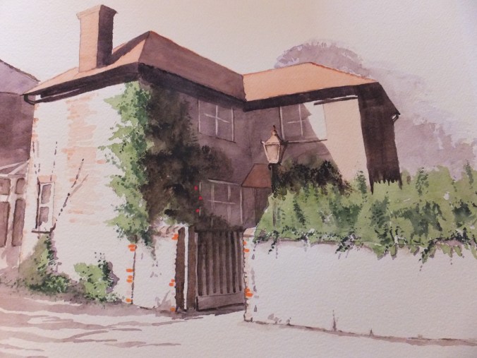
The finished house portrait
Just a pity that the camera leeches out some of the colour, try as I might to avoid it happening. The original has a much softer tone
This was an interesting commission, and of course follows on from the last post about the value of the preliminary sketch. The lights and darks from the tonal sketch were invaluable as a reference. What was so delightful about this subject was the strong light coming from the left and low at that.
After transferring the drawing onto watercolour paper, I bathed the whole thing in a mix of Naples Yellow and Raw Sienna. There was very little sky in the frame, so I saw little point in trying to introduce a sky colour. I have used this neutral sky on several occasions before and it works well, when you need to soften the subject, and also focus on a subject, so pertinent when you are doing a house portrait.
I usually paint roof tops with Burnt Sienna over the Raw Sienna. This time, as it was a commission, and therefore being more careful, I did some research. Some people use Light Red and some too use Indian Red, I was told. After a couple of trials, I elected to use Light Red, which I found rather pleasing and closer to the reference photograph.
The dark shadow was a mix of Violet and Transparent Brown, always successful. Some orange brickwork and one or two red roses to lead the eye
I was pleased with the result. A nice soft portrait of a period house, which was not unlike a sepia photograph, evocative of the period and somehow timeless.
From here, I can rest from commissions. I love doing them as they challenge me with something new, but I have exhibition commitments from March, which seems a long way off but not really. I have stock enough to do an exhibition now, but most have been seen this year, those that I have left unsold that is.
That means a new collection, so best get started