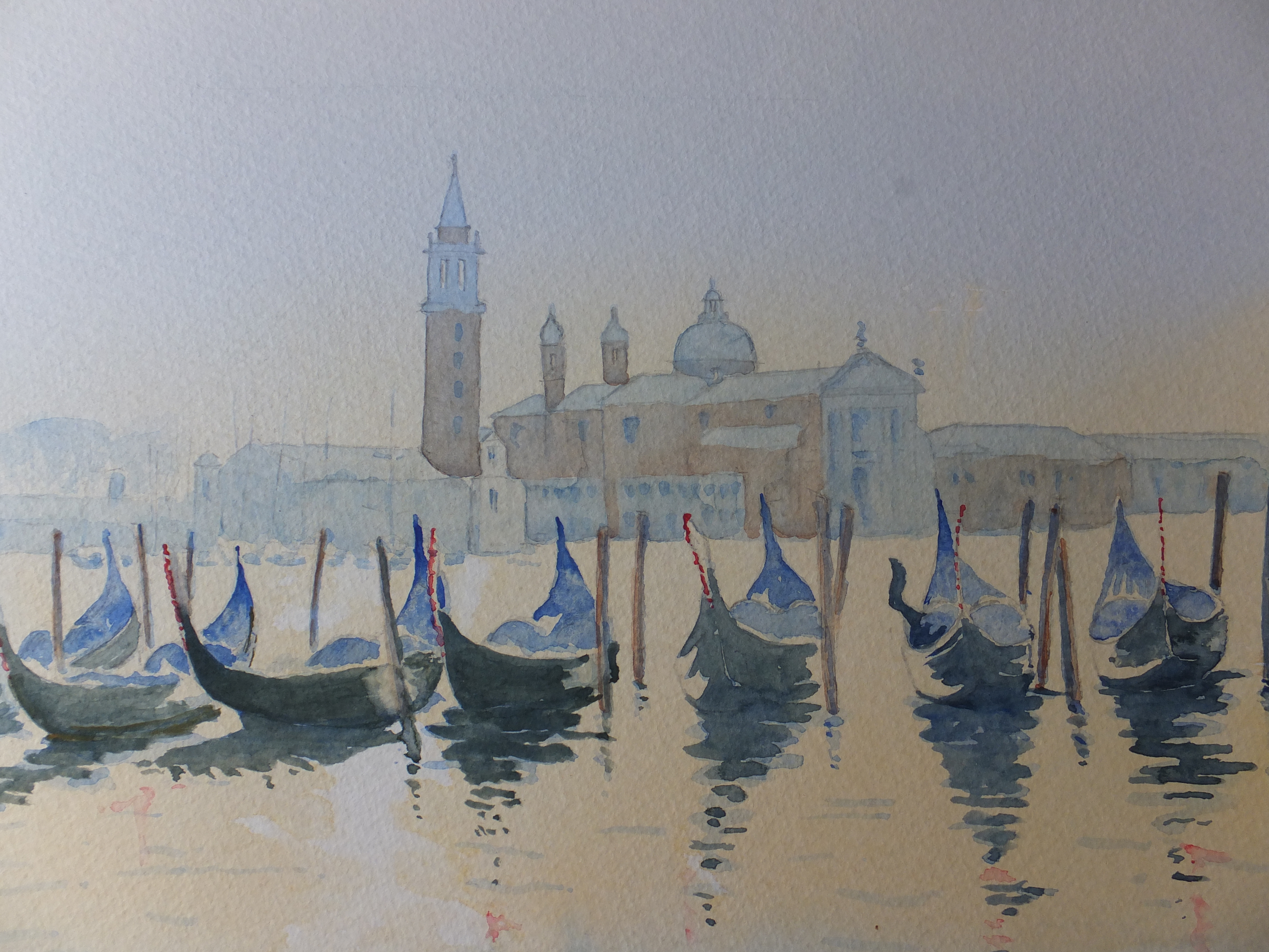
This is what I meant by an old favourite. The lagoon viewed looking out onto the magnificent church of San Giorgio Maggiore, which I have painted several times before in different lights. I don’t seem to have kept many, so must have been some time ago that I last painted this view, before I started keeping a file of all my pictures. Anyway, this one I was pleased with. The light seemed to work. A misty still morning before the sun broke through, there is very little in the way of colour as yet
I have used mostly just two colours, Cobalt Blue and Cadmium Orange. Here and there they have mixed and produced an interesting grey/green which I rather like and use from time to time. Burnt sienna for the brick buildings in the background, but not much of it
I put this one on social media to get some comments. Someone bought it which is always the ultimate accolade
I am doing a real exhibition this coming Saturday, and it would have been nice to have taken it, but you can only sell a painting once. I am happy with that

The gondolas look amazing! Their blue hue blend well with the surrounding. As for the buildings could you just add a bit more height or a straight line on the top of the domes and spires? I don’t know how to convey my message. Hopefully you understand.
LikeLiked by 1 person
They were all measured but maybe a finial on the domes would have helped
LikeLike
The tips of the domes look a bit blunt, because of course it’s a painting. The picture however creates an illusion that a rod like object is extended from the top of the dome, almost piercing the sky. It’s a very fine detail, I know, but still if it can improve the image a bit more, I’ll be delighted. It’s only a humble suggestion.
LikeLike