Back in the summer, we toured the Baltic. At one time we did eight shore excursions in eight days. Even by cruise ship, we found this tiring because of our age, especially my wife who has walking difficulties, so we might not attempt this sort of holiday again. Copenhagen was just one of the stops we made in Denmark
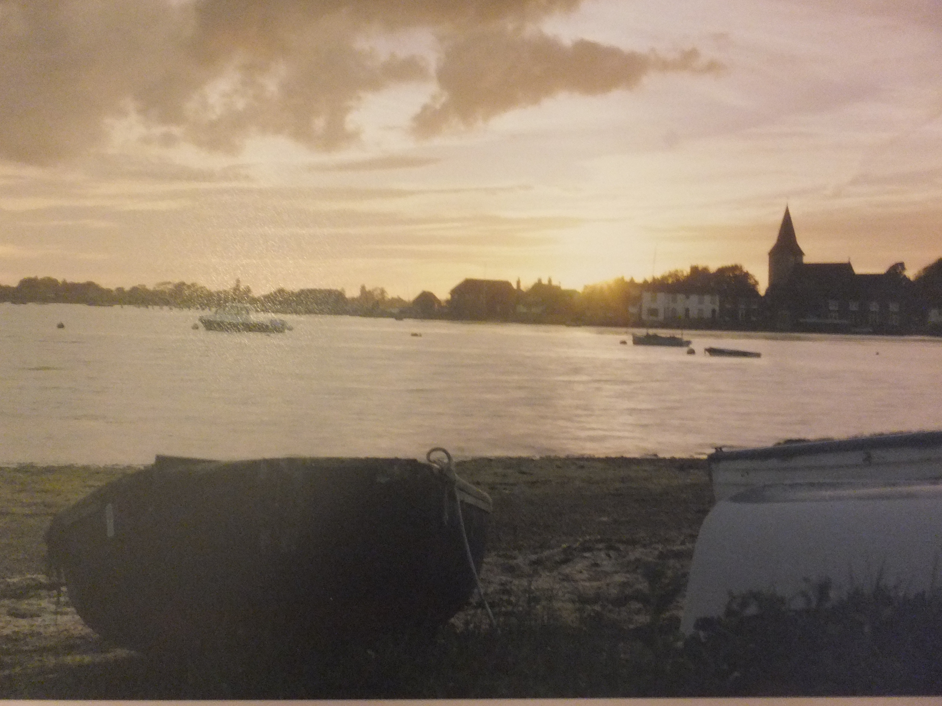
Touring the canal system was fun. i like painting boats and this was just one scene that I snapped for reference. Quite a lot of light and dark in this shot. The sun was very bright especially on the buildings in the background. Deep shadows were cast by the trees, which accentuated the boats. The figures on the canal side were reduced to silhouettes. It took me several glazes to get the water to be an acceptable colour, whilst at the same time still looking transparent. This was more of an exercise about light against dark, than anything else
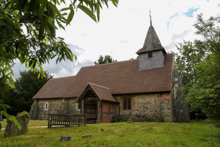
I have been commissioned to paint this church, the village church of Pyrford in Surrey. Ancient yet still in use as a parish church, it is set in a tranquil spot, and is quite charming. The lady who commissioned it no longer lives in the area. Her parents are buried here, so a meaningful place. I always feel very priviliged being asked to paint places that are so important in people’s lives. I am working on it at the moment and will post the result
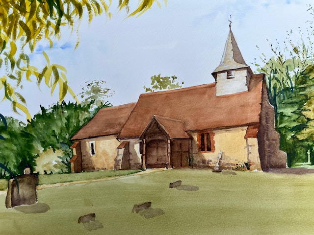
This is how the painting turned out. I have put sunshine into the painting as the photograph was taken on a very dull day, so the colours are brighter. The lady who commissioned this painting was very pleased, which is always a relief
I have another commission now, quite different to the last, This one is a wedding venue, which I get asked to do from time to time. This one involves marqees and the newly wed couple strolling in the grounds around a lake, so quite a lot of different things to worry about, Still it’s good to have these commissions coming through as sales from my gallery are poor at the moment. Times are hard everywhere still and doubtless will be for some time