Blue Mosque: the finished painting

Blue Mosque

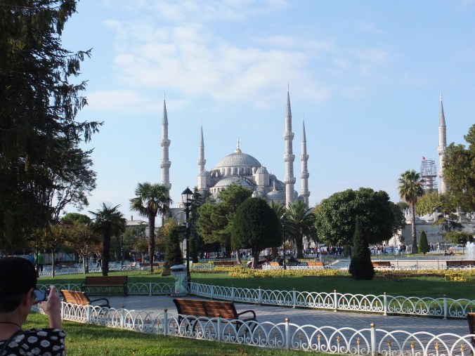
Alas once again a good painting spoiled slightly by a bad photograph. The camera has diffused the depth of colour in the trees etc in the foreground. This is the best photograph of all those that I took, so will have to put up with it. Shame because the colours of foliage etc are much richer than shown. The mosque is not too bad though, even though the shadows on the building are really much deeper.

Palm trees are tricky. They were done with a dry brush, just hoping that the bristles open out to give that feathery effect. They seem to have done.

For the trunks of the palm trees, I mixed permanent rose with burnt sienna to give, hopefully, the effect of bright sun highlighting the wood. That was the base coat. I used a very dark brown as a shadow over the top as a glaze, just leaving a little of the red showing on the sunny side. Likewise the park benches which were brightly lit in some cases, I used the same mix of rose and burnt sienna. I felt that that had worked

The other trees, some of which were obviously tidily clipped, I had to sort out, otherwise in a painting they would have been indistinguishable. I painted some lighter than they appeared against darker trees in the background so that one defined the other

Small figures, some of them in red, led the eye through the trees, and I hope have given a feeling of distance

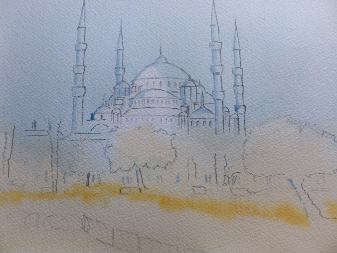
The enjoyable part of the exercise was the mosque itself. A lovely drawing exercise hopefully getting the domes and minarets right, and then the subtle shading, which I built up over a period, hoping to get the depth of shade correct. Hard for you to judge, I know, as the camera has bleached everything. So frustrating!

I had to do quite a lot of masking out in order to catch the bright spots where the light fell. So there we have it, the finished result

What to do next. I have some pictures taken on our local canal, which I would like to try. Also going to Spain in the not too distant future, so could be plenty of inspiration there too.

Thanks for reading, if you have done. Hope you enjoyed the result


Blue Mosque: First Wash

Blue Mosque First Wash

Just as an interim, and whilst I think of it, I have masked out several items on this picture before putting down a base wash

The scene was brightly lit from the left and there is interesting sparkle on the trees, on the tiny background figures and on the mosque itself. Whether or not I will be successful in capturing these remains to be seen. I have always found them elusive and welcome any tips.

I have masked along the left-hand edge of the minarets so as to get a hard edge against the blue sky. Likewise some of the domes and the sides of the tree trunks. The colour of the palm tree trunks is brown going towards red in the bright light, so will probably mix some permanent rose in with the burnt sienna, hopefully to catch that richness of colour. Also the park benches are that colour too.

I have put a band of Indian yellow wet-in-wet where the flower beds are so hope that works

The rest is detailing and building up the darks to encourage the brightness of the brights. We shall see. This may well take me a while

Exhibition at Tate Art Gallery: Art and Empire

Risaldar Jagat Singh and Risaldar Man Singh by Philip de Laszlo 1916

Risaldar Jagat Singh and Risaldar Man Singh painted by Philip de Laszlo in 1916

We went up to London earlier today, to see this exhibition at the Tate. It was a very big exhibition, drawn from collections from everywhere, which took us about two hours to get round.

There was early stuff, mostly to do with exploration and discovery. The maps reminded me of those in my classroom at primary school, which of course today would be very non-PC

Quite a lot of paintings, as one might expect, were to do with Imperial Heroics or what Victorians considered to be heroics. Not always ending with a British victory, like the battle of Isandlwana (spelling probably wrong) in Zululand, where 1400 infantrymen were slaughtered in a very short space of time. There was an amazing painting of that last stand by an artist named Fripp, who was attached to the newspaper The Graphic. He actually visited the site afterwards to get the atmosphere before embarking on this massive reconstruction. Other memorable pictures were the Death of Wolfe and the Death of General Gordon, all good heroic stuff. The British did quite a lot of bad things around the world, but hopefully left something behind that was worthwhile as well.

If I were to be asked to name the one painting that impressed me the most, I think I would have to choose the double portrait that I have shown. This is an amazingly expressive picture by Philip de Laszlo of two Indian Army officers, named above, painted in a single sitting. What is it about working at speed, that adds so much to a painting?  They were presented to George V at Buckingham Palace, before embarking for France and the Battle of the Somme, where who knows what became of them after that dreadful slaughter. We are told that one in six British soldiers came from the Indian Subcontinent! The contribution from Commonwealth countries was staggering.

Moslem Burial Ground

Moslem Military Burial Ground, Horsell Common

This links into a local monument of which we are justifiably proud, the burial ground pictured above, built by the War Office in 1917, for Moslem soldiers from the Indian Army who died in British hospitals from wounds received in France.

Various hospitals along the south coast housed Indian wounded from the Front. Some tragically did not survive. Sikhs and Hindus were cremated but Moslems were interred, and they were brought here for burial because of the proximity of the mosque at Woking, which is the earliest purpose built mosque in the country.

There were 28 graves in the cemetery which were moved in the 1960’s to the main War Graves Cemetery at nearby Brookwood. Sadly vandalism had been a problem. After a period of neglect, this burial ground was restored in 2014 as part of the centenary remembrance. A Garden of Remembrance has been laid out within the walls, and the names of the 28 soldiers who died are commemorated on a tablet.

Nothing jolly or frivolous to report from this exhibition, I am afraid, all rather heavy, moving stuff. On a lighter note, I am moving along with the Blue Mosque painting. The drawing has been transferred to watercolour paper and various bits masked out where appropriate.

Blue Mosque, Istanbul:Tonal Sketch

Blue Mosque Sketch

I mentioned a few posts back that I wanted a smaller picture for the exhibition as they are popular sometimes. I will repeat the photograph later, which was one that I took when we were there in October

The light was very good and the shadows were long and distinct. I couldn’t make my mind up, whether to use the local colours or whether to try a sunset picture. I think as the shadows are good that I will stick with the local colours, with maybe a mental note to do a sunset picture another time. As we were driving from the airport to pick up our ship,the day before,  the sun was setting over Istanbul, and especially over the Mosque of Suleiman the Magnificent, another beautiful building.  The sky was orange going towards pink and the buildings were violet. Sadly my camera was still packed in the luggage hold. Maybe I will try that shot from memory one day.

I think the sketch will be very helpful. I have moved some trees away from the front of the building, and I think I have sorted out the shaded areas. I didn’t use ink this time for the sketch. Instead I used Paynes Grey watercolour, which I quite like for sketching. You can’t tell from the photograph, but the colour is a blue-black shade, which is quite pleasing. I sometimes think that I prefer the sketch to the finished painting. There is something about a sketch, perhaps because it is done quickly and without inhibition, that the work retains spontaneity and freshness. Easy to lose this, when working carefully on the actual painting.

I now have to transfer the sketch to the watercolour paper, which is the uninteresting part and then start the painting. Colours to be decided, so I will be a little while

DSCF2491

As you can see, some unnecessary stuff left out, and I have moved closer to the building itself

I am hoping on Saturday to get up to London and go to another exhibition at the Tate Gallery. The exhibition is entitled Art and Empire which should be interesting. When we were there for the Frank Auerbach exhibition, we looked in quickly, but this is quite a big exhibition so we left it for another day. If it is good I will write something about it. Certainly it will be as different to the Auerbach collection as chalk is to cheese

Textured Finishes in Watercolour:Rust

DSCF2814

A while back now, I touched on the subject of accurately representing texture in watercolour. The particular texture that I mentioned was rust, and the patina of aged metal

The little study above, I did some time ago, and I followed an instruction from a reference book called  “Painting Country Gardens in watercolour, pen and ink “. This was written by Claudia Nice. This little painting was done in watercolour only, so no ink was used. I have had this book for some time now, and have found several of the techniques in it to be very useful indeed.

The rusty barrow does look very convincing, and is achieved through a straightforward glazing exercise. That is to say, one coat on top of another that has been allowed to dry rock hard. This is how she tells us to do it, with the following wash glazes in this order.

  1. Burnt Sienna (base coat)
  2. Cadmium Orange
  3. Either red muted with green or red violet muted with yellow green. I seem to remember using the first one
  4. Final glaze of Violet with Payne’s Grey

I must repeat that it is imperative that you allow each coat to dry rock hard. I usually leave each coat to dry overnight as I prefer natural drying. Some people speed the operation up with a hairdryer which is fine, unless the paper has cockled, in which case it won’t dry flat

With a damp brush, and there are specialist brushes on the market for this, but if you don’t have one, no worries as one of your detail brushes will do fine, just lift out highlights or sheen areas. If you are careful you can also use razor scrape on very dry paint, of course. Next image is a close up to give you a better idea

DSCF2815

Not done as well as the Claudia Nice version but I hope that gives you some idea

Her picture had the barrow full of flowers, hence the garden theme. I was only interested in the metal finish at the time

I hope you find that helpful. Every now and then, I stress that I am not an art teacher, just a painter whom you can follow if you want


John Constable Exhibition

Our local and comparatively new art gallery, the Lightbox in Woking is staging an exhibition entitled John Constable:Observing the Weather. No pictures from me, I am afraid so suggest the following link  thelightbox.org.uk. The exhibition opened yesterday and runs until May. We went today and will no doubt go again

Yet another triumph for the Lightbox, a provincial gallery with national recognition. Paintings, prints and watercolour sketches on loan from collections all round the country, tell us of Constable’s fascination with meteorology. Many sketches are from the years 1820-22 when he rented a house on Hampstead Heath to be near his studio in London, and these record cloud formations from different angles. They are really scientific observations which he drew from later when producing his oil paintings, such as Salisbury Cathedral from across the meadows which is the highlight of the show. This is one of nine giant oil sketches that he made which have become famous in their own right

Dismissed by the art world at the time, for not sticking to classical subjects painted in a studio, Constable stuck to painting en plein air, landscapes as he saw them uncontrived and true to nature. He was certainly an influence on the Barbizon School, with painters like Corot and Rousseau, and I always felt too, on the French Impressionists later on

Magnificent prints of Constable’s work by David Lucas are on display, such as The Drinking Boy and The Lock. This was about the time that printmaking moved away from the linear print to a representation that appeared like the painting, even down to brush strokes.

Obviously small by national standards but cleverly put together, and worth a visit, if you are able

Langstone Mill Reworked

Langstone Mill Reworked

Once again, the colours are deeper in the actual painting, but this is the reworked version, which, I believe, to be a great improvement on the first version. But, of course, that is my opinion

I have deepened the shadows enormously, which exaggerates the light coming from the right-hand side. The effect, I feel, is much more dramatic.

In the water, I have introduced more of the orange brick colour to look like reflections. Also I have added some current swirls and some flecks of white to look like movement in the sea.

The red posts and flag have been refreshed with Cadmium Red. I think they come forward now, which is good, and take the eye towards the mill

More seagulls add some life, plus too some distant rooks over the tall trees. The birds are spooked by that bad weather coming in from the background!

I keep looking from the screen to the painting. The colours are richer in the painting, of that there is no doubt, but little more that I can do about it

Time soon to move back to Istanbul, and work on that small painting of the Blue Mosque which will be fun to do, I think

Reworking Langstone Mill Painting

Langstone Harbour & Mill

Just to put the picture up again. The more I looked at this painting, the more dissatisfied I became

I think that I said before that the camera has leeched colour from the image, and that is true. Nevertheless, I feel that the painting looks anaemic ( I checked the spelling and I am correct, even though the spellcheck doesn’t agree). This was supposed to look dramatic with the wild sky etc, but just doesn’t work in my opinion

I consulted my mentor at the art club, and she has given me a list of suggestions, so I shall be working on this next, hopefully not too long, trying to get some feeling into the picture

After that, I want to get back to Istanbul. I need a smaller painting, and I think the Blue Mosque will lend itself to that, as this image

DSCF2491

I may have to remove a tree or perhaps not. This will make a nice little study. So plenty to get on with!

Snow Painting Completed

St.Nicholas Church, Pyrford, Surrey

St.Nicholas Church, Pyrford, in Surrey

This is the finished painting of the church to start with, and I will put up one of the stage paintings next, which deals with the masking out and the sky. The sky is probably the trickiest part of the operation as this is done wet-on-wet, and needs some handling, and I will talk about that with the next image

For the trees and bushes I used a fan brush loaded with two  colours at once, ultramarine blue and burnt sienna. These mixed on the paper giving a nice brown/grey or didn’t mix and gave the two colours in the tree which is fine too. Just needed to add some branches with a detail brush

Masking and sky

Masking and sky

I was asked where I would put the masking fluid in this picture. Well, along the snow line on the church roof, as when I come to put the sky in next, there will be quite a lot of water sloshing about, and it will be difficult to keep the blue colour off the virgin snow. Having said that, I have drawn the snow line down the roof line, as though it is thawing slowly, and that is just me, as I think it looks more interesting like that.

Also on the roofs of the house in the background, plus window ledges, grave stones and buttresses. Anywhere you think snow will cling

The sky is a subject in itself. I wanted to have a sky with movement in, and to look cold even though the sun was shining. That was the intention. I have a method which I have evolved and which I prefer, although obviously there are different ways of tackling this

Firstly I wet the area thoroughly with a large brush with clean water, so the paint can move around quickly. Next I brush on cobalt blue mid strength, and then pat out some cloud shapes with paper towel. Whilst the paper is still glistening, and that is very important otherwise the paint will not move, pump in ultramarine blue pigment, where you think you will want to see blue sky. I suggest not too much

I should have said at the beginning, make sure that your board is loose from the easel, as you are now going to pick it up and you won’t have a lot of time. Hold the board vertically and watch the ultramarine blue bleed downwards, and then turn the board on 90 degrees and watch the pigment bleed again this time across the sky, if that makes sense. You will have to decide when you think you have the right effect, and of course the colour will dry lighter than it is now

Put the board back on the easel. Phew!

Let this dry rock hard. I leave it overnight usually. What you should end up with is a swirling sky because with all this water swirling around that is the effect you should get. The cobalt blue will become dark cloud, and where you have blotted out will be the white tops of the clouds. The ultramarine will be the sky showing through

Obviously, when you are doing this, water will run down onto your snow. Just be ready with paper towel to mop that quickly and you should be ok

Apart from the sky, these are simple little paintings to do, yet effective in their simplicity. Hope you liked this