Corfu: Shopping Lanes in Kerkyra,continued

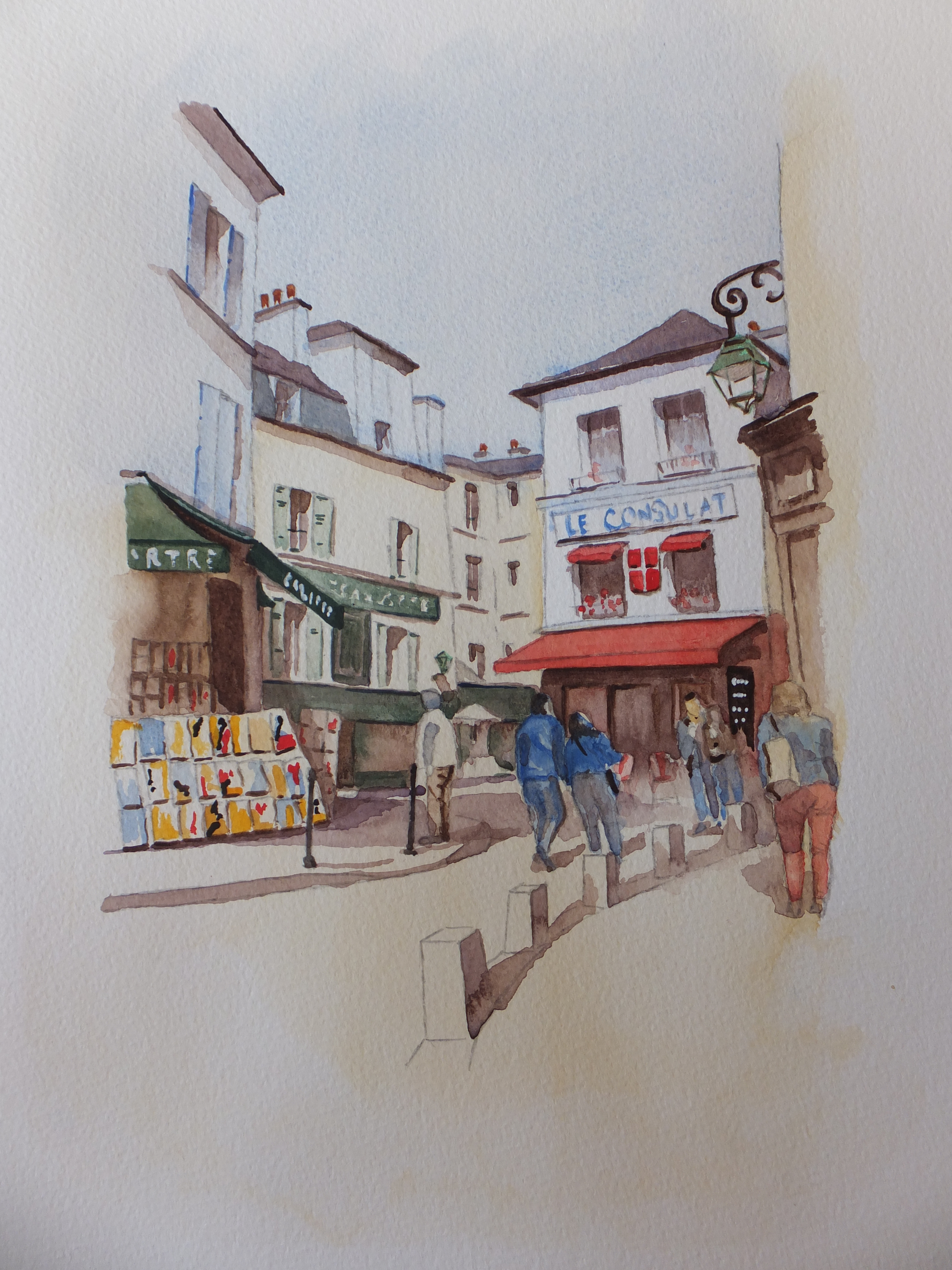
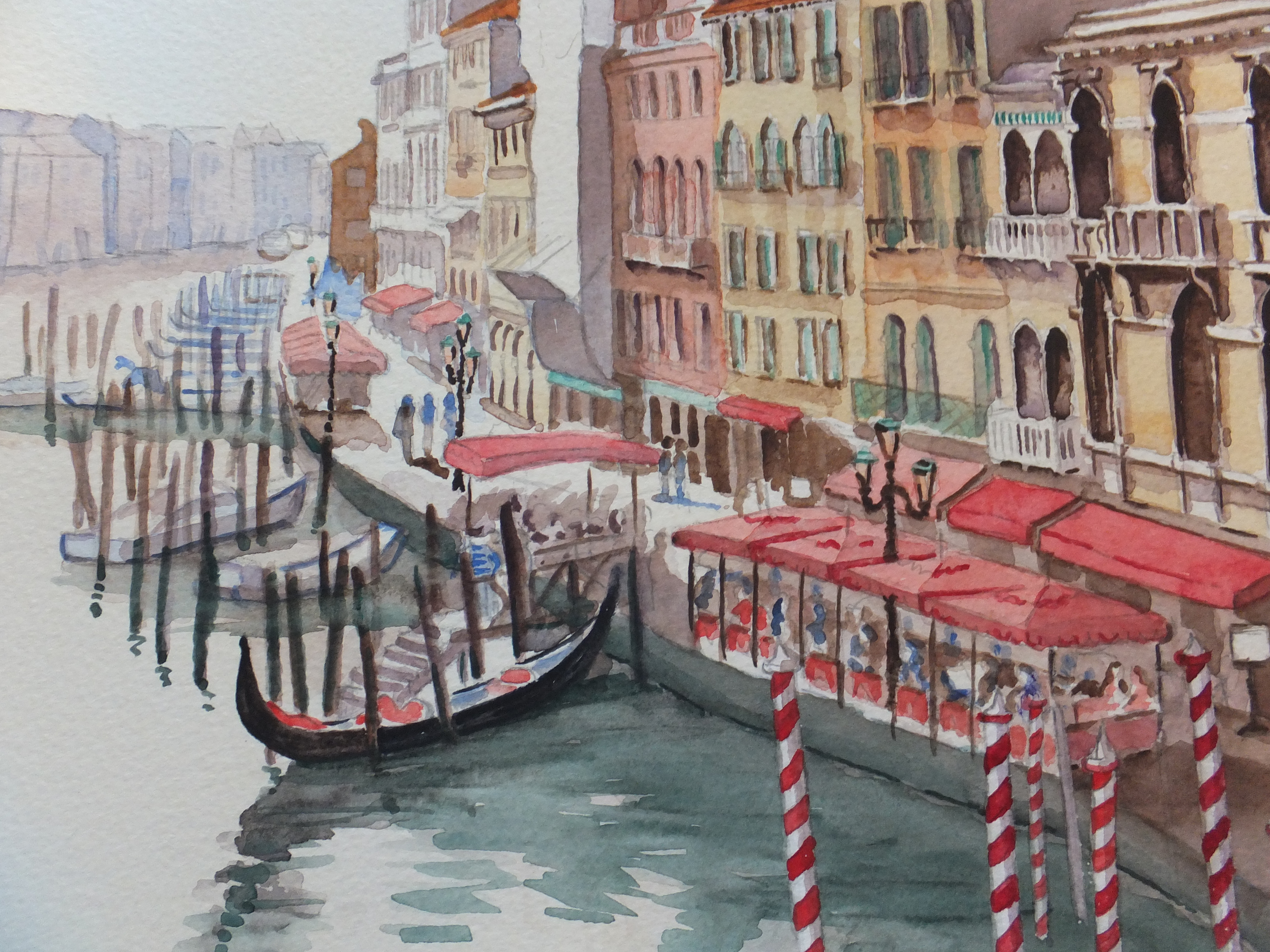
From where we finished on the last post, I used Indian Red to paint the dome on the bell tower. The blue sky dropped back, as I had hoped it would. Indian Red is a good hot weather colour, and I echoed its use on things down the lane, like awnings and shop blinds. On the left-hand side is a shop selling garments, and I used some dabs of red to denote red dresses hanging on display.

I finished the detailing on the bell tower so as to give me something sharp to focus on, when working out the detail on other parts of the painting.

I used my favourite warm weather shadow, ultramarine violet mixed with Sennelier Transparent Brown, and put in the shadow on the buildings

I left this to dry overnight, and this is what it looked like the next day

almost there

It was starting to look the part. I drew the figures in again with the brush, as I was starting to lose them

I still wanted some deep darks further down the lane, where the light didn’t reach. I still wanted to try Alvaro Castagnet’s mix of Brown Madder, Cobalt Brown and Raw Umber. I mixed up the first two, and then added Transparent Brown instead, which certainly produced a very dark shadow colour, with which I started to work

Corfu  Shopping Lanes in Kerkyra

This is the painting virtually complete. The dark mix has been used on the deep shadow areas. The figures have been finished, although the foreground figure looks a bit ghostly, and will need some colour after all. Some white gouache has been used to give the allusion of white paintwork on the balconies.

Was I successful in producing something in the style of Alvaro Castagnet? No, absolutely not, but nonetheless I have enjoyed working on this painting, and like the result

Possible framed version

This is what it could look like framed. Some extra colour went into the figures, otherwise the painting is finished

I hope you found this helpful, and by the same token, if you have suggestions for me, I am always pleased to hear


Corfu:Shopping Lanes in Kerkyra

It will make a pleasant change to work on something which involves some bright sunshine

A few weeks ago, we were lucky enough to be travelling in the east Mediterranean, starting from Turkey, sailing around Greece including some of the islands and then up the Adriatic as far as Dubrovnik.

On the way back to Greece, we should have called in at Kotor in Montenegro but rough seas prevented us docking. Instead we sailed for the nearest port that could take us, which was Corfu, which turned out to be something of a bonus

Not somewhere we had ever been before, so all was new. In the morning we had a guided tour up into the hills, where we enjoyed awesome views and walks round picturesque villages. We came back down into the capital, Kerkyra, which had been a British base in the c18, and where they still play cricket!

After lunch, we rambled at leisure around the shopping lanes, which were delightful. I took some pictures, thinking of possible paintings later, and one of them I shall append shortly. All those lights and darks reminded me of the work of Alvaro Castagnet. Maybe I will try something in his style which will be ambitious but interesting

DSCF2668

Quite a selection of lights and darks to have a go at. Some of the drawing will have to be tidied up. I won’t want those large heads in the foreground, but will want some of those other figures to come further down the picture

DSCF2730

So, this is the drawing. I have simplified some of the tangle of things like shop signs and awnings in the lane. Also, I have finished or almost finished the figures and made them into the foreground. The larger figure marked “mask”, I will mask out, as I would like him to have a white suit so that he stands out against the dark background. That is the plan.

Also I will run masking fluid along the edge of the church so that I get a crisp line against the blue sky. So, let’s see if I can find the next picture

DSCF2742

As you can see, I have put in the sky, mostly with a small brush, as some of the corners were fiddly. Ouch, too bright! I know that Mediterranean skies are that beautiful azure colour, but that doesn’t always work in a painting. Given more space, I could have run some of that colour off under the tap, but I couldn’t attempt that for fear of spoiling that white bell tower. I will have to live with it. Possibly when I paint the red dome, that will knock the blue back

I used phthalo blue mixed with cobalt, which I usually find works well with south European skies

As you can see, I have done the masking out. Not just the foreground figure and the edge of the bell tower, but also a narrow strip halfway down the lane on the left, which looks like an alley way catching the sunlight. In the next picture, I have done some wet-in-wet work, which will look rather messy at this stage

DSCF2743

Looks a bit of a mess at this stage, I know, but we will carry on

I used a very dilute mix of Naples yellow with raw sienna, for the buildings including the bell tower. Almost white for the tower, but thickened up the colour for the other buildings. For those on the left-hand side, I used a wash of cadmium orange, even before the first coat was dry. I followed up with cadmium orange pigment straight out of the tube, for the shadow areas such as underneath the balconies.

There is a wash of shadow to go on yet, which will take some of the sting out of the orange. I need to let this dry overnight, as it has to be rock hard, before a very wet coat of shadow goes on

I am going to leave it there, if I may, as still quite a way to go, and certainly enough for another post, hopefully towards the end of this week. Thank you for reading my blog


Pirbright, a paintable village, conclusion

I had to finish yesterday’s post rather abruptly, as time was against me. Sorry about that

Every year the village holds its annual Scarecrow Festival. Villagers compete in producing scarecrows, sometimes commemorating a tableau of some event or perhaps depicting a well-known person.

In the year of William’s marriage to Kate, a tableau of the wedding was made in the parish church. Also, you may remember, if you watched the wedding on TV, that after the ceremony, as people were filing out of the abbey, the Dean did a cartwheel for joy along the centre aisle. He was also immortalised as a scarecrow and so too was the bellringer. Pictures follow hopefully

Paintings various 025Paintings various 027Paintings various 030

They were all good but I was particularly taken with the Cartwheeling Dean, and decided to use him as a model for a painting. If I can upload successfully, I will show you the finished article.

Cartwheeling_Dean

I was pretty pleased with the result. I fully expected to sell him at a local exhibition. Not a bit of it. Serves me right for being overconfident. No interest whatsoever locally, and in my reckoning, outside of the Pirbright area, who would want him?

I decided to cut my losses and put him up for auction online, where he sold for little money. A gentleman in the north-east of England bought him, which I found surprising. He wrote to me afterwards, and said that every morning he would look at this painting, and it would cheer him up for the day.

Accolades like that are sometimes worth more than the money (but only sometimes)

I am not long back from cruising around Turkey and Greece, and have brought back some good reference material for future paintings. One of the loveliest places we went to was the island of Corfu, and I have just started sketching out a drawing of a lovely little shopping lane in Kerkyra, the island capital

One of my favourite watercolour artists is Alvaro Castagnet, who depicts Mediterranean street scenes so brilliantly with his skill with lights and darks. I am going to try and emulate him, if I can, although I doubt if I will be successful. What I am going to borrow are some of his colours for mixing his “rich darks”, so a different pallette to what I am used to, which will be interesting if perhaps risky.

That will be something that I will share in my next post, probably nearer the end of the month. Until then………..

Pirbright, a paintable village in Surrey

I mentioned in my last post, that I paint regularly with the Pirbright Art Club, and that their next exhibition is on December 5th and 6th

In itself the village is interesting, and has all the ingredients that painters love, a church, a village green with pond, some interesting houses and of course, good pubs

I have painted most of these and they have generally sold well at exhibition. The church is favourite, and my third version was shown in the last post, which will go to exhibition in December. It will probably nose-dive because I said that!

In the churchyard lies the grave of Henry Morton Stanley, the British American explorer who found Dr.Livingstone in 1871 on the shores of Lake Tanganyika, as it was called then. His grave is marked with a massive monolith, with the inscription, amongst other things, Bula Matari or Breaker of Rocks in Congolese. Apparently this referred to his ability to crack problems, no matter how insuperable they appeared

Lord Pirbright's Hall

The painting shown above was of the village hall in Pirbright, which I did in ink as well as watercolour. Ink is a lot of fun, and this reminds me that I haven’t done any for ages, so must give it another go

The other painting is of the church, on one of those rare occasions when we have snow. I sold this last exhibition. I can’t be lucky again

I shall have to cut this post short, as I have to pick up my grand-daughter. I had wanted to talk about the annual scarecrow festival which is impressive, and led to paintings, but will have to keep for next time

Pirbright Church in Winter

Pirbright Annual Art Exhibition December 5th and 6th 2015

I paint with the Pirbright Art Club, and we hold three local exhibitions every year. My entries this year areDSCF2475

Strolling through MontmartreStroll through MontmartreVenice, Grand Canal

Pirbright Parish Church (top right)

Venice, Grand Canal (bottom right)

The exhibition is held in Lord Pirbright’s Hall, Pirbright Village which is between Guildford and Woking in Surrey

This is just an interim post for local people who might be interested in going. I will do something on Pirbright which is an interesting village in its own right, later in the month

Notre Dame Cathedral, Paris continued

I came back to the painting, having given it a grey/green wash as I explained, then leaving it for 24 hours to go really hard. Then I started work on it againDSCF2721DSCF2722DSCF2723

I started by putting detail into the foreground especially into Lola’s coat and trousers. This gave me a focus for the mid and background. I put some detail into the cathedral, not too much, as this is not an architectural study, but hopefully just enough. Gothic architecture is very ornate in detail anyway, and there is only so fine you can go with a brush

How I regretted including the marquee on the left. Once the colour went in, that shape was too dominant. I should have known better. I could just as easily have painted distant buildings and trees in that space. However I was stuck with it, so I have to continue. Incidentally I never abandon a painting halfway, even when it looks like being a disaster. Often it works out better than you think, and if you want to do it again , then you have made all the mistakes, not just some

On the second painting I started darkening the road surface in the foreground and putting in reflections. It was starting to look like a wet surface. I put some red spots in the painting, leading the eye from the foreground to the front of the cathedral. The Nike tick on Lola’s shoe, bags, coats, and umbrellas by the cathedral door. I used Cadmium Red. Nothing better in my opinion for catching the eye

Still that marquee bothers me. If I frame this painting I could crop about two inches off the left-hand side, which would help. It would also lose me a couple of figures from the queue and some pigeons, which would be sad. With that in mind I drew some extra pigeons in the foreground to compensate. The last picture is of the finished painting, so let’s have a look at itDSCF2726

By and large, I think the painting works. It certainly looks like a wet day, and maybe I will get used to the marquee. I think they were using it for an exhibition at the time

I hope you liked that little demo, and found something helpful. Let me know your ideas too. After all that rain, it will be nice to look at some hot weather subjects for a change. I have just returned from Turkey and Greece, where we had some rain, but also some sunshine, and I have some interesting photographic references to work on.

In the nearby village of Pirbright, between Guildford and Woking, where I belong to the Pirbright Art Club, we shall be having our Winter Art Exhibition 5th and 6th December, so I have got to get working on my entries. I will show you what I have done towards the end of the month, and also talk a bit about Pirbright which is an interesting village. Until then………

Notre Dame Cathedral, Paris

New camera 2013 352Lola chasing the pigeons

When I last posted, I talked about painting a scene in the rain, with wet surfaces, something I have always found to be tricky. I showed a painting of our visit to Burano on a wet day which worked quite well. I wonder if I can do it again.

A couple of years ago, we went with the family to Paris and then on to Eurodisney. ( I enjoyed Eurodisney much more than I thought, incidentally). The two photographs which I am going to use are above, showing the queue into the cathedral and also my granddaughter Lola having great fun chasing the pigeons at the same time

I was more interested in creating a mood in this picture rather than drawing accurate figures. Heads down against the weather, just wishing we could get inside

I want to use them both in the composition. I think the child with pigeons will make a strong foreground against the other picture. We shall seeDSCF2487DSCF2488

Using a simple grid I did a freehand drawing of the cathedral with the figures in the rain. I added some more to the left to make the queue longer and also extended the tent/marquee which had been erected in front of the cathedral. That decision would come back to haunt me later on. I then did exactly the same exercise with the child and birds, guessing the proportions as best I could. The next step was to transfer the child drawing onto tracing paper, which I then slid across and back the cathedral drawing to best judge the correct proportion between the two

completed composition

completed composition

I am sorry this picture is rather dark. I had given it a coat of grey/green watercolour mix to establish the mood. Mixed from French Ultramarine Blue and Cadmium Orange. The figures in blue are masked out as I want them to have light coloured raincoats. I thought the relationship worked well. The child’s head is just overlapping one of the figures so they look part of the same scene.

I now have some painting to do, and will publish that as second part, probably during the week

Don’t forget I am always interested to hear from other painters who can give me tips how to improve my work