Istanbul: Ferry Crossing the Bosphorus, Finished Painting

ferries Crossing the Bosphorus

This time I used the camera on my phone. I think I prefer the result. The colours seem more faithfully represented, or so I think

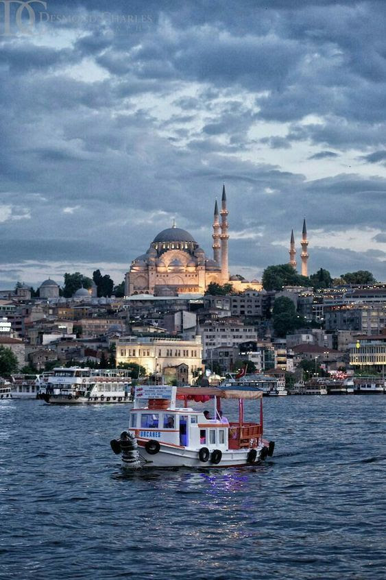
I have stopped working on this painting as I just don’t feel I can add any more. The ferry boat in the centre I have painted as sharply as I can, but as always when the paint has dried then some of the intensity goes with it. Sometimes that can be a good thing but on this occasion I would have liked the boat to be coming towards the viewer just a little more. I even finished off the waterline with dark pastel which has helped

Possibly I put too much definition into the background, but then I needed deep shadow to accentuate bright daylight. As always a slight dilemma. Maybe next time I will paint the foreground first and work backwards.

However I have another painting towards the next exhibition in April, and will soon have to think about my annual update of my own website davidharmerwatercolour.co.uk. Looking back over the year, a number of sales, certainly a quantity of amendments together with a collection of new work which always attracts attention.

Last year was very good for commissions, six in total, which for some artists I know would be unimpressive, but for me exceptional. We’ll see what 2019 brings!

Istanbul Painting: Initial Stages

Crossing the Bosphorus by ferry

This is very much work in progress. I have got as far as putting in the shadows with a mix of Cobalt and Phthalo Blue, the mix I like using in any scene that is southern European or nearby

I have done the sky in the same, and the sea also but over an orange wash which gives it a greenish hue, and as always I hope this works. I have put some more orange here and there into some of the buildings as highlights as the shoreline was getting monotonous. There will be some more shadows yet going in to the buildings and also the boats that are still tied up

The boat mid channel I hope to do in much more detail, as much as my shaky hand will allow, and I want to introduce some red into this boat to bring it forward from the shore. That is the theory anyway.

Annoyingly the camera has picked up the texture of the paper so that it looks as though I am painting on onion skin. I seem to get a better result with the camera on my phone these days so might use that for the finished image.

Since this photograph was taken I have done some more work on the painting. Nothing startling, just deepening the shadows, and deepening the sea colour in the foreground. The shoreline is starting to take on a cubist look, unintentionally but interesting nonetheless.

I need another painting of Istanbul

This one I quite like,as a reference, not my own but similar to the ones that I took of boats crossing the Bosphorus. I won’t be copying it as such but using the content for inspiration.

I think I will attempt to change the lighting. I have several Bosphorus shots of my own to refer back to, so will experiment a little and see what I end up with. The construction will remain much the same, as the composition would be difficult to improve on

It has all the ingredients, the mosque, the ferries and the water. No mistaking where it is. This is rather a dark shot, evening time and dramatic, quite a clever photograph, and all credits go to the photographer, if only I knew who it was

For the moment, I am just doing some free-hand sketches, and may just include those at the end of this blog. Those minarets are proving something of a problem to pin down. One minute they are leaning too far to the left, and when I correct that, too far to the right. The mosque building itself is a delightful exercise in geometry though, which may be forgiving because of the distance. I had the same problem when I painted the Blue Mosque which is in the archive somewhere

Both Istanbul paintings sold from my Artfinder site which was gratifying especially as I don’t have much success on that site, hence I need another Istanbul painting for my next exhibition which is in April, which will come round fast enough

The Fountain of Love commission was very well received, I am happy to report

Free hand preparatory sketches

The Finished Docklands Commission

Finished Dockland Commission

And this, I believe to be the final draft. I hope so. I am just starting to get tired of it being continually on the easel

However as cautiously as I can say, I am happy with it. I have kept within the terms of the commission, which was not easy, whilst at the same time, adding something myself to stop this being five copies of five photographs.

The Canary Wharf skyline has had some shadows added which have helped the definition. The little cranes even give a feeling of distance

Lensbury Circus, the second picture, that was difficult. Never easy to make anything of office blocks with lots of windows, we usually have an interesting sky or something to alleviate the sterility of square buildings. Not in this case as we are working with five vignettes, so all I could think of was to put some extra shadow over the front of the building and abstract those windows. More of an impression really

Bottom right, the pub, I think worked well. I used Cadmium Yellow for the umbrellas and the plants, which I think worked in conjunction with the violet used on the front of the building

The other two images I talked about on the last post, and still the little ferry boat is my favourite

The client is away until the end of June, so I will present the finished work then with fingers crossed under the table

To Continue with the Docklands Commission

Five Image Docklands Commission Partway Only

Well, out of the mist, some definition is starting to appear here and there

They wanted the Canary Wharf skyline to run along the top. Incidentally I photographed this on the easel so I am sorry that the images appear slanted. Also there are some shadows and stuff which shouldn’t be there. Just to make Canary Wharf more interesting I have used sunset colours building up oranges and vermillion across the windows. I have used vermillion and cobalt blue blended for soft shadows, which works, I believe. Little cranes help the feeling of distance. I think that picture is pretty well there, and I was asked to make that image soft anyway. I like to take the client’s instruction into account if I can, but sometimes they have to be persuaded to do things differently.

I finished the little ferry boat. Once I started I just could not stop. I think she will be my favourite image of the five, probably because I like painting boats anyway. For the background I have repeated the Canary Wharf Skyline, which is geographically impossible, but infinitely more interesting.

The pub in the bottom right, is ready for its next coat, which will be Transparent Brown over the Violet, which will give more definition to the building itself. I think yellow for the umbrellas, but I just need to work out which one.

The image which scares me and which I have made a start on is the crescent shaped building of Lensbury Circus. At the moment it is looking rather bleak, as though the area is run down, which of course it isn’t, far from it. All those windows too. They may have to succumb to a sort of lost and found treatment

But there are more positives than negatives so I will get back to it, but not tonight. I have spent hours on this one, but there are five pictures instead of one, which I should have realised when I took it on. Luckily I’m not on piece work or I would starve.