Magnificent exhibition at Tate Britain entitled Now You See Us is on until early next month. I wish I had gone sooner as this is an exhibition that needs more than one visit. It covers the work of women artists from 1520 – 1920, during ages obviously when women were subservient to men in most walks of life. Their work very often epitomises their struggle for recognition.
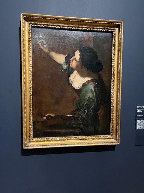
One of the earlier examples, a self portrait by Artemesia Gentileschi, an Italian artist working in London during the reign of Charles I, In London she worked for Charles I and Queen Henrietta Maria, and two works in this exhibition are from the Royal Collection. The other one is Susannah and the Elders, a popular Old Testament sory who was observed bathing by two of the elders, and sexually assaulted. The usual story, the elders tried to make out she was a whore but later her innocence was proved.
There were an amazing number of artists represented working through the ages. Very few did I recognise. Gwen John was one, and her self portrait was used in the exhibition publicity. In fact the work of hers shown was in my view some of the least inspiring.
During the 18c the work of the Royal Academy centred round oil paintings. Other media was looked down upon. Joshua Reynolds was especially sniffy about watercolour, pastel, embroidery and any sort of craft as being work that women did at home for their own amusement.
Gradually, and as we move into the c19 women are starting to meet men on equal ground. Two paintings which greatly impressed me were:
Colt Hunting in the New Forest by Lucy-Kemp Welch
The Roll Call by Elizabeth Butler, a painting of Guards Regiment in the Crimea. This painting was summoned to the palace for a special viewing by Queen Victoria. It sold for the staggering sum of £1200
Both of these were sensations in the art world at the time. Both were hung “on the line”, which means they were hung at eye-level, a great tribute by the hanging committee of the Royal Academy

Colt Hunting in the New Forest which is an enormous painting
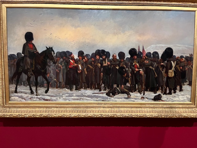
The Roll Call by Elizabeth Butler
My photographs are not very good alas, done quickly avoiding other viewers.
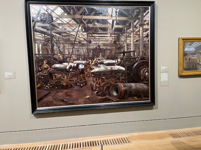
Finally. a painting by Anna Airy, commissioned by the Imperial War Museum, Shop for Machining 15″ Shells, shows women doing factory work in 1918. This was the old Singer sewing machine Company factory on Clydebank. Important work and an important painting