An alternative view of the Grand Canal, Venice

Grand Canal, Venice from the Rialto Bridge

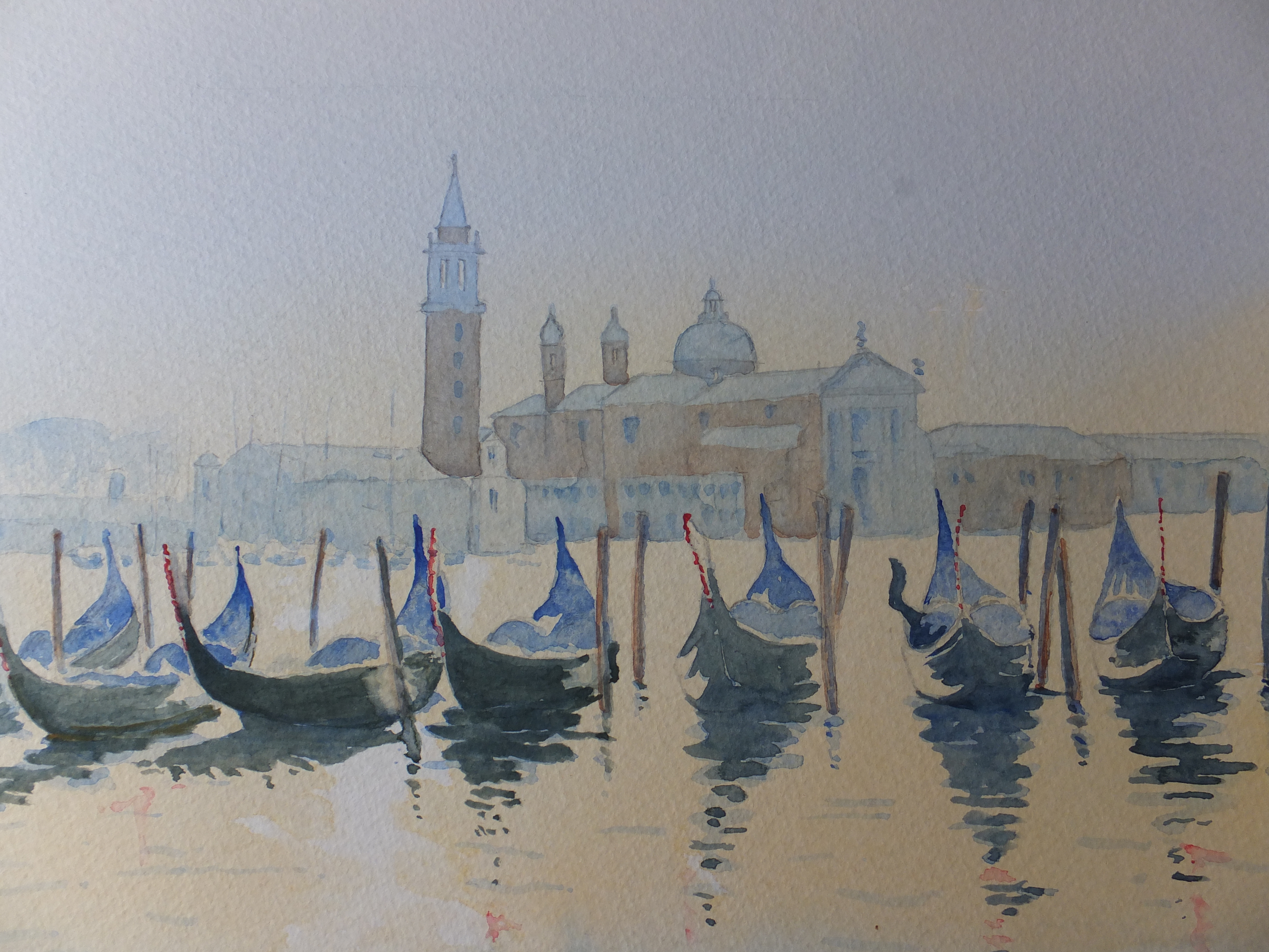
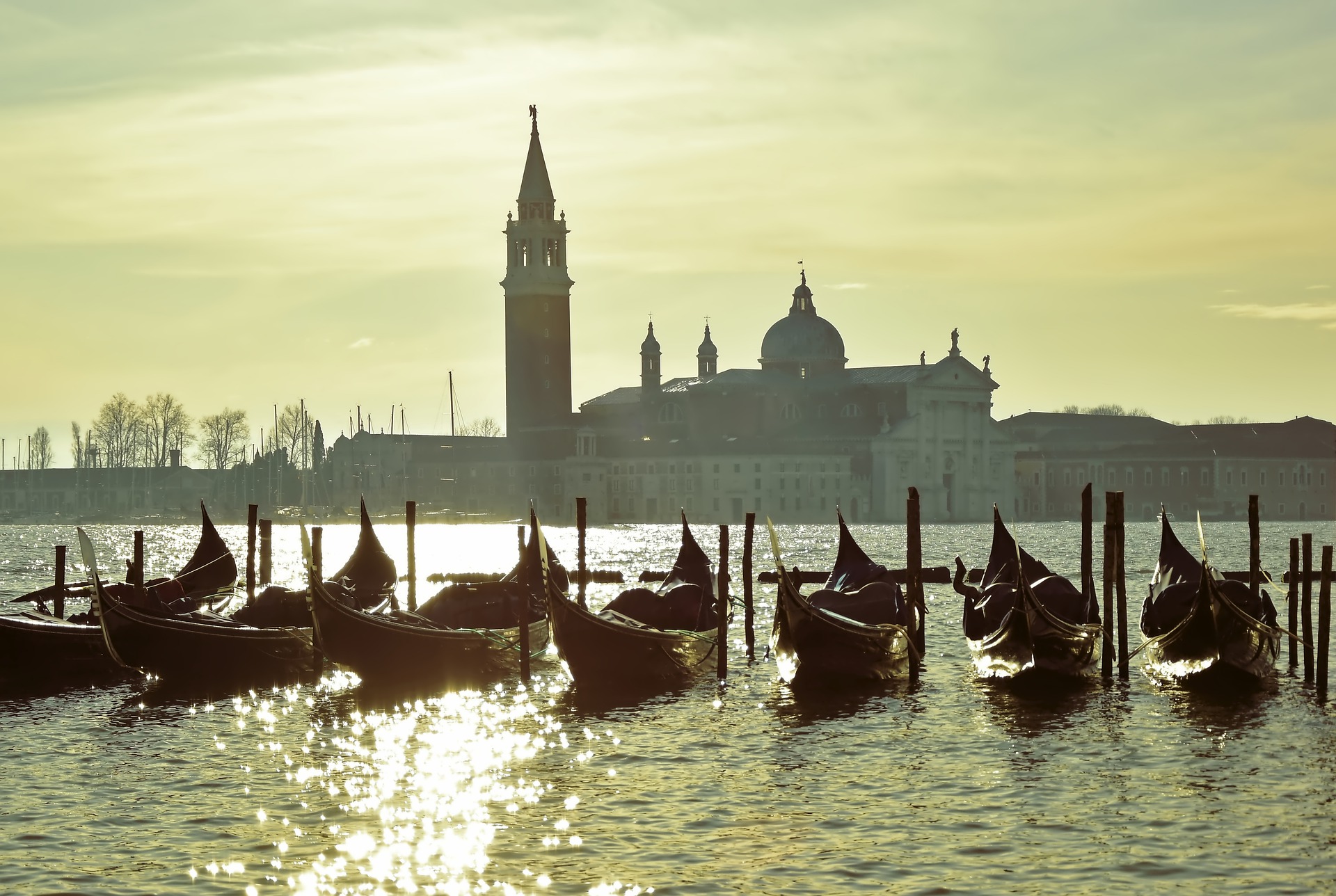
I am indebted to Pixabay for the use of their photograph. I have stood on this spot a few times and looked down the canal, but this picture was taken with a distant golden evening light which is very attractive. I hope I have done justice to this view. Standing on this spot, reminds me of the many little shops, in one of which I bought a piece of Murano glass, which was over-priced , but difficult to go home without something

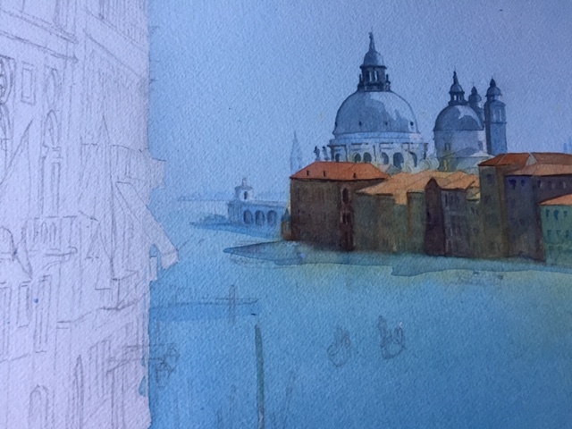
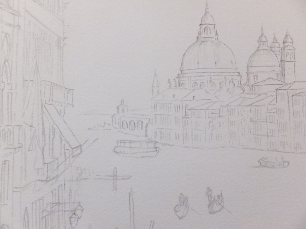
I love the feeling of depth. Close to us are the embarkment stations used by passengers boarding the many vaporettos which chug along the canal, going to many destinations. In the far distance you can just see the canal bending out of sight. In between are the old palaces now mostly hotels

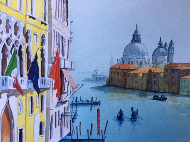
The sky was always going to be the biggest challenge. I used some cobalt and phthalo blue mixed, layered in orange for lower sky, and back to blue for the lower picture. I had to repeat this twice to get any sort of brightness to the orange sky. Later when bone dry, I put in some red clouds wisping along the top . The orange worked well as a reflection in the water too. As always the camera has leeched out some of the colour. The painting is so much more vibrant. I wish I could stop this happening

Venice continues to be popular, and I never tire of painting her. Just by way of a change I am trying to put together a composition around a cat in Ephesus. We have been there a couple of times. Very atmospheric treading in the footsteps of St.Paul, also very hot and dusty, but amazing nonetheless. On my last visit and just in front of the Library of Celsius, a cat was sitting motionless on a pedestal. There are always plenty of feral cats living amongst ruins. This one somehow added to the spiritual quality of the scene, not Christian, but more like an object of worship in Egypt. Fanciful I know, but that is how the view struck me. I wonder if I can convey that in a painting

Venice: a different treatment of a favourite view

Venice, Early Morning

This is what I meant by an old favourite. The lagoon viewed looking out onto the magnificent church of San Giorgio Maggiore, which I have painted several times before in different lights. I don’t seem to have kept many, so must have been some time ago that I last painted this view, before I started keeping a file of all my pictures. Anyway, this one I was pleased with. The light seemed to work. A misty still morning before the sun broke through, there is very little in the way of colour as yet

I have used mostly just two colours, Cobalt Blue and Cadmium Orange. Here and there they have mixed and produced an interesting grey/green which I rather like and use from time to time. Burnt sienna for the brick buildings in the background, but not much of it

I put this one on social media to get some comments. Someone bought it which is always the ultimate accolade

I am doing a real exhibition this coming Saturday, and it would have been nice to have taken it, but you can only sell a painting once. I am happy with that

A Favourite View of Venice

Gondolas with San Giorgio Maggiore in the background

Probably my favourite view of Venice which I have painted several times before, but not with this lovely misty light, which I shall assume to be morning but could be evening. This photograph I owe to Pixabay and am grateful

This is my finished watercolour painting, or my version of the photograph I should say

Painting of Venice in early light

This was a challenging photograph to work from. San Giorgio Maggiore in the background, shrouded in mist. I knew it well and had painted it a few times. This is a lovely building set on an island and reminds you where you are, almost into the mouth of the Grand canal. Gondolas line up like taxis in the foreground. Drawing them is always fun. They seem to have a twist along the length or maybe that is my imagination. An interesting point about gondolas is that they have to be black according to regulations and yet because they are so highly polished, they very often don’t look black, because of the highlights and the reflections

This fills a spot in my collection. I have two exhibitions planned for December, and I never feel complete without a painting of Venice. Unfortunately having been through my own collection of photographic references more than once, I am sometimes puzzled as to what to paint for a change. This view I have painted before but in bright sunshine, so a misty start to the day is a nice change. Initial response to the painting has been encouraging, so I think it could do well, but I have said that before

We shall see. At the moment I am in different stages of two works, not something I like doing but needs must

Painting in someone else’s style completed

Corner of Venice

So this is my version of the original photograph, something I took some while ago, and frankly was something of a muddle. It lent itself to the “less is more” concept, if anything did. I am not saying this is a masterpiece by any means but does improve on the photograph.

The corner of the Doge’s Palace has been detailed although not heavily so and so has the street lamp. The rest has been trailed out, although you can just make out what it is. As I remember the shot in the background forms part of the Basilica of St.Mark, but not enough showing to be recognisable, so not really missed when phased out

I haven’t found someone else’s style easy, as one’s own creeps back, but I have been as disciplined as I could. Nice to draw in ink again, too. I had forgotten the satisfaction that brings. I tend to draw in ink over my pencil lines and then erase the pencil. My pencil lines rarely go in the right place and need a few more tries. When inking over you can pick the line you like and then erase the rest. Ink or ball point, both work well with watercolour

Looking back I can see that I didn’t attach the original photo which I will do now

The original photo

This was the original photograph that I worked from, which is as you can see something of a muddle. A good candidate for “less is more” !

One corner of the Doge’s Palace and behind the street lamp, unrecognisable bits of the Basilica. I took this years ago. I don’t remember why, but it served its purpose with this exercise

Painting in someone else’s style

An example of someone else’s work

This isn’t something that I usually try. The example above is one of many hundreds of images by celebrated watercolour artist Judi Whitton. She starts with a line drawing in ink, and then uses watercolour. It would never have occured to me to imitate this style, had I not read her article in one of the recent painting magazines in which she outlined her method. It seemed like an invitation

The point that she was illustrating was what to leave out, as much as what to put in. In other words ” less is more”

That would be a useful lesson for me, as I never know when to stop, which is a common fault, so it might be worth me trying this exercise to see what I can learn. More importantly what will I remember for the future

Likewise, and this is something I have always tried to do, is the power of suggestion, rather than painting in every detail. If that comes out of this exercise, even better

For now I have done a line drawing from one of my old photographs of Venice. Quite a lot of her work is architectural, and she has written a book about Venice. In case anyone finds architectural work daunting, her method can be used on a variety of subjects. Probably best to look at her website.

My scene from Venice

I have used an old photograph from one of my visits, which looks like a corner of the Doge’s palace, and have drastically reduced the detail

I will see what I can do with this

Venice:Grand Canal the finished painting

Grand Canal, Venice

This has taken a long time to complete. We were away in Romania over the New Year Break, came home and were ill, and seemed to take weeks to recover.Funeral preparations had to be attended to throughout all this for my father’s burial.

However, on a more upbeat note, working on this painting has been a great support, as painting always is. There has been so much detail to attend to, especially with the buildings on the left. The architecture is very Gothic, so intricate, and the variety of colours was exciting. Trying to colour match the photograph was amusing, especially when it came to the flags.

I may have said that I altered the composition from the original photograph. I have shifted the buildings on the left away from the buildings on the right. This has cured some of the congestion, and has also given a view to the Customs House and beyond to the open sea. We now have depth where before we didn’t

I ended up quite liking the painting, despite the jumble of different colours. Sunny and bright at this grey time of the year, which cannot be bad

What shall I look at next? Staying in Italy, but moving from Venice to Florence, I am going to have a crack at the famous Ponte Vecchio , and see what sort of fist I can make of that

Grand Canal Venice Painting-Partway

Grand Canal Part Finished

Photography poor. I have had to use my phone as after upgrading, I am having difficulties loading from my camera, as everything is different and I don’t know why. I shall fathom in the end but for the minute I don’t have time

Suffice to say, I have painted the church of Santa Maria delle Grazie and put in detail as well as the houses on the opposite side in deep gloom. In reality they are much gloomier. The sunlit rooftops look orange which works, otherwise the detail on the house fronts disappears into the shadows.

Two coats of Phthalo Blue and Cobalt Blue mix on the water gives depth although the original is not quite as deep as this photograph

Still a long way to go as I will put the gondolas in with shadow colour and probably the vaporetto too

looking forward to tackling the bright colours on the foreground buildings and the flags

Grand Canal Venice– an old favourite, a different view

Grand Canal, Venice

This is the picture that I am going to work from. I have done this view before, but it is so magnificent that I come back to it every now and then. Incidentally, this is a different take to the one that I did last time, and also I am going to rearrange this photograph. I am going to push back the buildings on the left so that we can see the mouth of the Grand Canal and the horizon beyond. This should hopefully give us a feeling of distance as we look out to sea.

So far I have done the drawing which I will use for painting, and you will be able to see the changes for yourself, and I will show that now, although the lines are faint so may not stand out well

Grand Canal Drawing

Perhaps not too bad, and perhaps you can see where I have moved the buildings to the left. We can see the mouth of the canal, and the building I believe to be the Customs House, and then out to sea, but that won’t be apparent until after painting

For sky and water I will start with my mix of Cobalt and Phthalo Blue, which I know I have said before is a good Mediterranean colour. I will need to mask off the buildings to the left, including the balconies and awnings which stick out over the water.

They will need to be in yellow and pink, so important to paint on white paper.

The buildings on the right will need a cover of raw sienna as a base coat, before building up with other colours, and before covering with deep shadow.

Coming back to writing this blog, I have now done just that and have detailed the domes, and all I can say is so far so good.

Venice: The Old Fish Market finished and framed

The Old Fish Market, Venice

Finally completed and framed! It seems to have been a long time coming. I have shown it framed as because of its size and shape, I can only offer this painting in a framed condition. That will be fine for a local exhibition, but not sure about sending it, although the shipper I use is very good and is used to packing antiques, so will just have to investigate the cost side of things.

I used one of my own photographs as a reference for this painting. Looking down from one of the old palaces opposite, this view was nicely framed by Gothic windows which I have obviously not included. That could be an entirely different painting at another time.

For now, I will rest this painting in anticipation of the next show, of which there are various coming up

I now have to think of my next subject. The Basilica of the Sagrada Familia is in my mind to do, but also is the local church in Shere Village. I will have to think

Venice: Watercolour Painting of Old Fish Market Completed

Detail from Old Fish Market Completed

The painting is finished. All in watercolour, my usual medium. This picture is just a detail, as the complete painting is long, about 50 centimetres , and as the height is only 20 centimetres, is consequently too long for the camera.

I have frames purely for these long panoramics, as I call them. They work well and are popular, and when I have framed this one , will photograph it again, which will show it off to better advantage.

As always, as I finish a painting, I have to start thinking about the next, and trying to decide in my mind what it will be. I think, and especially as I have been there recently, I might well paint something from Barcelona. The obvious candidate is the Basilica of the Sacred Family, which is breath taking. I did bring back some good photographic references, so should be able to do something worthwhile with that subject. I should make a start on that and get it at least part underway, before we undertake our next journey, which will be Rome, and goodness knows what I will bring back from there. Trevi Fountain, St.Peter’s, Spanish Steps, the list goes on and on.

To be thought about.