Venice, Across the Lagoon

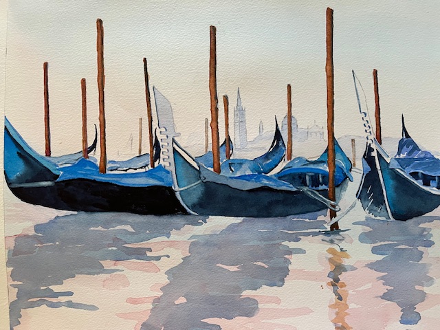
Misty View across the Lagoon, Venice

A favourite view across the Venice lagoon, with La Dogana just visible on the right-hand side , and Santa Maria delle Grazie in the distance. This was not my photograph, and I am grateful to Pixabay for the loan.

I have included the watery sun appearing through the mist, which probably will burn the mist off later. A useful tip that I read about recently was to take a bottle top, cover it with tissue and press it gently but firmly onto the wet paper. You will be left with a faint sun, which you can adjust to what you want

I used a mix of vermillion and cobalt blue to get this hazy effect, in fact no other colour. You can add more or less of one or the other to get whatever effect you want. The lonely gondola is out early by the looks of things

Just a short post this time, as other things await

Venice: a different treatment of a favourite view

Venice, Early Morning

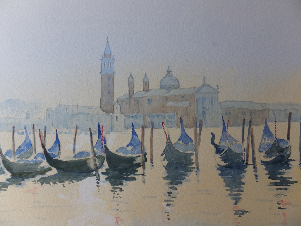
This is what I meant by an old favourite. The lagoon viewed looking out onto the magnificent church of San Giorgio Maggiore, which I have painted several times before in different lights. I don’t seem to have kept many, so must have been some time ago that I last painted this view, before I started keeping a file of all my pictures. Anyway, this one I was pleased with. The light seemed to work. A misty still morning before the sun broke through, there is very little in the way of colour as yet

I have used mostly just two colours, Cobalt Blue and Cadmium Orange. Here and there they have mixed and produced an interesting grey/green which I rather like and use from time to time. Burnt sienna for the brick buildings in the background, but not much of it

I put this one on social media to get some comments. Someone bought it which is always the ultimate accolade

I am doing a real exhibition this coming Saturday, and it would have been nice to have taken it, but you can only sell a painting once. I am happy with that

A Favourite View of Venice

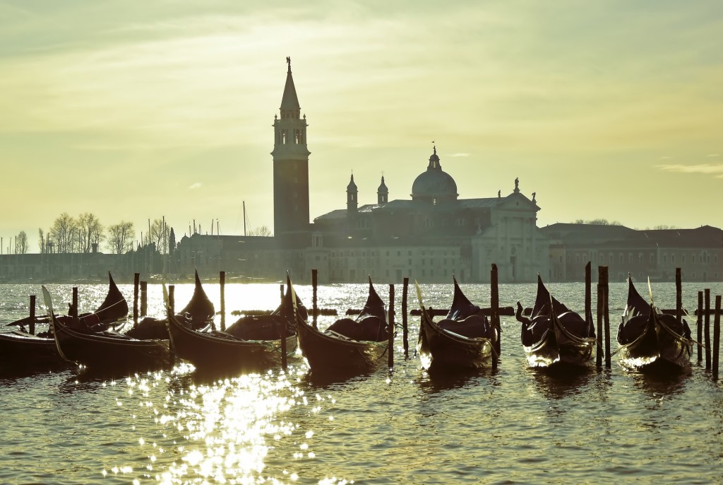
Gondolas with San Giorgio Maggiore in the background

Probably my favourite view of Venice which I have painted several times before, but not with this lovely misty light, which I shall assume to be morning but could be evening. This photograph I owe to Pixabay and am grateful

This is my finished watercolour painting, or my version of the photograph I should say

Painting of Venice in early light

This was a challenging photograph to work from. San Giorgio Maggiore in the background, shrouded in mist. I knew it well and had painted it a few times. This is a lovely building set on an island and reminds you where you are, almost into the mouth of the Grand canal. Gondolas line up like taxis in the foreground. Drawing them is always fun. They seem to have a twist along the length or maybe that is my imagination. An interesting point about gondolas is that they have to be black according to regulations and yet because they are so highly polished, they very often don’t look black, because of the highlights and the reflections

This fills a spot in my collection. I have two exhibitions planned for December, and I never feel complete without a painting of Venice. Unfortunately having been through my own collection of photographic references more than once, I am sometimes puzzled as to what to paint for a change. This view I have painted before but in bright sunshine, so a misty start to the day is a nice change. Initial response to the painting has been encouraging, so I think it could do well, but I have said that before

We shall see. At the moment I am in different stages of two works, not something I like doing but needs must

Venice:Grand Canal the finished painting

Grand Canal, Venice

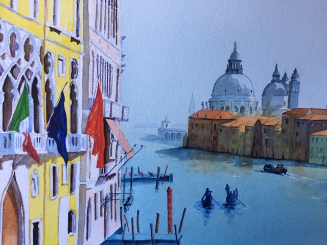
This has taken a long time to complete. We were away in Romania over the New Year Break, came home and were ill, and seemed to take weeks to recover.Funeral preparations had to be attended to throughout all this for my father’s burial.

However, on a more upbeat note, working on this painting has been a great support, as painting always is. There has been so much detail to attend to, especially with the buildings on the left. The architecture is very Gothic, so intricate, and the variety of colours was exciting. Trying to colour match the photograph was amusing, especially when it came to the flags.

I may have said that I altered the composition from the original photograph. I have shifted the buildings on the left away from the buildings on the right. This has cured some of the congestion, and has also given a view to the Customs House and beyond to the open sea. We now have depth where before we didn’t

I ended up quite liking the painting, despite the jumble of different colours. Sunny and bright at this grey time of the year, which cannot be bad

What shall I look at next? Staying in Italy, but moving from Venice to Florence, I am going to have a crack at the famous Ponte Vecchio , and see what sort of fist I can make of that

Grand Canal Venice Painting-Partway

Grand Canal Part Finished

Photography poor. I have had to use my phone as after upgrading, I am having difficulties loading from my camera, as everything is different and I don’t know why. I shall fathom in the end but for the minute I don’t have time

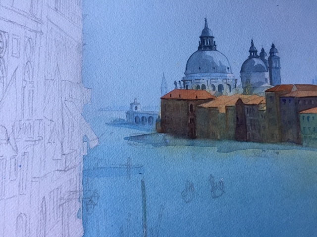
Suffice to say, I have painted the church of Santa Maria delle Grazie and put in detail as well as the houses on the opposite side in deep gloom. In reality they are much gloomier. The sunlit rooftops look orange which works, otherwise the detail on the house fronts disappears into the shadows.

Two coats of Phthalo Blue and Cobalt Blue mix on the water gives depth although the original is not quite as deep as this photograph

Still a long way to go as I will put the gondolas in with shadow colour and probably the vaporetto too

looking forward to tackling the bright colours on the foreground buildings and the flags

Grand Canal Venice– an old favourite, a different view

Grand Canal, Venice

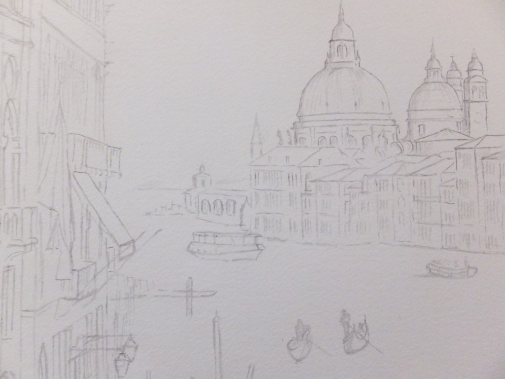
This is the picture that I am going to work from. I have done this view before, but it is so magnificent that I come back to it every now and then. Incidentally, this is a different take to the one that I did last time, and also I am going to rearrange this photograph. I am going to push back the buildings on the left so that we can see the mouth of the Grand Canal and the horizon beyond. This should hopefully give us a feeling of distance as we look out to sea.

So far I have done the drawing which I will use for painting, and you will be able to see the changes for yourself, and I will show that now, although the lines are faint so may not stand out well

Grand Canal Drawing

Perhaps not too bad, and perhaps you can see where I have moved the buildings to the left. We can see the mouth of the canal, and the building I believe to be the Customs House, and then out to sea, but that won’t be apparent until after painting

For sky and water I will start with my mix of Cobalt and Phthalo Blue, which I know I have said before is a good Mediterranean colour. I will need to mask off the buildings to the left, including the balconies and awnings which stick out over the water.

They will need to be in yellow and pink, so important to paint on white paper.

The buildings on the right will need a cover of raw sienna as a base coat, before building up with other colours, and before covering with deep shadow.

Coming back to writing this blog, I have now done just that and have detailed the domes, and all I can say is so far so good.

Canals of Venice: the finished painting

Canals of Venice

The finished painting which I have just framed, which will go in “The Railings” exhibition on Saturday, where I hope it may bring me more luck than those in the Royal Surrey Hospital have done. This exhibition  has been deathly quiet so far. Hard to explain this, as exhibitions at RSCH have always been so busy. Still there is yet time

The railings exhibition is a local show held at Pirbright in Surrey under the auspices of the Pirbright Art Club, with whom I paint. The exhibition is outdoor, so we pray for dry weather, and held outside the Pirbright Village Hall, which is a lovely Victorian building with beautiful iron railings. We hang our paintings on the railings, hence the name. It makes for a colourful and impressive display, and we hope for sales.

I enjoyed doing this painting as I always enjoy painting Venice. I sometimes wish I could get away from it but am always pulled back. There was considerable work in the underpainting on this one which can be tedious, so I took advice from a colleague, who advised finishing one detail, he said, which gives you that necessary boost to carry on. I finished the Gothic window in the middle of the picture, before I did anything else which I do think gave me encouragement to carry on.

When my grandchildren get back from their holiday late this week, we have a painting day lined up so I might try out the Little Green Frog which could amuse us all.

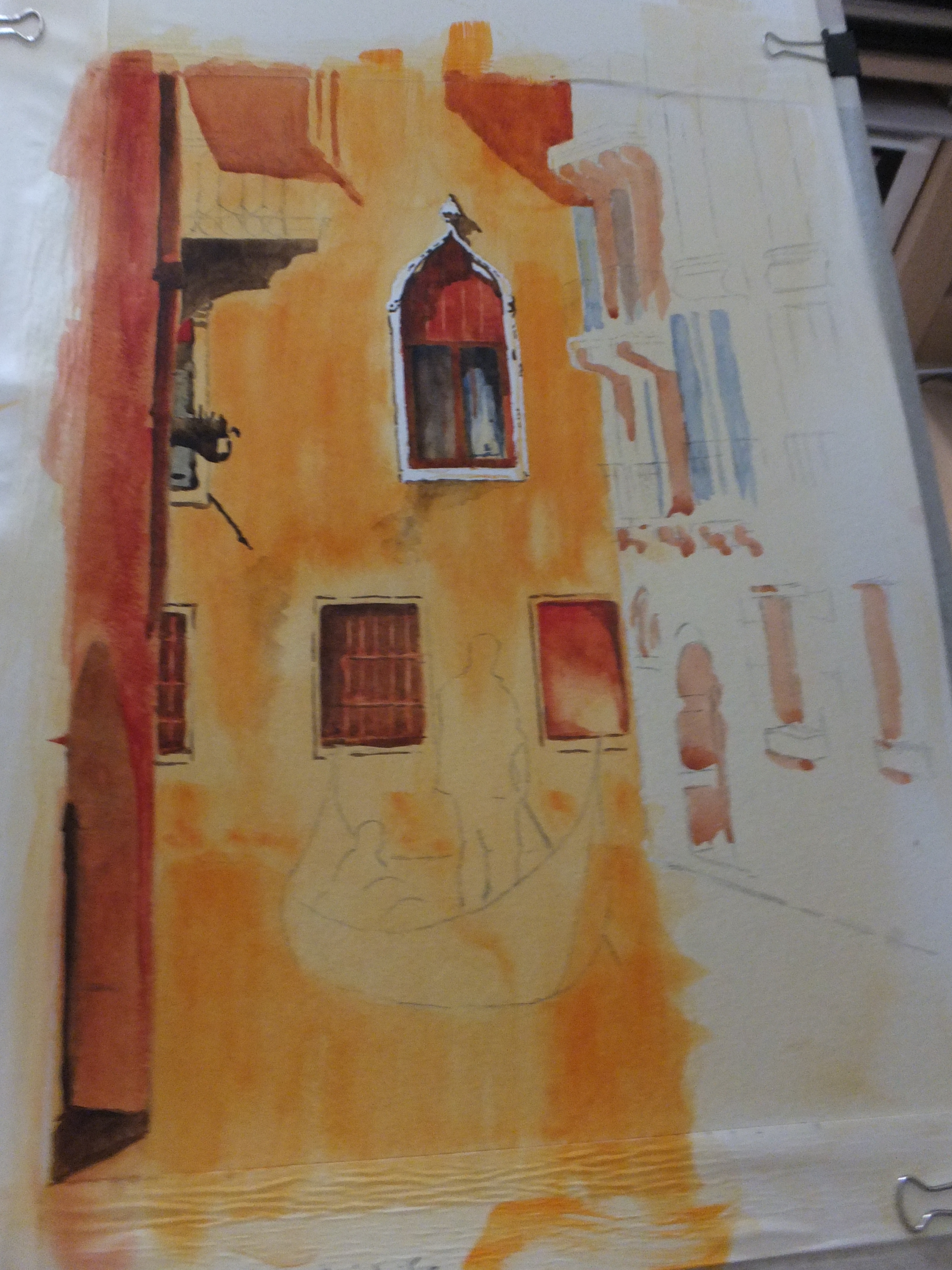
Canals of Venice: the Painting Partway

Canals of Venice partway

The story so far

I have been concentrating on the building opposite with all that orange rendering and patchy paintwork. The walls took me quite a while, as I used several undercoats starting with my favourite raw sienna and Naples yellow mix, which gives it some backlighting. It took several coats of dilute orange before it started to look orange, and finally I scrubbed orange pigment straight from the tube to get that patchy, water-damaged effect

I decided to finish detail the Gothic window. I do that sometimes so that I can look at something which encourages me to go on. I was pleased with it, once I had finished, says he who shouldn’t. I think I colour matched correctly the timber screen or whatever it is in the window. That took several coats of cadmium red over Burnt Sienna, which surprised me as that red is so strong. The texture looked like dry, flaky varnish so I hope I got that right. I used some blue in the windows which gave a pleasant relief to all that orange

Once I had put the brown shadow in, the window suddenly came to life. The carvings stood out, and the window under the screen took on some depth. So far so good

I then detailed the two windows on the ground floor, including the one with a rusty iron grille, which seemed to work quite well

I ploughed some cadmium red into the far left building which started to look authentic Venetian. I shall probably lose that when I mount the picture. How often does that happen

There is still plenty of detailing to do, which becomes tiring after a while which is why I have stopped to write this. I would like to finish and frame this for The Railings exhibition in Pirbright, as all my other work is at the Royal Surrey. May do possibly

Still no news from the Royal Surrey, but one of my paintings has been put on reserve on my Artfinder site, which indicates interest at least. I think one sale would be like a starting pistol for this year to finally get going.

I must not moan. I love painting and would continue to do it even if I never sold another picture, although what I would do with them I do not know!

Canals of Venice

Venice Drawing

Today my colleague in paint, Elaine and I set up our joint exhibition at the Royal Surrey Hospital in Guildford. I have to say that it did look good. It will be on for four weeks, and now one has to forget about it, which is never easy, as it is so tempting to check one’s emails

Having said that my exhibition work is over for a while, I am reminded that on the 29th July, our local club, the Pirbright Art Club are holding their summer exhibition. We call it the “Railings” as we hang our paintings from the iron railings around the old village hall. It does look quite effective

However all my best stuff is at the hospital and will be until mid August, so a bit of a problem

There was a Venice picture which I wanted to do, and I have attached the photograph as well as my line drawing version of it. I am going to try and complete this by the 25th when we have our “auditions” for this exhibition, so at least it will look as though I am trying to support our local show.

The photograph, I found startling, with the brightness of the colours and the deep shadows, both complimentary and both fascinating to attempt. Some lovely deep oranges and some texture work with these bright colours, should be very satisfying to do. There are too some really good architectural shapes, such as the Gothic window which I hope to give more prominence. I have omitted the window next to it, shown in the photograph. The architectural iron work of he balconies is a study in itself

Anyway that is my next task, which promises to be fun

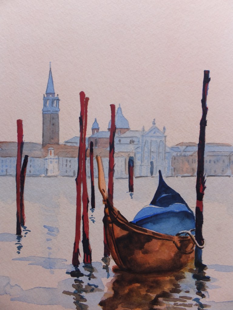
Venice Painting Completed

Venice Painting Completed

The finished painting with San Giorgio Maggiore in the background, which I enjoyed doing, although trying to hit the right colours was testing to say the least

I have already mentioned the mooring posts. In the photograph they looked red in the evening light. This turned into a glazing exercise, wet on dry, although nothing like as tricky as the hull of the gondola which I will come to in a minute

For the posts I started with a Burnt Sienna wash which is pretty safe. When the paint had dried, the pigment had disappeared. I applied another coat of the same colour, followed by a coat of Permanent Rose which should have given these posts a nice evening red glow, but still pasty. I had been waiting to use quinacridone red, of which I have a fairly limited experience, so perhaps risky. The colour worked well, I thought, giving me what I wanted. I used Indigo for the strips of bark hanging onto the wood. Indigo makes an alternative to black which I avoid if I can

Now the real challenge, to use that overworked word, was how to treat the hull of the gondola. I may have said before that gondolas are black by regulation. The finish is of a very high gloss, the sort one sometimes gets on pianos, in fact it used to be called piano finish. I think polyurethane was involved which may have been universally banned by now because of health risks.

Black gloss in certain lights obviously won’t look black, because of the other bright colours it picks up in this mirror like shine. If you remember the original photograph that I worked from, the vessel looked a sort of bright copper colour.

Again this was a long and drawn out glazing exercise. At least five coats as I remember and twenty four hours natural drying in between each coat. I used Quinacradone Gold, Burnt Sienna, Van Dyke Brown, Transparent Brown and Permanent Rose

I looked at it in the morning from a distance. I think it worked but I will have to put it away and get it out again another time, before I can make an objective view

As always comments are welcome