Two White Rabbits

DSCF3028

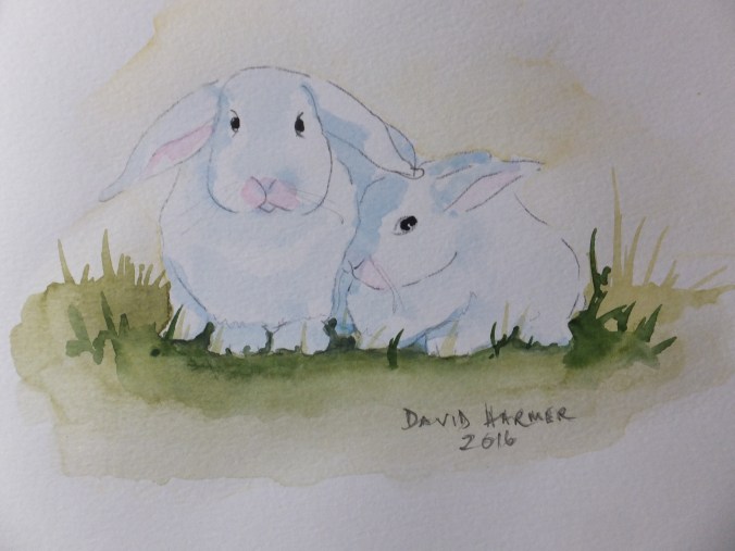
The two white rabbits

This was a project miles away from my usual comfort zone

I was asked if I could provide an illustration for a children’s story, which was flattering in itself, as not really something I am known for. I am usually doing something architectural. Occasionally I paint animals, but this exercise was rather different

The stipulation was to paint or draw two white rabbits, a mother and child. They were to be white but set against a white background, so tricky in itself. The storyline dictated that the picture had been painted by a child, albeit an art prodigy, as an entry to a competition. How to look through the eyes of a child? Not something I have ever been good at

After the drawing, which was simple enough, I shaped the rabbits with shading in a very pale blue. I think I used Cobalt as that is fairly flat anyway. White rabbits tend to have pink noses andĀ pinkĀ inside their ears, which I added with very dilute Crimson

To give the forms some sort of identity, I washed round the edges with again very dilute green gold, which gave a little bit of a lift, without straying far from the original specification

So that the images didn’t float in mid air, I did put some darker green as grass, but otherwise stuck to the original premise

I am pleased to say that the young boy won first place in the competition, so all was worthwhile

The story is called The Poisoned Apple and is serialised on Pinterest

two white rabbits


Exhibition at Royal Surrey County Hospital

Brewery Dray

Brewery Dray in Guildford

When we were breaking down the exhibition on Friday morning, I sold this painting at the last minute. A young woman arrived breathless with the money and bought it. I was very pleased with this as it raised my score for the whole exhibition to four paintings sold. Not the best that I have ever done but not the worst either, and certainly quite respectable.

The other three were Strolling through Montmartre, Grand Canal Venice and Painshill Park

Paris and Venice are always popular, especially the well-known landmarks. I have almost lost count of how many of each that I have sold. Painshill Park is a new subject for me and I was heartened to sell this picture, as I now feel encouraged to paint some other views, of which there are many to choose from

Painshill is a local estate near Cobham in Surrey. It was laid out in the c18 by a man called Charles Hamilton. It was in the style of a natural landscape made popular at the time by garden architects like Capability Brown and Humphrey Repton. The views were sculpted, whole forests were planted, fake ruins were built and rivers were dammed to form lakes.

Hamilton worked a lot with American species of trees. It was interesting to note that you could import a “box” of plants from American nurserymen, suitably packed to withstand the rough and long sea voyage. Many did survive and are still flourishing in the park today.

Over the years, the place deteriorated and became overgrown. In the 1950s it was rediscovered and lovingly brought back to life. Every year there is a new project. Recently the old boat house was rebuilt using old photographs. The previous year one of the bridges was replaced using an old painting as a reference. I attach my painting

PainshilL Park, Surrey

This was an unwary group of people feeding the Canada Geese by the lake at Painshill. There are literally flocks of geese of different species, as well as ducks and swans. Always a lot of activity on the water. In the background is one of the strategically placed follies, which I think is the Gothic Chapel

I am starting to whet my own appetite for painting here again!

DSCF0985

A different view of the lake with a different ruin which could make a good subject. Wants something in the foreground though. I have umpteen swan pictures from which to choose.

I have a commission to do and then I might tackle this one

Schlee Collection at Mottisfont Abbey

DSCF3027

Mottisfont Abbey near Romsey in Hampshire, UK, owned by the National Trust

We were at Mottisfont yesterday to see the roses which are magnificent now. These are grown inside the old walled kitchen garden, which give them a superb backdrop against old brickwork. I took some pictures of specimens, especially blooms which are about to fall, hopefully to do a rose study again. I haven’t done one for a long time. Not just the roses though. We had come to see the art, in the form of the Schlee Collection which is on loan from Southampton Art Gallery until July 3rd

There is an exhibition of the Schlee Collection of drawings and sketches, on loan from Southampton Art Gallery, which lasts until July 3rd. A private collection which was bequeathed to Southampton Art gallery in 2013, which includes work or should I say squiggles, by David Hockney, Henry Moore and Franz Auerbach, plus many others. I would like to say that I was thrilled by them, but I wasn’t. Heavily worked and corrected jottings are not very impressive, even if by one of the great names in British art. I was more pleased to see a drawing by Barbara Hepworth of an operating theatre, placed next to her mentor Henry Moore’s work. The Barbara Hepworth was borrowed from the Derek Hill collection which is in permanent residence at Mottisfont.

Derek Hill was a portrait and landscape painter of note, who became sought-after during the 1960s. From the south of England he moved to the west coast of Ireland and founded the Tory Island School of painting, where he taught the fishermen to paint the wild Irish landscape. He was also an avid collector of modern art, including the post-Impressionists. He was a friend of Maud Russell the last owner of Mottisfont, and bequeathed a portion of his collection there. These are always worth seeing, including many of his own works, time and again.

For me, however, the gem is still the Whistler room. Here we see Rex Whistler’s unfinished murals. Unfinished because he was killed in Normandy in 1944. His trompe l’oeil paint pot and brush high up on the coving below the ceiling, still makes me feel that I want to get a ladder and climb up and get it. I believe several have in the past

DSCF3021

Thames Estuary Sea Forts: Finished Painting

Sea Forts Thames Estuary

This is the finished painting

I had intended to post another work in progress shot, but as I got into the rhythm of the painting, it was as easy to finish, and more interesting to look at anyway

I had one false start, which normally I wouldn’t admit to. I decided the sea looked too pale and insipid, so I scrubbed back the bottom half of the platform legs, so that I could paint over the sea again and deepen the colour. Especially the area around the platforms needed to be darker even though it wasn’t in the photograph. I used Viridian mixed with a little Lamp Black for the sea colour, which works well I always think, with a nod of thanks to Rowland Hilder.

This alteration did leave me with two hard lines which normally I would have been able to blend. I have disguised them a bit with white caps, so not too bad

As for the structures themselves, I used Burnt Sienna with a little Crimson to get close to the colour of rust, and drybrushed as much as possible to look like rusty paintwork. The very deep shadows on the platforms I did with Ultramarine Violet, neat straight out of the tube with as little water as possible and straight over the rust colour. The barnacles at the bottom were painted with Olive Green, but still not dark enough, so I overlaid with the Violet.

There were some red marks where brackets had been fitted, which was probably red oxide base coat in its day. Again some Crimson, with a little free expression, seemed to get that effect.

This turned out better than expected, I am pleased to say. I have learned from it, and it was a welcome change from the usual scenes. Not a painting anyone is likely to buy, so pure self-indulgence really.

Sea Forts Work in Progress

DSCF2988

So far, I have put down a base coat of Cobalt Blue/Phthalo Blue mix right across. I fixed the horizon with a vague idea of coastline. One or two small details were masked out. There is a small buoy next to one leg of the first fort, which will be white eventually. One or two girders or rails facing the light will be pale blue when the mask is removed.

It may not appear so in the photograph but I have washed over the sea, with a dilute Cobalt green, and then rubbed in Raw Sienna at the base of the towers, as the sandbank is visible through the water

With the shadows on the metalwork, I have allowed myself to experiment and used a mix of Cerulean Blue and Ultramarine Violet, a combination I have not used before, but only read about. This makes a pleasant shadow colour, although whether it suits old ironwork is another matter. Some people put shadows in afterwards, and it is a personal choice. I find putting in shadows first gives me a dimensional image to start with, which I find helpful

I couldn’t get near the pale greenĀ colour of theĀ paintwork on the towers. I used the Cobalt Green over the original blue wash, and will hope for the best. TimeĀ nowĀ to work on those delicious rust shades, which I hope will bring a touch of reality

I have absolutely no idea how this painting will end up