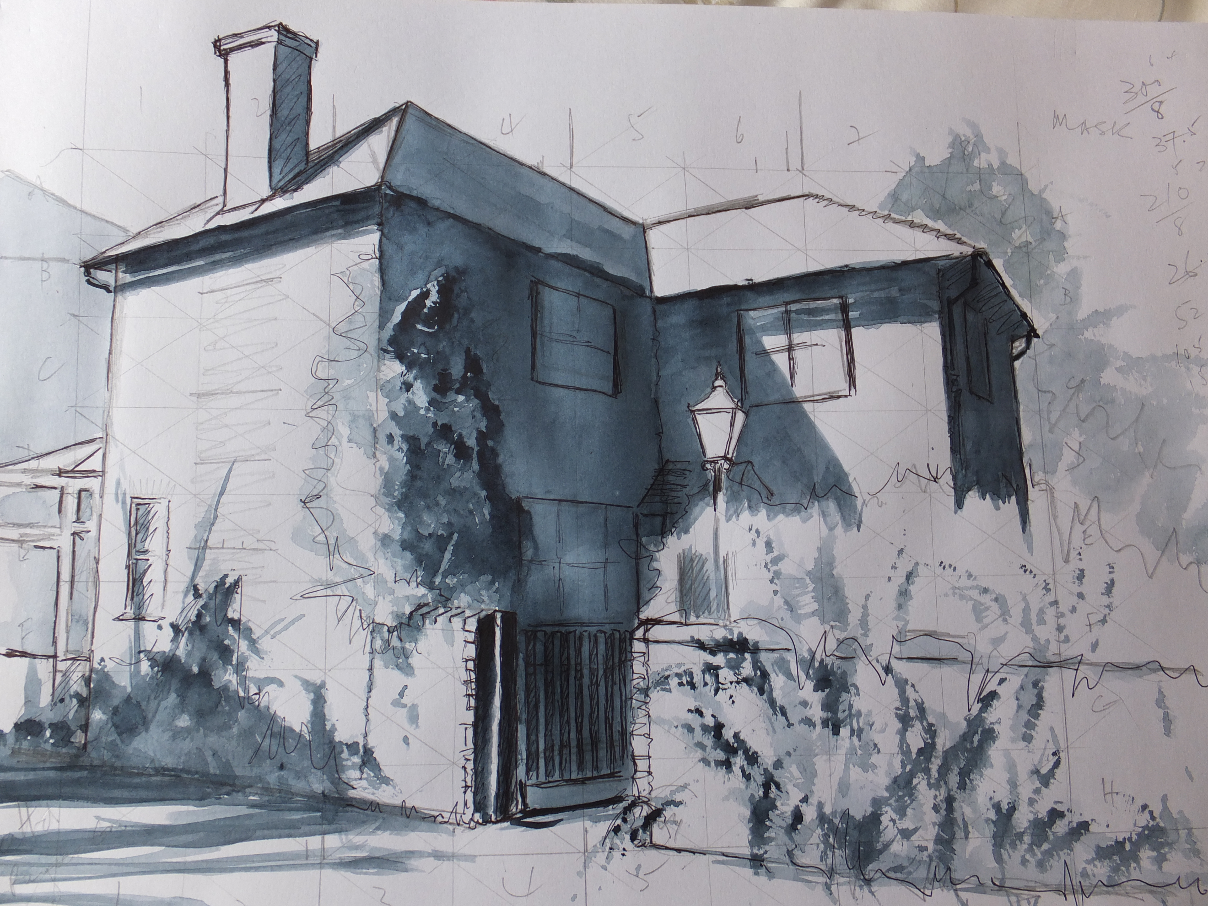
This painting has given me some problems, even though it should have been straightforward. Never be complacent, and think you will dash something off. I needed a Langstone picture for a forthcoming exhibition, and thought I would fall back on an old favourite, namely Langstone Mill. This lovely spot is on the edge of Chichester Harbour and just before you cross the road bridge to Hayling Island. You may know it. If not, enough to know that it was once a bustling medieval port which died in the twentieth century, and now is a quiet creek. The old mill, wind and tide, is a very paintable subject.
I thought I would give it a sunset look. Again straightforward. For some reason, beyond my comprehension, the lower half did not work. The transition line from red to blue which should have blended seamlessly, just did not do so. In fact I had one of the roughest edges that I can remember. Not just hard but erratic looking like nothing I could understand
I have tried washing in carefully with clean water, but that was not a success and left an even more unseemly mess. Watercolour, as all will know, is difficult. Mistakes are hard to correct. I should know that. I have painted in nothing else for about twenty five years
The last resort is always to paint something over the blemish, if you can. I painted an extra boat in the bottom right to cover the very worst mark, and was lucky enough to use the lines of the blemish as part of the composition. So far so good, but there is a long way to go. In the centre I added a dinghy to the same purpose, and then another to make a small convoy to the sailing boat. I have seen two dinghies in tow to a larger boat before , so not too fanciful
And now what am I going to do. Well, when I know I will let you know. There will either be a finished painting or nothing at all. We shall see after I have done a lot of thinking and a lot of playing around
- Alhambra
- Amsterdam
- Ancient English Ports
- Ancient Greek Temples
- Andalucia
- Andy Warhol
- Animals
- Arles
- Art Exhibitions
- Art Nouveau
- Artfinder
- Arts and Crafts
- Aubrey Beardsley
- ball Point Pen
- Barcelona
- Barges
- Baroque
- Basilica of Sacre-Coeur de Paris
- Bath
- Beach
- Bicycles
- Boat Paintings
- Book Illustration
- Bosham
- Bosham Harbour
- Bosphorus
- Brittany
- Buildings/Architecture
- c13 woollen industry in Britain
- Camargue
- Camden Art Group
- Canal Bridges
- Canals
- Castles
- Cathedrals
- cats
- Cefalu
- charity auctions
- Chichester
- Chinoiserie
- Christmas Street Scene
- CLASSICAL aRCHITECTURE
- Competitions
- Conkers
- Constable
- Copenhagen
- Corfu
- Cornwall
- Correcting mistakes in watercolour
- Country Churches
- Country House Hotels
- Country Houses
- Danube
- David Hockney
- Devon
- Dewdrop on Leaf Detail
- dog portraits
- Donkeys
- Dorich House Museum
- Dragons
- Eagle Comic
- Education
- Egypt
- Egypt Equine Aid
- Eifel Mountains
- Elizabethan Country Houses
- English Country Gardens
- Equipment and work space
- Ferry Boats
- Figures in Streetscape
- Fishing
- Fishing Boats
- Flamingos
- Florence
- Fountains
- Fountains Abbey
- France
- French Impressionists
- Frog
- Frogs
- Galicia
- Garden Statuary
- Gardens/Floral
- George Gilbert Scott
- Georgian Architecture
- Georgian Gazebo
- Germany
- Gondolas
- Granada
- Grayson Perry
- Guildford in Surrey, UK
- Harry Potter
- Henry Moore
- Holland
- Horses
- House Portrait
- Hungarian Cattle Country
- India
- Islamic Art and Architecture
- Istanbul
- Italian Chapel
- Italy
- Jane Austen
- Kew gardens
- Kew Gardens
- Knights Templar
- Langstone Mill
- Leaf Soirit
- Leatherhead Theatre
- Life in the 1950s
- Light and Dark
- Lightbox, Woking
- Lock Gates
- London
- London Docklands
- Louis Philippe
- Ludlow
- Marinas
- Maritime History
- Marsala
- Mary Wollstonecraft
- Marzamemi
- Medieval Undercroft
- Mediterranean
- Mice
- Mosques
- National Trust
- Night Sky
- North Sea
- Notre Dame de Paris
- Opera
- Orkney
- Ostrich
- Oxford
- Pagoda
- Painshill Park, Cobham
- Painting Snow
- Pallant House Art Gallery, Chichester
- Paris
- Pattle Sisters
- Paul Nash
- Payne's Grey
- Pelican
- Period House
- Photography
- Plas Newydd, Anglesey
- Ponte Vecchio
- Portsmouth Harbour
- Post Impressionists
- Pre Raphaelites
- Preliminary Sketch
- Properties of Watercolour Paints
- Ragusa
- Railway Stations
- Reviews
- Rex Whistler
- Richmond Hill
- River Wey
- Rome
- Rossetti Family
- Royal Surrey Hospital
- Sagrada Familia
- Sailing Boats
- Saxon England
- schooldays
- Schools
- Scotland
- Sculpture
- Seascapes
- Sicily
- Sickert
- Sidney Sime Gallery
- Simon Gudgeon
- Simon Gudgeon
- South Africa
- Southampton Art Gallery
- Spain
- Spinnaker Tower
- St Johns near Woking
- St Katherine's Dock
- St Thomas a Becket
- Stanley's Grave
- Still Life
- Sunset
- Surrealism
- Surrey Villages
- Swans
- Syracuse
- Tate Art Gallery
- Terra Cotta
- Textbooks
- Textured Finishes
- Thames
- Tower Bridge
- Townscapes
- Transylvania
- Tudor Houses
- Turner
- Twickenham
- Uncategorized
- Van Gogh
- Venice
- Vignette Style
- War Artists
- War Graves
- Water Birds
- Watercolour
- Watercolour Painting
- Waterscapes
- Watts Gallery
- Wet-in-wet
- Wey Navigation
- William Blake
- William Payne
- Windmills
- Winter Street Scene
- Wisley Gardens
- Women Painters
- Working to Commission
- World War 1
- World War 2
- World War 2 Architecture
- Yorkshire