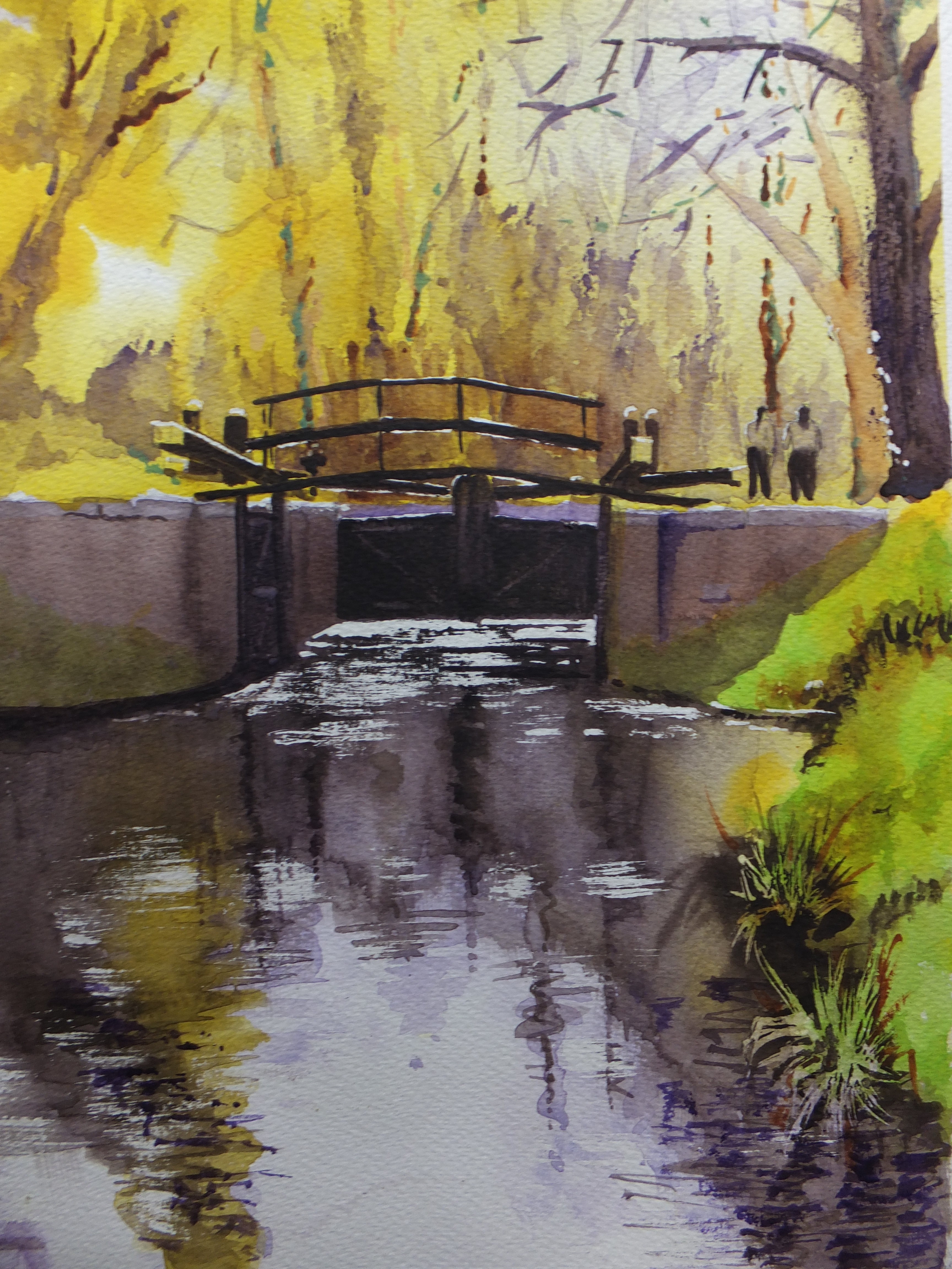
This is a really old favourite. The lock gates on the Basingstoke Canal, which flows quite near where I live. The canal is part of our industrial heritage, cut in the late eighteenth century to provide an inland link between London and Southampton, a major seaport. This was the time of wars or imminent wars with France, and transport by sea was fraught with risk, so the Wey was linked to the Arun by canal and extended to Portsmouth, which lasted for a short while, and this canal now called the Basingstoke was planned to reach Southampton. It never got there. It reached Basingstoke in the north of Hampshire, and then came the railways ,and canals were quickly redundant.
This painting went out to New Zealand by the way. It was bought by a young couple who’d come back to visit an elderly mother. They came to one of my shows, and took this painting home with them. That was years ago. I hope it’s still giving pleasure.
Today this canal is used for leisure only and is a haven for wildlife. It also gives artists and photographers subjects for their art. I’ll include a few
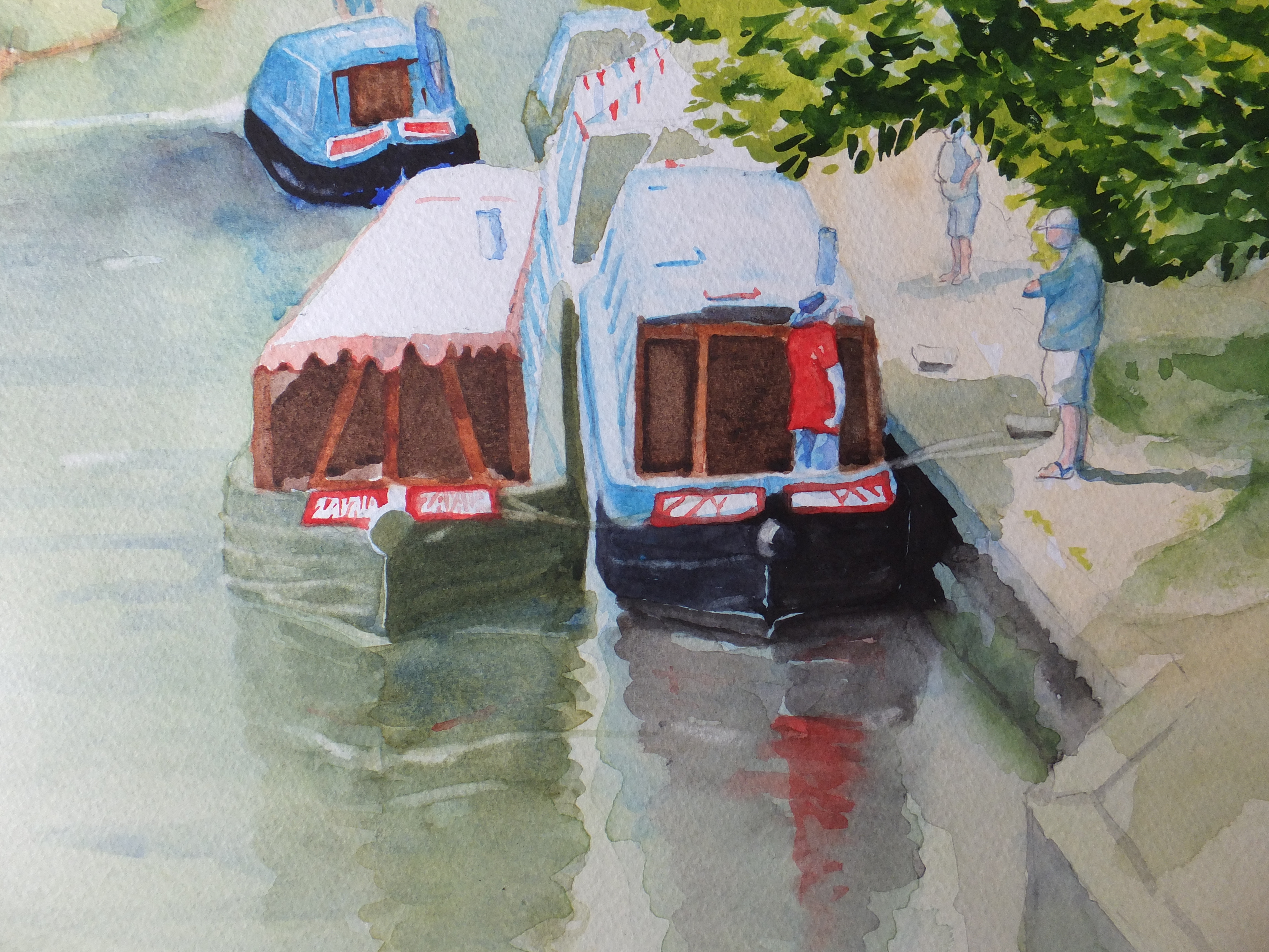
Barges gathering on the Basingstoke Canal
These are barges, of the type used for transportation in times gone by, which are now used for leisure purposes.Every so often there is a gala, when the barges get together as part of their social exercise. This is an ideal spot alongside one of the old wharves, which is outside our local Italian restaurant, which you can’t see, but is to the right of the picture. Delightful on a summer evening to sit outside with a glass of Cava and watch the activity on the water. The old boathouse is there too, long converted to a pharmacy.
I stood on one of the old bridges, Kiln Bridge, to take the reference picture for this painting
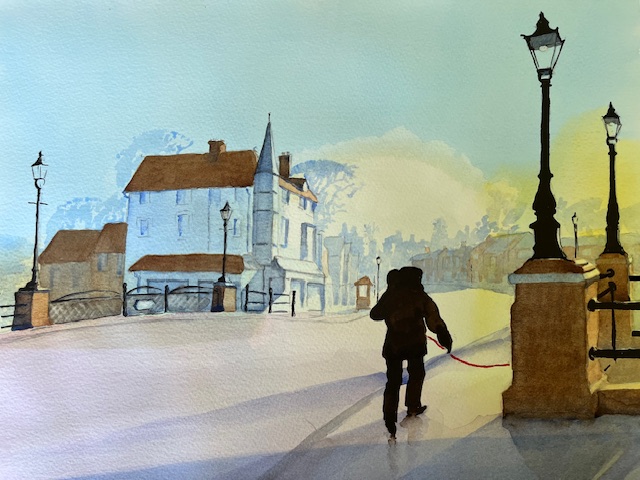
Kiln Bridge in winter sunshine
This is the bridge over the canal leading into the village of St John’s. Kiln Bridge, well the clue is in the name. When they were building the canal, they made the bricks as they went along. The village grew up around the canal in a shanty town sort of way, and most of the buildings are Victorian. The shop opposite in the picture is a restaurant today, but in its day was a haberdashers shop for a while, in those good old days when small shops could make a living selling everyday things, before being driven from the high streets.Today restaurants and beauty parlours proliferate but at least they aren’t empty
The village took its name from the church of St John’s which was built by the rector of Old Woking, as a chapel of ease for the villagers. Very considerate, as everything was a walking distance in those days, and a five mile trudge to church in bad weather would be offputting even to the most pious.
I haven’t painted this church yet although I do intend to. It is a handsome Victorian church by a very well known architect George Gilbert Scott, who was responsible for many new churches up and down the country, not to mention restoration of old churches and cathedrals. Not just churches but also remembered for the Midland Hotel outside St Pancras Station, which was derelict for many years and beautifully restored comparatively recently. There were three generations of architects. Giles the grandson, built power stations like Bankside now Tate Modern and Battersea finally developed into a magnificent shopping mall. He is especially remembered for the red telephone box, which now are collector’s items.
For the moment, that is enough for one post. An interesting journey for me which I hope you enjoyed as well. I am quite elderly now, so if I want to look back again, there is plenty for me to look at