Sunset Horses in the Wetlands

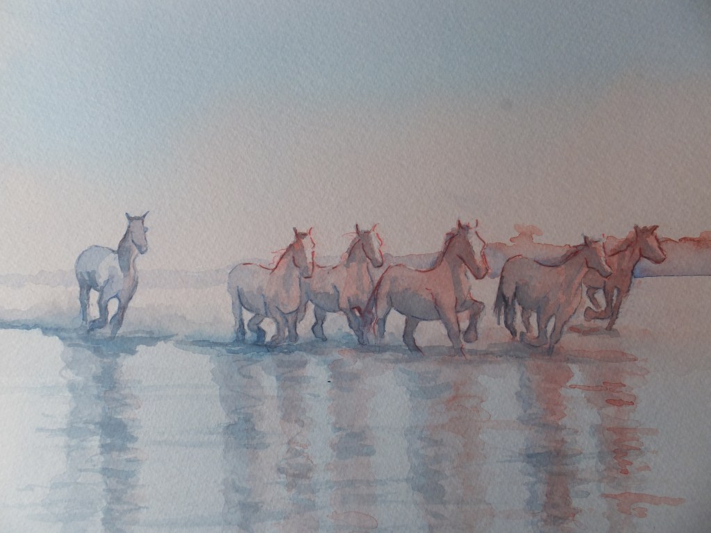
Horses galloping through water in the sunset

I never tire of looking back to our visit to the Camargue, where tributaries of the Rhone flow into the Mediterranean sea. This wetland area is famous for its wildlife, flamingos which breed here in possibly their only breeding ground in Europe, bulls which are bred for fighting, and, of course, the famous white horses which run wild throughout the area. They are magnificent to watch

I have painted them before. Always a delight. I hope you enjoy looking at this painting. As far as I remember I have only used two watercolours, Cobalt Blue and Vermillion which work well together as a sunset effect.

Langstone Painting Emerging

The painting emerging

This is the moment when the painting starts to emerge from the mist, quite literally for a painting by the sea.

My big problem was the hard line between blue and pink at the bottom of the painting. It was impossible to eradicate. I tried a small section and it was worse if anything

One of the marks fortuitously formed the shape of a stern of a small boat. That was something of a gift and I painted in the bottom right hand boat with canvas cover. Ok, what next? I think I have already said that I painted in the two dinghies in tow from the sailing boat, and the last one does help to cover that hard line.

That still leaves the left hand side of the picture. I scoured my files for images, and found one that would work. The boat is not afloat, rather propped up in the shallows, so the bottom length of painting will now be shallow water, about ankle deep. That will be amusing, trying to give that illusion. The propped up boat will help and I have made a start. A ladder is alongside and so are props. You will be able to see the keel standing out of the water. After that, I haven’t worked out

I have started to deepen the colours of the mill buildings. They look quite brightly lit now by a low sun. The photograph doesn’t do it justice, but then does it ever.

Still plenty to do

Bosham Harbour at Sunset: part finished

Bosham Sunset not quite finished

This is the painting so far, which wants tidying up, and at the moment I am just looking at it, and wondering the best way to go

I’m thinking that the nearest boat needs some more detail, but it is also supposed to be in deep shadow, so detail obscured which contradicts

I am going to work on the spinnaker, which needs beefing up. I am not a sailor, but even to me, the spinnaker is rather puny. Quite a lot of sail gets wrapped around this so it needs to look a good deal fatter than I have shown it

In the shadow of the nearest boat, I would like to see more red, which won’t necessarily be correct, but I would like relief from the grey. I have tried to convey the sun catching the stern

Other than that I shall just keep looking, whilst all the time trying not to fiddle, which is a cardinal sin in watercolour.

I am also itching to start on something fresh, a castle in a loch, which I saw in Scotland a couple of weeks ago, which is very dramatic, so I may wrap Bosham up and move on soon

Preparatory Drawing for Bosham Painting

Bosham Harbour in Evening Light

I have made a start. Bosham, always a favourite subject for exhibitions, and I don’t have one ready for my next exhibition which is in October, having sold Bosham Creek at the Guildford Institute.

The drawing is based on an old postcard, which gave me part of the composition, and helped with the relationship of the boat in the foreground, with the shoreline. The other boats I have added from my own library of sketches.

I have added some dark ink lines on the shadow sides of the two boats, and have masked out a tiny boat in the background.

I started to lay in a wash as a base colour. I used Cobalt Blue together with Vermillion. As they mixed on the paper, they have made grey as a basis for shadows to come. Still plenty of red in the sky and sea, although I can play with that when it has dried right out.

I have dabbed out a mark for the evening sun and its reflections across the water, which at the moment is not easy to see.

I am hoping this wash will be enough for background. I don’t want the sky competing with the foreground, but until the painting has dried right out, it will be impossible to say

Looking Back at Old Work

The London Eye

Do you ever look back at really old stuff? I don’t do that often, but I think it’s a good exercise to do sometimes. Sometimes you can see that you have improved, although looking at some of my old work, i sometimes wonder if I have.

That aside, I found this picture of the London Eye, which was a very good example of rescuing a painting from the jaws of disaster. This had been a much larger painting, crossing the Thames and including the Parliament buildings and some river boats as well,

. Frankly the end result was a mess and I put it away, thinking to reuse the back of the painting for some rough work later on. At another time, someone was talking about cutting down an old painting and using what was left as a presentable picture. I though of that Thames picture and ending up cutting the centre out, leaving out the rubbish, and concentrating on the image shown, which although not perfect, was not too bad.

The final image wasn’t much bigger than a postcard. It centred on the London Eye. I thought it worked well. So did the person who bought it.

So the moral is. Discard nothing until you’re sure there is nothing worth retrieving

St Katherine’s Dock Commission

This is the drawing so far of the boat I was commissioned to paint. Rather faint I am afraid, not only because it’s in pencil but also because she has had a wash of phthalo blue and cobalt mix. Some orange and vermillion went in to the tops of the boats to give that evening sun look, but that will need strengthening

I have already sketched this scene just to realise the composition and to get that agreed. This is the real thing. Just a tad apprehensive, as although I have painted boats enough times, this would be the first boat portrait that I have tackled.

So much of the boat is white, and not even many shadows to relieve the situation. The vessel is beautiful, streamlined and highly polished, in fact all the things that don’t work so well in watercolour. A rough-textured old steamer, dirty and rusty, with plenty of smoke really lets the watercolourist’s imagination run riot. 

But we don’t have that. We have a sleek yacht instead. In the background of the reference photograph which I haven’t published here, are a row of houses, which were not only superfluous, but actually crowded the composition, and didn’t look good against the boats. I have left them out altogether, and I have not regretted doing so. The depth of the painting has increased whilst still preserving the look of a marina

So for the moment I shall just carry on building up the colours on the items that matter. The yacht centre stage of course is the star attraction and needs to come forward

We shall see how this goes

Langstone Mill Drawing Stage

Langstone Mill Drawing

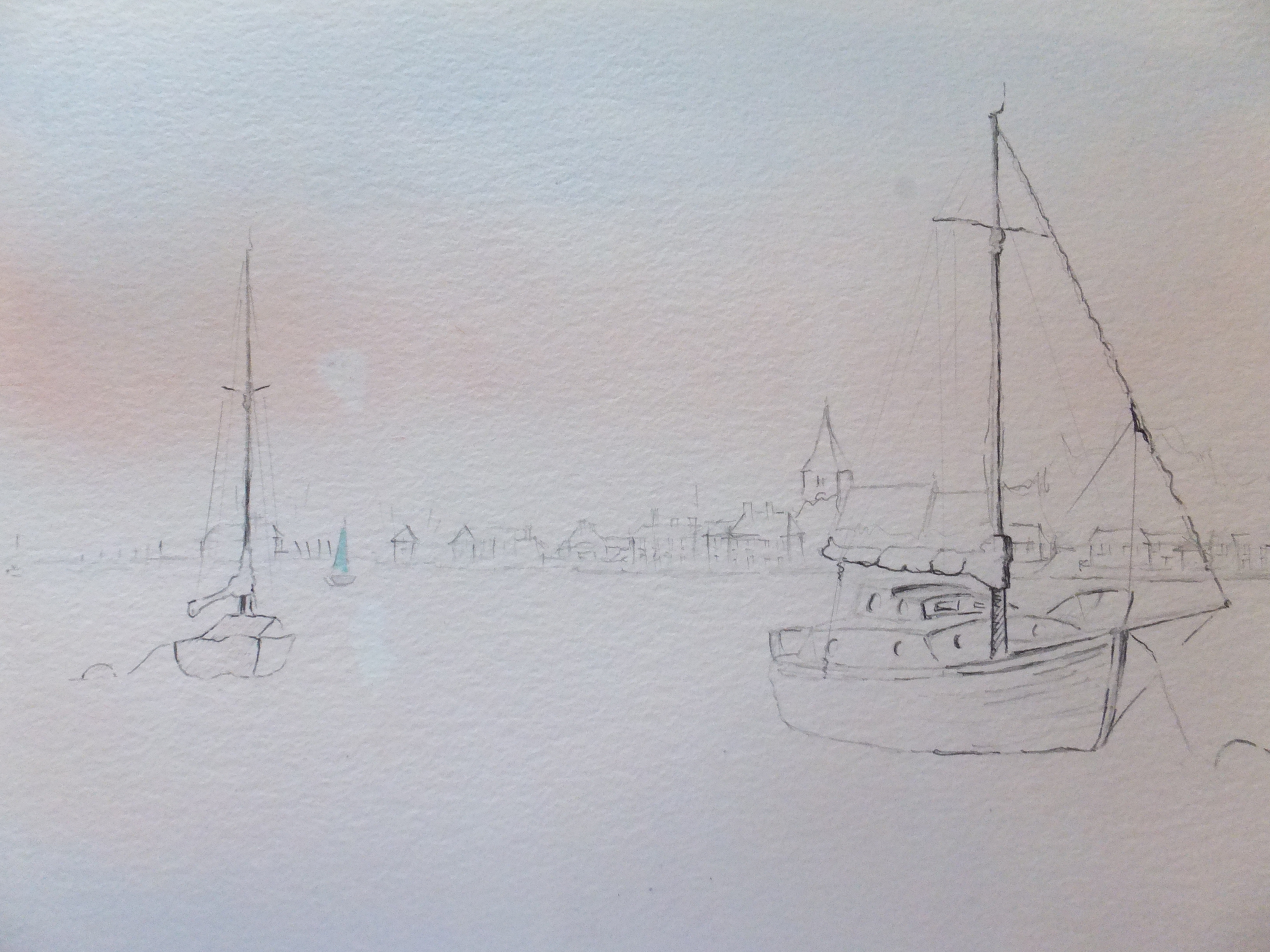
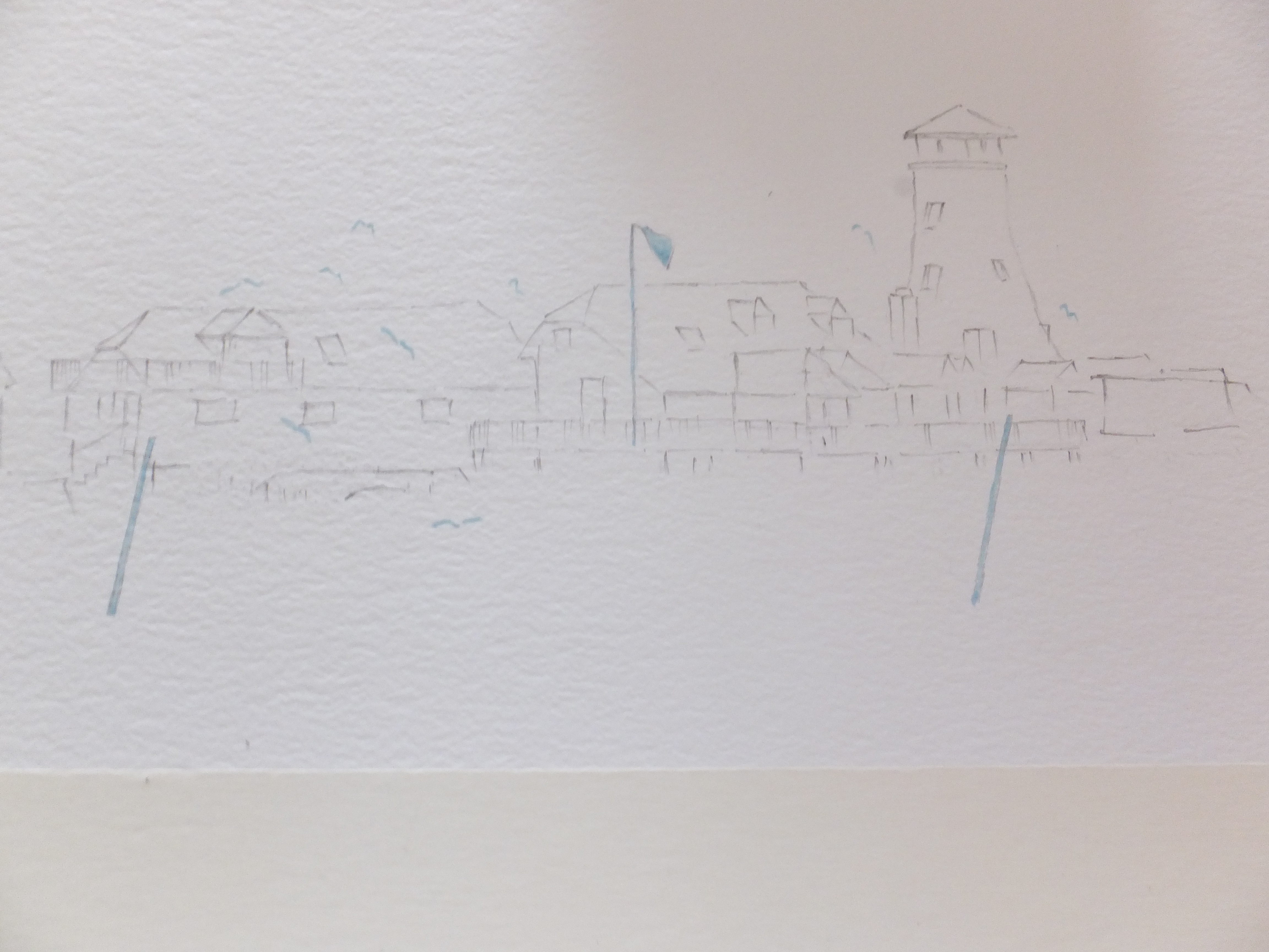
This will be rather faint, I’m afraid, as I only want faint guidelines before applying any colour

Two posts which mark the depth, and painted red and white like barber’s poles I have masked out. Also the flag pole which is white and the flag, both have been masked out for now. To the right of the drawing, which couldn’t be included are three small boats. They are near the horizon line, with one side in light and the other in shadow.

I am going to use pink as a background sky, moving in to a blue grey across the buildings and then pink again across the water. I need the background to look misty ideally, so not too deep in colour but not so pale that everything looks white still.

When that is good and hard I shall work on some of the details. I usually put the shadows in first, which I will do with more of the blue-grey, and that will give the picture some structure, on which to build. Likewise background trees in the grey behind the rooftops. The colour of these I haven’t quite decided, but they need some sort of red in them

I will need to check the sea-level so that it doesn’t look wrong against the buildings.

If I can do that and make sure that the shading is right around the pillars under the mill store, then I might have the basis of a decent painting

We shall see

Bosham Creek, the finished painting

Bosham Creek

This is the finished painting, which I happen to like, although I will admit to one or two scary moments

I have managed to keep to a rather limited palette. Cadmium Yellow which I mentioned before and Ultramarine Violet, together with Transparent Brown which I softened with Violet. This is still my favourite shadow colour. I used Vermilion for some distant red clouds behind the trees, and also for the red paint along the hull of the hulk on the beach.

After getting the sky about right or so I thought, as the dark clouds coming in from the sea might have been darker, I put in the distant buildings along the shore line of Bosham village. The steeple of the Saxon church, so well-known as to need little introduction, is probably the only building that needs to be recognisable, although I have done my best with the others, plunged in shadow as they are.

To the right are two beached boats, one clinker built and the other which looks as though made of fibre-glass, so not the easiest to convey in watercolour. The dunes with some coarse grass rise in front of them, and make a convenient break

The beached hulk is one of those things that are fun to paint. So many details and textures with rusting metal and flaking paintwork on the timber. I mentioned that someone had daubed white paint on the prow, which I could have left off but decided to include. I daubed masking fluid on and then overpainted several times with the dark brown mix. When the masking is removed, then that should look like white paint over rough brown planking. That was the plan. I hope it has worked.

The real test of course is getting the light right and the highlights in the right place. I hope I have done that. The camera again has bleached out the colours, try as I might, so in reality the shadows are much deeper, and appear more convincing. Oh well, in the scheme of things, not the worst problem one could have.
Going back to the Bosham Painting

Bosham Underpainting

We are going back now to before the last two commissions, which I was pleased to take on, challenging though the last one was. I still await the final judgement from the client on that one, as she comes back from holiday on the 16th only, so fingers crossed under the table on that one.

I had started this painting of Bosham Creek, or rather drawing, with just the main elements in place.

So far I have added two dilute coats of watercolour across the page. Violet running into yellow, mostly with a watery coat of vermilion over the whole thing when bone dry. I dashed some pure yellow pigment into the area where I think the sun is setting. In the photograph this yellow shrieks at you. In reality it doesn’t. I am often intrigued how the camera sometimes disagrees with the human eye. Possibly one of those paintings which won’t sell on the internet, alongside a few others.

The hulk on the beach, I am hoping will provide most of the interest. The detailing on this sort of subject is usually a lot of fun, and tends to draw the eye. I noticed in the photographic reference, that someone has daubed white paint along the prow. I have used masking fluid here in a dry-brush fashion. Going over this later with dark brown pigment, and then removing the masking, should leave the illusion of white painted roughly over dark brown. I hope that makes sense. We will see later if it works or not. I have done it successfully in the past, which is of course no guarantee of success in the future

Since taking this picture I have started to darken the clouds and will gradually go on, wet over dry until I like what I see, hopefully. That will be the judgement, not getting them too dark or yet too wishy-washy. We shall see, and much still to do.

To Continue with the Docklands Commission

Five Image Docklands Commission Partway Only

Well, out of the mist, some definition is starting to appear here and there

They wanted the Canary Wharf skyline to run along the top. Incidentally I photographed this on the easel so I am sorry that the images appear slanted. Also there are some shadows and stuff which shouldn’t be there. Just to make Canary Wharf more interesting I have used sunset colours building up oranges and vermillion across the windows. I have used vermillion and cobalt blue blended for soft shadows, which works, I believe. Little cranes help the feeling of distance. I think that picture is pretty well there, and I was asked to make that image soft anyway. I like to take the client’s instruction into account if I can, but sometimes they have to be persuaded to do things differently.

I finished the little ferry boat. Once I started I just could not stop. I think she will be my favourite image of the five, probably because I like painting boats anyway. For the background I have repeated the Canary Wharf Skyline, which is geographically impossible, but infinitely more interesting.

The pub in the bottom right, is ready for its next coat, which will be Transparent Brown over the Violet, which will give more definition to the building itself. I think yellow for the umbrellas, but I just need to work out which one.

The image which scares me and which I have made a start on is the crescent shaped building of Lensbury Circus. At the moment it is looking rather bleak, as though the area is run down, which of course it isn’t, far from it. All those windows too. They may have to succumb to a sort of lost and found treatment

But there are more positives than negatives so I will get back to it, but not tonight. I have spent hours on this one, but there are five pictures instead of one, which I should have realised when I took it on. Luckily I’m not on piece work or I would starve.