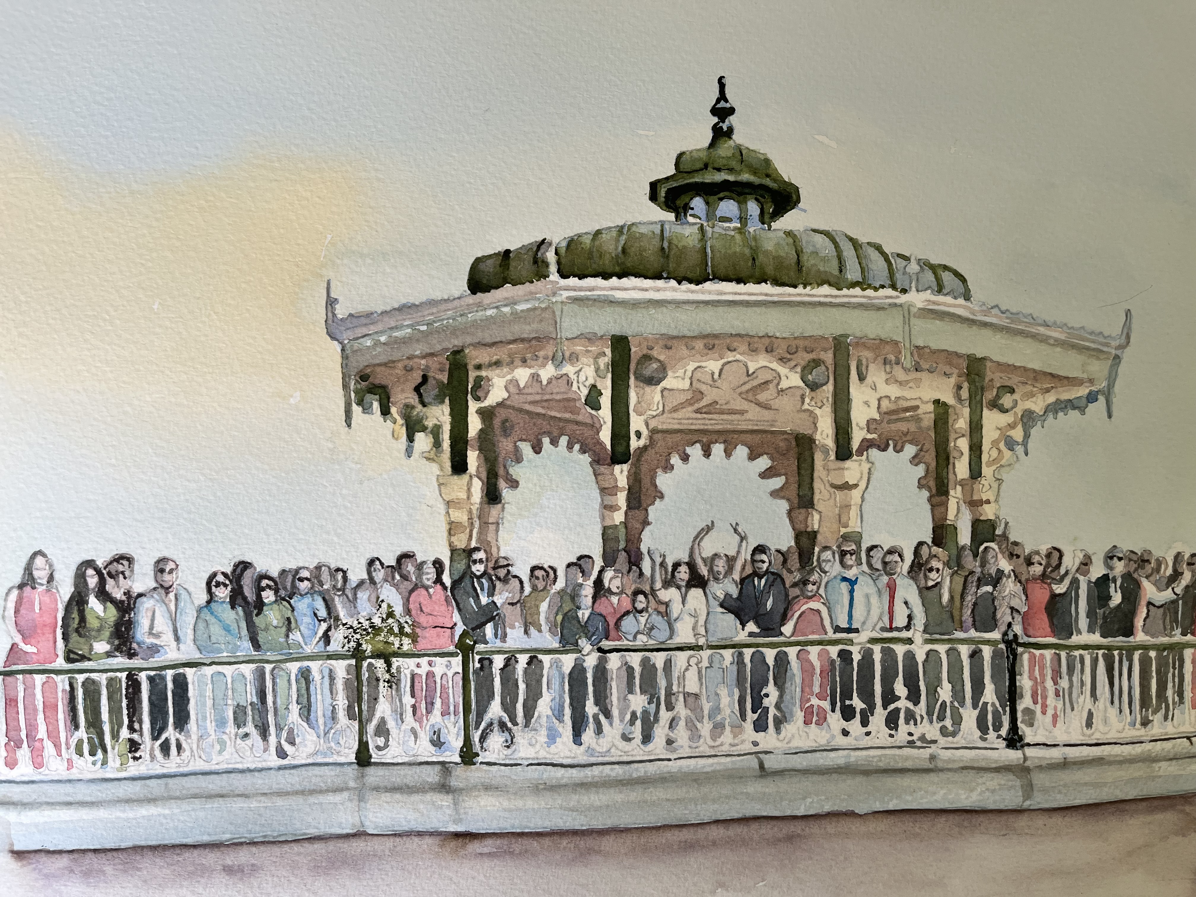
I nearly didn’t take this on, but later, I was pleased that I did. Like something that I have never attempted before, a large group of people all facing the camera or in this case the painter. Faces this small are tricky in watercolour with a brush, and are best avoided or abstracted in some way, which is usually acceptable. The guy who commissioned the painting asked if some detail could go into the faces, and so against my better judgement I did make an effort. Fortunately many were wearing sunglasses which made life easier. The result was acceptable. More than acceptable. he was delighted and so was his mother. She was the one getting married, and I believe she was thrilled with the result, so as always I was heartily relieved. I have said before that it is a great responsibility and a great privilege to be entrusted with someone else’s special occasion.
The monument in the background is the famous bandstand on Brighton promenade and is a delight to paint in itself. Completed in 1884 it is an historical landmark of architectural importance. The cast ironwork was made in Glasgow by Walter Macfarlane & Co, in their saracen foundry. It operates as Heritahe Engineering. Popular for weddings as you can see
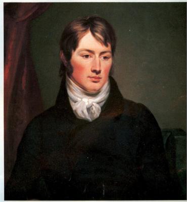
Something I didn’t know until I started reading about him with a view to preparing a talk later this year entitled Turner and Constable. In 1821 when he showed at the Royal Academy and showed The haywain in fact, he was wildly embraced by the French art market, not quite literally although he might have been. he was totally unprepared for all this enthusiasm which he certainly wasn’t used to at home
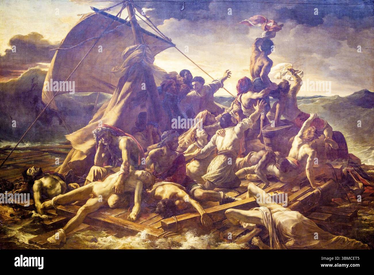
One of the first to discover him was the French Romanticist Theodor Gericault. He is probably best known for his famous painting The Raft of the Medusa, which he had brought to London, and which we are told thrilled 70,000 Londoners
And this is Gericault’s famous painting, which I will just talk about before talking about Gericault’s reaction to Constable’s work
This painting was based on a real incident which shocked the French nation. The French naval frigate ran aground off the coast of Mauretania on 2 July 1816. At least 150 people were set adrift on a hurriedly constructed raft. Only 15 survived and were picked up. The event fascinated Gericault and he could be said to have hooked into national grief. He undertook extensive research including visiting morgues for the skin colour of the dying and the dead. The painting was shown in the Salon of 1819 and received national approbation. He brought it to London where it thrilled Londoners including one Turner who went back to his studio and reworked his own great work The Shipwreck
Whilst in London Gericault visited the Academy exhibition and there discovered Constable. He thought that The Haywain was the best in the exhibition. Other French visitors thought the same and waxed lyrical.
Much to Constable’s surprise the interest quickly snowballed. A Parisian art dealer called Arrowsmith, French despite his name, offered to buy The Hay Wain and offered a derisory sum. The negotiations broke down but two years later, when Constable was short of money, he agreed to sell the painting to Arrowsmith for £250, as well as other pieces. The paintings caused a stir when they arrived in Paris.
The arrival of the Hay wain in 1824 was like a pebble dropping in a Parisian mill pond. The effect was immediate. At the epi-centre of the quake was another influential figure, Eugene Delacroix, who was so influened by the Hay Wain that he went back to his studio and repainted background on his great work The Massacre at Chios. He was blown away by Constable’s greens and tried to copy them. Critics viewing this picture at the time couldn’t find much evidence of green being used, but there we are.
If Delacroix was talking about the Hay Wain, then others were bound to be listening. A few weeks later it was these two paintings which received the greatest share of the attention at the Academie des Beaux-Arts, known as the Salon. The Salon dominated taste and opinion in France to an even greater extent than the Academy in Britain
Constable was embraced at the Salon in a way that had never happened to him at home. His large paintings were removed to positions of prominence, and Monsieur Constable, Peintre de Paysage was awarded a gold medal of excellence. His friend John Fisher couldn’t resist commenting that plain old Constable, who didn’t speak a word of French, was the talk and admiration of the French. His name entered the language. Landscapes were described as a la Constable!. More French exhibitions followed in Lille including another gold medal, Douai and the Salon again in1827, where there were plenty of landscapes a la Constable, with rustic cottages, wagons in ponds and open fields and skies.
Constable nevertheless refused to visit France, his attitude seemingly bloody-minded bordering on rude.
This is probably a good place to take a break. We are about half way, so a lot of writing and a lot of reading for you guys. It will take another post to complete the subject which I will do soonest
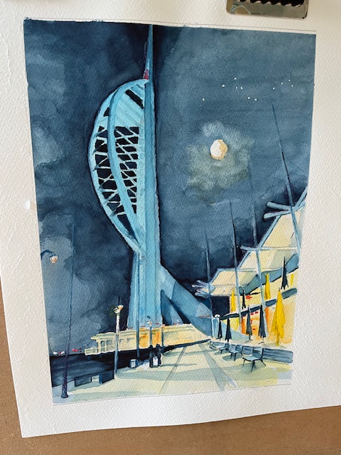
This is the finished painting literall hot of the easel. This was a commissioned painting which the client has previewed, and is delighted with. That is always a relief. I was happy with it, but art is subjective, so one is never sure. i don’t remember tackling a night time scene before one that is highly illuminated. It is quite tricky as so many light sources to take into account. Interesting nonethe less.
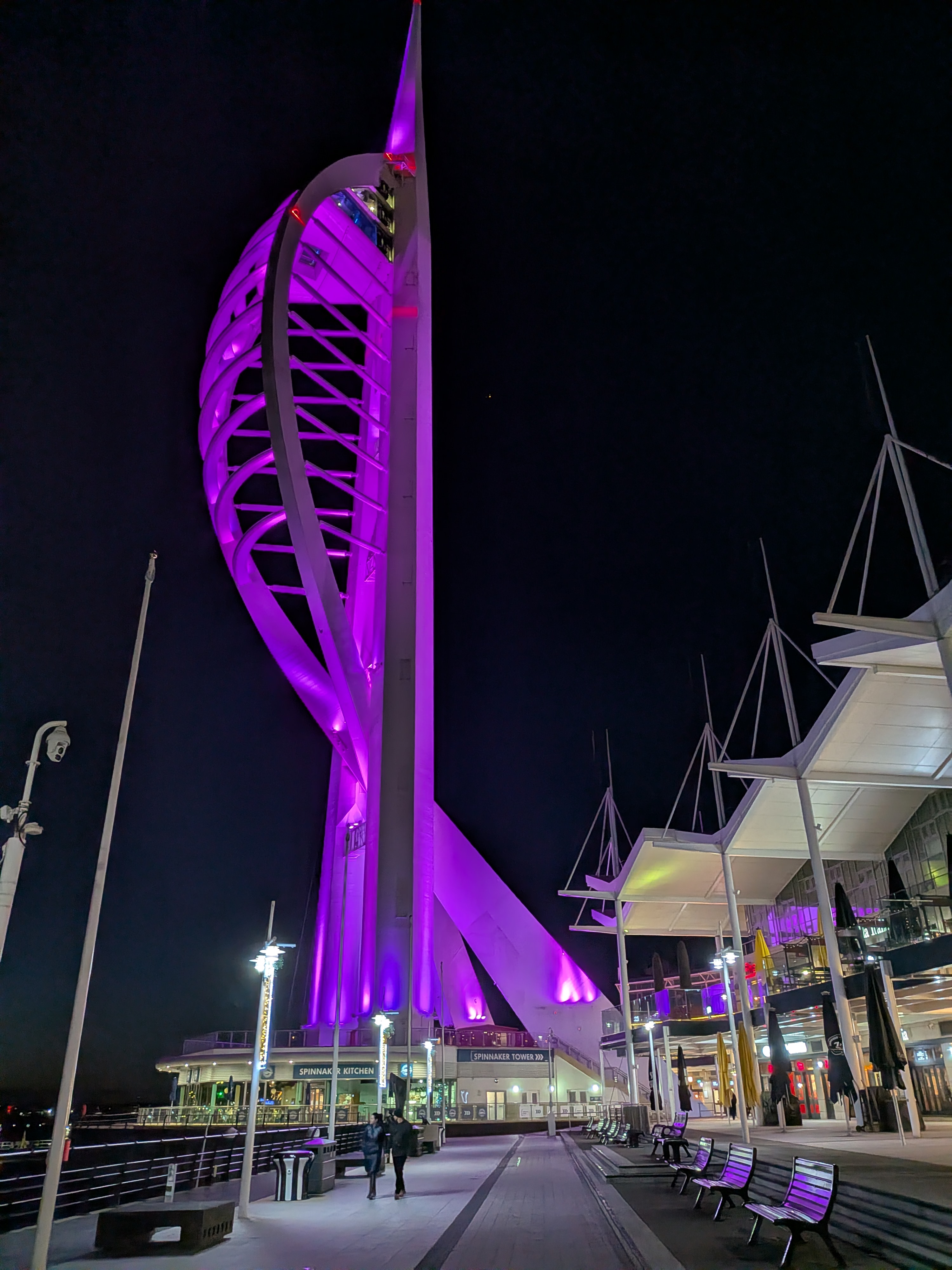
I used indigo for the night sky and introduced cloud and the moon to make it more interesting. An occasional dab of black where I wanted the sky to be really dark. Quite a lot of masking out on this one. The tower itself for one which was a big job, plus the gables over the restaurants. Also I had to do a lot of lifting of colour for example to produce the tall poles which are shown in deep shadow on the photograph. They worked well. I was pleased from some of the comments afterwards that the mood created was what I was trying to get. Some drama and some romanticism, bearing in mind that this was someone’s special place
As always I was privileged to be entrusted with something that is special to someone, and as always so pleased that it turned out well.
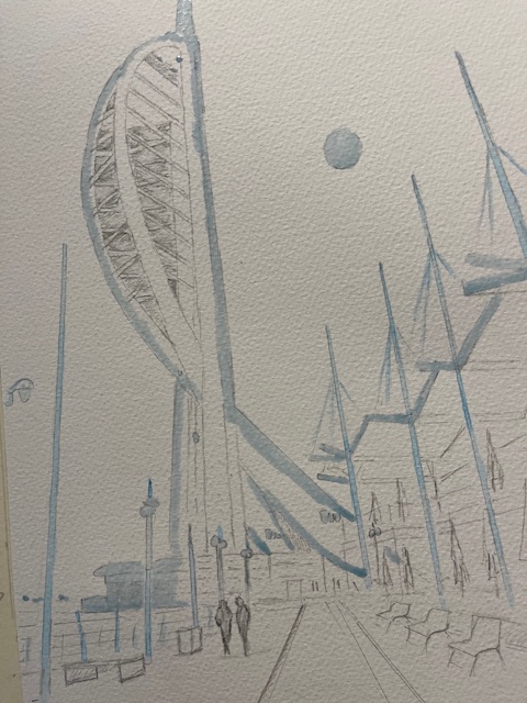
This is the drawing so far and even this took some working out. There was an awful lot of masking out to do. The tower itself has had to be protected as the night sky will be darker than the colour chosen for the tower itself.
Likewise the gables on the rooves over the shops on the right hand side have had to be protected. I don’t usually like a lot of sharp edges in a painting, preferring to let colours blend, but in this case it has been unavoidable. Plastic or metal edges really have to be shrp otherwise just look wrong imho.
I am apprehensive about starting the painting on this one, especially the sky. If that doesn’t work, and I have to start again, then I will have wasted a lot of time. Let’s not go there. I have retrieved worse situations
This must be one of the trickiest commissions that I have ever accepted, and one which questions my wisdom. Firstly working out a colour for night black, and it won’t be black ,has not been easy. Black in large quantities I find tends to flatten the painting, unless it is a raven glossy black which works for many things but not sky imho. Then what colour to use for the illuminated tower itself, and there we have a certain choice of watercolours that have a luminous quality, but which one to use against which night sky that is the question.
This is the client’s photograph btw and is a very good one in terms of composition. So many aren’t and refreshingly I have little or nothing to change other than possibly including the moon, which i have agreed with the client. Perspective is intriguing which I like. All those lines going towards the vanishing point will be fun to work with
I have done various trials and have shared these with the client. For the night sky I looked first at a midnight blue colour, definitely steering away from black per se. To mix a midnight blue I am using indigo with a touch of Payne’s Grey, which is a blue black colour, and is useful. A lot of artists avoid Payne’s Grey but I find it useful at times. in fact that was the other contender for the night sky, as it is not quite black, as I say more of a blue black colour. So that was my submission for the sky. Now for the illuminated tower. The colour needs to be luminous which is not that easy with watercolour. I chose in the end pthalo blue and as an alternative, permanent rose both of which would work. I also glazed pthalo blue over rose just to see what would happen and again the result was workable
The client came back quite quickly. She preferred the indigo version of midnight blue and also the pthalo blue for the tower. I was relieved about that, as both were my preferred option, and in neither case did I lead her in anyway
So I know which direction I am going in, and will proceed with the painting. I will come back about that although probably not too soon
This was one of my entries for postcard sized entries for a charity auction to be held by a school catering for students of secondary age. These are youngsters who may have emotional problems or have suffered domestic abuse, and now need a stable and calming background in order to study and reshape their lives
The school wrote to me and asked me to provide artwork for their auction. I was very happy to help, not because I am a supporter of charities generally, quite the reverse, I am not known for helping people. This is the sort of project that I enjoy doing, so not exactly selfless
This is a fundraiser obviously and will take place during their summer break. The school is run as a charity and depends on donations from private donors. I feel a certain weight of responsibility on my shoulders and can only hope that my entries don’t let them down.
The initial reaction has been encouraging from the school who have received my entries, and are very pleased with them. An old friend of mine, John Griffiths, stage actor and writer, whose last book I illustrated, has already laid down a bid on one of the pictures, so we hope for great things
I have painted a view of Marzameni before some years ago. It is a delightful fishing village, where we stopped just for a coffee break, and then wandered down to the water’s edge. Many of the boats were obviously old and maintained by their owners, Some of them were hand painted, just bright Mediterranean colours, vivid reds and blues, together with dazzling whites.
The sea was the brightest blue, and as always I hope I do the colours justice. I used Pthalo Blue modified with Cobalt Blue for the sky and the sea, which seemed to work. The same colour strengthened seemed to work for the boats as well, although I did get an opportunity to use Windsor Blue for a really deep blue stripe on one of the boats
As we watched ,the boat with the umbrella hove into view and rowed slowly by, eventually finding a place to tie up. This boat was smarter but the colours were more muted
I enjoy painting Sicily. Always the colours are so vibrant, and the shadows so pronounced
I am exhibiting at the moment at Denbies Wine Estate near Dorking, and have sold a painting of Horses in the Wetlands, another favourite subject
It is now some time since I have posted anything, and it is good to be back. It is also extremely good to be painting again. My life for the past ten weeks, has centred round hospital visits and more recently consultations with the physiotherapist. Today I was discharged from hospital so trying to get back to normal after my accident
I started this painting about two weeks ago. It was to replace a gap in my range. I sold two Bosham paintings at my last exhibition in June, which was held in the gallery at Denbies Wine Estate near Dorking. I had a telephone call from a gentleman asking if by chance I had a painting available of Bosham which he wanted as a gift for a friend.. How fortunate. He was prepared to wait and is collecting the finished item tomorrow, so that is good
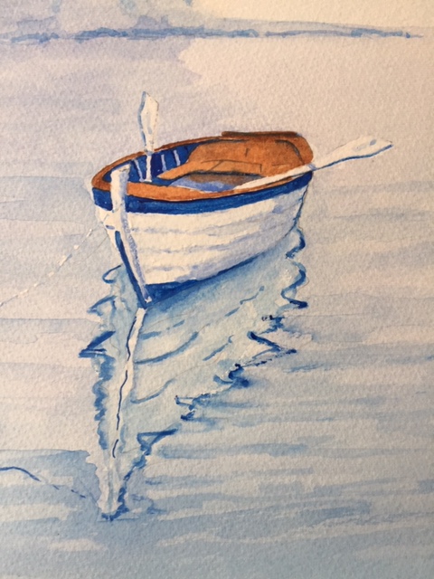
I have used sunset colours which always work with any subject involving water. The deep reflections are perfect for this size of painting. There are just four colours in the picture, red and cobalt blue, violet and transparent brown
There are more finished paintings to come. Roman Sunrise, which is a splendid early morning view of St Peter’s Basilica, and also the Bridges of Prague, which I am just finishing
Two exhibitions in December coming up so will need plenty. Fingers crossed that strict Covid restrictions aren’t reintroduced of course as they were last year at the last minute. Our infection rate is rising worryingly, with the government trying to avoid taking any action. It is as though they are taking some desperate gamble that herd immunity will kick in which will save them putting any curbs on the economy
Anyway sorry about my long absence. Hopefully I can get back into the swing again.
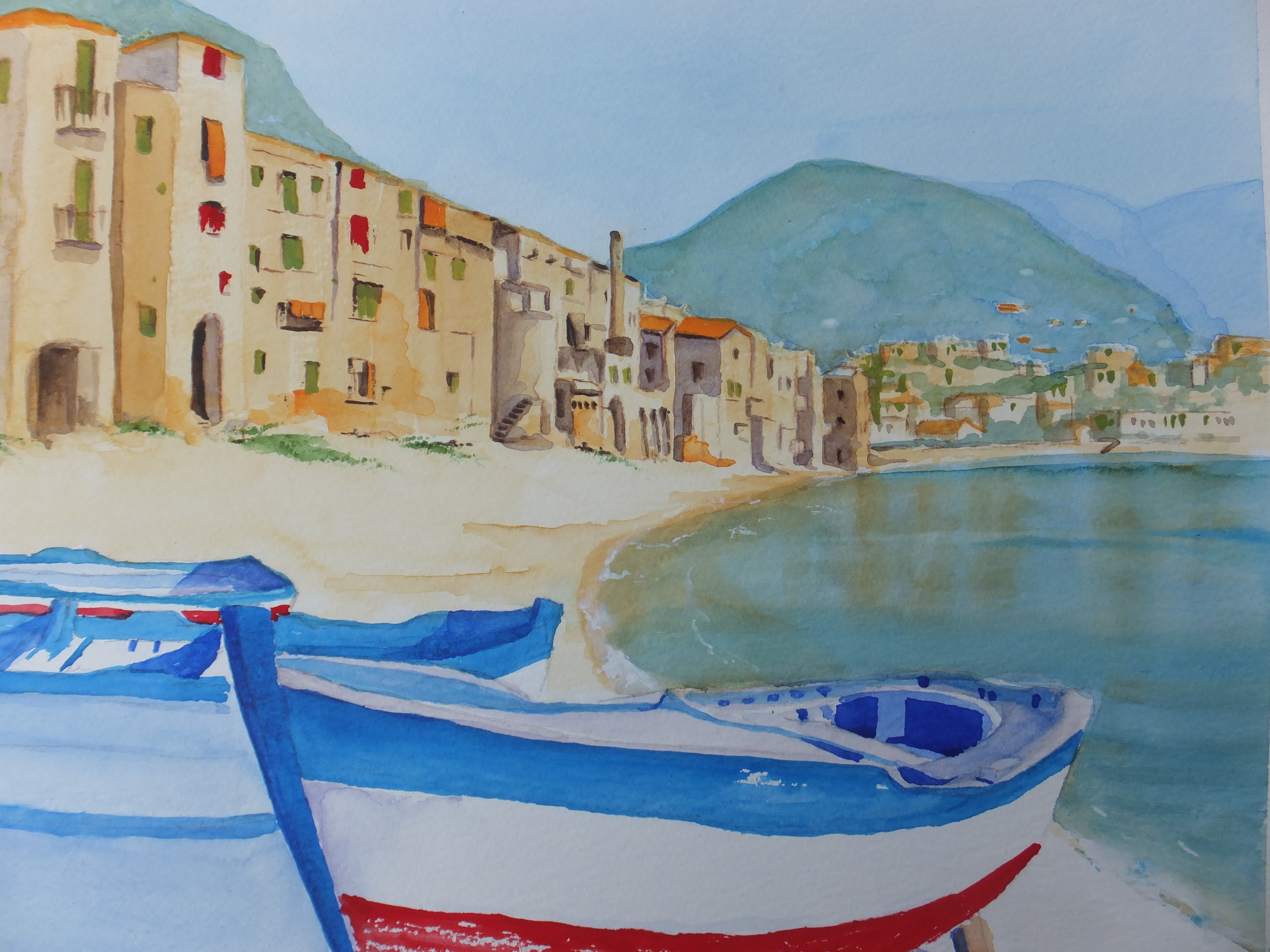
I went here many years ago on a trip out from Palermo. Lovely stretch of beach which I have featured although I had to rely on someone else’s photograph for reference. Many thanks to Websi for the use of their photograph
Not only the beach but a lovely town square and a delightful Norman cathedral from the 12th century, which we remember visiting
The brightly coloured fishing boats are fun to paint. I have added a different red to my stock as I have been trying to get away from cadmium red, as I have used it so often. Someone suggested Sennelier Red, and this painting gave me a chance to use it. It really is a magnificent poppy red and I have used it on these boats. Sennelier say that they put honey in their pigment mix, and certainly their paints do go on very smoothly
I put this painting on my online site on Wednesday and it sold yesterday Thursday. Not quite wet from the easel but getting that way. Certainly a record for me, although friends of mine have done that more than once. I think it must be Sicily which is certainly very popular or are we just looking for sun after the winter lockdown
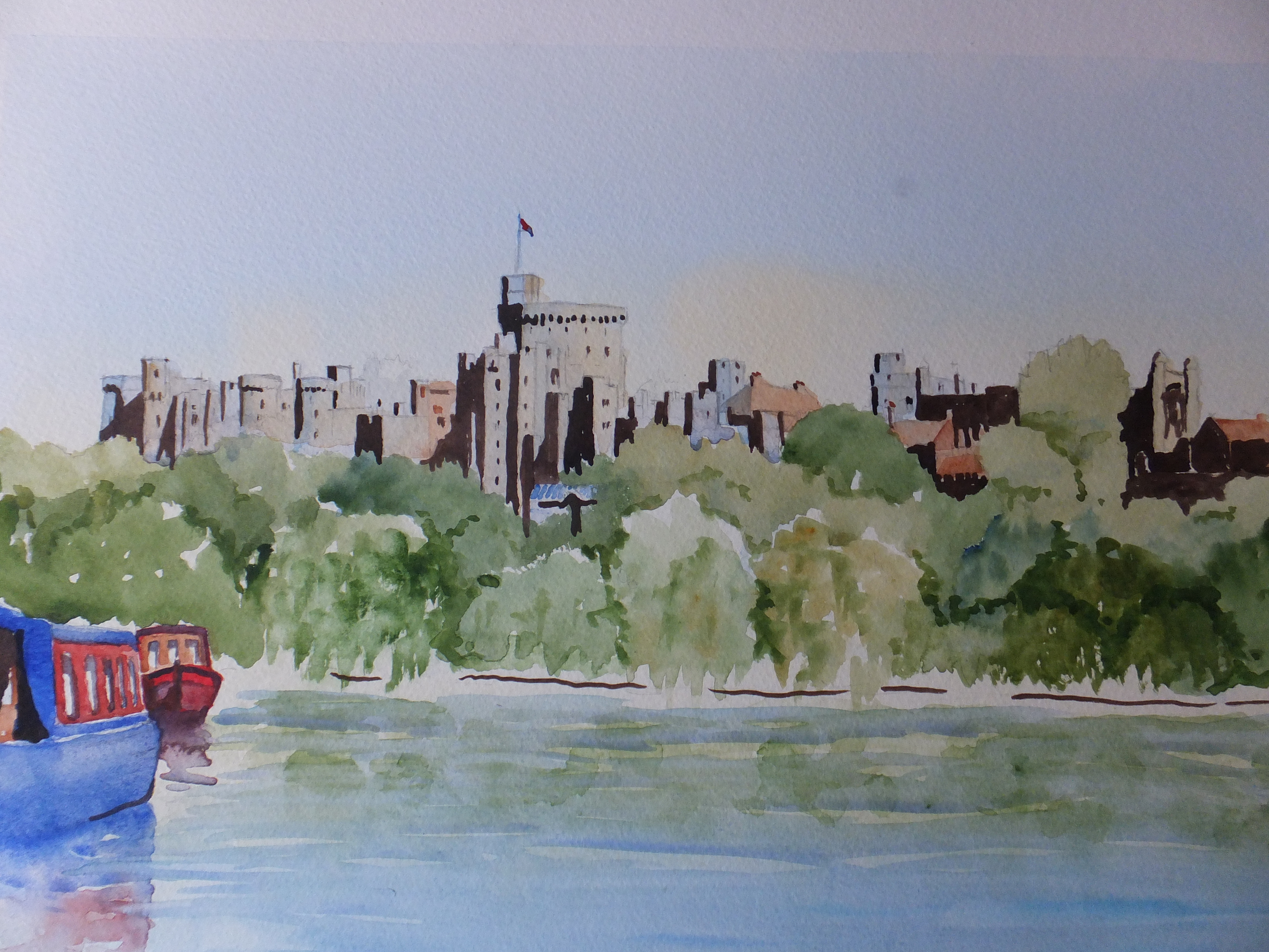
The finished item. Quite a lot of trees, relieved by the building to a certain extent, but nevertheless the greens took some sorting out. Mostly they are a mix of sap green with something else. Quite a lot with raw sienna, which is the one I use mostly for vegetation, and works I think for the lighter trees.
The boats have been useful, bringing in some red to relieve all that green, and also stop the eye going off the page. As I said in the last post, I have used sepia ink for the shadows on the castle. I was a little hesitant about that, but seems to have worked out ok.
I seem to be working my way through the list of paintings that I always wanted to do and couldn’t find the time. Lockdown plus very wet weather does keep us indoors a lot. Looking back at these favourite places does make us wonder if we’ll see them again. Vaccination programme seemed to be going well, but now they have found two tested positive for the South African variant, in our village, without them going to South Africa