Horse and Rider

I would first like to acknowledge with thanks Rebecca Photography on Pixabay who kindly allowed me to use her reference photograph, when preparing this watercolour painting

I like, as many will know, painting horses and horses in water. This image intrigued me and presented problems from the start. Horse and rider were a complete silhouette. So? Well, there were no details to help me with the drawing or very few at least. It was difficult, if nigh impossible to check my measurements as I proceeded with the drawing. Likewise the rider, which I don’t normally include but they were the same image. They could not be separated. If you have ridden horses, and I have a little when I was younger, you will know that you have to adopt certain attitudes or body shapes, otherwise you will just fall off. Legs must be in the right place for example. You can’t see the legs in this image so what to do?

I ended up doing a separate drawing of the horse with rider showing her legs and stirrups. I had to match the correct leg position with the rest of her body. That took me some time. It was quite a long time of experimentation, before I was ready to paint. Sky and water were comparatively straightforward in comparison. I had to give horse and rider two coats of burnt umber before I had a perfect silhouette.

I must have done something right. The painting sold on its first announcement

I would have liked her for my current show at Denbies Wine Estate but you can’t have everything, and anyway you can only sell a painting once

I hope you enjoy looking and reading my blog

A Street in Florence–the finished painting

A Street in Florence–latest version

So here it is, the recent version, which I had attempted in a different style, but despite which turned out much the same as my version of four years ago.

As a group we were trying to produce something in the style of Tom Haugamat, the illustrator. Not someone I knew but impressed with his work when I looked him up. Most of our group were working on ipads and produced some very credible if not impressive work.

Mine veered off course as my own style crept back in. I still kept the painting simpler, that is less detailed, than my norm, and I fancied started to have a cubist feel. I thought that maybe that is how cubism started to evolve. Not that I would have been clever enough to develop a major movement like cubism, but I might recognise it happening

Anyway, this is how it turned out, and others can judge, as always

The streets are deserted today in our local neighbourhood despite the warm weather. We are becoming more disciplined in our efforts to check this pandemic. I took a short walk this afternoon, which we are still allowed to do, for exercise, just one walk.

It was very eerie out there. I took some pictures for a possible painting. I don’t usually do social commentary, but maybe something as a record would be of interest one day. I have lived for nearly eighty years, and never experienced anything like this. I wonder how many people are thinking the same

There was something very like this happening in 1665, when the bubonic plague travelled from London to a village in Derbyshire called Eyam, in a bolt of cloth which had been ordered by a cloth finisher in the village

When the cloth was unrolled the infection spread to the cloth finisher and he died within three days. The infection spread quickly, people died and survivors buried them, in gardens and in fields. The village elders closed the road in and out of the village, total lockdown. People left food and supplies outside of the village

Gradually the plague burned itself out. Not everyone died because they never do in an epidemic, hence this dreadful expression herd immunity. One woman, a farmer’s wife buried her husband and three sons in a field. She survived and went to live afterwards with her sister in Sheffield.

Today Eyam is known as The Plague Village and is a tourist attraction.

A Street in Florence-Revisited

A Street in Florence– first version

This was the painting that I did some years ago from one of my own photographs. We had toured Tuscany by rail, and went to Florence of course as one of the most important destinations. I took a photograph looking down this street, and painted it when we got back. I gave it to a friend as a leaving present

I thought I would like to do it again, using different colourways, and that is what I am setting out to do

So far. and I haven’t photographed a stage painting yet, I have put in less detail. The images are very simple blocks of colour, almost cubist in effect. I didn’t think I would like doing it this way, but having let my work dry out. the result is starting to grow on me. But I have a long way to go yet

For now I will just publish the stage I’ve reached. It is working out differently to the first version. I’ve used a different colour for the distant buildings, which somehow I prefer. We’ll have to see how it finishes

Part Finished

Photograph was taken quickly and is poor but will give us an idea

Plein Air Painting at New Haw Lock

DSCF4301

Something I rarely find time for is painting outdoors, but recently did, with our local art group at New Haw Lock, which is one of the many locks along the Wey Navigation in Surrey. The Navigation dates from the c17, and made the river Wey navigable by cutting canals across the meanders and shallows. Thus this mix of river and canal made the Wey navigable for barge traffic from Guildford to the Thames. Amazingly this traffic by horse drawn barge went on until 1959. By then the navigation had been cut through to Godalming in the south, and had been especially useful in carrying gunpowder from nearby Chilworth Mill through to the Thames and on into the Port of London

During the c18 the Wey Navigation linked with the River Arun, and on down to the south coast, but that leg was short lived and proved uneconomic to run. That section fell into disuse, although some sections have been revived by conservationists

In the picture, one of the many lock keeper’s cottages, very charming and very paintable still. New Haw is somewhat underrated and is easily missed when driving by.

We found shade to sit, as the day was hot and became hotter towards midday. The morning was enough for me, so for about 2-3 hours during which time, I worked out my composition, and just sketched putting in the shadows which of course changed quickly. Photography helps the sketch book and I recorded several stages. It is my intention to finish the painting in my “studio”, but for the moment need to finish my Alhambra painting

I shall look forward to painting the New Haw lock. This is a typical Surrey scene and a typical Surrey cottage. I will attach my drawing. I regretted afterwards only taking an A3 pad which didn’t give me enough space but at home i can use a half sheet which will enable me hopefully to include the lock in its entirety

DSCF4307

Now all I have to do is to decide whether or not to include the foreground tree which obscures much of the cottage but nevertheless provides some interesting lights and darks

Walking Round the Alhambra, the Tonal Sketch

Alhambra Sketch Lion Courtyard

From the photograph, I have made a fairly quick sketch in black and white, just to give myself a tonal guide for when I attempt the actual painting

This is not intended to be an architectural drawing of any merit. The actual painting will, I trust, be better, but even then the detailing of the architecture is such that with the best will in the world, some simplification will have to be permissible. I am more interested at this stage in working out the light and dark areas. Hopefully the finished work will reflect the dazzling floor of the courtyard, and also suggest the intense heat from outside. It was about 35c whilst we were wandering around, but we were fine in the shaded areas. It must have been much the same for the original owners who built the citadel, and of course it would get much hotter in July/August

As I’m writing this in south-east England, the temperature is around 32c with no prospect of rain in the foreseeable future. It seems strange to be nostalgic for our unreliable climate of yesteryear, when the possibility of rain was always a worry when planning an event.

I didn’t use ink this time. I used Paynes Grey watercolour which I quite like. It is underrated, I think, and gives a pleasant blue/black shade to a sketch which I find preferable.

I have exaggerated the bleached out look of the arches on the other side of the courtyard. Whether I will get away with doing that in colour, remains to be seen. The small round fountain in the foreground does nothing for me and will be left out of the finished work

My poor sales record for the year received a boost at the week-end. I delivered successfully the Docklands Commission, and that will be going out to Sweden next month. The same day, I sold Bosham Panorama from my website and that is being collected next week. So very pleased about that.

It meant that I had to rush round and frame my latest painting of Bosham Creek, so that I had something to show on Saturday at the Railings Exhibition in Pirbright. That though is a happy problem


A different aspect of Bosham Harbour

DSCF3969

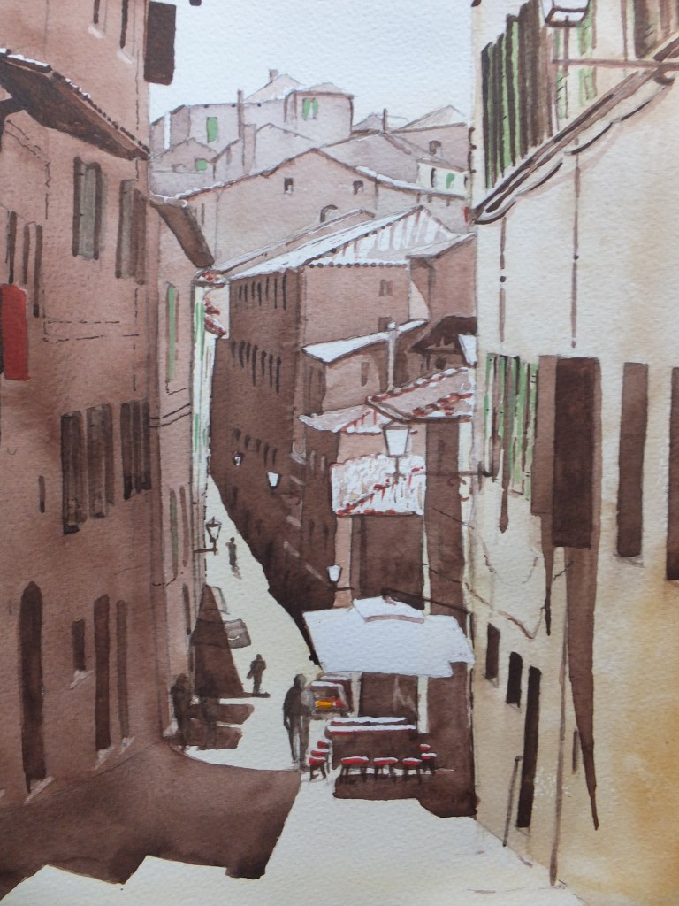
i think I may have mentioned ad nauseam that Bosham Harbour with its ancient church is a favourite subject for painting, and is widely known

If I am preparing for an exhibition, I usually like to have at least one view of this beautiful little place. The problem is that everyone wants the same shot, across the harbour with the church against the skyline, so painters, like me, are continually looking for a way to paint this view, and yet make it look different every time.

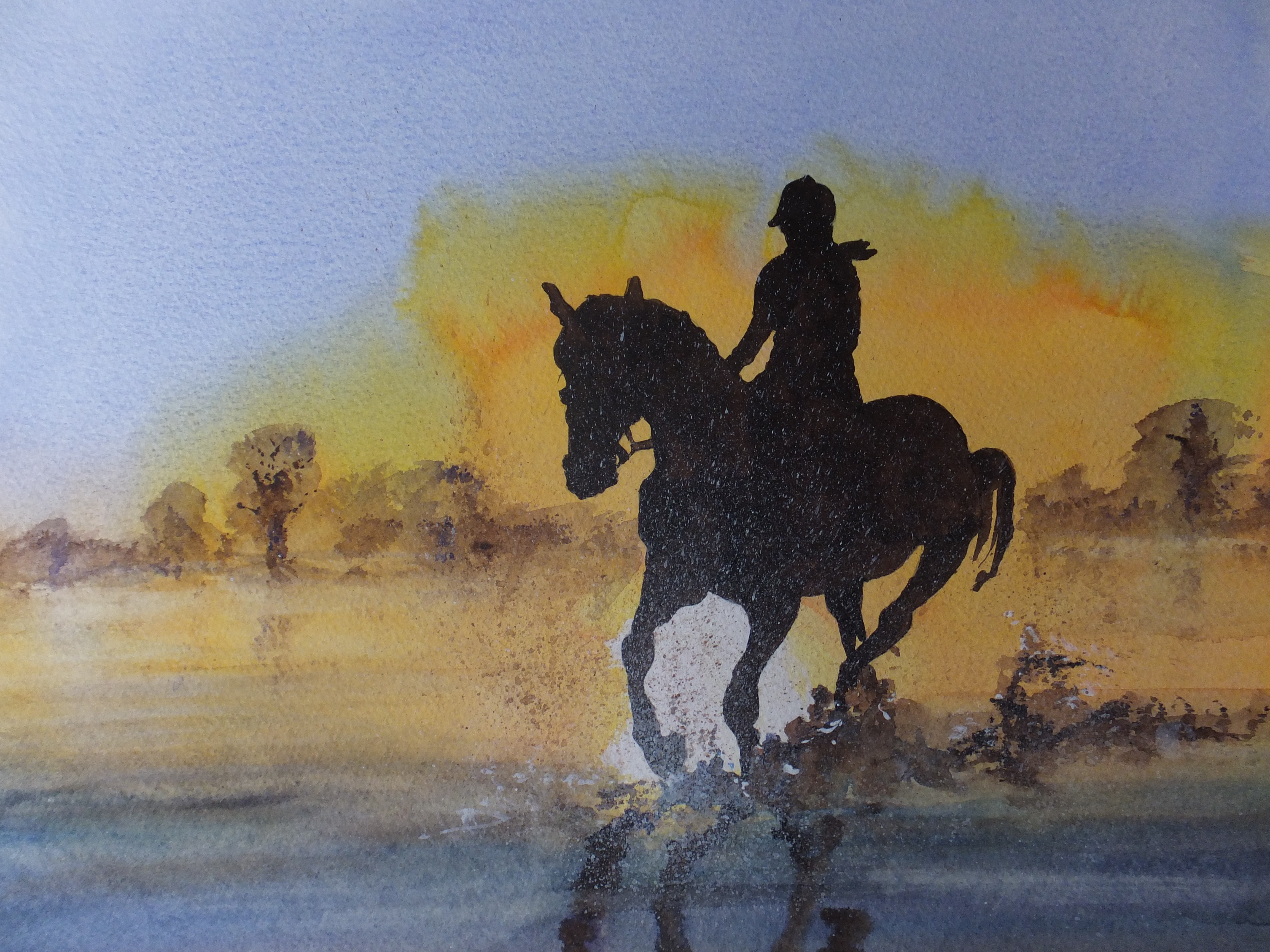
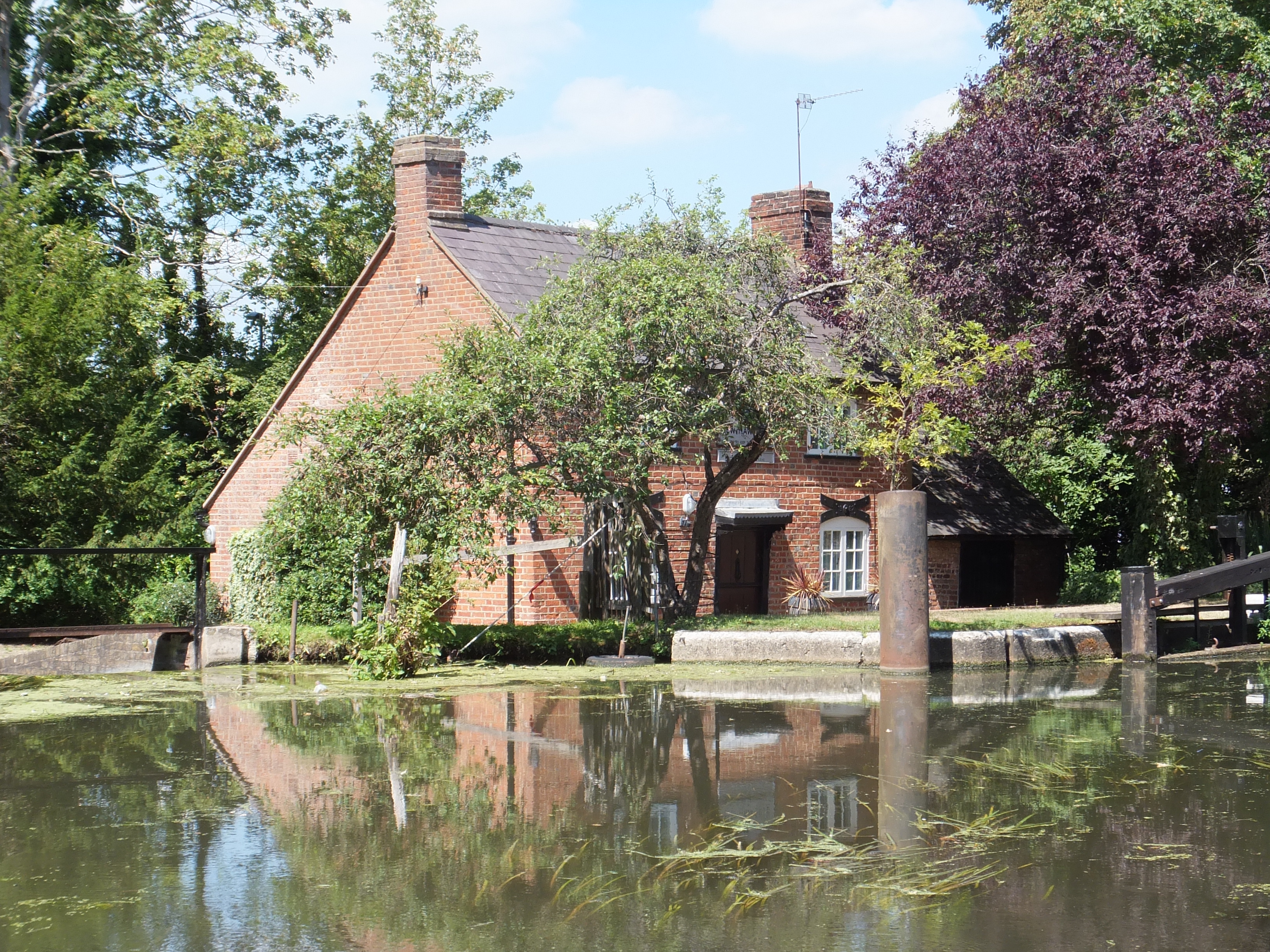
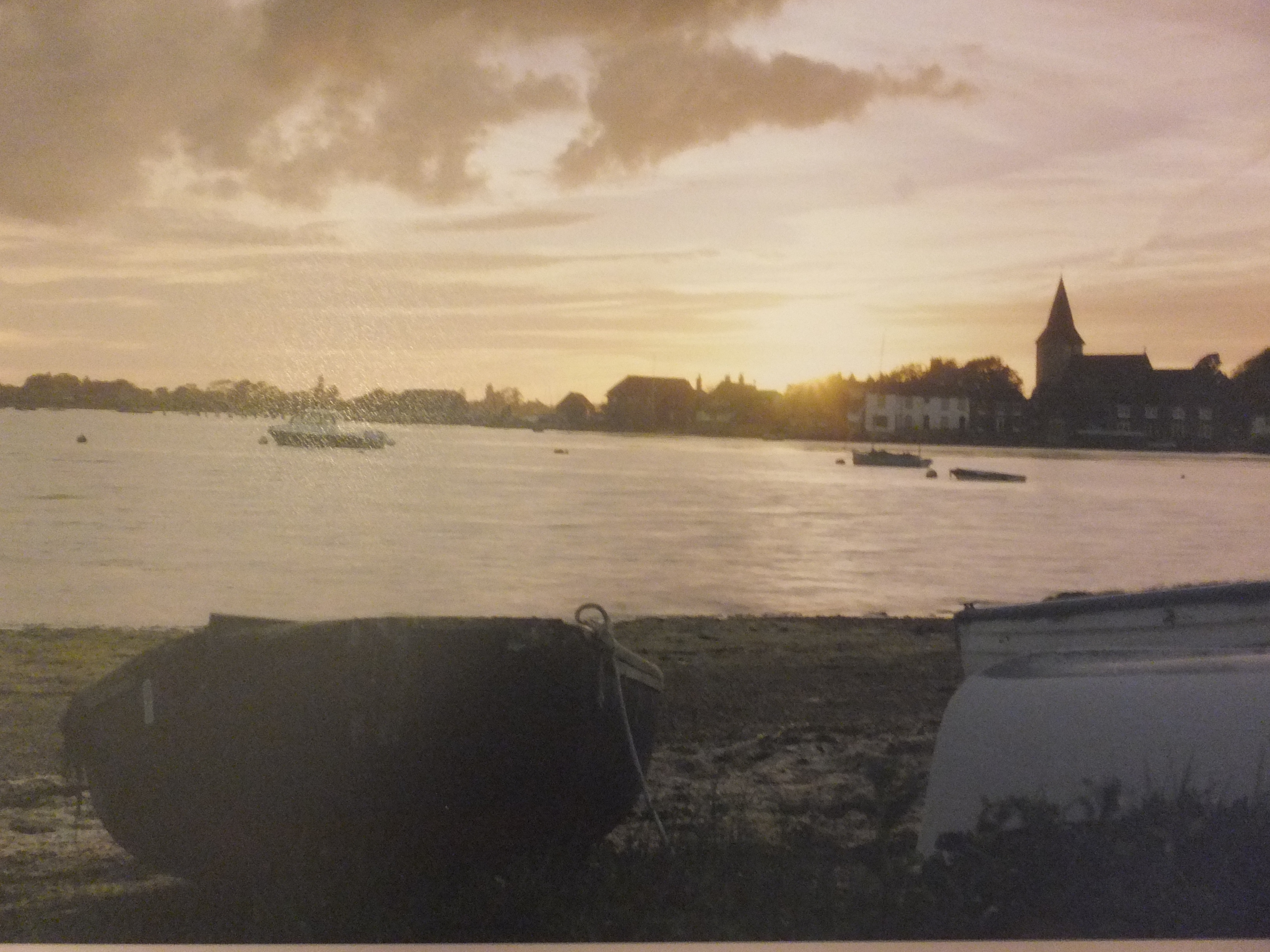
I came across the attached photograph a few months ago, which interested me. As you can see, it is a gentle evening shot, with some bright sky and some very deep silhouettes. The details are blurred, which is not something I usually do, but found myself intrigued nonetheless. The effect could be impressionistic, which again is not something I usually do. The other thing I liked, is that, when translating this into a painting, one could use a very limited pallette, which I find improves the effect very often. In this case, we are looking at yellow and violet basically, which generally work together very well.

I haven’t used these two colours for a while, so the idea is attractive

I am not sure about how I feel about the beached boats in the immediate foreground. They are certainly an aid to perspective, which I can appreciate, and yet in your face just a bit. I think I will draw some of these separately on tracing paper and chase them round the composition to see what I like best. I have been through my archives of boats too, and have sketched one or two of those, again to see what works.

Despite what I said about getting away from detail for a change, I don’t want meaningless shapes either, and unlike photographers, artists can choose what goes into a composition, which gives us an advantage, so I might be able to get away from that rather shapeless foreground.

I think there will be quite a lot of work with little bits of tracing paper, before we hit on the right composition, so we will see what happens. Yet another journey into the unknown.

Canals of Venice: the Painting Partway

Canals of Venice partway

The story so far

I have been concentrating on the building opposite with all that orange rendering and patchy paintwork. The walls took me quite a while, as I used several undercoats starting with my favourite raw sienna and Naples yellow mix, which gives it some backlighting. It took several coats of dilute orange before it started to look orange, and finally I scrubbed orange pigment straight from the tube to get that patchy, water-damaged effect

I decided to finish detail the Gothic window. I do that sometimes so that I can look at something which encourages me to go on. I was pleased with it, once I had finished, says he who shouldn’t. I think I colour matched correctly the timber screen or whatever it is in the window. That took several coats of cadmium red over Burnt Sienna, which surprised me as that red is so strong. The texture looked like dry, flaky varnish so I hope I got that right. I used some blue in the windows which gave a pleasant relief to all that orange

Once I had put the brown shadow in, the window suddenly came to life. The carvings stood out, and the window under the screen took on some depth. So far so good

I then detailed the two windows on the ground floor, including the one with a rusty iron grille, which seemed to work quite well

I ploughed some cadmium red into the far left building which started to look authentic Venetian. I shall probably lose that when I mount the picture. How often does that happen

There is still plenty of detailing to do, which becomes tiring after a while which is why I have stopped to write this. I would like to finish and frame this for The Railings exhibition in Pirbright, as all my other work is at the Royal Surrey. May do possibly

Still no news from the Royal Surrey, but one of my paintings has been put on reserve on my Artfinder site, which indicates interest at least. I think one sale would be like a starting pistol for this year to finally get going.

I must not moan. I love painting and would continue to do it even if I never sold another picture, although what I would do with them I do not know!

Marzamemi in Sicily: the finished painting

marzameni-finished-painting

Marzamemi, the fishing village near Syracuse in Sicily, almost a study in blue. The painting itself is more striking, but the photograph is as good as I can get it.

There is very little that I can add from the last post. I have detailed the boats in the foreground and you can check back against the original photograph. The only difference , I think, is that I have added a brighter red to the hull along the waterline.

I like it and it will be going into my exhibition in March

Next, well, there is one more painting of Sicily that I would like to try, and that is of the salt mills at Trapani. Salt is still extracted from the sea, by evaporation in salt pans. The majestic windmills that stand there still against the skyline no longer work, but they look marvelous. You couldn’t imagine the horizon without them

We will see how they come up in a painting

Monschau in the Eifel Mountains, Germany

monschau-in-the-eifel-mountains

The very pretty and old village of Monschau on the river Rur ( without an h). Very cold in the valley but nice where the sun caught. We were expecting to find a Christmas market open that day, but it wasn’t. The village itself was very attractive though, high in the Eifel Mountains, an area of Germany I hadn’t visited before. Very sparkly at this time of year, with the sun on the frost.In fairness I should say that some shops were open, and they were of a high standard, so our visit there was generally enjoyable

I took a lot of reference pictures whilst I was there. The lights and darks were good and the tumbledown buildings would be fun to draw. I haven’t painted German villages before and maybe I will. I tend to paint places that people buy at exhibition, which perhaps is wrong as nothing worse than a bored artist.

In all, our trip to the Christmas markets was not successful. Monschau was lovely, but the Christmas markets in Liege, Belgium the following day were poor, and even in Bruges on the way home, a city so beautiful normally, the markets were disappointing.

But what really marred the trip, apart from the disgusting food in our hotel, was the fact that we both became ill partway through the holiday, and towards the end all we wanted was home. I have no doubt that this jaundiced our view of the trip

I found, when I went to my own doctor,( and at my wife’s insistence), that I had developed bronchitis, so no wonder I had difficulty breathing! Thank heavens for penicillin, and now partway through my course, I am feeling much better, and interested enough to write my blog, which I have neglected.

I have done no more on Bosham Harbour sadly, not having had the will to take up a brush, but now I am looking forward to getting started again

One little ray of sunshine to brighten my gloom this week, was to hear that my charity card, Christmas Shopping in Guildford High Street, which is described somewhere in the archive of this blog, actually sold out. That was 250 packs of ten, so very pleased at that. That in addition to the original painting which I donated as well, which they sold for £150, so delighted about that too

I hope to get back to normal soon

White Horses of the Camargue

Camargue Horses

White Horses of the Camargue

When we were in the south of France a few weeks ago, we finished our voyage down the River Rhone at Arles. I have already mentioned my walking tour of the city in the footsteps of van Gogh, as well as the magnificent Roman amphitheatre

Just south of the city, and in the salt marshes of the Rhone estuary, is the Camargue region, famous for its semi-wild horses, its black bulls bred for fighting and also flamingos, which breed there, the only breeding ground of that species in Europe.

I say the horses are semi-wild. They roam the region more or less at will until round up time, but also they are used for riding, and the tamer ones used by riding schools and trekking stations. They are, I believe one of the oldest breeds in Europe, and because of the remoteness of the area, the bloodstock remains undiluted

I wanted to paint them. I do paint horses occasionally, usually heavy draft horses as I find them intriguing, but the Camargue horses are something of a challenge, because of their colour as much as anything. You can always find one white horse or two perhaps in a herd, but a complete herd all the same colour is unusual, and would make a striking painting.

I took some pictures of my own, which were shot from the hip very often as an opportunity presented itself, and were ok but not the best. I bought a photograph from a local, which was much more impressive, and am using this to compose something which I hope will make an interesting painting

I have sketched something out as above, using Paynes Grey watercolour which I now prefer to ink, which I think will work. Quite a lot of shadow of course on white and how to make it stand out against white paper will be interesting too. I shall transfer this sketch onto watercolour paper and see how we get on