A Brush with Impressionism

Still Life Impressionism

During the very dark days of lockdown, when restrictions were very tight and you couldn’t go out, we had various zoom meetings. One was within the family including family members living in Spain, one of the advantages of zoom, and centred round art, with one person giving the others a specific task and nominating an artist as their influence

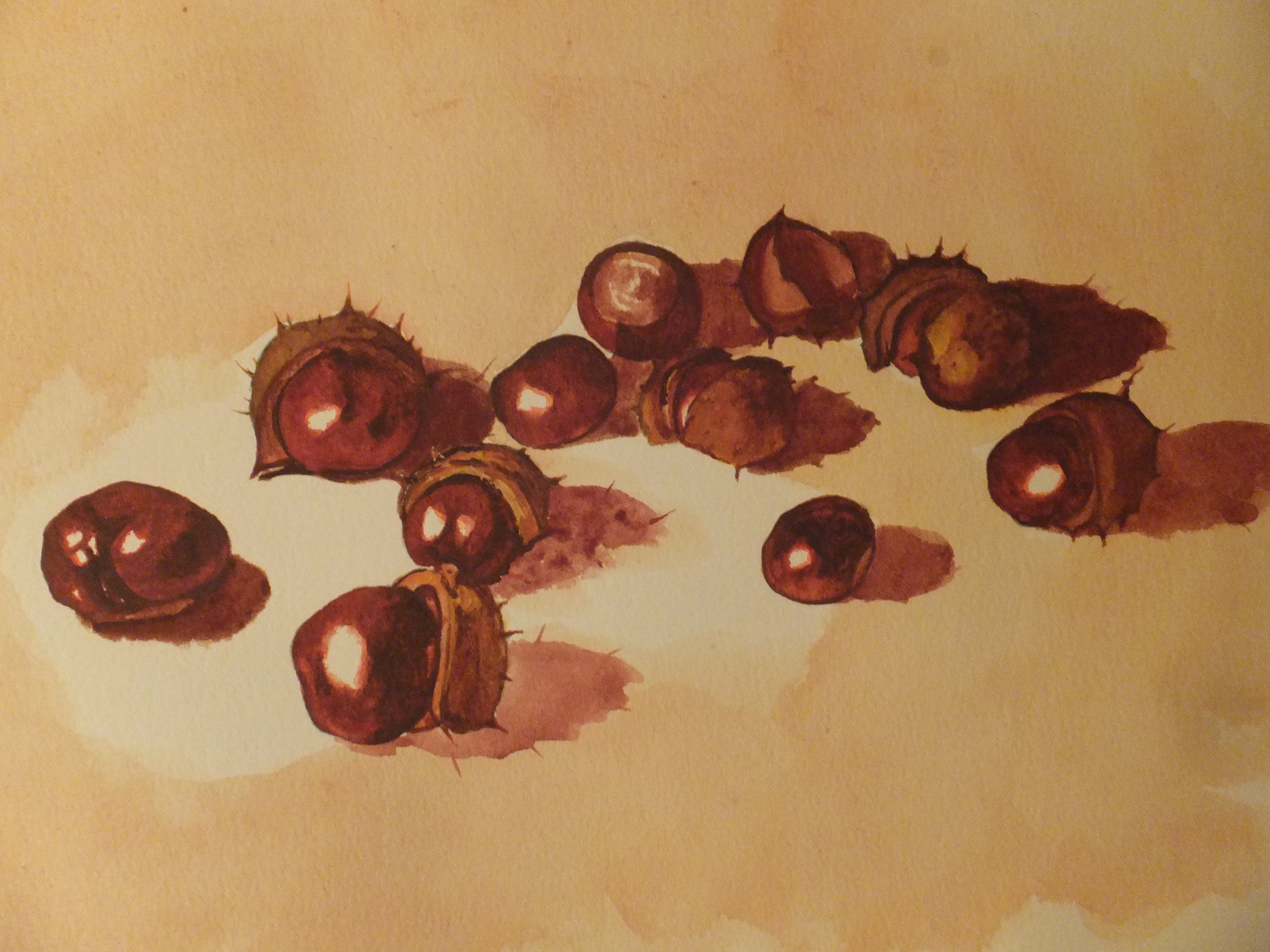
I chose a well-known local artist who produces lovely work verging on Cubism, which is post-Impressionism I know. I produced the above, which is a feeble attempt to emulate her style, which I tried to remember from attending one of her demos once. As for the famous artist, the finished work reminded me of, I could only think of Picasso or even Braque when they did those cubist still lives

As the image emerged I could see how Cubism developed. Not that I would have developed Cubism, I’m not clever enough, but I could see how others did

The local artist I mentioned whose name is Liz Seward, I don’t imagine she would mind being mentioned, I remember started with broad bands of vertical colours over the original drawing. From there it was a case of painting the negative shapes, and that’s all I remember. A finished image seemed to emerge, and I seem to remember being struck by wonderful colours being produced. The result of so many glazes I imagine

I have posted about my still life here, only because some people seemed to like it. These same people recommended I include it in my very recently redesigned web site which I have done and we’ll judge the response if any. Do I like it? Sometimes and sometimes not. Easy to be drawn by the colours

My grandchildren, incidentally, produced some stunning work, and I may well post about them at a later date. I think I should but that is for the future

Still Life as far as it will go

Still Life as far as it will go and now to be abandoned

As the title says, this is really as far as I can go with this painting, which was only supposed to be a learning exercise, and I have learned from it. There was no question of producing a finished piece of work, unless by happy accident.

I have sharpened up some of the detail and also removed the mask since the last post. The highlights were a bit blobby and needed tidying up, and I am far from happy with them even now. The mask needs to be applied with a pen for this sort of subject, which I didn’t have with me at the time. The metal cap on the lamp on the right is meant to be copper. I could not remember how to portray copper in watercolour, but found a website that told me, burnt sienna and a little raw umber. An example of a painting was shown which was beautiful. Hmm, I need to practice this, as the result is far too ginger for my liking

I prefer of the three, the glass cylinder on the left. Not sure whether it is a candle holder or a piece of laboratory equipment. A group of glass items from a laboratory would make a very interesting composition for a still life painting.

The real lesson that I have learned is not to attempt this sort of painting without the proper references, either the items themselves or an accurate photograph. Going from an old painting, and trying to remember where the highlights were, really dooms you from the beginning

I will return to my comfort zone next with a subject I am more used to, but useful to do something like this from time to time,(not to mention humbling)

A Lesson in Still Life Painting

Still Life Exercise

This is not the finished painting!

Not by a long way. On this occasion I am the student, and am preparing to follow a demo on Thursday at our local art club. We have been told to prepare in sketch form, a group of objects, and if we wanted to, put in some basic colour. The demonstration is to show how to provide an effective background wet-in-wet, which will one hopes transform this rather ordinary little group of objects into a painting

One of the many advantages of belonging to an art club, is that it gives you the opportunity to experiment with something totally different. Normally I paint town or seascape, so with this I shall be out of my comfort zone as it is called

More after Thursday

More work has been done

Still a lot more to do

We had the demonstration yesterday which really centred around negative painting. The spaces around the glass bottles were made wet, but only a manageable space at a time. Pigment was dropped in and allowed to spread, which gave quite a pleasing effect. Of course, as my subjects were glass, I had to allow the shadows to be visible through the bottles. My problem was that I didn’t have actual bottles to refer to, only a sketch from twenty years ago. I went darker than anyone else, looking for something dramatic, presumably.

The edges are finely masked with Frith masking fluid.

This exercise is by no means finished. Some more shadows need to go in around the base of the jars. The top of the lamp on the right is copper so some red needs to go on which will alleviate the green, and of course the masking needs to come off

I think I will try and finish it, although I don’t have to. it is one of those exercises where learning the method is the aim, not to produce a finished piece of work

Some more interesting topics to come from the art club, including painting with acrylic inks which I haven’t done for many years, so something to look forward to.

Dewdrop on Leaf Exercise

Dewdrop on Ivy Leaf

Now that my exhibition work is finished pro tem and before I go away for a while, I thought I would look at some exercises that I have been meaning to do, yet never found the time

This one I owe thanks to Susan Neale who did this demonstration in the Paint magazine some while ago.

She mixed the leaf colour with indigo and lemon watercolour. I have to say, one of the most accurate dark leaf greens I have seen and I have included a real leaf in my picture to compare

Using her own words, more or less:

  1. Using the dark green mix, paint the leaf shape with a no 7 brush. Add the veins using a mix of white gouache mixed with the lemon yellow ( I did add a little of the pale green too)
  2. When dry, draw the dewdrop shape. Now with dark green colour add the shadow area at the top of the dewdrop. Soften the shape with clean water and allow to dry
  3. Paint the cast shadow at the base of the dewdrop, using a darker shade of green
  4. To finish, using the white gouache, apply a rounded dot to the top of the bubble and a highlight to the bottom end


As for my attempt, well, could improve with practice perhaps

A useful little detail if you can master it

Close up of dewdrop

I won’t be posting anything for a while so don’t get upset if I don’t respond

Still Life with Conkers: Finished Painting

still-life-with-conkers

This is the finished painting. Rather laborious but we got there in the end! Every now and then I quite enjoy tackling something like this, not botanical painting exactly, but painting a specimen of fruit or flowers, with some expression thrown in. Textures are tantalising, and making an object look solid on a two-dimensional plane likewise.

I hope I have succeeded. One or two conkers, I feel, I can pick up, but I will let others judge

I talked about the story of conker-playing when I last posted, and how sadly, the gentle art has disappeared amongst schoolchildren, thanks to the interference of the health and safety police. No need for me to dwell on that anymore, only to lament the passing of part of our heritage, which had continued effortlessly from generation to generation. Too easy to blame the iPad! Children that I know like traditional games and playing with their iPads

But enough ranting. Let’s get back to the painting and how it takes shape. I remembered to take a picture of an interim stage, so let’s have a look at that

dscf3502

This is the stage following on from where I left the last post. I have completed a couple more of the conkers, this time with their husks, just to make sure the recipe is actually working. It seems to be!

As a base coat, I painted all the conkers with a bright orange, leaving a soft white spot on each, where the bright light is being reflected. I had already used a pale green for the husks, and had they been fresh from the tree. I could have continued with more green, but they had already gone a yellowy-brown colour, so true to nature, that is what I am doing.

The finished conker colour, I achieved using a succession of reds and browns. I did this wet-into-wet, so it is hard to give a blow by blow account. It is rather like sculpting. Do a bit, stand back and do a bit more

I can tell you, that I used light red, burnt sienna and burnt umber. At the very end, I gave nut and husk a unifying wash of light red, which I think gave them the colour I was looking for. And there it is

Thinking ahead, I have two projects taking shape in my head. One is to carry on with the painting of Bosham Harbour which I drew up and went no farther with. The other is to look back at Notre Dame with Pigeons, and redo the whole thing, removing that ghastly marquee on the left, and also improve the weather, and make the whole thing brighter and sunnier, albeit still winter time

I could also be going to Germany soon for the Christmas markets, so may be able to bring some interesting subject matter back with me

All for the future………….

Conkers:producing the painting

dscf3500

I managed to dig back into one of my old reference books and remind myself how I painted my first conkers still-life originally. As you can see, I have just drawn the nuts with their husks from the photograph. I have also put a base coat of yellow/green over the husks, and for this I have mixed sap green with raw sienna, which I find produces quite a natural green, for want of a better word

They look unassuming, and quite uninteresting, do they not. So I thought, what I would do, would be to finish off one conker, one nut, completely just to see if I could still do it.

This was the method I used.

I gave the nut, a base coat of bright orange, in this case Cadmium Orange with a touch only of Cadmium Red, and then let it dry hard. I should have said that I left a soft spot of white paper, working from the photograph, to simulate the point where strong light bounces off a glossy surface.

I then worked a succession of reds and browns wet-in-wet, almost sculpting the shape of the conker, finishing with Burnt Umber for the very dark surfaces. I also put in the shadow and darkened up the right-hand side. I let that dry hard, and put a unifying wash of Burnt Sienna across the whole of the conker, and left it until the following day

The next day, I felt quite pleased with the result. This was probably the nearest that I had come to trompe-l’oeil, where something painted in two dimensions looks solid enough to be picked up. I am not saying that every artist would be pleased with this, but I was, and confident enough to go on

The paper I am using is worth a mention. It is made from pressed rag, and I believe comes from Pakistan. It is similar to hot pressed paper, so that the surface is smoother than the cold-pressed paper that I normally use. It was sent to me as a sample some time ago, and I never used it, but it has proved perfect for this type of work

I shall probably finish the painting completely now and post again when it is done

Conkers

dscf3456

I painted “conkers” a few years back, and the painting sold fairly quickly, and can be seen on my website davidharmerwatercolour.co.uk. I thought I would do another version, so assembled this little still life from a neighbouring tree, a few weeks ago, and photographed it, to do later at my leisure. It is very important that the conkers are fresh from their husks so that the finish is nice and glossy in order to reflect the light. These are beautiful like polished mahogany

If you were a schoolboy in the 1950s like me, these were highly prized as they would be used every autumn in the game of yes,…conkers. They are, of course, the nut from the horse chestnut tree, the non-edible version. We would drill each one with a skewer, and thread them with string, tying one end off with a large knot. Then let combat commence. Players would take it in turns to bash each other’s conker until one split and fell off the string. The one left intact was the winner. Players would count the number of “kills” and accord them to their own champion, so it would be a “sixer” or “tenner” or whatever.

Competition was fierce and led to devious practices, like baking your conker in the oven to make it rock hard, or soaking it in vinegar so that it pickled. I was never sure that helped, but people did it nonetheless

Sadly, in this millenium, the game was banned by several schools, thanks to a jaundiced view of people’s safety. Headmasters thought a piece of nut could fly off and hit someone in the face! Anything is possible, but in my long experience of the game, nothing like this ever happened. Someone even suggested that players were at risk from “nut-allergy”!! Absolutely no evidence for that whatsoever. Incredible when one thinks of the disabling injuries from playing rugby or from boxing, which young people are encouraged to play

I haven’t seen anyone playing conkers now for years, probably because a generation have never known what it is, so the tradition hasn’t been handed down. I believe that the game of conkers has resurfaced in the United States, so maybe it will come back to us from across the pond.  Comments appreciated if you have any information on that

In the event, my interest for now is in the aesthetic as much as the nostalgic. I have made a drawing from this grouping, which is rather too faint to show, so I will get some colours together, and post another time about the painting exercise

Paul Nash Exhibition at Tate Art Gallery

the-menin-road-1918-19

The Menin Road 1918-1919

This was the best picture I could get taken from my guide book. This was prominently displayed in the exhibition being one of his best known WW1 paintings. A very big painting and naturally surrounded by people, so no chance I could photograph the real thing, and nor should I.

This painting was commissioned by the Ministry of Information, and was destined for inclusion in a Hall of Remembrance, which was never built. Today it is part of the Imperial War Museum’s collection

His style is starting to alter. He has become fascinated by geometric shapes, which will take him down the road to cubism and abstraction

However, to start at the beginning, we drove into London yesterday in the driving rain. Fortunately you can still park just outside the Tate which was useful considering the weather

The first section dealt with his early work and his comparatively comfortable existence in Iver Heath, where he paints in the garden and starts to show his predilection for landscape, which was to govern his painting throughout his life.

WW1 transformed him and his painting. He described himself as a messenger bringing back word from the men fighting to those who wanted the war to continue. This time a ravaged landscape witnessing a violent emotional experience. The Menin Road which I have shown is the best example of this in my opinion

After the war, places took on an importance for him. He lived at one time in Dymchurch on the Sussex coast, where he painted the sea defences again demonstrating his interest in geometric shapes and becoming ever more cubist. He was also influenced by de Chirico, after visiting an exhibition in 1928, and his paintings started to show lonely places and tell mysterious narratives through isolated objects.

He also at this time became interested in interiors and in still life. These paintings again showed him exploring cubist ideas, with their dependence on geometric shapes. A painting called “Dead Spring” painted in 1929 best illustrates this and I am sorry that I don’t have a copy of this one

He went on to explore the life of the inanimate object, conveying on them human personages. Working closely with fellow artist Eileen Agar, on the Dorset coast, they both used found objects in their work,  both in paintings and in collage.

He became closely involved with Surrealists, and produced work like “Landscape from a Dream” which I can showdscf3496

Some of this was cropped to get it into the frame, but here on the Dorset coast, the hawk is looking at itself in the mirror and also watching itself flying

Then came WW2, and Nash was made an official war artist. He was equally terrified of and fascinated by bombers.He talked about the “sky was upon us all like a huge hawk hovering, threatening”. He was inspired by the imagery of crashed German bombers in the landscape, like sculpture, and also at the Cowley Dump where these parts were brought. He drew upon his surrealist ideas when he painted Totes Meer or Dead Sea, where the twisted mass of crashed planes metamorphosed into waves of a metal sea.

This painting I can show and it is probably the one we all think of,when we think of Paul Nashtotes-meer

By now his health is suffering. He returns to landscape painting. In 1946 he succumbs to pneumonia and heart strain, and can no longer stand at his easel. Severely depressed he dies at Boscombe near Bournemouth at the age of 57. He is buried at Langley Marsh