Photography poor. I have had to use my phone as after upgrading, I am having difficulties loading from my camera, as everything is different and I don’t know why. I shall fathom in the end but for the minute I don’t have time
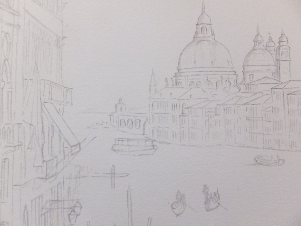
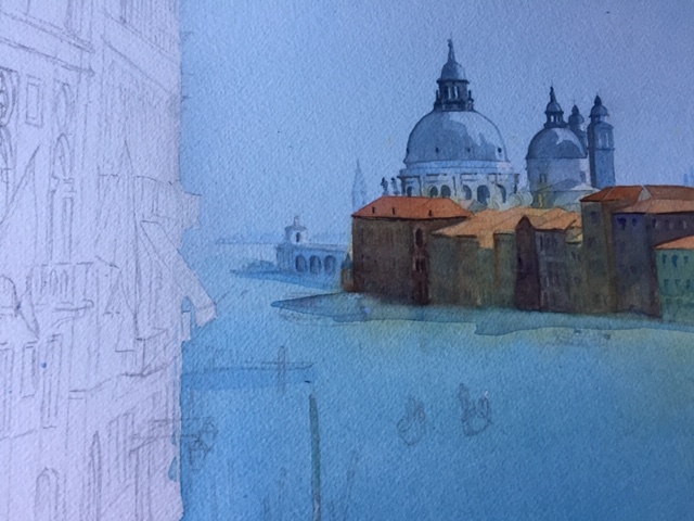
Suffice to say, I have painted the church of Santa Maria delle Grazie and put in detail as well as the houses on the opposite side in deep gloom. In reality they are much gloomier. The sunlit rooftops look orange which works, otherwise the detail on the house fronts disappears into the shadows.
Two coats of Phthalo Blue and Cobalt Blue mix on the water gives depth although the original is not quite as deep as this photograph
Still a long way to go as I will put the gondolas in with shadow colour and probably the vaporetto too
looking forward to tackling the bright colours on the foreground buildings and the flags
- Alhambra
- Amsterdam
- Ancient English Ports
- Ancient Greek Temples
- Andalucia
- Andy Warhol
- Animals
- Arles
- Art Exhibitions
- Art Nouveau
- Artfinder
- Arts and Crafts
- Aubrey Beardsley
- ball Point Pen
- Barcelona
- Barges
- Baroque
- Basilica of Sacre-Coeur de Paris
- Bath
- Beach
- Bicycles
- Boat Paintings
- Book Illustration
- Bosham
- Bosham Harbour
- Bosphorus
- Brittany
- Buildings/Architecture
- c13 woollen industry in Britain
- Camargue
- Camden Art Group
- Canal Bridges
- Canals
- Castles
- Cathedrals
- cats
- Cefalu
- charity auctions
- Chichester
- Chinoiserie
- Christmas Street Scene
- CLASSICAL aRCHITECTURE
- Competitions
- Conkers
- Constable
- Copenhagen
- Corfu
- Cornwall
- Correcting mistakes in watercolour
- Country Churches
- Country House Hotels
- Country Houses
- Danube
- David Hockney
- Devon
- Dewdrop on Leaf Detail
- dog portraits
- Donkeys
- Dorich House Museum
- Dragons
- Eagle Comic
- Education
- Egypt
- Egypt Equine Aid
- Eifel Mountains
- Elizabethan Country Houses
- English Country Gardens
- Equipment and work space
- Ferry Boats
- Figures in Streetscape
- Fishing
- Fishing Boats
- Flamingos
- Florence
- Fountains
- Fountains Abbey
- France
- French Impressionists
- Frog
- Frogs
- Galicia
- Garden Statuary
- Gardens/Floral
- George Gilbert Scott
- Georgian Architecture
- Georgian Gazebo
- Germany
- Gondolas
- Granada
- Grayson Perry
- Guildford in Surrey, UK
- Harry Potter
- Henry Moore
- Holland
- Horses
- House Portrait
- Hungarian Cattle Country
- India
- Islamic Art and Architecture
- Istanbul
- Italian Chapel
- Italy
- Jane Austen
- Kew gardens
- Kew Gardens
- Knights Templar
- Langstone Mill
- Leaf Soirit
- Leatherhead Theatre
- Life in the 1950s
- Light and Dark
- Lightbox, Woking
- Lock Gates
- London
- London Docklands
- Louis Philippe
- Ludlow
- Marinas
- Maritime History
- Marsala
- Mary Wollstonecraft
- Marzamemi
- Medieval Undercroft
- Mediterranean
- Mice
- Mosques
- National Trust
- Night Sky
- North Sea
- Notre Dame de Paris
- Opera
- Orkney
- Ostrich
- Oxford
- Pagoda
- Painshill Park, Cobham
- Painting Snow
- Pallant House Art Gallery, Chichester
- Paris
- Pattle Sisters
- Paul Nash
- Payne's Grey
- Pelican
- Period House
- Photography
- Plas Newydd, Anglesey
- Ponte Vecchio
- Portsmouth Harbour
- Post Impressionists
- Pre Raphaelites
- Preliminary Sketch
- Properties of Watercolour Paints
- Ragusa
- Railway Stations
- Reviews
- Rex Whistler
- Richmond Hill
- River Wey
- Rome
- Rossetti Family
- Royal Surrey Hospital
- Sagrada Familia
- Sailing Boats
- Saxon England
- schooldays
- Schools
- Scotland
- Sculpture
- Seascapes
- Sicily
- Sickert
- Sidney Sime Gallery
- Simon Gudgeon
- Simon Gudgeon
- South Africa
- Southampton Art Gallery
- Spain
- Spinnaker Tower
- St Johns near Woking
- St Katherine's Dock
- St Thomas a Becket
- Stanley's Grave
- Still Life
- Sunset
- Surrealism
- Surrey Villages
- Swans
- Syracuse
- Tate Art Gallery
- Terra Cotta
- Textbooks
- Textured Finishes
- Thames
- Tower Bridge
- Townscapes
- Transylvania
- Tudor Houses
- Turner
- Twickenham
- Uncategorized
- Van Gogh
- Venice
- Vignette Style
- War Artists
- War Graves
- Water Birds
- Watercolour
- Watercolour Painting
- Waterscapes
- Watts Gallery
- Wet-in-wet
- Wey Navigation
- William Blake
- William Payne
- Windmills
- Winter Street Scene
- Wisley Gardens
- Women Painters
- Working to Commission
- World War 1
- World War 2
- World War 2 Architecture
- Yorkshire