Istanbul: Bosphorus Waterfront: the finished painting

Istanbul Bosphorus Waterfront

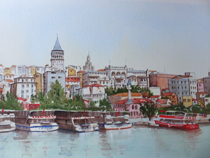
The finished painting!

I read somewhere that you have six seconds to catch a reader’s eye before they move on, so I thought I would put the picture first and talk about it afterwards

Once again the photograph has leeched out some of the colour. The painting itself is brighter and fresher than the jpeg, but for the moment is the best I can do

Quite a time consuming painting to do, but rewarding watching the finished view come towards you.

The palette was much as I foretold in one of my previous posts:

Phthalo Blue/ Cobalt Blue mix for the sky and water, with extra phthalo blue on the water

Raw Sienna/Naples Yellow as a base coat for all the buildings etc

Sap Green/raw sienna mix for trees

Transparent Brown/Ultramarine Violet for all shadows

Burnt Sienna for brickwork

Cadmium Red

I did use a little Permanent Rose as a glaze over the brickwork to give it a little zing. The burnt sienna first coat has to be rock hard for this. The result should look as though the sun is catching the building

For the white reflections from the boats, I lifted out the blue back to white paper, and then touched in some White Gouache or body paint, whichever you call it. Still watercolour but opaque

Fun to do, but nice to finish. This painting will go towards my exhibition at the Guildford Institute in May, which seems a long way off but really isn’t as I have much to do. I still need a snow scene for the exhibition and will be working on that next. As we so rarely have snow these days, I shall have to work from a photograph without snow, and put snow in. This is quite a test for the imagination, but it will be interesting to talk about, perhaps in the next post.

The web site has been busy over the last three months, which is nice. The only problem is I am selling paintings which were going in to the exhibition. Can only sell a painting once though, so best get working.

Frank Auerbach at Tate Britain and the Third Curse Of Euston

Head of William Feaver 2003

Head of William Feaver 2003 by Frank Auerbach

We went to the Frank Auerbach exhibition at Tate Britain today, which is on until mid March. I am not at my best with modern painting, perhaps because I lack perception, or that third eye which may be needed to understand non-representational painting. But nevertheless I like to go to exhibitions like these if only to broaden my outlook

Auerbach is reputedly the nation’s greatest living painter. The exhibition has borrowed his paintings from across the continents, many from private collections, and is the first time they have been shown together. He paints in oils and acrylics, and puts the paint on very thickly. Some of his strokes are in fact furrows in the base paint, so thick is it. I found that I needed a very long view, about five or six metres before the image came together.

His work looks spontaneous, yet we are told that he would sand back 30, 50 or even 200 times before he achieved the image he wanted. Nightmare for portrait sitters who had to keep coming back

His studio is in Mornington Crescent in Camden, that area of London associated with other famous painters from Camden, like Walter Sickert and Spencer Gore. Plenty of paintings by Auerbach of this area of London, but I particularly like this misty one by Spencer Gore

Mornington Crescent by Spencer Gore

John Sutherland writing in the February issue of The Oldie Magazine informs us that this area is under threat from HS2, the proposed high-speed rail link between London and Birmingham. Half an hour will be clipped from the journey time, and in return we lose part of London’s art heritage.

As well as losing Mornington Crescent, the construction of HS2 will have dire consequences for Camden Lock and Camden Market, which is sought out by thousands of tourists each year, not only local but from overseas as well, so famous is it.

He describes this as the Third Curse of Euston. The first was the destruction of Euston in 1837, then the destruction of the Great Doric Arch, over which Betjeman and Pevsner wept in 1962 and now HS2, in return for which we lose an important chunk of London’s art and architectural heritage

It just doesn’t seem right, does it?


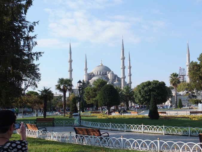
Istanbul:our condolences

DSCF2491

Our deepest sympathies to the people of Istanbul, for yet another terrorist outrage in your country today

We were there on this spot in October, so makes it feel closer. Crazy misguided people who can’t be reasoned with are a threat to us all. Somehow they must not win

Such a lovely city, Istanbul. People should keep visiting

Istanbul: Finished Drawing transferred to Watercolour Paper

Not very often that I am moved to include a quotation, but this one in last week’s Painter magazine, seemed very appropriate for artists, no matter what standard they have reached.

” Don’t think about making art, just get it done. Let everyone else decide if it’s good or bad, whether they love it or hate it. While they are deciding, make even more art”       Andy Warhol

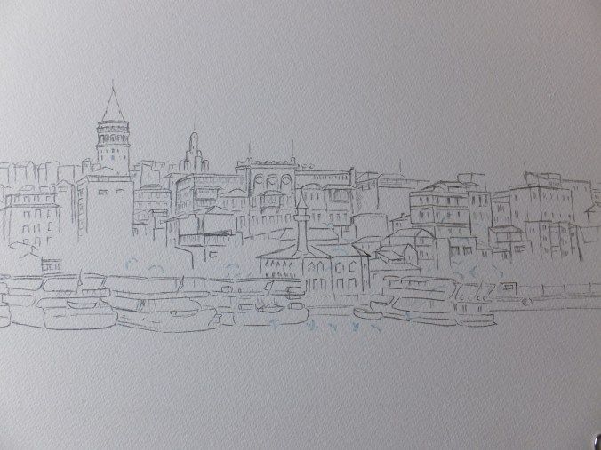
The drawing has now been transferred onto watercolour paper, seemingly without mishap

DSCF2792

I have left the shading out, and just left the line work for guidance. The image has unfortunately cropped some of the drawing out to the left and right hand sides. I did actually achieve the length of 43 centimetres that I wanted.

I didn’t do very much masking out, just a few gulls hovering over the surface and two tiny windows on the Galata Tower which appear to be reflecting sunlight. The boats, I know are brilliant white, but I have chosen to go with the old adage” the darker the darks, the brighter the lights”. In other words if I can make the shaded sides of the boats dark enough, then the rest will appear white. That is the theory. I have done it before, but watch this one go wrong.

I have chosen the following palette, which if I include the mixes as one colour, then I will have a palette of six, which would be quite effective if I can stick to it

Base colour: Raw Sienna/ Naples Yellow blend which is my favourite hot colour for buildings

Shadows : Ultramarine Violet/ Transparent Brown blend

Burnt Sienna

French Ultramarine

Sap Green/Raw Sienna blend for trees

Cadmium Red for those foreground red spots like flags, life belts etc

Not that I am above changing my mind as I go along but that is the palette that I want to stick to. I shall get some detail done before posting again

Just changing the subject, the Frank Auerbach exhibition at Tate Britain finishes the end of this month, so I am hoping to go on Saturday, unless I get an urgent call from someone, wanting me to do something else

I don’t know anything much about him, other than he is Britain’s most celebrated living artist. He appears to paint unrecognisable portraits which seems to be a contradiction in terms. However, I am speaking without firsthand knowledge, so will go with an open mind and reserve judgement until after I have seen the exhibition. I am not very good at appreciating images that are not recognisable, which could be an indictment of me, of course. It will be interesting, whatever happens

Istanbul, Bosphorus: finished preparatory sketch

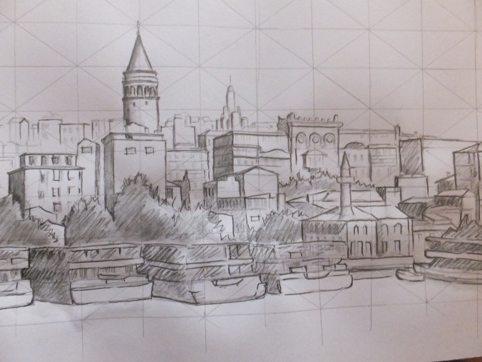
I said that I would publish the finished preparatory sketch, which will be my tonal guide for the painting stage. That doesn’t mean that I won’t change things as I go along. Not thrilled with the way that boat in the bottom right has turned out, which seems to be lost amongst a clump of trees. Still, that is the benefit of the tonal sketch on cartridge paper, which means that you can make and correct your mistakes, without damaging the surface of the watercolour paper.

Galata Tower finished tonal sketch

Now comes the laborious task of moving the sketch across to the sheet of watercolour paper, which will not make for very interesting reading, so the next post, I think, will deal with starting the painting.

Choice of colours will be interesting. There seem to be plenty of reds and greens which is nice. Definitely my old favourite of raw sienna mixed with Naples yellow across the buildings for some reflected sunshine, and brown shadows to heighten the bright bits

If I get this right, could be a nice painting. We will see

Istanbul, Bosphorus Preparatory Drawing

As today is the first day of the first month, I would like to wish anyone and everyone reading this post, a very happy new year. Perhaps I should wish you a fortunate new year, as inevitably this year will bring the usual mix of joy and sadness that we all share

Meanwhile back to the drawing board, quite literally….

I have made a start on the drawing using the photographs that I featured on the last post. It is not complete yet but is sufficiently in place, so that we can talk about it. This will be a tonal sketch, rather as I did for the Langstone painting, which means that the shadows will have been worked out well in advance of the painting stage.

On this occasion, I have used Derwent sketching pencils which are soluble. I have cross-hatched the dark side of buildings, and then washed over with clean water to give a shaded effect. These are much more convenient to use than ink. I had forgotten that I had them, so that was a nice find.

I will get the image up before we go any further.Galata Tower, Istanbul

The important building in the picture is the Galata Tower, which was a watch tower and which gives a panorama across the city. It was built by the Genoese in 1348, and replaced an earlier tower destroyed by crusaders in 1203. The Genoese were a merchant community in Constantinople at the time, and I guess this was their way of expressing gratitude for the hospitality shown them

I will only be able to use two of the three photographs, as I want to keep the finished painting within 40 centimetres. This is a pity, as I had hoped to include the splendid red Turkish flag shown between two buildings on the third photo. Not to worry, I still have dashes of red in the foreground with the life belts and the small flags on the boats. Maybe I can do a postcard study of the buildings holding this large flag, at a later date

In case you don’t know, and my apologies if you do, using some red in the foreground is a useful device for artists. It is an aid to perspective, as red comes towards you, just as blue recedes. Distant scenery turns blue, as you have probably noticed.

Let me repeat, that this drawing is not yet complete. I will post the completed drawing when I have finished it

I also have photographic references of the Blue Mosque, which should make a lovely study at some time. The last time we were in Istanbul, which was 2001, so a while ago, we went to the Blue Mosque and Hagia Sofia, which I believe is a museum now. We also went to the ancient cisterns of Constantinople, that masterpiece of Roman engineering, where the city’s water supply was stored. I try not to use the word “awesome” too lightly but that really was.

This time we went to the Topkapi Palace and of course cruised along the Bosphorus. Istanbul is still one of those places I would like to return to.

If you are following this demo, then thank you. I will complete the finished painting in stages and post as I go

Istanbul along the Bosphorus Waterfront

We were here in October, and cruised in a small boat gently along the Bosphorus Strait for about an hour. There were any number of picture opportunities and ideas which I have brought back.

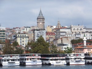
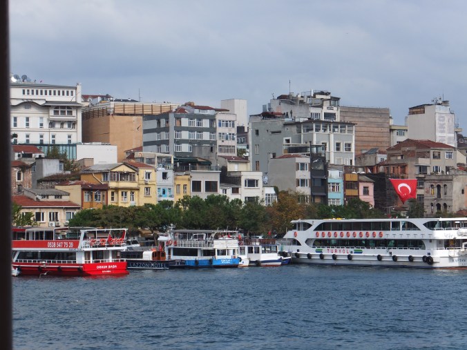
I have picked for now, three shots of the waterfront with its variety of buildings. These are consecutive frames which I hope to piece together to make an interesting composition, and finally a painting

Istanbul Bosphorus 1


Istanbul Bosphorus 2

Istanbul Bosphorus 3

Just not clever enough to get them in a line but the idea is there. I need to get a painting measuring about 45×30 centimetres out of these three frames, so will be fun sorting out the drawing in the New Year

Corfu: Shopping Lanes in Kerkyra,continued

From where we finished on the last post, I used Indian Red to paint the dome on the bell tower. The blue sky dropped back, as I had hoped it would. Indian Red is a good hot weather colour, and I echoed its use on things down the lane, like awnings and shop blinds. On the left-hand side is a shop selling garments, and I used some dabs of red to denote red dresses hanging on display.

I finished the detailing on the bell tower so as to give me something sharp to focus on, when working out the detail on other parts of the painting.

I used my favourite warm weather shadow, ultramarine violet mixed with Sennelier Transparent Brown, and put in the shadow on the buildings

I left this to dry overnight, and this is what it looked like the next day

almost there

It was starting to look the part. I drew the figures in again with the brush, as I was starting to lose them

I still wanted some deep darks further down the lane, where the light didn’t reach. I still wanted to try Alvaro Castagnet’s mix of Brown Madder, Cobalt Brown and Raw Umber. I mixed up the first two, and then added Transparent Brown instead, which certainly produced a very dark shadow colour, with which I started to work

Corfu  Shopping Lanes in Kerkyra

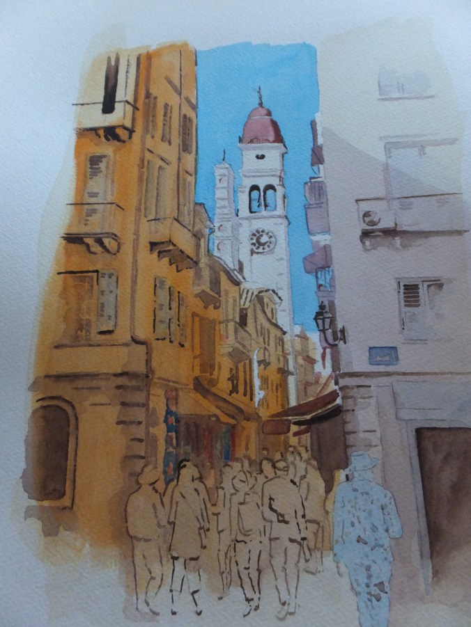
This is the painting virtually complete. The dark mix has been used on the deep shadow areas. The figures have been finished, although the foreground figure looks a bit ghostly, and will need some colour after all. Some white gouache has been used to give the allusion of white paintwork on the balconies.

Was I successful in producing something in the style of Alvaro Castagnet? No, absolutely not, but nonetheless I have enjoyed working on this painting, and like the result

Possible framed version

This is what it could look like framed. Some extra colour went into the figures, otherwise the painting is finished

I hope you found this helpful, and by the same token, if you have suggestions for me, I am always pleased to hear


Corfu:Shopping Lanes in Kerkyra

It will make a pleasant change to work on something which involves some bright sunshine

A few weeks ago, we were lucky enough to be travelling in the east Mediterranean, starting from Turkey, sailing around Greece including some of the islands and then up the Adriatic as far as Dubrovnik.

On the way back to Greece, we should have called in at Kotor in Montenegro but rough seas prevented us docking. Instead we sailed for the nearest port that could take us, which was Corfu, which turned out to be something of a bonus

Not somewhere we had ever been before, so all was new. In the morning we had a guided tour up into the hills, where we enjoyed awesome views and walks round picturesque villages. We came back down into the capital, Kerkyra, which had been a British base in the c18, and where they still play cricket!

After lunch, we rambled at leisure around the shopping lanes, which were delightful. I took some pictures, thinking of possible paintings later, and one of them I shall append shortly. All those lights and darks reminded me of the work of Alvaro Castagnet. Maybe I will try something in his style which will be ambitious but interesting

DSCF2668

Quite a selection of lights and darks to have a go at. Some of the drawing will have to be tidied up. I won’t want those large heads in the foreground, but will want some of those other figures to come further down the picture

DSCF2730

So, this is the drawing. I have simplified some of the tangle of things like shop signs and awnings in the lane. Also, I have finished or almost finished the figures and made them into the foreground. The larger figure marked “mask”, I will mask out, as I would like him to have a white suit so that he stands out against the dark background. That is the plan.

Also I will run masking fluid along the edge of the church so that I get a crisp line against the blue sky. So, let’s see if I can find the next picture

DSCF2742

As you can see, I have put in the sky, mostly with a small brush, as some of the corners were fiddly. Ouch, too bright! I know that Mediterranean skies are that beautiful azure colour, but that doesn’t always work in a painting. Given more space, I could have run some of that colour off under the tap, but I couldn’t attempt that for fear of spoiling that white bell tower. I will have to live with it. Possibly when I paint the red dome, that will knock the blue back

I used phthalo blue mixed with cobalt, which I usually find works well with south European skies

As you can see, I have done the masking out. Not just the foreground figure and the edge of the bell tower, but also a narrow strip halfway down the lane on the left, which looks like an alley way catching the sunlight. In the next picture, I have done some wet-in-wet work, which will look rather messy at this stage

DSCF2743

Looks a bit of a mess at this stage, I know, but we will carry on

I used a very dilute mix of Naples yellow with raw sienna, for the buildings including the bell tower. Almost white for the tower, but thickened up the colour for the other buildings. For those on the left-hand side, I used a wash of cadmium orange, even before the first coat was dry. I followed up with cadmium orange pigment straight out of the tube, for the shadow areas such as underneath the balconies.

There is a wash of shadow to go on yet, which will take some of the sting out of the orange. I need to let this dry overnight, as it has to be rock hard, before a very wet coat of shadow goes on

I am going to leave it there, if I may, as still quite a way to go, and certainly enough for another post, hopefully towards the end of this week. Thank you for reading my blog


Notre Dame Cathedral, Paris continued

I came back to the painting, having given it a grey/green wash as I explained, then leaving it for 24 hours to go really hard. Then I started work on it againDSCF2721DSCF2722DSCF2723

I started by putting detail into the foreground especially into Lola’s coat and trousers. This gave me a focus for the mid and background. I put some detail into the cathedral, not too much, as this is not an architectural study, but hopefully just enough. Gothic architecture is very ornate in detail anyway, and there is only so fine you can go with a brush

How I regretted including the marquee on the left. Once the colour went in, that shape was too dominant. I should have known better. I could just as easily have painted distant buildings and trees in that space. However I was stuck with it, so I have to continue. Incidentally I never abandon a painting halfway, even when it looks like being a disaster. Often it works out better than you think, and if you want to do it again , then you have made all the mistakes, not just some

On the second painting I started darkening the road surface in the foreground and putting in reflections. It was starting to look like a wet surface. I put some red spots in the painting, leading the eye from the foreground to the front of the cathedral. The Nike tick on Lola’s shoe, bags, coats, and umbrellas by the cathedral door. I used Cadmium Red. Nothing better in my opinion for catching the eye

Still that marquee bothers me. If I frame this painting I could crop about two inches off the left-hand side, which would help. It would also lose me a couple of figures from the queue and some pigeons, which would be sad. With that in mind I drew some extra pigeons in the foreground to compensate. The last picture is of the finished painting, so let’s have a look at itDSCF2726

By and large, I think the painting works. It certainly looks like a wet day, and maybe I will get used to the marquee. I think they were using it for an exhibition at the time

I hope you liked that little demo, and found something helpful. Let me know your ideas too. After all that rain, it will be nice to look at some hot weather subjects for a change. I have just returned from Turkey and Greece, where we had some rain, but also some sunshine, and I have some interesting photographic references to work on.

In the nearby village of Pirbright, between Guildford and Woking, where I belong to the Pirbright Art Club, we shall be having our Winter Art Exhibition 5th and 6th December, so I have got to get working on my entries. I will show you what I have done towards the end of the month, and also talk a bit about Pirbright which is an interesting village. Until then………