Not very often that I am moved to include a quotation, but this one in last week’s Painter magazine, seemed very appropriate for artists, no matter what standard they have reached.
” Don’t think about making art, just get it done. Let everyone else decide if it’s good or bad, whether they love it or hate it. While they are deciding, make even more art” Andy Warhol
The drawing has now been transferred onto watercolour paper, seemingly without mishap
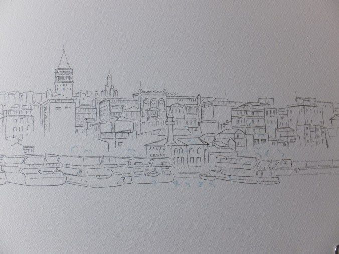
I have left the shading out, and just left the line work for guidance. The image has unfortunately cropped some of the drawing out to the left and right hand sides. I did actually achieve the length of 43 centimetres that I wanted.
I didn’t do very much masking out, just a few gulls hovering over the surface and two tiny windows on the Galata Tower which appear to be reflecting sunlight. The boats, I know are brilliant white, but I have chosen to go with the old adage” the darker the darks, the brighter the lights”. In other words if I can make the shaded sides of the boats dark enough, then the rest will appear white. That is the theory. I have done it before, but watch this one go wrong.
I have chosen the following palette, which if I include the mixes as one colour, then I will have a palette of six, which would be quite effective if I can stick to it
Base colour: Raw Sienna/ Naples Yellow blend which is my favourite hot colour for buildings
Shadows : Ultramarine Violet/ Transparent Brown blend
Burnt Sienna
French Ultramarine
Sap Green/Raw Sienna blend for trees
Cadmium Red for those foreground red spots like flags, life belts etc
Not that I am above changing my mind as I go along but that is the palette that I want to stick to. I shall get some detail done before posting again
Just changing the subject, the Frank Auerbach exhibition at Tate Britain finishes the end of this month, so I am hoping to go on Saturday, unless I get an urgent call from someone, wanting me to do something else
I don’t know anything much about him, other than he is Britain’s most celebrated living artist. He appears to paint unrecognisable portraits which seems to be a contradiction in terms. However, I am speaking without firsthand knowledge, so will go with an open mind and reserve judgement until after I have seen the exhibition. I am not very good at appreciating images that are not recognisable, which could be an indictment of me, of course. It will be interesting, whatever happens

That’s a great quote! What brand of paint do you use?
LikeLike
I use mostly Daler-Rowney or Winsor and Newton. occasionally I use Sennelier or Rembrandt if I want a particular colour. I always use artists’ quality. I buy on line mostly usually these days from the Society for all Artists, which you have to join and then you can get discounts from their shop.
LikeLiked by 1 person