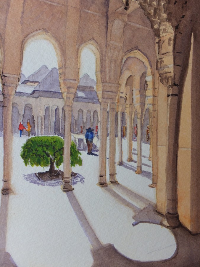
The watercolour version of the black and white sketch that I posted a week or two back
Hmm sometimes I prefer the black and white, and this may be one of them
The intricacies of Islamic tracery are beyond compare, and maybe one shouldn’t attempt them in watercolour. Much of the detailing had to be left out as beyond the scope of the brush, or certainly mine at any rate. Really I was interested in shadows as much as anything else, and even then not perhaps my best work
For spontaneous watercolour painting of architecture, I am a great admirer of John Singer Sargent, who is usually remembered as a society portrait painter, but he travelled and painted in Europe a great deal, especially in Italy. He would draw architecture with a brush, which is a skill I admire, but haven’t yet aspired to, as I need pencil guidelines for something like architecture where accuracy is essential. I looked at some of his work recently and have started collecting his paintings on Pinterest, so stimulating are they.
Looking into some of his paintings of Venice for example, he paints enough detail to create the effect, not quite Impressionism but going that way, and feels confident enough to leave things out. The results and the colours are stunning, and each one is a collector’s piece, which of course they are. Perhaps I could convince myself that I was attempting something like that with this painting.
Coming back to my Alhambra piece, the camera has once again bleached out some colour, and reveals brushwork which the naked eye cannot see. A lame excuse but I offer it anyway
I may come back to it one day, but I have one or two things I want to do for an exhibition in October, one of which is to paint the view of New Haw Lock which I drew on site last week, so that will be my next project.

Graet work. I prefer the warmth of the water colour as compared with the tonal study, David. I think you have hinted at the tracery effectively enough, too!
LikeLiked by 1 person
Reassuring Emma thanks
LikeLiked by 1 person
The painting is great Monsieur. Could I offer a tiny bit of insight? The bush looks out of place. It’s too green for such a great painting. Otherwise, the painting is super hit.
Really enjoyed your background information on Singer Sergeant. He’s one of my favourite artists too.
👍👍👍👍👍
LikeLiked by 1 person
I toyed with leaving it out. Maybe I should have done. One random splash of green was not helpful, but it was there so I put it in. If I ever did a repaint I might well leave it out. Thanks Farzana
LikeLiked by 1 person
Monsieur, I think that the bush is fine but it’s just a bit too green for the surrounding tranquil atmosphere. That’s why it looks out of place. But if you had left out the bush, it would have looked like a concrete jungle. The bush gives the painting some life, but the colour is just a bit too bright.
For your next version, you could try making the bush a bit more dull green and see if it looks good to your expert eyes.
Kind regards.
LikeLiked by 1 person
Point taken
Thanks Farzana
LikeLiked by 1 person