
The painting finished, and that now completes my quota for the exhibition coming up at the Guildford Institute on the 13th. Something of a relief that I am in time, and only have some framing left to do.
For the conical roofs on the mills, I used a different red. Quinacridone Red which I haven’t used before, makes a nice deep pinky red and was virtually an exact colour match to the photograph. Indian Red is not dissimilar but I remembered buying the quinacridone some while ago for some purpose or other, so thought I would trial it. I quite like it by way of a change
I then went on to run a dilute shade of the same colour down the sides of the mills themselves which again brought the masonry colour closer to the original in the photograph.
The stones along the walkway between the salt pans, were quite bright in the sunlight, so I used quinacridone gold instead of raw sienna
There was little else to do. I deepened the blue in the foreground. Sadly little or nothing to put there, so I have made the reflections more pronounced in order to break up the expanse of blue water I could use red for my signature. I will think about that
But life does not stop here. I have another exhibition coming up in July at the Royal Surrey Hospital, which is another favourite venue. This time I shall be sharing the space with my colleague, Elaine. She does more abstract and adventurous stuff than me, so our paintings seem to compliment one another
Taking a pessimistic view, with no sales at the Institute, I shall just move these paintings to the next exhibition. However there would be one or two changes that I would like to make anyway, and I would like to include some more paintings of Venice which are always popular. I have come across a very good source of photographs that I can work from and leave the next one with you
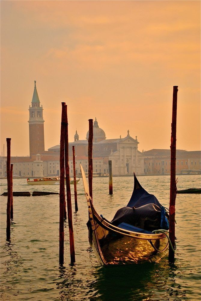
San Giorgio Maggiore, an old favourite which I have painted before but the light and colours on this shot are delightful
We will see what I make of it. Suggestions by the way, are always welcome

I’m sorry I couldn’t comment earlier. Yesterday I left home at 8 and returned at 10pm. Then it was dinner and straight to bed.
I hope your exhibition goes well and am glad that despite the current situation at home you have completed your quota of paintings for the Exhibition. On the boat painting, it’s good but I think it looks a bit gloomy when you look at the boat against the backdrop of those colours. But that’s me…I suppose. I love to look at colours when it’s a painting.
As always your painting has been pinned to your board.
Kind regards.
LikeLiked by 1 person
Fair enough. I like to receive all comments whether good or bad, otherwise one doesn’t grow. Thank you
LikeLiked by 1 person
If I might add to that: comments help one to assess one’s work but from my little experience with readers, I understood that most of them don’t fully realize the extent of work and dedication put to it. There was a time when I loved to receive comments, I still like to receive them but the difference is they don’t tempt me anymore. You are in this field for more than twenty years now, surely you understand the truth behind this realization.
LikeLike
Reactions to paintings are instinctive and naturally subjective. Experience counts for nothing. A child’s comment is as valuable as that of a leading art critic. That much I have learned
That wouldn’t apply to literature, I understand that.
LikeLiked by 1 person
Monsieur, that remark is going on TPA, as Monsieur Monette’s reaction to eligibility of criticism in the field of paintings. Get ready to be quoted more often from now.
LikeLiked by 1 person
Look forward to seeing it
LikeLike
The mills make an interesting painting. I like their reflection on the water.
LikeLiked by 1 person
Thanks Caroline
LikeLike