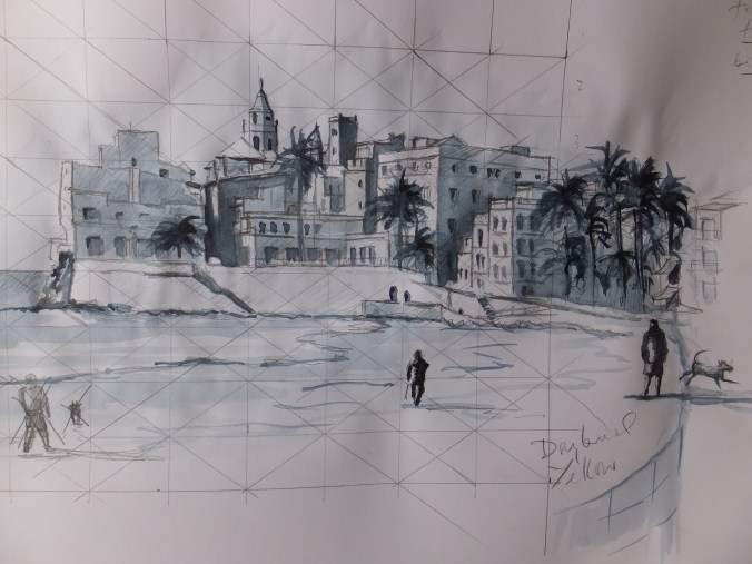
Probably the messiest sketch that I have done in a long time, but nevertheless it will do the job.
I have scratched out the figure in the bottom left corner, as he just was going nowhere. There were two dogs with him and they looked like pigs. I am going to substitute the figure on the far right, man and dog. They are strictly speaking in the margin, for as you can see they are out of proportion to the main picture. I sketched them from the screen which is rather like drawing from life, and which I had wished I had done before, instead of trying to scale from the photograph.
When I attempt to transfer this sketch onto watercolour paper I think I will trace the figures separately, and slide them round the foreground until they look right. I hadn’t intended to put a figure on the right hand side, but quite like in some ways, the effect of the righthand figure. I know he is out of proportion but nevertheless acts as a balance somehow. I will go through my photo library again and see if I can find someone
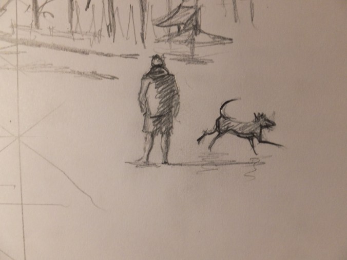
This is the thumbnail sketch of man and dog. I quite enjoy doing these in real life, and they make a wonderful library of props that you can use in composite paintings. Drawing from the screen is easier in many ways as the subject doesn’t move about. I have seen other people do it, but never tried it before.
The tedious bit comes next. Moving the finished sketch or sketches onto watercolour paper. You have to trace some bits, and my conscience is clear as I am tracing my own drawing, but I do not like tracing. Boring and messy work. I wish I could wave a wand. However you can’t erase mistakes from watercolour paper without spoiling the surface so you just have to get on with it. At this stage I always make the point that I am still learning and welcome suggestions, if you have a better solution, please tell me. I use the Frisk product Tracedown which takes some of the tedium out of the job, but still looking for even more shortcuts.
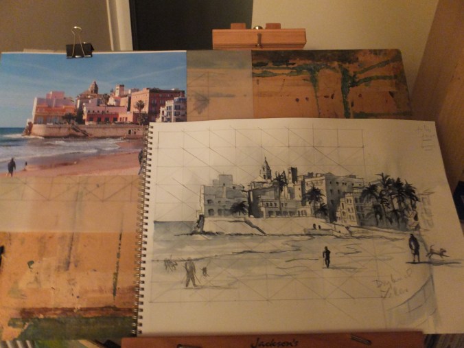
This is the sketch against the photograph. What I hope to capture more than anything is not so much an architectural study, (so many of you will do that better than me), but more the effect of the strong light on the buildings with those delicious deep shadows.
After the tedium of transposing the drawing, comes the fun bit of deciding on the palette. The building far left which is bright white will need to be preserved with masking fluid. So will some of the details along the top edge, and so too will the sunlit edge of the walking figures.
Choice of colours? Well, my favourite base colour of raw sienna mixed with Naples Yellow which always looks sunlit as a base colour for buildings and beach. Some of the buildings, burnt sienna glazed with either permanent rose or cadmium orange. Phthalo blue in the mix for sea and sky, with maybe indigo along the horizon line. I bought Quinacradone Red the other day and am looking for an excuse to use it.
Once I have decided on the palette, I will publish it, just in case it is of interest. In the meantime, I will have to crack on. There is much to be done!

I struggle with drawing…doing it twice is even harder.
LikeLiked by 1 person
Don’t forget I trace the second one just to move the drawing on to watercolour paper. My conscience is clear as I am tracing my own drawing. Not that I like tracing though, something seems to get lost, which is why I just trace the main outlines and fill in by eye
LikeLike