Istanbul Painting: Initial Stages

Crossing the Bosphorus by ferry

This is very much work in progress. I have got as far as putting in the shadows with a mix of Cobalt and Phthalo Blue, the mix I like using in any scene that is southern European or nearby

I have done the sky in the same, and the sea also but over an orange wash which gives it a greenish hue, and as always I hope this works. I have put some more orange here and there into some of the buildings as highlights as the shoreline was getting monotonous. There will be some more shadows yet going in to the buildings and also the boats that are still tied up

The boat mid channel I hope to do in much more detail, as much as my shaky hand will allow, and I want to introduce some red into this boat to bring it forward from the shore. That is the theory anyway.

Annoyingly the camera has picked up the texture of the paper so that it looks as though I am painting on onion skin. I seem to get a better result with the camera on my phone these days so might use that for the finished image.

Since this photograph was taken I have done some more work on the painting. Nothing startling, just deepening the shadows, and deepening the sea colour in the foreground. The shoreline is starting to take on a cubist look, unintentionally but interesting nonetheless.

I need another painting of Istanbul

This one I quite like,as a reference, not my own but similar to the ones that I took of boats crossing the Bosphorus. I won’t be copying it as such but using the content for inspiration.

I think I will attempt to change the lighting. I have several Bosphorus shots of my own to refer back to, so will experiment a little and see what I end up with. The construction will remain much the same, as the composition would be difficult to improve on

It has all the ingredients, the mosque, the ferries and the water. No mistaking where it is. This is rather a dark shot, evening time and dramatic, quite a clever photograph, and all credits go to the photographer, if only I knew who it was

For the moment, I am just doing some free-hand sketches, and may just include those at the end of this blog. Those minarets are proving something of a problem to pin down. One minute they are leaning too far to the left, and when I correct that, too far to the right. The mosque building itself is a delightful exercise in geometry though, which may be forgiving because of the distance. I had the same problem when I painted the Blue Mosque which is in the archive somewhere

Both Istanbul paintings sold from my Artfinder site which was gratifying especially as I don’t have much success on that site, hence I need another Istanbul painting for my next exhibition which is in April, which will come round fast enough

The Fountain of Love commission was very well received, I am happy to report

Free hand preparatory sketches

Blue Mosque: the finished painting

Blue Mosque

Alas once again a good painting spoiled slightly by a bad photograph. The camera has diffused the depth of colour in the trees etc in the foreground. This is the best photograph of all those that I took, so will have to put up with it. Shame because the colours of foliage etc are much richer than shown. The mosque is not too bad though, even though the shadows on the building are really much deeper.

Palm trees are tricky. They were done with a dry brush, just hoping that the bristles open out to give that feathery effect. They seem to have done.

For the trunks of the palm trees, I mixed permanent rose with burnt sienna to give, hopefully, the effect of bright sun highlighting the wood. That was the base coat. I used a very dark brown as a shadow over the top as a glaze, just leaving a little of the red showing on the sunny side. Likewise the park benches which were brightly lit in some cases, I used the same mix of rose and burnt sienna. I felt that that had worked

The other trees, some of which were obviously tidily clipped, I had to sort out, otherwise in a painting they would have been indistinguishable. I painted some lighter than they appeared against darker trees in the background so that one defined the other

Small figures, some of them in red, led the eye through the trees, and I hope have given a feeling of distance

The enjoyable part of the exercise was the mosque itself. A lovely drawing exercise hopefully getting the domes and minarets right, and then the subtle shading, which I built up over a period, hoping to get the depth of shade correct. Hard for you to judge, I know, as the camera has bleached everything. So frustrating!

I had to do quite a lot of masking out in order to catch the bright spots where the light fell. So there we have it, the finished result

What to do next. I have some pictures taken on our local canal, which I would like to try. Also going to Spain in the not too distant future, so could be plenty of inspiration there too.

Thanks for reading, if you have done. Hope you enjoyed the result


Blue Mosque: First Wash

Blue Mosque First Wash

Just as an interim, and whilst I think of it, I have masked out several items on this picture before putting down a base wash

The scene was brightly lit from the left and there is interesting sparkle on the trees, on the tiny background figures and on the mosque itself. Whether or not I will be successful in capturing these remains to be seen. I have always found them elusive and welcome any tips.

I have masked along the left-hand edge of the minarets so as to get a hard edge against the blue sky. Likewise some of the domes and the sides of the tree trunks. The colour of the palm tree trunks is brown going towards red in the bright light, so will probably mix some permanent rose in with the burnt sienna, hopefully to catch that richness of colour. Also the park benches are that colour too.

I have put a band of Indian yellow wet-in-wet where the flower beds are so hope that works

The rest is detailing and building up the darks to encourage the brightness of the brights. We shall see. This may well take me a while

Blue Mosque, Istanbul:Tonal Sketch

Blue Mosque Sketch

I mentioned a few posts back that I wanted a smaller picture for the exhibition as they are popular sometimes. I will repeat the photograph later, which was one that I took when we were there in October

The light was very good and the shadows were long and distinct. I couldn’t make my mind up, whether to use the local colours or whether to try a sunset picture. I think as the shadows are good that I will stick with the local colours, with maybe a mental note to do a sunset picture another time. As we were driving from the airport to pick up our ship,the day before,  the sun was setting over Istanbul, and especially over the Mosque of Suleiman the Magnificent, another beautiful building.  The sky was orange going towards pink and the buildings were violet. Sadly my camera was still packed in the luggage hold. Maybe I will try that shot from memory one day.

I think the sketch will be very helpful. I have moved some trees away from the front of the building, and I think I have sorted out the shaded areas. I didn’t use ink this time for the sketch. Instead I used Paynes Grey watercolour, which I quite like for sketching. You can’t tell from the photograph, but the colour is a blue-black shade, which is quite pleasing. I sometimes think that I prefer the sketch to the finished painting. There is something about a sketch, perhaps because it is done quickly and without inhibition, that the work retains spontaneity and freshness. Easy to lose this, when working carefully on the actual painting.

I now have to transfer the sketch to the watercolour paper, which is the uninteresting part and then start the painting. Colours to be decided, so I will be a little while

DSCF2491

As you can see, some unnecessary stuff left out, and I have moved closer to the building itself

I am hoping on Saturday to get up to London and go to another exhibition at the Tate Gallery. The exhibition is entitled Art and Empire which should be interesting. When we were there for the Frank Auerbach exhibition, we looked in quickly, but this is quite a big exhibition so we left it for another day. If it is good I will write something about it. Certainly it will be as different to the Auerbach collection as chalk is to cheese

Istanbul: Bosphorus Waterfront: the finished painting

Istanbul Bosphorus Waterfront

The finished painting!

I read somewhere that you have six seconds to catch a reader’s eye before they move on, so I thought I would put the picture first and talk about it afterwards

Once again the photograph has leeched out some of the colour. The painting itself is brighter and fresher than the jpeg, but for the moment is the best I can do

Quite a time consuming painting to do, but rewarding watching the finished view come towards you.

The palette was much as I foretold in one of my previous posts:

Phthalo Blue/ Cobalt Blue mix for the sky and water, with extra phthalo blue on the water

Raw Sienna/Naples Yellow as a base coat for all the buildings etc

Sap Green/raw sienna mix for trees

Transparent Brown/Ultramarine Violet for all shadows

Burnt Sienna for brickwork

Cadmium Red

I did use a little Permanent Rose as a glaze over the brickwork to give it a little zing. The burnt sienna first coat has to be rock hard for this. The result should look as though the sun is catching the building

For the white reflections from the boats, I lifted out the blue back to white paper, and then touched in some White Gouache or body paint, whichever you call it. Still watercolour but opaque

Fun to do, but nice to finish. This painting will go towards my exhibition at the Guildford Institute in May, which seems a long way off but really isn’t as I have much to do. I still need a snow scene for the exhibition and will be working on that next. As we so rarely have snow these days, I shall have to work from a photograph without snow, and put snow in. This is quite a test for the imagination, but it will be interesting to talk about, perhaps in the next post.

The web site has been busy over the last three months, which is nice. The only problem is I am selling paintings which were going in to the exhibition. Can only sell a painting once though, so best get working.

Istanbul:our condolences

DSCF2491

Our deepest sympathies to the people of Istanbul, for yet another terrorist outrage in your country today

We were there on this spot in October, so makes it feel closer. Crazy misguided people who can’t be reasoned with are a threat to us all. Somehow they must not win

Such a lovely city, Istanbul. People should keep visiting

Istanbul: Finished Drawing transferred to Watercolour Paper

Not very often that I am moved to include a quotation, but this one in last week’s Painter magazine, seemed very appropriate for artists, no matter what standard they have reached.

” Don’t think about making art, just get it done. Let everyone else decide if it’s good or bad, whether they love it or hate it. While they are deciding, make even more art”       Andy Warhol

The drawing has now been transferred onto watercolour paper, seemingly without mishap

DSCF2792

I have left the shading out, and just left the line work for guidance. The image has unfortunately cropped some of the drawing out to the left and right hand sides. I did actually achieve the length of 43 centimetres that I wanted.

I didn’t do very much masking out, just a few gulls hovering over the surface and two tiny windows on the Galata Tower which appear to be reflecting sunlight. The boats, I know are brilliant white, but I have chosen to go with the old adage” the darker the darks, the brighter the lights”. In other words if I can make the shaded sides of the boats dark enough, then the rest will appear white. That is the theory. I have done it before, but watch this one go wrong.

I have chosen the following palette, which if I include the mixes as one colour, then I will have a palette of six, which would be quite effective if I can stick to it

Base colour: Raw Sienna/ Naples Yellow blend which is my favourite hot colour for buildings

Shadows : Ultramarine Violet/ Transparent Brown blend

Burnt Sienna

French Ultramarine

Sap Green/Raw Sienna blend for trees

Cadmium Red for those foreground red spots like flags, life belts etc

Not that I am above changing my mind as I go along but that is the palette that I want to stick to. I shall get some detail done before posting again

Just changing the subject, the Frank Auerbach exhibition at Tate Britain finishes the end of this month, so I am hoping to go on Saturday, unless I get an urgent call from someone, wanting me to do something else

I don’t know anything much about him, other than he is Britain’s most celebrated living artist. He appears to paint unrecognisable portraits which seems to be a contradiction in terms. However, I am speaking without firsthand knowledge, so will go with an open mind and reserve judgement until after I have seen the exhibition. I am not very good at appreciating images that are not recognisable, which could be an indictment of me, of course. It will be interesting, whatever happens

Istanbul, Bosphorus: finished preparatory sketch

I said that I would publish the finished preparatory sketch, which will be my tonal guide for the painting stage. That doesn’t mean that I won’t change things as I go along. Not thrilled with the way that boat in the bottom right has turned out, which seems to be lost amongst a clump of trees. Still, that is the benefit of the tonal sketch on cartridge paper, which means that you can make and correct your mistakes, without damaging the surface of the watercolour paper.

Galata Tower finished tonal sketch

Now comes the laborious task of moving the sketch across to the sheet of watercolour paper, which will not make for very interesting reading, so the next post, I think, will deal with starting the painting.

Choice of colours will be interesting. There seem to be plenty of reds and greens which is nice. Definitely my old favourite of raw sienna mixed with Naples yellow across the buildings for some reflected sunshine, and brown shadows to heighten the bright bits

If I get this right, could be a nice painting. We will see

Istanbul, Bosphorus Preparatory Drawing

As today is the first day of the first month, I would like to wish anyone and everyone reading this post, a very happy new year. Perhaps I should wish you a fortunate new year, as inevitably this year will bring the usual mix of joy and sadness that we all share

Meanwhile back to the drawing board, quite literally….

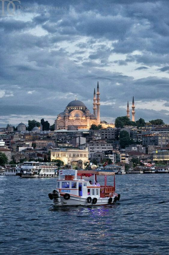
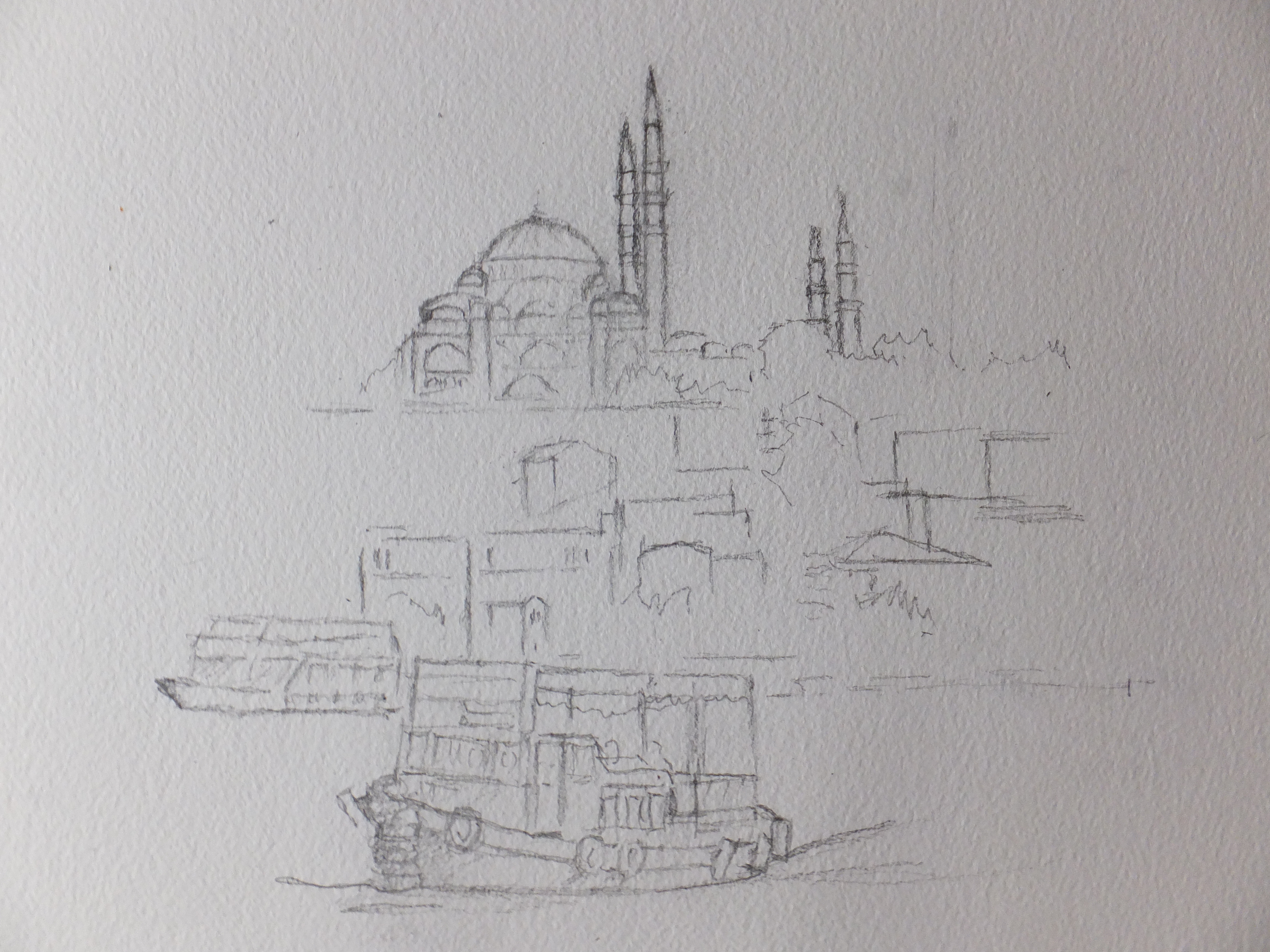
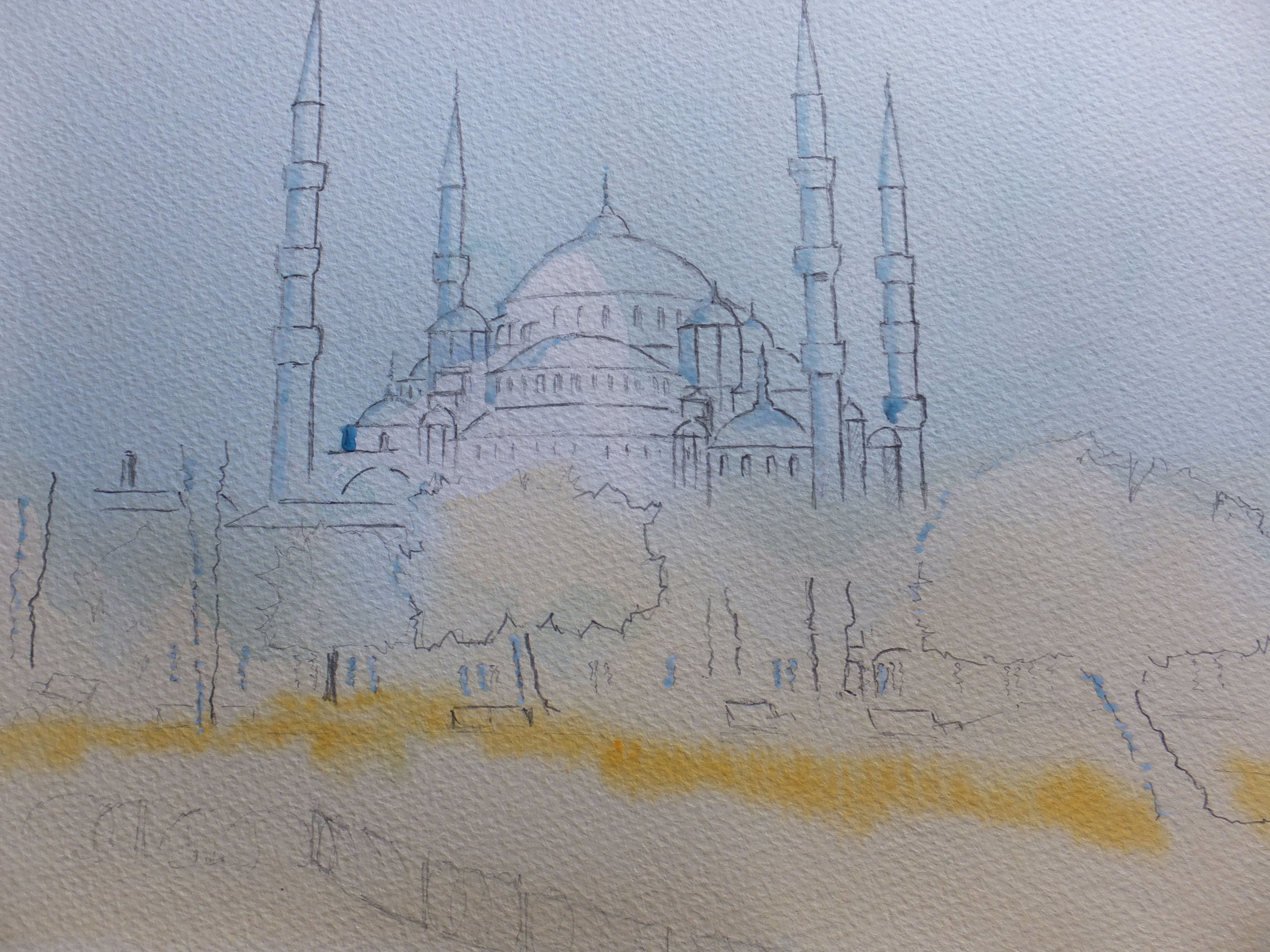
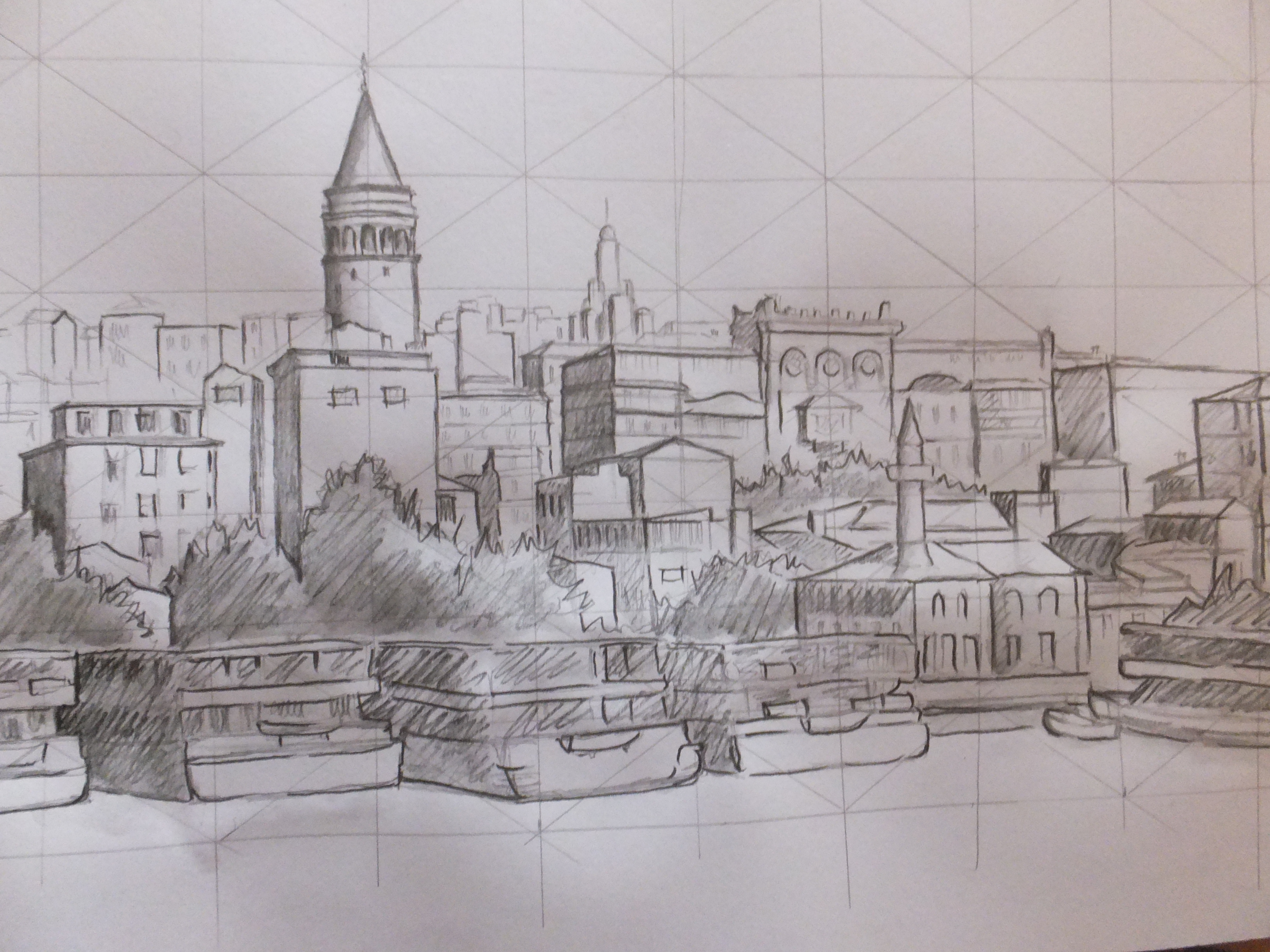
I have made a start on the drawing using the photographs that I featured on the last post. It is not complete yet but is sufficiently in place, so that we can talk about it. This will be a tonal sketch, rather as I did for the Langstone painting, which means that the shadows will have been worked out well in advance of the painting stage.

On this occasion, I have used Derwent sketching pencils which are soluble. I have cross-hatched the dark side of buildings, and then washed over with clean water to give a shaded effect. These are much more convenient to use than ink. I had forgotten that I had them, so that was a nice find.

I will get the image up before we go any further.Galata Tower, Istanbul

The important building in the picture is the Galata Tower, which was a watch tower and which gives a panorama across the city. It was built by the Genoese in 1348, and replaced an earlier tower destroyed by crusaders in 1203. The Genoese were a merchant community in Constantinople at the time, and I guess this was their way of expressing gratitude for the hospitality shown them

I will only be able to use two of the three photographs, as I want to keep the finished painting within 40 centimetres. This is a pity, as I had hoped to include the splendid red Turkish flag shown between two buildings on the third photo. Not to worry, I still have dashes of red in the foreground with the life belts and the small flags on the boats. Maybe I can do a postcard study of the buildings holding this large flag, at a later date

In case you don’t know, and my apologies if you do, using some red in the foreground is a useful device for artists. It is an aid to perspective, as red comes towards you, just as blue recedes. Distant scenery turns blue, as you have probably noticed.

Let me repeat, that this drawing is not yet complete. I will post the completed drawing when I have finished it

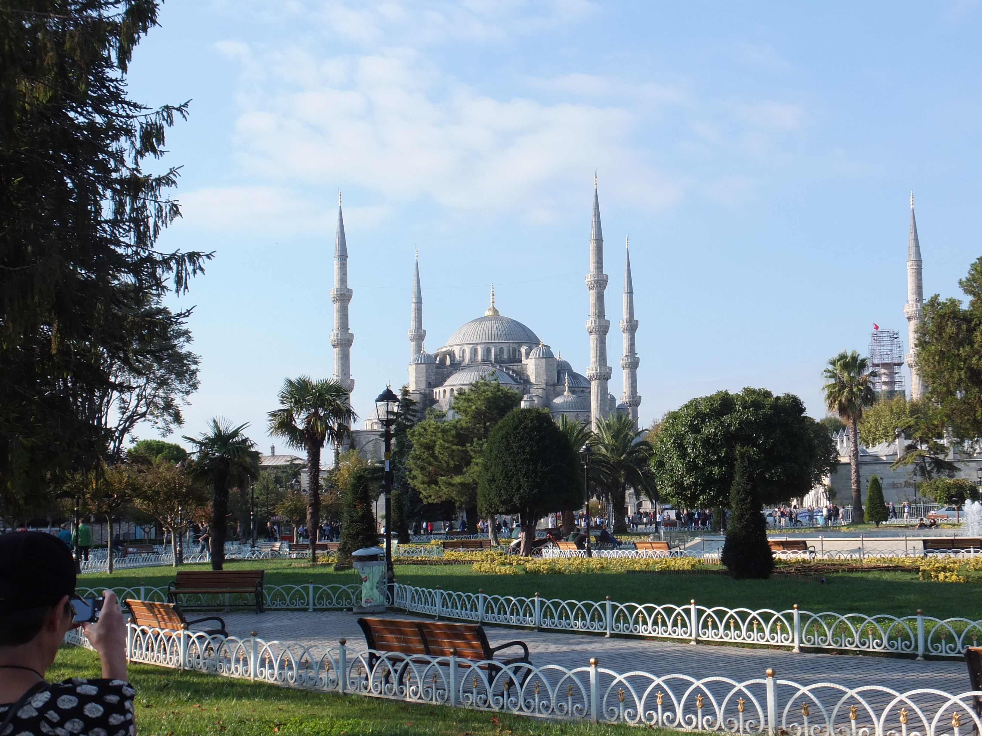
I also have photographic references of the Blue Mosque, which should make a lovely study at some time. The last time we were in Istanbul, which was 2001, so a while ago, we went to the Blue Mosque and Hagia Sofia, which I believe is a museum now. We also went to the ancient cisterns of Constantinople, that masterpiece of Roman engineering, where the city’s water supply was stored. I try not to use the word “awesome” too lightly but that really was.

This time we went to the Topkapi Palace and of course cruised along the Bosphorus. Istanbul is still one of those places I would like to return to.

If you are following this demo, then thank you. I will complete the finished painting in stages and post as I go