This is the painting that we always think of and this was shown for the first time in Paris in 1824
This became the style that the French referred to as a la Constable, rustic cottages,wagons in ponds and open fields and skies.
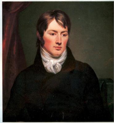
In the light of his French success, Constable’s continues determination not to travel abroad seems nothing short of bloody-mindedness if not pure rudeness. In spite of all inducements from Arrowsmith, from his friend Fisher, and even despite his gold medal was about to be presented by King Charles X himself he was adamant about refusing to go to France.He was thrilled with the medal which was later presented to him in London by the French ambassador. But he was resolved not to go to France
“I hope not to go to Paris as long as I live” he said. ” I would rather be a poor man here than a rich man abroad”. Well, be careful what you wish for. All of a sudden, as quickly as it came,Constable’s moment of French fame passed. By the end of 1825 he had fallen out with Arrowsmith. When the French market crashed like the British one during the mid-1820s, Arrowmith and another of Constable’s dealers Claude Scroth, went out of business. Constable’s commercial conduit dried up. He had sold more landscapes in a short space of time than had been bought by British buyers in years, but now the HayWain came back and The Cornfield was sent back from the Louvre in 1827 unsold

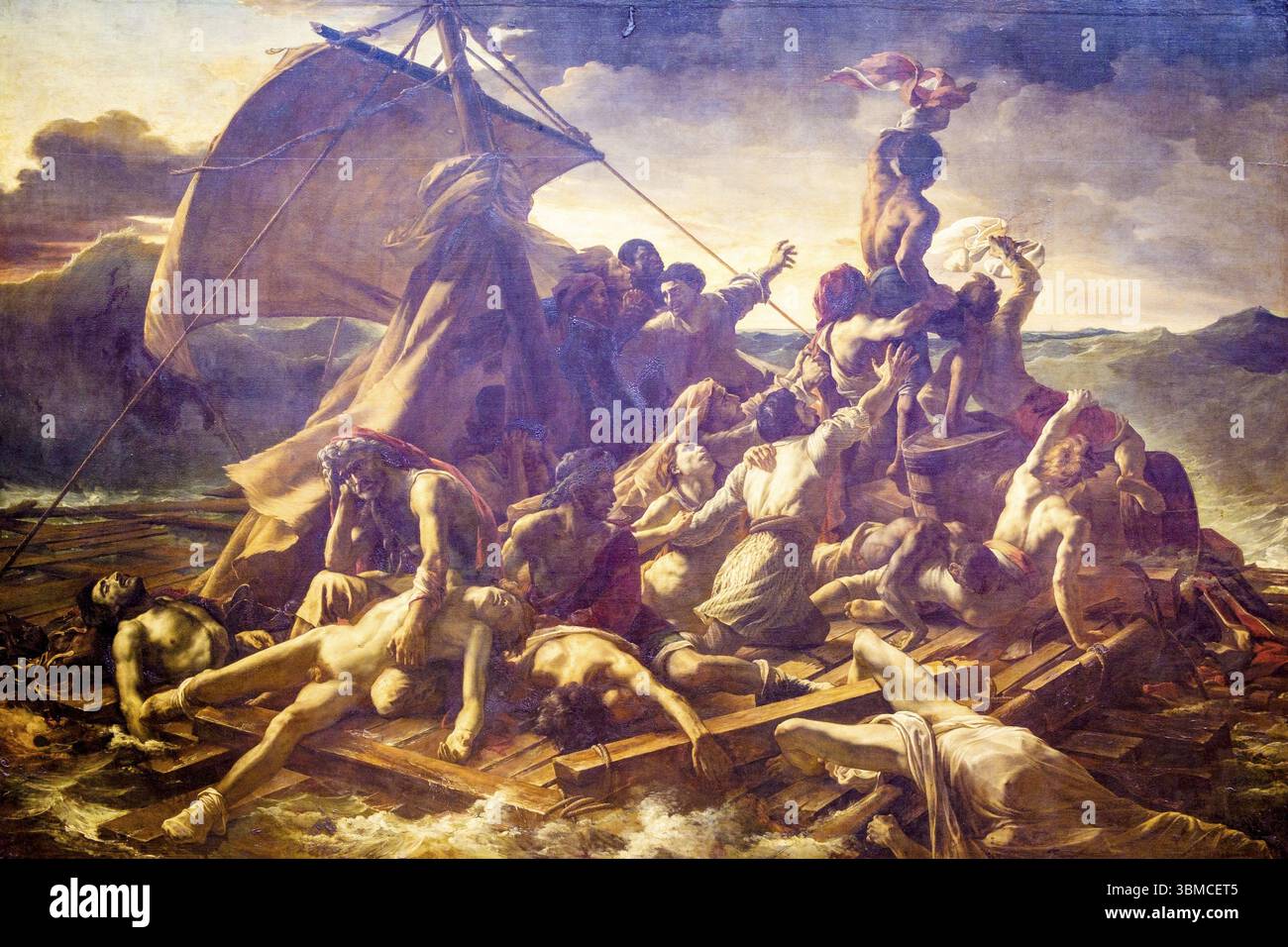
And there it is. It is in the National Gallery now
Constable hadn’t been the only successful british Painter at the 1824 salon. In fact so many British painters were showing , that it was known as the Salon des Anglais, which was quite a coup for the national contingent. Two others like Constable were awarded medals, and another made a Chevalier of the Legion d’Honneur. There seemed to be widespread approval of the so-called “British style” in landscape painting. If only Constable had been more amenable to travel and doing some networking he might well have prolonged his popularity. Delacroix for one was anxious to meet him, but although Delacroix came to London in 1825, and met other painters, there is no record of him meeting with Constable. You can’t imagine Turner squandering an opportunity to make such an important relationship. Quite the contrary, Turner went to a lot of trouble to meet Delacroix in Paris, in either 1829 or 1832. The urbane Frenchman was underimpressed with Turner’s appearance. Constable he described as ‘an admirable man…one of the glories of England’. He recorded Turner as looking’like an English farmerwith his rough black coat and heavy boots, and his cold, hard expression’. Later on though we was to concede that both Turner and Constable were the ‘true reformers’ of landscape painting
So on that note, let’s bring Turner bck into the story. Did Turner also fly the flag for the British School in Paris. No he didn’t.
He was conspicuous by his absence. Despite his enthusiasm for European landscape and despite his frequent travels, and the way he reinforced the preeminece of European culture, he was never represented at the Salon.
He rarely exhibited outside of his own country, only on two occasions and both times probably wished he hadn’t. The first was a solo exhibition in Rome in 1828 when reaction to his work was vitriolic to say the least. There was a cartoon going round which said ‘O Charlatan excrement is not art’ ! The second occasion was in Munich in 1845. Turner was the only British artist showing at an exhibition called ‘Congress of European Art’ Again his painting horrified the locals. The Germans were appalled by the loose handling and lack of form and regrettably interpreted this as a satire upon their country. To add insult to injury the picture was returned to Turner damaged , with additional carriage costs to pay. He was furious and apparently fussed over it ‘like a hen in a a fury’
An interestin paradox then in Turner’s relationship with Europe. Despite his extensive travels and his European outlook, his paintings had limited appeal abroad during his lifetime. It was Constable who was the more prominent of the two. To this day, it remains one of the more unlikely developments in Western art history.