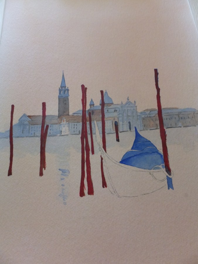
Now that my exhibition work is finished pro tem and before I go away for a while, I thought I would look at some exercises that I have been meaning to do, yet never found the time
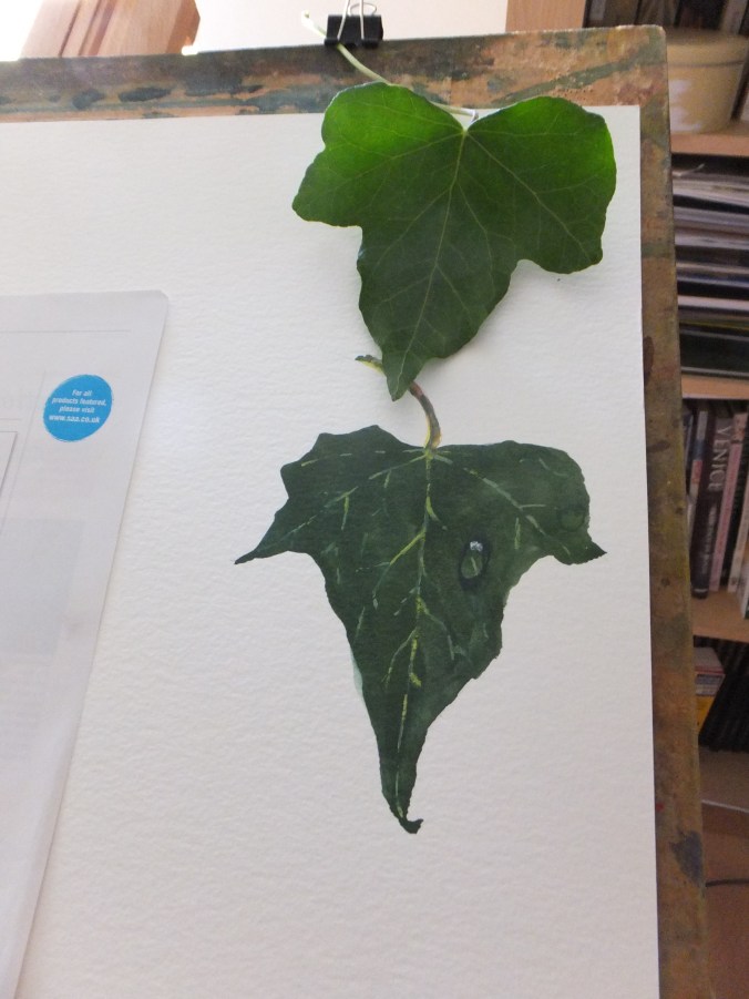
This one I owe thanks to Susan Neale who did this demonstration in the Paint magazine some while ago.
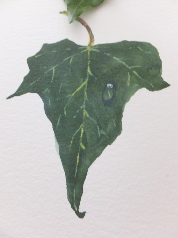
She mixed the leaf colour with indigo and lemon watercolour. I have to say, one of the most accurate dark leaf greens I have seen and I have included a real leaf in my picture to compare
Using her own words, more or less:
- Using the dark green mix, paint the leaf shape with a no 7 brush. Add the veins using a mix of white gouache mixed with the lemon yellow ( I did add a little of the pale green too)
- When dry, draw the dewdrop shape. Now with dark green colour add the shadow area at the top of the dewdrop. Soften the shape with clean water and allow to dry
- Paint the cast shadow at the base of the dewdrop, using a darker shade of green
- To finish, using the white gouache, apply a rounded dot to the top of the bubble and a highlight to the bottom end
As for my attempt, well, could improve with practice perhaps
A useful little detail if you can master it
I won’t be posting anything for a while so don’t get upset if I don’t respond