This painting refers back to one of my rare outdoor painting trips with the Pirbright Art Club, when we went out to New Haw Lock on the Wey Navigation. An ancient waterway, the Navigation connects Godalming with the Thames, and is part river and part canal system, which is why it is called a navigation and not a canal.
The lock-keeper’s cottage is easily the worst house that I’ve ever drawn in my life, and I should be ashamed. Well I am. I have managed to crop out most of it and just left enough to give some colour and relief against the trees. The proportions are wrong. Perfectly correct when I sketched this scene on the day, but somehow when I enlarged and transferred the sketch both proportions and perspective went out of the window. I don’t know where my head was that day.
As I was about to leave, these two girls arrived to open the lock gates. Here they are opening the sluice gates to fill the lock with water before opening the gates. I photographed them quickly thinking they might be useful to put in the picture, as sometimes these scenes can be improved with the addition of one or two figures.
In actual fact, they became the picture, as I pushed the house more and more out of sight. Part of me still considers focusing on the two girls completely, without including any house at all, but can’t decide on that. The two figures are sharper on the painting than they are in the photograph
I’m busy getting paintings together for another exhibition in the Leatherhead Theatre in October, so would like to include this one, if I can
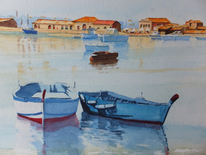
Looking forward now to working on something new, as I have been working on New Haw Lock for some time now and could do with a change. As for what I shall do next, I think I will do another long panoramic picture, probably of Langstone Harbour, which I have done before but not as a panoramic. The last one that I did, of Bosham, I sold recently from the web site, so could do with something else.