Back in the summer, we toured the Baltic. At one time we did eight shore excursions in eight days. Even by cruise ship, we found this tiring because of our age, especially my wife who has walking difficulties, so we might not attempt this sort of holiday again. Copenhagen was just one of the stops we made in Denmark
Touring the canal system was fun. i like painting boats and this was just one scene that I snapped for reference. Quite a lot of light and dark in this shot. The sun was very bright especially on the buildings in the background. Deep shadows were cast by the trees, which accentuated the boats. The figures on the canal side were reduced to silhouettes. It took me several glazes to get the water to be an acceptable colour, whilst at the same time still looking transparent. This was more of an exercise about light against dark, than anything else
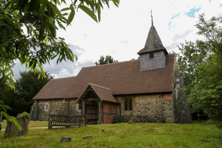
I have been commissioned to paint this church, the village church of Pyrford in Surrey. Ancient yet still in use as a parish church, it is set in a tranquil spot, and is quite charming. The lady who commissioned it no longer lives in the area. Her parents are buried here, so a meaningful place. I always feel very priviliged being asked to paint places that are so important in people’s lives. I am working on it at the moment and will post the result
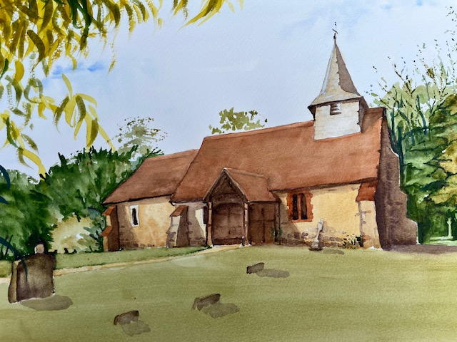
This is how the painting turned out. I have put sunshine into the painting as the photograph was taken on a very dull day, so the colours are brighter. The lady who commissioned this painting was very pleased, which is always a relief
I have another commission now, quite different to the last, This one is a wedding venue, which I get asked to do from time to time. This one involves marqees and the newly wed couple strolling in the grounds around a lake, so quite a lot of different things to worry about, Still it’s good to have these commissions coming through as sales from my gallery are poor at the moment. Times are hard everywhere still and doubtless will be for some time
I come back to a subject I never tire of painting. The historic church in the parish of Pirbright in Surrey
Dedicated to St Michael and all Angels, the church has saxon foundations and was a site of worship before then. The current church building dates from the c18. The churchyard is notable for its wildlife and also contains the grave of Sir Henry Morton Stanley, the explorer, he who found Livingstone, and said the immortal words “Doctor Livingstone I presume”. He is also well known for the discovery of the sources of the Nile and the Congo rivers The headstone is a huge piece of granite with his African name, Bula Matari 1841-1904 The funeral service was in Westminster Abbey but the interment was here at Pirbright, near his country home at Furze Hill.
This is my photograph of Stanley’s grave with its monolithic headstone
I have painted this church on a couple of occasions over the years. One painting I did in the snow which was well received. I was especially thrilled at the end of last year, for that particular painting to be printed as a greeting card by the church and sent to everyone in the parish, setting out the times of services over the Christmas period. I will see if I still have an image
This was the painting done in the snow. I’m not sure that I don’t prefer it to the one that I have just done. Looser somehow. Also there is something about snow with sunshine that softens the light beautifully. The trees on the left have been removed since I did this painting
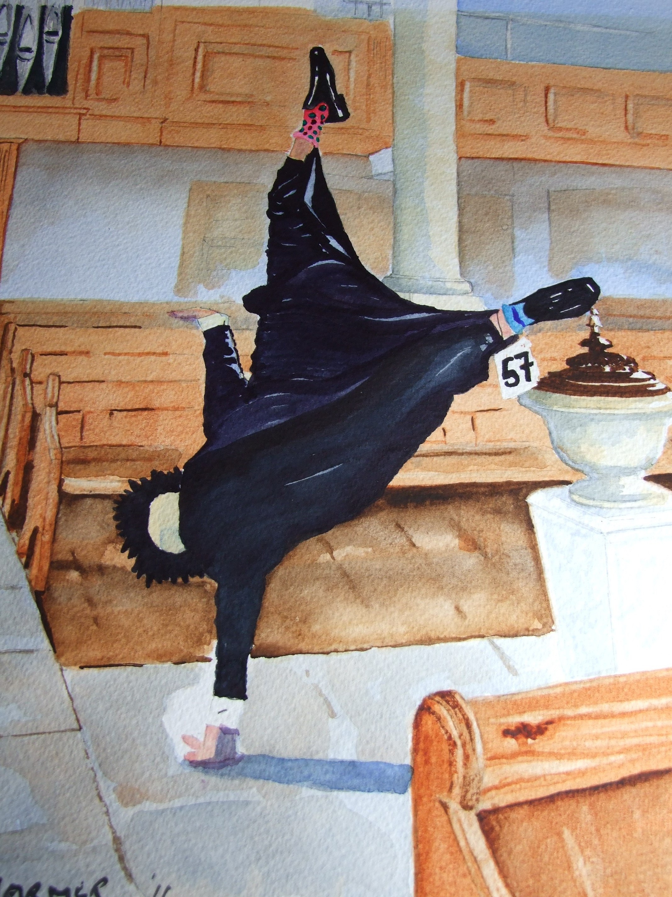
Although I don’t actually live in Pirbright, I do get involved through the Pirbright Art Club which i have belonged to for many years. Pirbright like so many villages, has an annual fair and the art club would take a stall. The theme for some years was scarecrows, and ingenious examples were made, very often characters from literature. Do you remember the wedding of the Prince and Princess of Wales? After the service the Dean of Westminster cartwheeled down the centre aisle, presumably overjoyed. An amazing scarecrow was made and was on display in the church. I painted it. I’ll see if I can find it
I was proud of this painting. I exhibited it locally expecting it to be snapped up. It wasn’t! In the end, I sold it online to a buyer in the north east of England. How strange was that. Afterwards the buyer wrote to me and told me he looks at it every morning and it cheers him up for the day, so it was worth doing just for that.
I’ve been off the air for a while. I had to get a new PC as part of an upgrade, and of course, nothing was where I remembered it. I couldn’t find my way back into my blog, or not at least to the page where I coud write something, and I can’t pretend the seemingly helpful robot was any use to me. Anyhow after a tortuous journey I can now post again
As I have been away for a while I thought I would just do a compendium of more recent paintings, just to catch up, and start with one called Gondolas. Always a favourite subject, and this view with San Giorgio Maggiore in the background I have painted and sold several times. This shot is completely different to any that I have done before
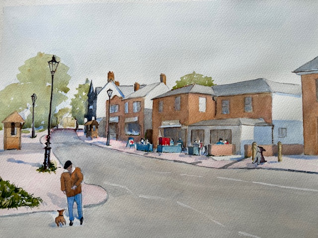
I have also been painting some views of my local village, something I have neglected in the past. This shot I put on the village website and received over 150 hits. I am pleased to say that a gentleman in Canada ,who used to live locally, bought it, Always that extra buzz when a painting makes a long journey
This view just shows some of our shops, so being a village we only have indepemdent shops which is a nice relief to seeing brands all the time. In the background by the trees is the bridge over the canal, which was cut in the late c18. In fact the village grew up around the canal. The name St John’s came from the church which was built here as a Chapel of ease for the villagers
The hub of the village is the coffee shop which was started only about ten years ago and provided a much needed meeting place and alternative to the nearest pub.
I have been getting commissions which is always nice. A more recent one shows a country house hotel called Gravetye Manor, which I have painted before. This is a different view in evening light commissioned by a guest who had a meaningful stay there
This is a mistake but I will leave it there. An old shot of Venice. I will now try and find the shot of Gravetye Manor
Succesful this time. An evening shot with the last of the sun catching the roof tops, so it worked well
There are others but I will leave it there. I am not long back from a trip up the Baltic as far as and including Helsinki so quite a lot to digest. I am going to try and put a post together about that voyage. On the art side, we went to Skagen on the northern most tip of Jutland. Artists in the c19 were attracted there by the wonderful light and their work is just breathtaking
I am going to try and be more regular now that I have got back control, and am grateful for the help I have received
Described as Newark Abbey which is in fact Newark Priory, and even Newark Priory Church. The priory was a huge complex, and the ruined church is all that is left after the Dissolution . It looks to me that Turner sketched this from the road. The view is much the same today. The land is privately owned so close inspection is not possible. Cows are in the field much the same as Turner’s sketch. Newark Abbey is near Ripley as a point of reference. This painting is in Tate Britain
After the dissolution it was said that the priory was bombarded by cannon from nearby Pyrford Hill. After that the site must have been robbed for stone, as the ruined church is all that remains, apart from the odd outcrop
Turner would row down the river. We know that he stayed at the White Lion in Guildford, and at another in inn in Walton-on-Thames. He also thought nothing of sleeping on his boat. He was also a prodigious walker, known to cover 25 miles in a day including making sketches on the way. Sometimes he would set out with company and leave them behind if they couldn’t keep up
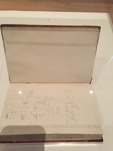
This is the entrance to Quarry Street in Guildford today. It is not by Turner! This is my painting made about twenty years ago. There is a link with Turner albeit a tenuous one. In order to take the reference photograph for this painting, I had to step back into the White Lion Walk in order to keep the bright sunshine out of my lens. The White Lion Walk is the shopping arcade which now stands on the site of the old White Lion Hotel. Let’s look at the next picture.
This is by Turner! It is one of his sketch books and shows the same view which I made years later, which still amuses me. I am sorry the image is so pale, but he worked in pencil. You can see the building on the left is much the same and the ancient church of St Mary stands in the background exactly as it does today On the right hand side is an inn much as today. Turner sketched this whilst staying at the White Lion in Guildford. Was he in the lounge relaxing or in his room. We know he didn’t like an audience so maybe the latter
We’ll leave it there for now and continue Turner’s drift down the Wey at some later date
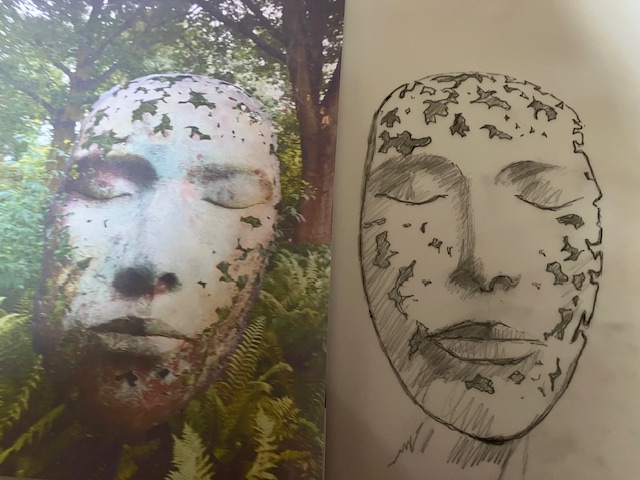
I have talked about this sculpture before. Leaf Spirit by the sculptor Simon Gudgeon, which is in Kew gardens. This isn’t the only example of this sculpture but the only one that I have seen. I did a blog about this some years back. It is in my opinion, an amazing piece of work, and I did wonder at the time whether I could attempt a painting of it, and in watercolour too, which will be a handicap in this instance.
This isn’t about the result, but more about the exercise and what I will learn from it. i suspect that it will be a steep learning curve, to coin a well worn phrase
I have found this to be a very hard year for selling paintings. I am not alone in this. There is a dearth of disposable income around the world. Competition for sales is fierce at the moment. Fortunately this is not my day job but for some artists life is tough. My mentor at our local art club has given me very good advice. Step out of your comfort zone, and paint things which challenge you. Don’t necessarily paint subjects that you expect to sell. So I have made a start on Leaf Spirit. I have done the drawing which has been surprisingly tricky. No matter how often I checked my measurements, the expression on my face is not quite the same as the one in the photograph. Mine looks more feminine for some reason, but it could change again with colour added.
I will go on with this at another date. I have some other projects queuing up and they too hopefully will take me in new directions. This could be the start of something totally different, a change of style even. For now, we will see where it takes us. Good I am starting to get inspired again
Magnificent exhibition at Tate Britain entitled Now You See Us is on until early next month. I wish I had gone sooner as this is an exhibition that needs more than one visit. It covers the work of women artists from 1520 – 1920, during ages obviously when women were subservient to men in most walks of life. Their work very often epitomises their struggle for recognition.
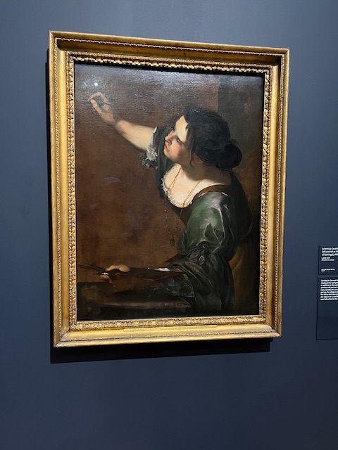
One of the earlier examples, a self portrait by Artemesia Gentileschi, an Italian artist working in London during the reign of Charles I, In London she worked for Charles I and Queen Henrietta Maria, and two works in this exhibition are from the Royal Collection. The other one is Susannah and the Elders, a popular Old Testament sory who was observed bathing by two of the elders, and sexually assaulted. The usual story, the elders tried to make out she was a whore but later her innocence was proved.
There were an amazing number of artists represented working through the ages. Very few did I recognise. Gwen John was one, and her self portrait was used in the exhibition publicity. In fact the work of hers shown was in my view some of the least inspiring.
During the 18c the work of the Royal Academy centred round oil paintings. Other media was looked down upon. Joshua Reynolds was especially sniffy about watercolour, pastel, embroidery and any sort of craft as being work that women did at home for their own amusement.
Gradually, and as we move into the c19 women are starting to meet men on equal ground. Two paintings which greatly impressed me were:
Colt Hunting in the New Forest by Lucy-Kemp Welch
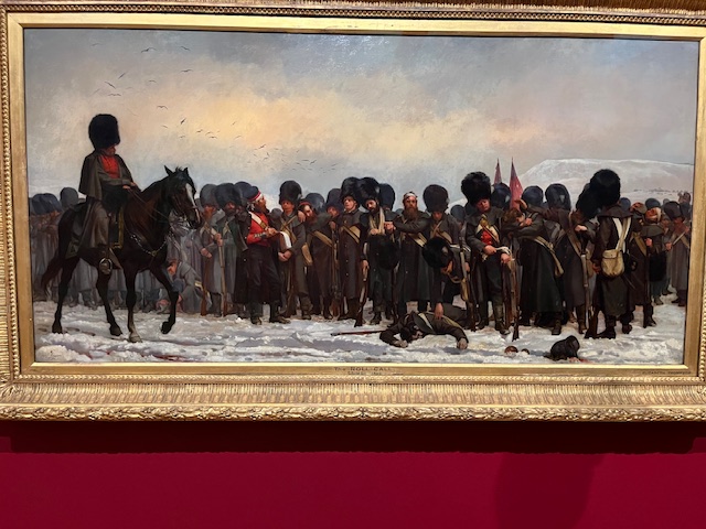
The Roll Call by Elizabeth Butler, a painting of Guards Regiment in the Crimea. This painting was summoned to the palace for a special viewing by Queen Victoria. It sold for the staggering sum of £1200
Both of these were sensations in the art world at the time. Both were hung “on the line”, which means they were hung at eye-level, a great tribute by the hanging committee of the Royal Academy
Colt Hunting in the New Forest which is an enormous painting
The Roll Call by Elizabeth Butler
My photographs are not very good alas, done quickly avoiding other viewers.
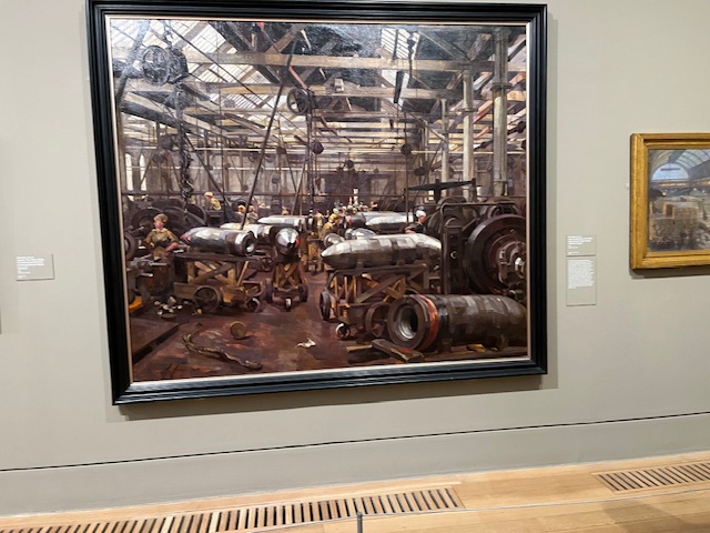
Finally. a painting by Anna Airy, commissioned by the Imperial War Museum, Shop for Machining 15″ Shells, shows women doing factory work in 1918. This was the old Singer sewing machine Company factory on Clydebank. Important work and an important painting
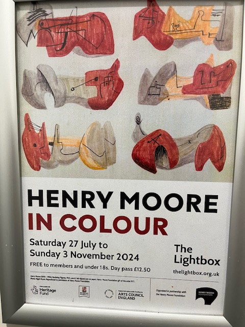
Yet another excellent exhibition at Woking’s Lightbox art gallery. Small, obviously, size dictated by the venue but focused and to the point. We, in Woking, are so pleased as following the bankruptcy of the town brought about by reckless investment, the fate of the Lightbox has been in the balance. Deep cuts are having to be made, and when difficult choices and sacrifices are having to be made, then difficult sometimes to make a case for our wonderful art gallery to be saved. So far it has been managed by the new local government and we are grateful for that. The Lightbox is relatively new, in a town with virtually nothing by the way of heritage or culture, so the rise in prominence of our gallery has been a matter of civic pride. We hope it will continue
Henry Moore is well known, and if like me you tend to remember his wonderful sculptures, then it is useful to be reminded that he painted as well, and some while ago too. When reminded, of course I remember his drawings and paintings of people taking shelter during air raids in London, in the underground railway stations. This exhibition highlights some of these works, known as the Shelter drawings commissioned by the War Artists Advisory Committee during the last war. These Shelter drawings were responsible for achieving widespread recognition for the artist following their display in the National Gallery. When you look at some of these drawings you start to see forming some of his later sculptures and I will show one if I can as an example
Certainly the first one I think I have seen as one of his sculptures!
Many years ago, there was a major exhibition of his sculptures in Kew Gardens, and I painted one of them that was placed in front of the Palm House. By way of light relief, I will end with it here
A figure stretching after a night on a cold platform? Might be
This is the centre of my local village, St John’s near Woking. The name St John’s was taken from the local church, built in the c19 by the then rector of Old Woking, as a chapel of ease for the village inhabitants. Quite a long walk to church otherwise in a century when no one had transport.
The village is mostly Victorian, and although surrounded by suburbia, does still retain its village atmosphere and integrity. Life started here in the late c18 when the canal was cut through open heathland. In the distance in my picture, the road makes a hump, as it crosses the canal. This is Kiln Bridge, where as the name suggests bricks were made from local clay, and these were used in the building of the canal. The canal was intended to link London with Southampton, but only reached Basingstoke before the railways were built and superseded canals. This was still a time when war with France was a possibility, and inland links with major south coast ports were desirable.
Today the Basingstoke Canal is maintained by Surrey and Hampshire County Councils. There is some leisure boating but not much. Wild life proliferates and the towpath is used for cycling and walking.
This is the very first time that I have painted my own village. I don’t know why. I put this painting on a local website and had more than 240 hits. All complimentary, I am pleased to say. No offers to buy though.
In the middle of the picture is our comparatively recent coffee shop, which has become the hub of village activity. Walkers and shoppers meet there to relax and catch up. We never had that before and it is a very welcome addition. We do have a pub but located going out of the village, so not so convenient. We have most shops so a useful selection.
At the bottom of my lane, we are blessed with a green open space, called St John’s Lye. Lye, lea or leigh means a green space. It is common land and so protected although we did have to physically resist Woking Borough Council who wanted to build a village hall on the Lye to replace the one that was starting to fall down. Eventually common sense prevailed and the new hall was built on the site of the old one. The Lye is available to all age groups for spontaneous activity including dog walking.
And so you have it. Not a place that many know, but loved by its local population
I shall publish a recent picture soon of this fascinating house, which Turner had a hand in designing together with his friend and near neighbout John Soane
And this is it in Sandycoombe Road in Twickenham, where we made a visit recently
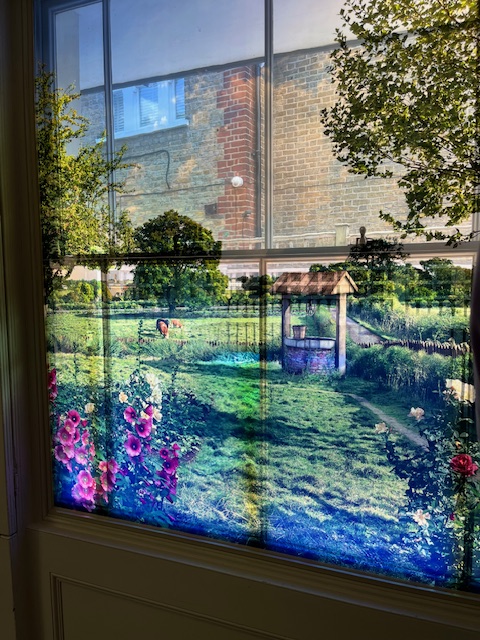
Turner built this house in the style of a small country villa, in 1813, for himself and his “old dad” William, where they spent much time relaxing away from his London gallery. At the time it was way out in the country. Later on in the latter part of the c19 it was surrounded by suburbia, as it still is today. Quite historic suburbia now of course, but suburbia nonetheless. If I can find it I have somewhere a recreated view from the dining room window at the time that Turner lived there.
And this is it. Tranquil pastoral countryside image on the window of the dining room. Quite clever. The garden with well,and meadows beyond. Ignore the brickwork showing through the upper part of the window. That is the house next door today in real life, which we can’t block out
How did Turner live at Sandycombe Lodge? Did he paint there? He always went with sketch book in hand, studying the landscape, and its changing moods. It was believed that he used the drawing room as a studio. It had French windows facing north-east from which friends recollect that Turner would refresh his eye.
He used a pony and gig for getting about on sketching trips.The pony was the “old crop-ear” who may have grazed on Turner’s nearby meadow, and whom Turner buried somewhere on his land. No stables are recorded on of the later maps, he must have been stabled elsewhere, perhaps at the nearby Crown Inn.
Fishing was a quiet pleasure shared with friends, many of them fellow artists.The Thames nearby provided an abundant supply.Turner made some beautiful watercolour studies of tench,trout and perch, the catches of some of these expeditions. Often he was accompanied by John Soane, who was also an enthusiastic eel catcher
One of the most prestigious acquaintances Turner made during his time at Twickenham,was the Duc d’Orleans later Louis Philippe, King of France, who lived with his brothers near the Thames at Highshot House in Crown Lane from 1800-1807. Turner met the Duc at a Royal Academy dinner in 1802. Later, between 1815-1817 the Duc was again in exile in “dear quiet Twick”, this time in a house which is still there, named Orleans House which today houses a prestigious art gallery. They must have become firm friends as Louis Philippe gave him a gold snuff box when he came to England for Queen Victoria’s coronation in 1837. Turner took his last continental excursion in 1845, and called on Louis Philippe, who had a chateau on the coast of Picardy, and enjoyed a convivial evening of chat about Twickenham.
The other incumbent of Sandycombe Lodge, was “old Dad”, Turner’s father William, retired barber of Maiden Lane, Covent Garden. He kept house and also opened up the gallery for his son in Queen Anne Street. They both enjoyed frugal living, as William complained about the cost of getting into London, easily affordable by Turner. He was overjoyed to find a market gardener who would take him in on his cart sitting on the vegetables, for the price of a glass of gin!
After 1815, and the Napoleonic Wares drawing to a close, Turner could at last travel on the continent, and we know well, his wonderful paintings of the Alps which he crossed into Italy. Likewise magnificent views of Venice. The Low Countries and Germany were on his list.
He kept Sandycombe on for his father, who enjoyed the life there, but by 1826, William’s health was failing, and indeed by 1829 died. Turner had removed him back to Queen Anne Street before then. Sandycombe had become an irrelevance by then and I believe was sold for a modest £500, ironically less than Turner might expect for a major oil painting. Old William’s death affected Turner greatly. They were very close.
The house enjoyed a long life after Turner, and has now been fully restored , brought back to life by Harold and Ann Livermore, who bought the house in 1947. Ann died in 1997, and Harold established the Sandy Lodge Trust, now Turner’s House Trust, to preserve and maintain the property, which is now open to visitors and certainly worth a visit.
This is the finished painting which I have called Windswept
I have done quite a lot of work on the horses as you can see. One horse in a familiar grey colour whilst the other in deep chestnut with black mane and tail, whilst also with black legs. Manes are swept out in one direction, as well as tails. Powdered snow is being kicked up by their hooves. The general effect I like to believe, is one of storm and threat even of chaos. I will let others judge
I have, I hope kept the strong light coming in from the left. The snow heightens that effect.
Not an easy one to put together. At times I was tempted to abandon, but I usually like to finish before condemning a painting to the bin. I am generally happy with this one, and comments on social media have been enthusiastic