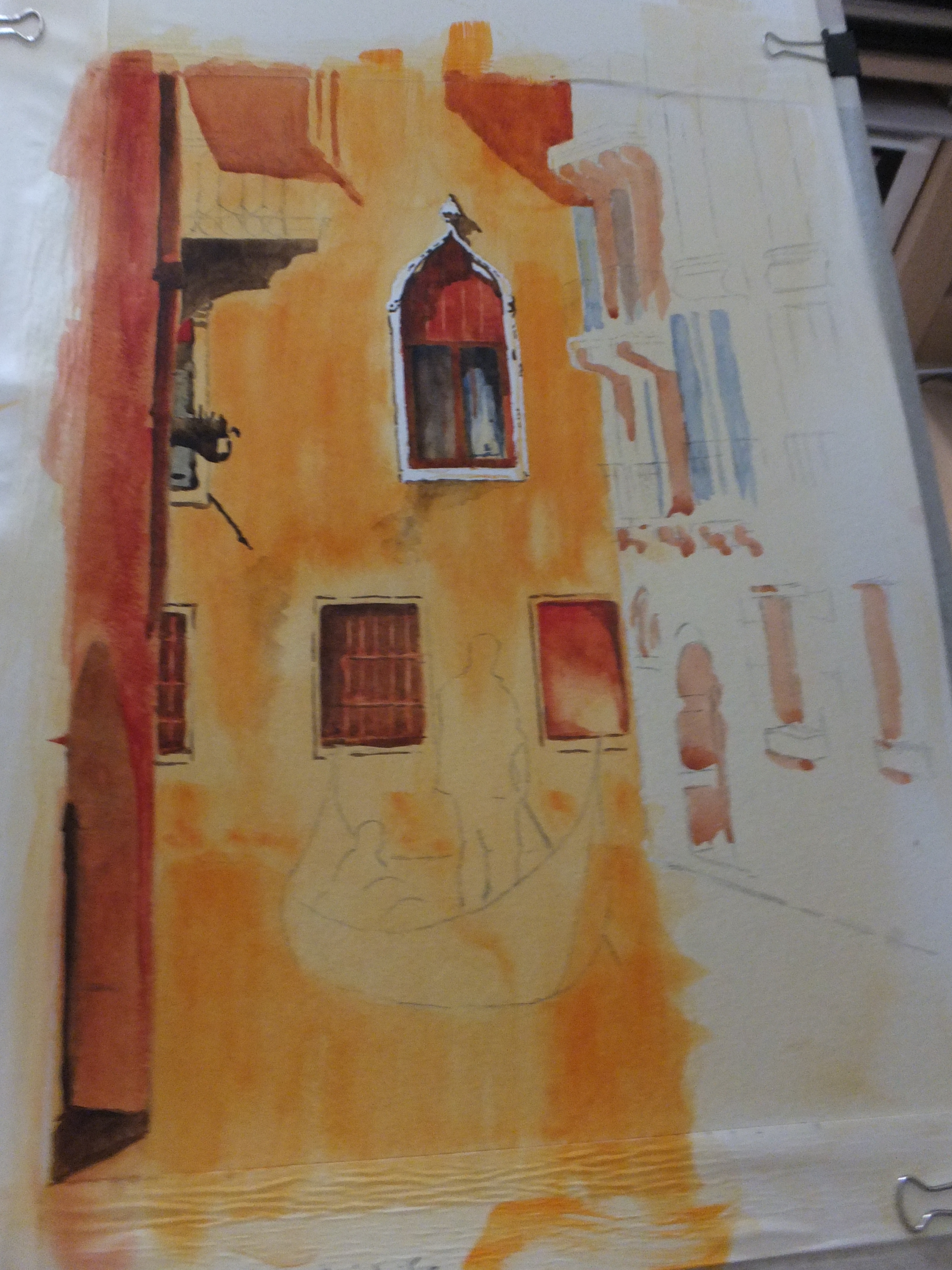
In between doing other things, I have been working on this long painting of the Old Fish Market and neighbouring buildings along the Grand canal.
I started with my favourite Mediterranean sky colour, Phthalo Blue mixed with Cobalt Blue, worked into a mix of Raw Sienna and Naples Yellow as a basis for the buildings and then back into the sky colour for the water.. I have given the water one coat of Phthalo Green, which has had no effect whatsoever, so will have to go over it again. I do want it to look green rather than just a mirror image of the sky
The rest of the painting is mostly painstaking detailing. I have put in some deep shadow in places and have done a few windows, but must summon up the strength to do more. But this where we are for the moment, crossing my fingers that all will be well in the end.
I quite enjoyed putting in the red and green blinds on the market building. They were part of the attraction of the scene. But as I always say, the painting must be finished before a judgement can be made
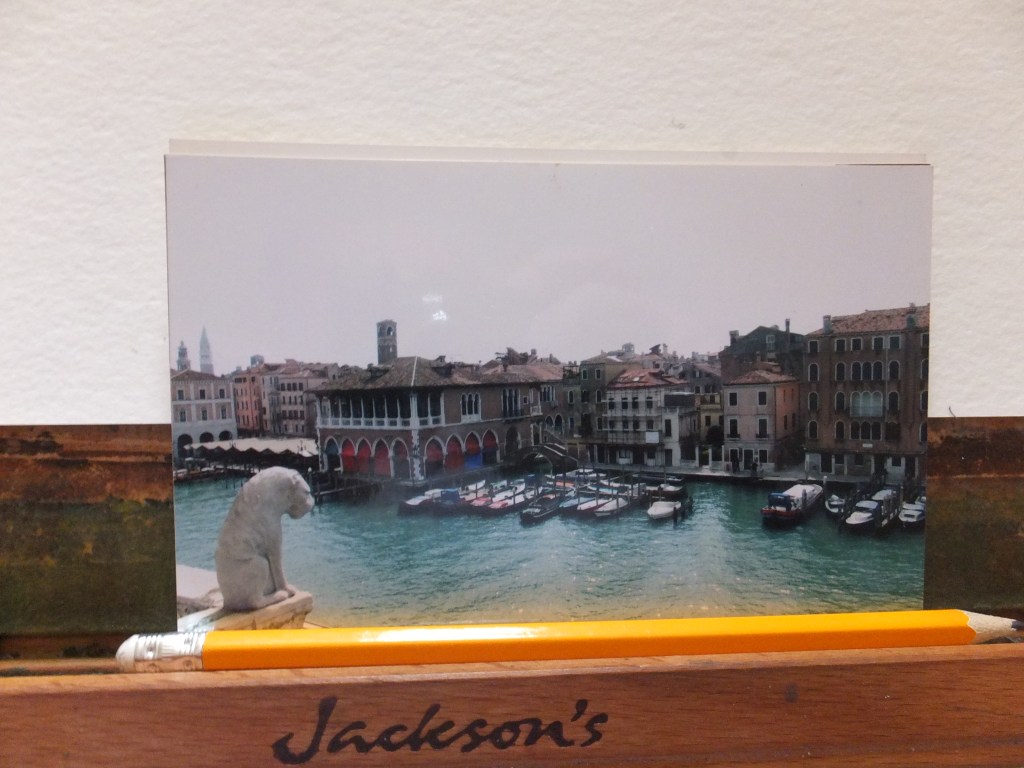
My very bad photograph can act as a reminder of the scene that I am trying to capture in paint.
Whilst writing, I extend deepest sympathy to the people of France for the fire at Notre Dame de Paris. Very sad moment. It will be rebuilt and be glorious again but upsetting for now
- Alhambra
- Amsterdam
- Ancient English Ports
- Ancient Greek Temples
- Andalucia
- Andy Warhol
- Animals
- Arles
- Art Exhibitions
- Art Nouveau
- Artfinder
- Arts and Crafts
- Aubrey Beardsley
- ball Point Pen
- Barcelona
- Barges
- Baroque
- Basilica of Sacre-Coeur de Paris
- Bath
- Beach
- Bicycles
- Boat Paintings
- Book Illustration
- Bosham
- Bosham Harbour
- Bosphorus
- Brittany
- Buildings/Architecture
- c13 woollen industry in Britain
- Camargue
- Camden Art Group
- Canal Bridges
- Canals
- Castles
- Cathedrals
- cats
- Cefalu
- charity auctions
- Chichester
- Chinoiserie
- Christmas Street Scene
- CLASSICAL aRCHITECTURE
- Competitions
- Conkers
- Constable
- Copenhagen
- Corfu
- Cornwall
- Correcting mistakes in watercolour
- Country Churches
- Country House Hotels
- Country Houses
- Danube
- David Hockney
- Devon
- Dewdrop on Leaf Detail
- dog portraits
- Donkeys
- Dorich House Museum
- Dragons
- Eagle Comic
- Education
- Egypt
- Egypt Equine Aid
- Eifel Mountains
- Elizabethan Country Houses
- English Country Gardens
- Equipment and work space
- Ferry Boats
- Figures in Streetscape
- Fishing
- Fishing Boats
- Flamingos
- Florence
- Fountains
- Fountains Abbey
- France
- French Impressionists
- Frog
- Frogs
- Galicia
- Garden Statuary
- Gardens/Floral
- George Gilbert Scott
- Georgian Architecture
- Georgian Gazebo
- Germany
- Gondolas
- Granada
- Grayson Perry
- Guildford in Surrey, UK
- Harry Potter
- Henry Moore
- Holland
- Horses
- House Portrait
- Hungarian Cattle Country
- India
- Islamic Art and Architecture
- Istanbul
- Italian Chapel
- Italy
- Jane Austen
- Kew gardens
- Kew Gardens
- Knights Templar
- Langstone Mill
- Leaf Soirit
- Leatherhead Theatre
- Life in the 1950s
- Light and Dark
- Lightbox, Woking
- Lock Gates
- London
- London Docklands
- Louis Philippe
- Ludlow
- Marinas
- Maritime History
- Marsala
- Mary Wollstonecraft
- Marzamemi
- Medieval Undercroft
- Mediterranean
- Mice
- Mosques
- National Trust
- Night Sky
- North Sea
- Notre Dame de Paris
- Opera
- Orkney
- Ostrich
- Oxford
- Pagoda
- Painshill Park, Cobham
- Painting Snow
- Pallant House Art Gallery, Chichester
- Paris
- Pattle Sisters
- Paul Nash
- Payne's Grey
- Pelican
- Period House
- Photography
- Plas Newydd, Anglesey
- Ponte Vecchio
- Portsmouth Harbour
- Post Impressionists
- Pre Raphaelites
- Preliminary Sketch
- Properties of Watercolour Paints
- Ragusa
- Railway Stations
- Reviews
- Rex Whistler
- Richmond Hill
- River Wey
- Rome
- Rossetti Family
- Royal Surrey Hospital
- Sagrada Familia
- Sailing Boats
- Saxon England
- schooldays
- Schools
- Scotland
- Sculpture
- Seascapes
- Sicily
- Sickert
- Sidney Sime Gallery
- Simon Gudgeon
- Simon Gudgeon
- South Africa
- Southampton Art Gallery
- Spain
- Spinnaker Tower
- St Johns near Woking
- St Katherine's Dock
- St Thomas a Becket
- Stanley's Grave
- Still Life
- Sunset
- Surrealism
- Surrey Villages
- Swans
- Syracuse
- Tate Art Gallery
- Terra Cotta
- Textbooks
- Textured Finishes
- Thames
- Tower Bridge
- Townscapes
- Transylvania
- Tudor Houses
- Turner
- Twickenham
- Uncategorized
- Van Gogh
- Venice
- Vignette Style
- War Artists
- War Graves
- Water Birds
- Watercolour
- Watercolour Painting
- Waterscapes
- Watts Gallery
- Wet-in-wet
- Wey Navigation
- William Blake
- William Payne
- Windmills
- Winter Street Scene
- Wisley Gardens
- Women Painters
- Working to Commission
- World War 1
- World War 2
- World War 2 Architecture
- Yorkshire