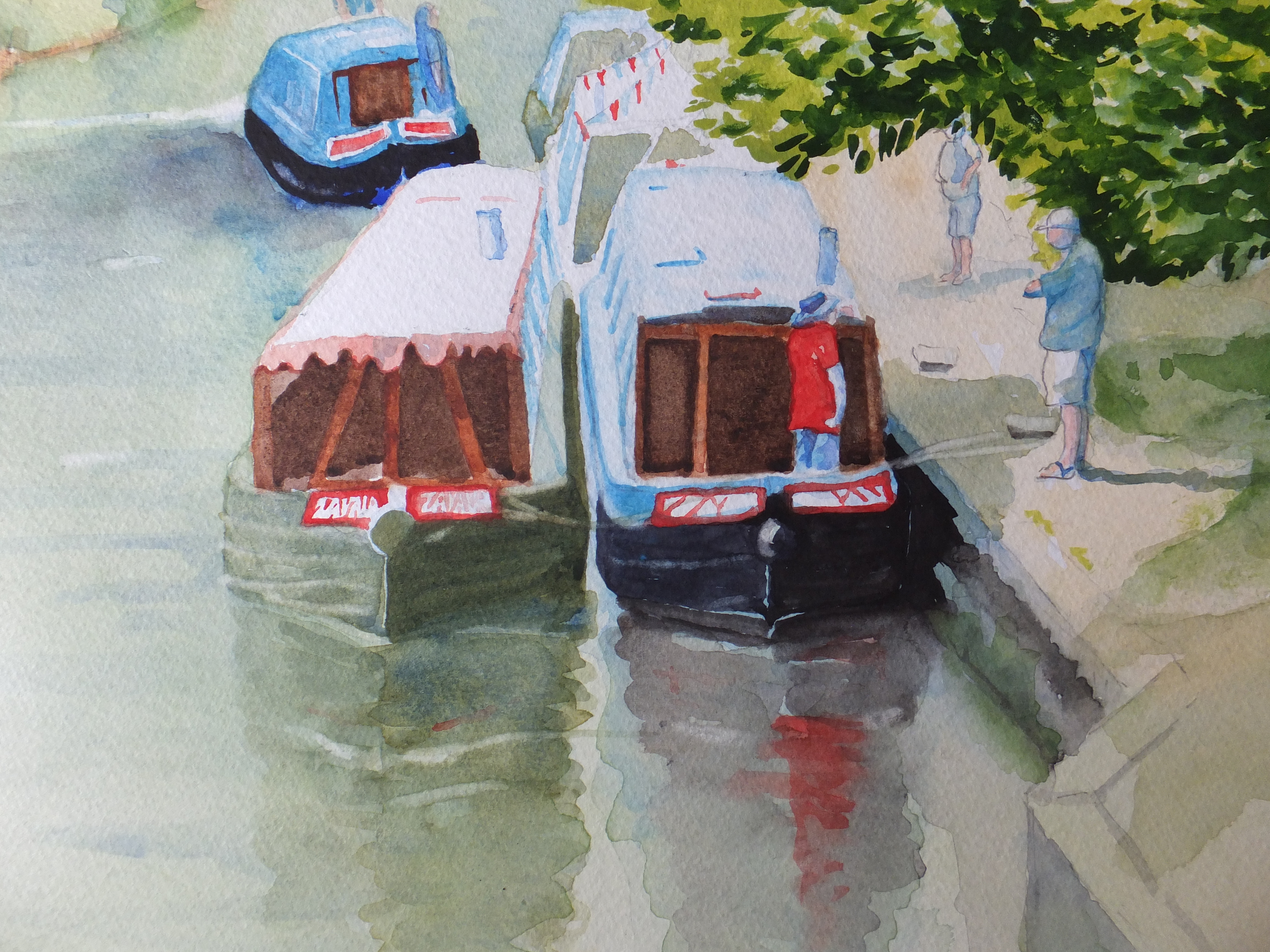
Painting something again

Padstow Harbour

I sometimes have to stop and think what to paint next. Often I have a list in my head, but when i come to the end of that, then I have to think of what I need in my website

One of my lockdown tasks has been to sort through many years of reference photographs. So many years that many of them were turned into prints rather than being stored more conveniently on the PC. The collage above of Padstow Harbour is a typical example

I painted from this probably ten years ago. I have been to Padstow in Cornwall on several occasions, and I like the harbour there very much indeed. I have painted several different shots, and I am pleased to say that they proved popular. The painting from the view above, sold on its first showing and after that I moved on to other things.

Looking through these photographs reminded me of it, and I thought I would like to tackle this shot again, but of course differently. My style has changed between then and now, hopefully for the better. Not necessarily so, as sometimes I look back at old paintings, and wonder how I got a particular result, and could I do it again

On this occasion, I am going to do a similar composition, but work the changes hopefully with different colour combinations. Last time, as I remember I did local colour which was fine, but now I might try something a little more ambitious. I needn’t tell anyone if it fails

I shall start on some sketchwork soon and after that we’ll see what happens

Wisteria at Wisley: the finished painting

Wisteria at Wisley

We haven’t been able to visit the RHS gardens at Wisley ever since lockdown began. It was a favourite place and we miss going there. Hopefully as things ease they may reopen, although how social distancing will be organised, remains to be seen

Doing this painting reminded me of happier times. We have stood here enough times in the loggia if that is the term, looking through the wisteria along the canal to the laboratory, which is an uninspiring name for the splendid mock-Tudor building in the background

Flowers and foliage are not my strong point. I had to look up how to paint wisteria. I used ultramarine violet, and then dark mauve for the deeper colours. I also dropped some quinacradone gold in here and there for the tips of the flowers. That has a name which botanists will know

The leaves were built up with a succession of colours. Sunlight streamed through in places and cadmium yellow suited that. I used Sap Green mixed with Lemon and finally Olive green for the leaves in shadow

Anyway I think it came close to the photograph, but as always I will leave others to judge

Just to finish off, I have been having a remarkable number of sales, all online obviously. I think this must be the lockdown factor

Ferry across the Bosphorus sold this week and was shipped today in fact, bringing my total to four since January. Chicken feed to many artists I know but significant for me.

Ferry Crossing the Bosphorus


Now gone and missed already

Wisteria at Wisley


Wisley Gardens, the headquarters of the Royal Horticultural Society is fairly near us, and we go there frequently. Since lockdown the place has been closed, like so many other gardens. We’ve missed it enormously especially at this time of year

This photograph appeared in Garden magazine this month, showing the view through the wisteria along the canal towards the laboratory which is the elegant building in the background. I have painted it many times

As I can’t go there I shall paint this view with everyone’s permission, as the next best thing. We look forward to going back when things return to normal.

I have in fact made a start, and I will let you know how I get on

Despite lockdown , I am still selling a few pictures. I sold the painting of the Scottish castle, Eilean Donan a few days, and the buyer collected from my door. We observed social distancing of course

Ponte Vecchio Bridge, Florence: the second version

Second Version Drawing

I wasn’t overly happy with the first painting of the Ponte Vecchio, as I may have said. I didn’t like the grass bank, which although attractive in real life, meant that I had to introduce another colour which I didn’t want to do. Also it cut out a large section of river, which I think was a pity

Instead of the grass bank, I have constructed a wharf with boats. Fictitious I know and offensive to some. The bridge however remains intact, and is still the subject of the painting.

I much prefer this composition. Not only do I keep my limited palette, but also brings something into the foreground, which is useful

Plenty of time for things to go wrong though. With the gentler colours that I’m using, this is more sunrise than sunset, but I still have to make up long shadows which I find tricky. Where exactly will they fall, and will they look convincing?

Time will tell

I was asked to quote for a commission yesterday, so there is some life in the market, which is of comfort, with all the bad news at the moment

Drawing the Ponte Vecchio, Florence

Reference photo with grid

I have used the grid method of transferring an image before, but was reminded of it when I went to the Hockney exhibition at the Lightbox in Woking recently. It is very useful especially when you want to enlarge a picture as I do with this one. This is how my drawing has turned out

Drawing of Ponte Vecchio from the photo

I have now doubled the image size so that it is about the usual size that I paint, ie 30×40 centimetres. I have traced the drawing now and am about to transfer this image to watercolour paper

The nice thing about using this method is that once the grid is in place on both images, then there is very little, if any, measuring to be done. Drawing or copying within each small square is relatively simple, and gives you a check on perspective so very useful for anything architectural

There is no restriction on size so if you wanted to paint a mural and make it ten times or twenty times the photograph, then you could. You can work the other way, of course, and reduce the size of an image too.

I shall paint this when ready and probably use a completely different colourway than shown in the photograph. Not sure what yet, possibly an evening colour, and may even do two different colour ways from the same drawing, which will save me some time

We’ll see how it turns out

Venice:Grand Canal the finished painting

Grand Canal, Venice

This has taken a long time to complete. We were away in Romania over the New Year Break, came home and were ill, and seemed to take weeks to recover.Funeral preparations had to be attended to throughout all this for my father’s burial.

However, on a more upbeat note, working on this painting has been a great support, as painting always is. There has been so much detail to attend to, especially with the buildings on the left. The architecture is very Gothic, so intricate, and the variety of colours was exciting. Trying to colour match the photograph was amusing, especially when it came to the flags.

I may have said that I altered the composition from the original photograph. I have shifted the buildings on the left away from the buildings on the right. This has cured some of the congestion, and has also given a view to the Customs House and beyond to the open sea. We now have depth where before we didn’t

I ended up quite liking the painting, despite the jumble of different colours. Sunny and bright at this grey time of the year, which cannot be bad

What shall I look at next? Staying in Italy, but moving from Venice to Florence, I am going to have a crack at the famous Ponte Vecchio , and see what sort of fist I can make of that

Grand Canal Venice Painting-Partway

Grand Canal Part Finished

Photography poor. I have had to use my phone as after upgrading, I am having difficulties loading from my camera, as everything is different and I don’t know why. I shall fathom in the end but for the minute I don’t have time

Suffice to say, I have painted the church of Santa Maria delle Grazie and put in detail as well as the houses on the opposite side in deep gloom. In reality they are much gloomier. The sunlit rooftops look orange which works, otherwise the detail on the house fronts disappears into the shadows.

Two coats of Phthalo Blue and Cobalt Blue mix on the water gives depth although the original is not quite as deep as this photograph

Still a long way to go as I will put the gondolas in with shadow colour and probably the vaporetto too

looking forward to tackling the bright colours on the foreground buildings and the flags

Grand Canal Venice– an old favourite, a different view

Grand Canal, Venice

This is the picture that I am going to work from. I have done this view before, but it is so magnificent that I come back to it every now and then. Incidentally, this is a different take to the one that I did last time, and also I am going to rearrange this photograph. I am going to push back the buildings on the left so that we can see the mouth of the Grand Canal and the horizon beyond. This should hopefully give us a feeling of distance as we look out to sea.

So far I have done the drawing which I will use for painting, and you will be able to see the changes for yourself, and I will show that now, although the lines are faint so may not stand out well

Grand Canal Drawing

Perhaps not too bad, and perhaps you can see where I have moved the buildings to the left. We can see the mouth of the canal, and the building I believe to be the Customs House, and then out to sea, but that won’t be apparent until after painting

For sky and water I will start with my mix of Cobalt and Phthalo Blue, which I know I have said before is a good Mediterranean colour. I will need to mask off the buildings to the left, including the balconies and awnings which stick out over the water.

They will need to be in yellow and pink, so important to paint on white paper.

The buildings on the right will need a cover of raw sienna as a base coat, before building up with other colours, and before covering with deep shadow.

Coming back to writing this blog, I have now done just that and have detailed the domes, and all I can say is so far so good.

Erquy in Brittany: the Finished Painting

Erquy in Brittany

The painting is now finished, in that I have started to fiddle, which is a good time to stop

Getting the sand/mud to look waterlogged has been a problem, and I have settled for what I’ve got, rather than end up with a surface which looks dark and unconvincing. I did mask out some tyre tracks which had filled with water, and then touched them in afterwards. They seemed to work well enough.

I have taken the mask off the lighthouse, and painted that in, with its red domed top, that attracts the eye. Two tricolor flags on the boats give another opportunity for small dabs of red too. I tend to use vermilion now rather than cadmium red, which seems to work.

Some of the figures and dinghies have bled into the wet, which I have allowed, as I think that gives a hint of reflection.

I think I have taken it as far as I dare without spoiling, so will leave it now as complete.

I have a new commission arrived, a house portrait, which is highly convenient so will start on that soon

Erquy: the Drawing

Erquy in Brittany

I have done some drawing and also started to paint as you can see. Nothing startling, just the background. The lighthouse has been masked out, so it can stand out stark white with red at the very end

I have also masked out some of the tyre marks in the sand which are full of water, hopefully to recreate that image. The composition itself I have altered slightly, but only slightly, as really not much improvement is necessary. The fishing boats have been beached at low tide, which immediately offers an interesting picture for watercolour. There is light coming from the left, offering shadows as well as possible reflections.Some boats were left out, and one different one added. Otherwise the scene is much the same as it was in 1972

I needed some human activity so added the two figures in the foreground. They are actually copied from the figure in the distance. I had to guess the perspective, so I hope it looks convincing. Both figures are bent over as though hauling on some imaginary chain, so a little bit of narrative

I have added shadow to the boats just to give them form, and to guide me when I go to paint them in. One or two extra dinghies as well. I may well have to add somehting small in the centre, but I am not sure yet.

That is as far as I have got. So far so good I think