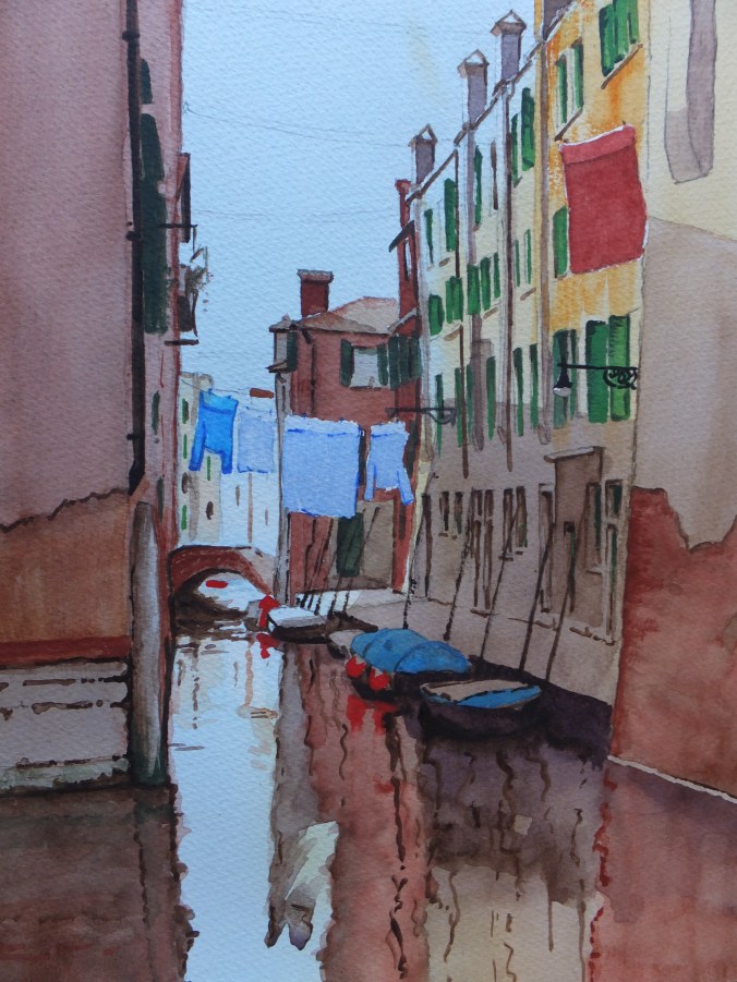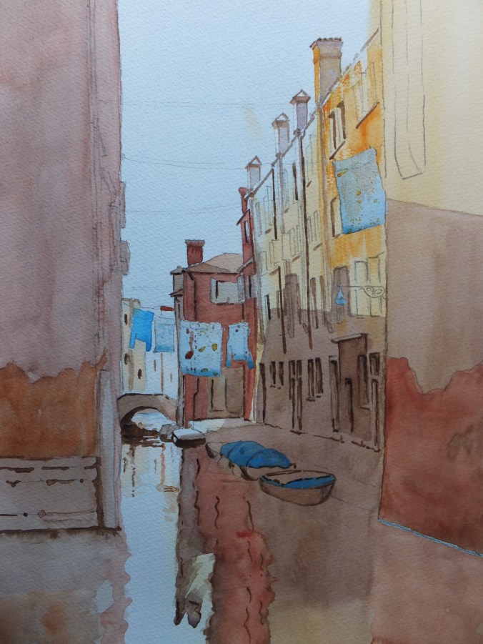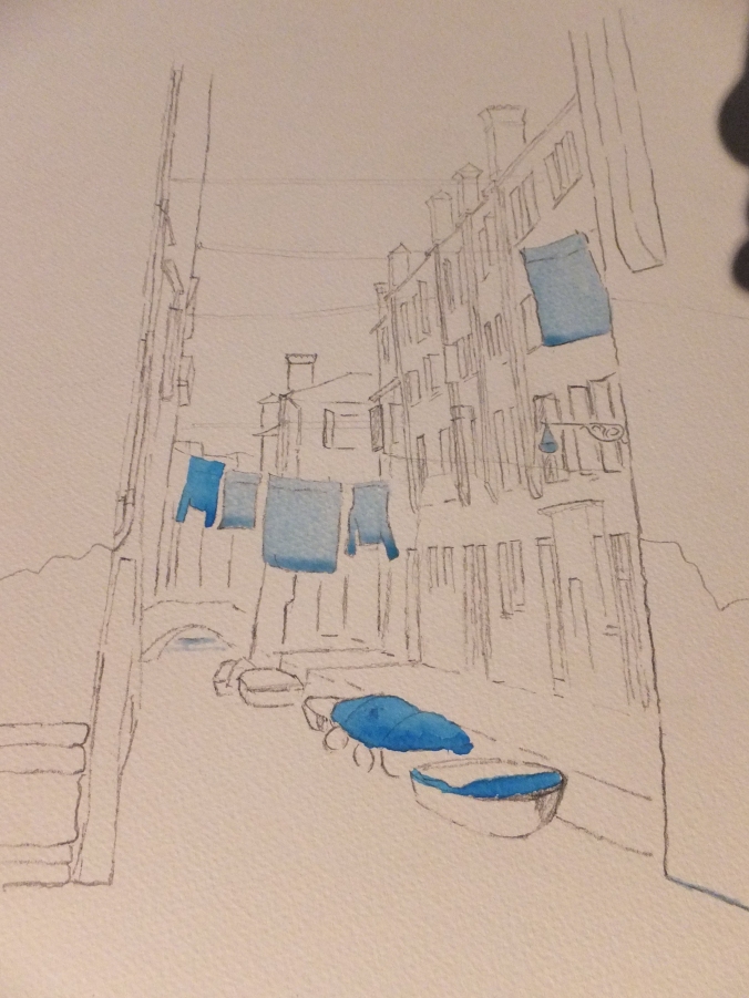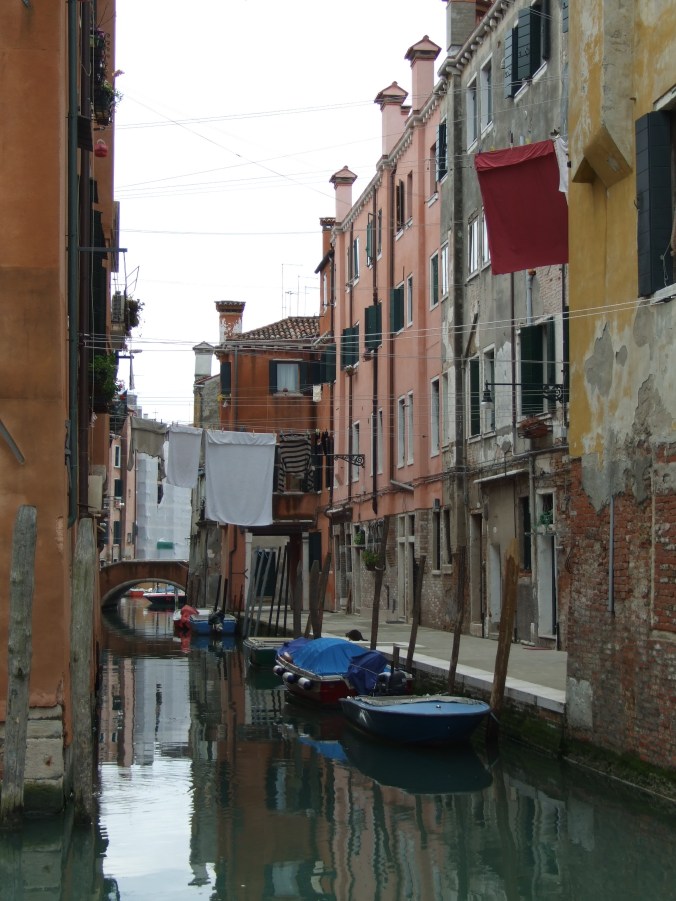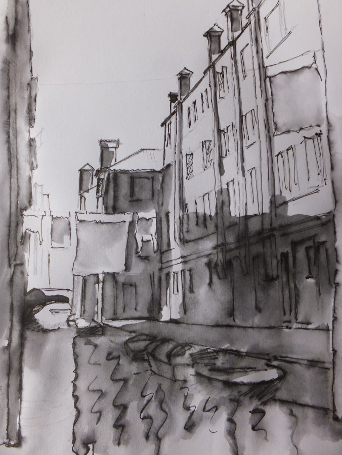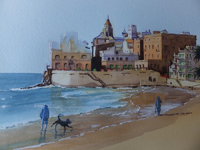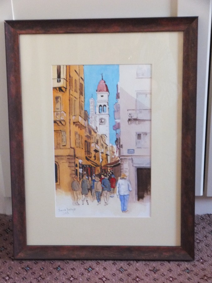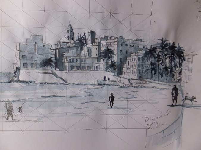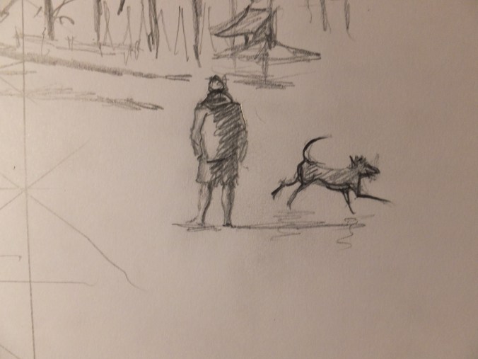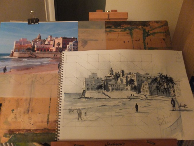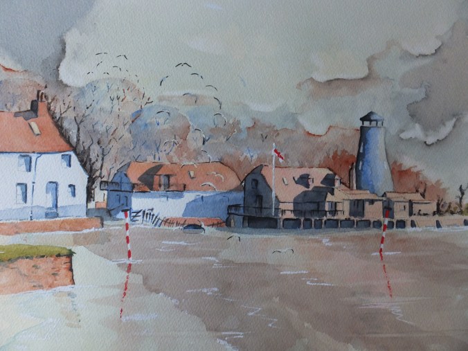
I have just finished the work for my second exhibition which I set up tomorrow in the Royal Surrey Hospital in Guildford, for anyone living close enough to go, this will be on for a month. All new work, so hopefully enjoyable
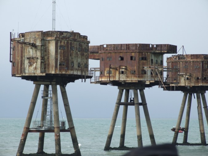
With that said and with a couple of weeks spare before I start my next commission, I am going to indulge myself and tackle something totally different, namely the Maunsell Sea Forts in the picture above. These are in the North Sea about nine miles out from the Thames Estuary, and loom like ghosts in the mist as you approach them
They were designed by a civil engineer called Guy Maunsell, and had a short but intense life during WW2. Built in 1942, they were erected on sandbanks, and commanded the estuary of the Thames, so they protected London and the Kent coastline from low-flying attacks by the Luftwaffe.
After a spell as a pirate radio station in the 1960s, they relapsed into disuse and as far as I know nothing is being done with them, probably because they are out of sight and so out of mind. There were seven of them, but one was hit by a Norwegian vessel and had to be taken down
We went to see them some years ago on a one-off trip organised out of London. This was on a paddle steamer called the Waverley, which originated from the Clyde as I remember, but would sail round the British coast and would organise excursions from various ports. This one was from London. We started in the Pool of London, sailed through Tower Bridge which was novel at the time, although I think cruise ships do this quite often now, and then chugged down the Thames, stopping only at the end of Southend Pier to pick up some more passengers. The voyage continued out into the North Sea , passing a surprising number of ferry boats at anchor, mothballed until they were needed. The forts slowly came into view through the sea mist. Very atmospheric indeed
I thought I would paint them one day, and have finally got round to it. Not something that is commercial, although I may get a surprise, but that doesn’t matter. This will be an interesting project in itself, tackling all those rusty surfaces, and hopefully capturing something of the mood which the photograph has missed somehow