A Street in Florence–the finished painting

A Street in Florence–latest version

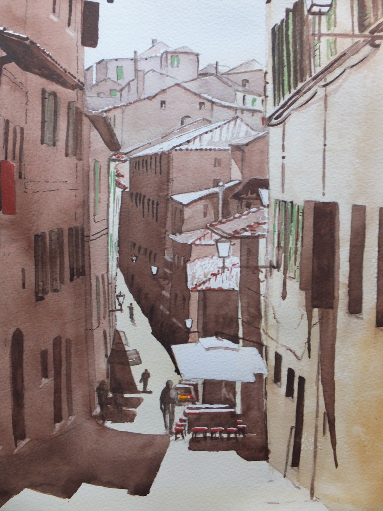
So here it is, the recent version, which I had attempted in a different style, but despite which turned out much the same as my version of four years ago.

As a group we were trying to produce something in the style of Tom Haugamat, the illustrator. Not someone I knew but impressed with his work when I looked him up. Most of our group were working on ipads and produced some very credible if not impressive work.

Mine veered off course as my own style crept back in. I still kept the painting simpler, that is less detailed, than my norm, and I fancied started to have a cubist feel. I thought that maybe that is how cubism started to evolve. Not that I would have been clever enough to develop a major movement like cubism, but I might recognise it happening

Anyway, this is how it turned out, and others can judge, as always

The streets are deserted today in our local neighbourhood despite the warm weather. We are becoming more disciplined in our efforts to check this pandemic. I took a short walk this afternoon, which we are still allowed to do, for exercise, just one walk.

It was very eerie out there. I took some pictures for a possible painting. I don’t usually do social commentary, but maybe something as a record would be of interest one day. I have lived for nearly eighty years, and never experienced anything like this. I wonder how many people are thinking the same

There was something very like this happening in 1665, when the bubonic plague travelled from London to a village in Derbyshire called Eyam, in a bolt of cloth which had been ordered by a cloth finisher in the village

When the cloth was unrolled the infection spread to the cloth finisher and he died within three days. The infection spread quickly, people died and survivors buried them, in gardens and in fields. The village elders closed the road in and out of the village, total lockdown. People left food and supplies outside of the village

Gradually the plague burned itself out. Not everyone died because they never do in an epidemic, hence this dreadful expression herd immunity. One woman, a farmer’s wife buried her husband and three sons in a field. She survived and went to live afterwards with her sister in Sheffield.

Today Eyam is known as The Plague Village and is a tourist attraction.

A Street in Florence-Revisited

A Street in Florence– first version

This was the painting that I did some years ago from one of my own photographs. We had toured Tuscany by rail, and went to Florence of course as one of the most important destinations. I took a photograph looking down this street, and painted it when we got back. I gave it to a friend as a leaving present

I thought I would like to do it again, using different colourways, and that is what I am setting out to do

So far. and I haven’t photographed a stage painting yet, I have put in less detail. The images are very simple blocks of colour, almost cubist in effect. I didn’t think I would like doing it this way, but having let my work dry out. the result is starting to grow on me. But I have a long way to go yet

For now I will just publish the stage I’ve reached. It is working out differently to the first version. I’ve used a different colour for the distant buildings, which somehow I prefer. We’ll have to see how it finishes

Part Finished

Photograph was taken quickly and is poor but will give us an idea

Ponte Vecchio Bridge, Florence: the second version

Second Version Drawing

I wasn’t overly happy with the first painting of the Ponte Vecchio, as I may have said. I didn’t like the grass bank, which although attractive in real life, meant that I had to introduce another colour which I didn’t want to do. Also it cut out a large section of river, which I think was a pity

Instead of the grass bank, I have constructed a wharf with boats. Fictitious I know and offensive to some. The bridge however remains intact, and is still the subject of the painting.

I much prefer this composition. Not only do I keep my limited palette, but also brings something into the foreground, which is useful

Plenty of time for things to go wrong though. With the gentler colours that I’m using, this is more sunrise than sunset, but I still have to make up long shadows which I find tricky. Where exactly will they fall, and will they look convincing?

Time will tell

I was asked to quote for a commission yesterday, so there is some life in the market, which is of comfort, with all the bad news at the moment

Drawing the Ponte Vecchio, Florence

Reference photo with grid

I have used the grid method of transferring an image before, but was reminded of it when I went to the Hockney exhibition at the Lightbox in Woking recently. It is very useful especially when you want to enlarge a picture as I do with this one. This is how my drawing has turned out

Drawing of Ponte Vecchio from the photo

I have now doubled the image size so that it is about the usual size that I paint, ie 30×40 centimetres. I have traced the drawing now and am about to transfer this image to watercolour paper

The nice thing about using this method is that once the grid is in place on both images, then there is very little, if any, measuring to be done. Drawing or copying within each small square is relatively simple, and gives you a check on perspective so very useful for anything architectural

There is no restriction on size so if you wanted to paint a mural and make it ten times or twenty times the photograph, then you could. You can work the other way, of course, and reduce the size of an image too.

I shall paint this when ready and probably use a completely different colourway than shown in the photograph. Not sure what yet, possibly an evening colour, and may even do two different colour ways from the same drawing, which will save me some time

We’ll see how it turns out

Venice:Grand Canal the finished painting

Grand Canal, Venice

This has taken a long time to complete. We were away in Romania over the New Year Break, came home and were ill, and seemed to take weeks to recover.Funeral preparations had to be attended to throughout all this for my father’s burial.

However, on a more upbeat note, working on this painting has been a great support, as painting always is. There has been so much detail to attend to, especially with the buildings on the left. The architecture is very Gothic, so intricate, and the variety of colours was exciting. Trying to colour match the photograph was amusing, especially when it came to the flags.

I may have said that I altered the composition from the original photograph. I have shifted the buildings on the left away from the buildings on the right. This has cured some of the congestion, and has also given a view to the Customs House and beyond to the open sea. We now have depth where before we didn’t

I ended up quite liking the painting, despite the jumble of different colours. Sunny and bright at this grey time of the year, which cannot be bad

What shall I look at next? Staying in Italy, but moving from Venice to Florence, I am going to have a crack at the famous Ponte Vecchio , and see what sort of fist I can make of that

An Interesting Sale

Corfu:Shopping Lanes in Kerkyra

This painting sold on the internet out of the blue. They’re often the best ones I often think, as they give you a boost. A buyer in the United States has bought it, and it is on its way as we speak

We have had a dreadful start to the year since getting back from Romania. My father died on New Year’s Eve whilst I was away. My wife and I have both been ill ever since getting back. I am just getting over bronchitis and my wife has one heavy cold followed by another. Fearsome bugs

We have had to do funeral preparations whilst feeling like death ourselves, even though having wonderful support from family, there were some things I had to do myself

This painting had happy memories. We were in Corfu about three years ago, and enjoyed it immensely. Literally any port in a storm, we were unable to dock on the Adriatic coast and had to run from the storm. Corfu took us, and what a lovely place it is. We had a tour round the island and spent the afternoon in Kerkyra in the shopping lanes. This painting was my memento. I am so pleased that someone has chosen it and it will go somewhere it will be valued

Afterwards we sailed for Greece in the evening. It had been a lovely trip. Often thought I would like to revisit Corfu and spend more time

Anyway this short blog whilst I think of it. I am still working on the Venice picture but not as much as I would like

Grand Canal Venice Painting-Partway

Grand Canal Part Finished

Photography poor. I have had to use my phone as after upgrading, I am having difficulties loading from my camera, as everything is different and I don’t know why. I shall fathom in the end but for the minute I don’t have time

Suffice to say, I have painted the church of Santa Maria delle Grazie and put in detail as well as the houses on the opposite side in deep gloom. In reality they are much gloomier. The sunlit rooftops look orange which works, otherwise the detail on the house fronts disappears into the shadows.

Two coats of Phthalo Blue and Cobalt Blue mix on the water gives depth although the original is not quite as deep as this photograph

Still a long way to go as I will put the gondolas in with shadow colour and probably the vaporetto too

looking forward to tackling the bright colours on the foreground buildings and the flags

Grand Canal Venice– an old favourite, a different view

Grand Canal, Venice

This is the picture that I am going to work from. I have done this view before, but it is so magnificent that I come back to it every now and then. Incidentally, this is a different take to the one that I did last time, and also I am going to rearrange this photograph. I am going to push back the buildings on the left so that we can see the mouth of the Grand Canal and the horizon beyond. This should hopefully give us a feeling of distance as we look out to sea.

So far I have done the drawing which I will use for painting, and you will be able to see the changes for yourself, and I will show that now, although the lines are faint so may not stand out well

Grand Canal Drawing

Perhaps not too bad, and perhaps you can see where I have moved the buildings to the left. We can see the mouth of the canal, and the building I believe to be the Customs House, and then out to sea, but that won’t be apparent until after painting

For sky and water I will start with my mix of Cobalt and Phthalo Blue, which I know I have said before is a good Mediterranean colour. I will need to mask off the buildings to the left, including the balconies and awnings which stick out over the water.

They will need to be in yellow and pink, so important to paint on white paper.

The buildings on the right will need a cover of raw sienna as a base coat, before building up with other colours, and before covering with deep shadow.

Coming back to writing this blog, I have now done just that and have detailed the domes, and all I can say is so far so good.

A Completed Commission

The Final Version

This is the last commission of the year, and it is finished, I am pleased to say. I have had to keep in touch with the client, at every stage of the painting, which I don’t usually do, as it does make a lot of work . Having said that I have enjoyed this commission more than I thought, and maybe stage by stage consultation is not a bad idea, certainly after my last bad experience

However, they were nice people to deal with, and although they made a few changes here and there, basically they were onside.The painting was collected today and I am pleased to say that they were thrilled with the result

The subject of the painting was a Victorian cottage deep in the Surrey woods. Probably it had originally been an estate worker’s cottage, built around 1840 with a later addition.

I went to look at the cottage quite early one morning. The sun had risen. At this time of year, the shadows are long. The woods behind the house were brightly lit, most of the leaves had gone, and the light filtering through the branches gave them a translucent feel. To get that effect on paper needed thinking about. I used a colour that I don’t use often, quinacradone gold. It was perfect for the job and just gave the effect of sun-bathed trees that I was looking for

Most of the house was in shadow. I removed some as I wanted the effect of bright sun hitting the brickwork here and there. The combination of light and dark should be dramatic

When I was on site, the client brought their little dog, a Labrador bitch puppy. She was a beautiful colour, gold. Would I include her in the painting. I like to please, so I said yes, but I was anxious. I have painted dogs before but never done a dog portrait, especially one so tiny. She would be the size of a fingernail

I had taken some pictures. I have to say that for a lively puppy, she was very well behaved and posed beautifully. I picked one of the photographs and did a full sized drawing, which I was pleased with. I then reduced it in size to a thumbnail and put it in the sketch, and went on from there. When the time came to paint, I used the same gold as the trees in the background, and used more of the same for shadows on the dog. It worked better then I thought possible

Mostly straightforward otherwise, except that I could not get definition to stay in the cottage features. Overnight the colour would dry and disappear, which is not that unusual in watercolour. Eventually I reddened the brick colour with vermilion, which darkened the building and somehow improved the brick texture. Again something I have learned for another time

Commissions can certainly be testing, and very occasionally go awry, like my last unhappy experience, but they can also be broadening and make you attempt something you wouldn’t normally tackle. Will I start doing animal portraits? Hmm perhaps not, but animals in landscape are a possibility

House Portrait Completed

The Finished Portrait

There was quite a lot of detailing in this one. Different things were asked to be included, which I have done, but because of the scale, they have ended up as rather tiny. I was worried about that. Things like different coloured pots and also some blooms slightly out of season. Let’s hope they don’t disappoint

The car port and furniture store relationship on the left hand side, took some working out so that each was distinguishable. I did wonder afterwards whether I should have recommended leaving the furniture store out completely. The car port is a nice building, almost barn-like with its hipped roof, and it would have stood alone quite easily. However I didn’t. I painted what was there, which is the honest thing to do.

I reduced the enormous expanse of gravel with shadows coming in from trees which were off stage. I think that improves. Not really a follower of feng shui, I have left, nevertheless, an uninterrupted view of the path leading to the front door.

Some of the colours I have changed as well as scaling down the sizes of some of the shrubs. Generally a mix of reds and greens , I think the colour scheme works well, although some might disagree.

I now have another commission, another house portrait, which I went to see a couple of days ago. This is a rather charming cottage out in the woods, built around 1830, so lots of character, which I am shortly to start.

Just when it looked straightforward, I was asked to include the dog. Oh well, another challenge