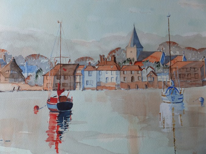
Thames Estuary Sea Forts: Finished Painting

Sea Forts Thames Estuary

This is the finished painting

I had intended to post another work in progress shot, but as I got into the rhythm of the painting, it was as easy to finish, and more interesting to look at anyway

I had one false start, which normally I wouldn’t admit to. I decided the sea looked too pale and insipid, so I scrubbed back the bottom half of the platform legs, so that I could paint over the sea again and deepen the colour. Especially the area around the platforms needed to be darker even though it wasn’t in the photograph. I used Viridian mixed with a little Lamp Black for the sea colour, which works well I always think, with a nod of thanks to Rowland Hilder.

This alteration did leave me with two hard lines which normally I would have been able to blend. I have disguised them a bit with white caps, so not too bad

As for the structures themselves, I used Burnt Sienna with a little Crimson to get close to the colour of rust, and drybrushed as much as possible to look like rusty paintwork. The very deep shadows on the platforms I did with Ultramarine Violet, neat straight out of the tube with as little water as possible and straight over the rust colour. The barnacles at the bottom were painted with Olive Green, but still not dark enough, so I overlaid with the Violet.

There were some red marks where brackets had been fitted, which was probably red oxide base coat in its day. Again some Crimson, with a little free expression, seemed to get that effect.

This turned out better than expected, I am pleased to say. I have learned from it, and it was a welcome change from the usual scenes. Not a painting anyone is likely to buy, so pure self-indulgence really.

Sea Forts Work in Progress

DSCF2988

So far, I have put down a base coat of Cobalt Blue/Phthalo Blue mix right across. I fixed the horizon with a vague idea of coastline. One or two small details were masked out. There is a small buoy next to one leg of the first fort, which will be white eventually. One or two girders or rails facing the light will be pale blue when the mask is removed.

It may not appear so in the photograph but I have washed over the sea, with a dilute Cobalt green, and then rubbed in Raw Sienna at the base of the towers, as the sandbank is visible through the water

With the shadows on the metalwork, I have allowed myself to experiment and used a mix of Cerulean Blue and Ultramarine Violet, a combination I have not used before, but only read about. This makes a pleasant shadow colour, although whether it suits old ironwork is another matter. Some people put shadows in afterwards, and it is a personal choice. I find putting in shadows first gives me a dimensional image to start with, which I find helpful

I couldn’t get near the pale green colour of the paintwork on the towers. I used the Cobalt Green over the original blue wash, and will hope for the best. Time now to work on those delicious rust shades, which I hope will bring a touch of reality

I have absolutely no idea how this painting will end up

Estuary Sea Forts: Sketch

Estuary Sea Forts

This is the preliminary sketch from the photograph. Very quickly done, as I have dropped behind with this particular picture, probably because there is no deadline on this one. As I said before, I am just painting these forts for my own amusement

There is very little detail drawn in so far. This is just a basic framework put in with the grid ready to transfer onto watercolour paper, which hopefully will ensure that the perspective is correct, and that everything goes into the right place. I quite like finishing the drawing straight onto the surface that is going to be painted. It just feels more immediate that way

I have started to have a few thoughts on colour. I think I will go right across with a mix of cobalt and pthalo blue. Let that dry hard and glaze the sea with another coat of pthalo blue. The horizon line is quite low, so there won’t be too much of that

When that is hard, I could put in the shadows perhaps this time with a mix of cerulean blue and violet, just to show where they are. When that,too, is hard, give the metal work a glaze of pthalo green as a base colour. That should set me up for having a crack at all that rust and dirt and seaweed. The shadows can be deepened up with a dark brown

Once I get those base colours in, then things will get more interesting, I am sure

Thames Estuary Sea Forts

Pirbright 098

I have just finished the work for my second exhibition which I set up tomorrow in the Royal Surrey Hospital in Guildford, for anyone living close enough to go, this will be on for a month. All new work, so hopefully enjoyable

With that said and with a couple of weeks spare before I start my next commission, I am going to indulge myself and tackle something totally different, namely the Maunsell Sea Forts in the picture above. These are in the North Sea about nine miles out from the Thames Estuary, and loom like ghosts in the mist as you approach them

They were designed by a civil engineer called Guy Maunsell, and had a short but intense life during WW2. Built in 1942, they were erected on sandbanks, and commanded the estuary of the Thames, so they protected London and the Kent coastline from low-flying attacks by the Luftwaffe.

After a spell as a pirate radio station in the 1960s, they relapsed into disuse and as far as I know nothing is being done with them, probably because they are out of sight and so out of mind. There were seven of them, but one was hit by a Norwegian vessel and had to be taken down

We went to see them some years ago on a one-off trip organised out of London. This was on a paddle steamer called the Waverley, which originated from the Clyde as I remember, but would sail round the British coast and would organise excursions from various ports. This one was from London. We started in the Pool of London, sailed through Tower Bridge which was novel at the time, although I think cruise ships do this quite often now, and then chugged down the Thames, stopping only at the end of Southend Pier to pick up some more passengers. The voyage continued out into the North Sea , passing a surprising number of ferry boats at anchor, mothballed until they were needed. The forts slowly came into view through the sea mist. Very atmospheric indeed

I thought I would paint them one day, and have finally got round to it. Not something that is commercial, although I may get a surprise, but that doesn’t matter. This will be an interesting project in itself, tackling all those rusty surfaces, and hopefully capturing something of the mood which the photograph has missed somehowPirbright 091


Sitges Beach: the finished painting

Sitges Beach

The finished painting!

Pleased with it, and pleased to finish as well. The sea seemed to work in this painting. It doesn’t always. I like the way the wet sand finished up too.

So this one goes for framing and will form part of “Watercolour Wanderings” exhibition. I think I have enough now, so might be able to do something more experimental, if I have both exhibitions sorted

Wouldn’t mind having a go at portrait work again. Not successful with faces. Might try again

I expect that I will persuade myself that one more Venice picture is needed though!

Sitges: the Painting so far

Sitges Interim

I don’t normally publish halfway through a painting if I can help it, but I have several family commitments over the next few days, so doubt if I will get away to the easel for a while

But the painting is underway, and with the usual reservations about my photography, I am reasonably happy so far. If you remember the photograph from a previous post, there is bright sunshine and consequently deep shadow. These are always fun to do, as they give depth and heighten the drama of the picture

i used my usual “Mediterranean” mix for the sky of Phthalo blue and Cobalt and let that run down for the first wash of the sea. I let that run down onto the buildings and let it mix with the Raw Sienna/ Naples Yellow mix I used for them.In the case of the building far left top, this worked quite well as these buildings were white yet in shade, so the effect was ethereal, and I let that stay. The rest I have sharpened up with detailing

The tricky part will be the sea with white foam. I have masked out here and there to give myself a guideline, but will have to do some work with white body paint. Also wet sand with reflections will be challenging too. The dog walking couple I have part masked to provide a sunlit edge coming in from the left, otherwise I can just paint across them

I will cautiously call this “so good so far”, and leave it there

Sitges: the Transferred Drawing plus Preparation for Next Exhibition

Transferred Drawing of Sitges

This is the drawing now transferred onto watercolour paper. I hope you can make it out. Obviously only lightly pencilled in as I want it to be covered by the painting.

One or two areas are covered by the blue masking fluid, especially the building on the far left which is sparkling in the sunlight. I want a hard edge there, and likewise in one or two other places which are caught by the sun. I have denoted white foam in the sea where I might otherwise lose it, although I shall have to enhance later with white gouache.

I have kept the foreground figures to two plus dog. Hopefully I should get some pleasing reflections on the wet sand from the buildings which will need some space in the foreground

Spaces have been left amongst the buildings too, for large areas of shade and for trees. Soon I shall have to pick up a paint brush and start. I still get apprehensive until I get underway

As well as this I have been trying to finalise my entries for my next forthcoming solo exhibition, which will be in Guildford, a town near me, in one of the town’s best known venues, the Guildford Institute. Always an enjoyable place to show, albeit not especially busy, but nevertheless because of the prestige of the place, I am able to get good coverage in local papers, which is so very useful

I have been trying to get my framing up-to-date and these are two of the latest

Brewery Dray Framed

Brewery Dray on Guildford Bridge

Corfu Shopping Lanes Framed

Corfu Shopping Lanes in Kerkyra

You may well have seen these in earlier posts, but it is nice to see them framed, and ready to be exposed to an unsuspecting public. I am aiming to show between 12-14 pictures in total. I am almost there.Still time to make some revisions, and certainly if the Sitges painting turns out well, I shall want to include that too. The exhibition, if I haven’t said before has a theme entitled “Watercolour Wanderings”, so every picture will be of a place I have visited. Not just faraway places that I have been to on my travels but also local scenes as well, which are just as relevant. The name is a little bit corny, I know, but you are expected to give your exhibition a name, which I admit does give the show some sort of structure, rather than a motley collection of miscellaneous paintings.

The exhibition runs from 3rd to 20th May, so just under three weeks. We shall hope for a successful show. I shall be following up with another exhibition at the Royal Surrey Hospital starting on the 27th May and running for one month, so two bites at the cherry

Just while it goes through my mind, I get many “visits” to this art blog from all corners of the globe, and I am very grateful for your interest. It is so nice to feel that you are talking to someone. Comment if you want to. Thanks

Sitges: the Tonal Sketch

Tonal Study

Probably the messiest sketch that I have done in a long time, but nevertheless it will do the job.

I have scratched out the figure in the bottom left corner, as he just was going nowhere. There were two dogs with him and they looked like pigs. I am going to substitute the figure on the far right, man and dog. They are strictly speaking in the margin, for as you can see they are out of proportion to the main picture. I sketched them from the screen which is rather like drawing from life, and which I had wished I had done before, instead of trying to scale from the photograph.

When I attempt to transfer this sketch onto watercolour paper I think I will trace the figures separately, and slide them round the foreground until they look right. I hadn’t intended to put a figure on the right hand side, but quite like in some ways, the effect of the righthand figure. I know he is out of proportion but nevertheless acts as a balance somehow. I will go through my photo library again and see if I can find someone

figure sketch

This is the thumbnail sketch of man  and dog. I quite enjoy doing these in real life, and they make a wonderful library of props that you can use in composite paintings. Drawing from the screen is easier in many ways as the subject doesn’t move about. I have seen other people do it, but never tried it before.

The tedious bit comes next. Moving the finished sketch or sketches onto watercolour paper. You have to trace some bits, and my conscience is clear as I am tracing my own drawing, but I do not like tracing. Boring and messy work. I wish I could wave a wand. However you can’t erase mistakes from watercolour paper without spoiling the surface so you just have to get on with it. At this stage I always make the point that I am still learning and welcome suggestions, if you have a better solution, please tell me. I use the Frisk product Tracedown which takes some of the tedium out of the job, but still looking for even more shortcuts.

Tonal Study and photograph

This is the sketch against the photograph. What I hope to capture more than anything is not so much an architectural study, (so many of you will do that better than me), but more the effect of the strong light on the buildings with those delicious deep shadows.

After the tedium of transposing the drawing, comes the fun bit of deciding on the palette. The building far left which is bright white will need to be preserved with masking fluid. So will some of the details along the top edge, and so too will the sunlit edge of the walking figures.

Choice of colours? Well, my favourite base colour of raw sienna mixed with Naples Yellow which always looks sunlit as a base colour for buildings and beach. Some of the buildings, burnt sienna glazed with either permanent rose or cadmium orange. Phthalo blue in the mix for sea and sky, with maybe indigo along the horizon line. I bought Quinacradone Red the other day and am looking for an excuse to use it.

Once I have decided on the palette, I will publish it, just in case it is of interest. In the meantime, I will have to crack on. There is much to be done!

Few days in Spain

DSCF2865

Just back from a few days in Sitges, not far from Barcelona. We hadn’t been there before so something of a treat. Still cold at night but during the day an agreeable 17-19 compared with our British 6 at the moment. There is nothing like winter sunshine to revive the spirit

As you can see from one of my pictures, all the ingredients for some really good paintings are there. Mediterranean sky, active sea, old churches, strong light, deep shadows with figure drawing thrown in. Some interesting side streets with iron window grilles and some strong colours should make for interesting material to work from.

I have just saved about 50 pictures so should get 2 or 3 at least, worthwhile compositions out of that lot. My next exhibition “Watercolour Wanderings” looms large. That starts on May 3rd and takes place at the Guildford Institute. That sounds a long way off but in painting terms is very close, and certainly Sitges needs to be part of my “wanderings”

Time to get started

DSCF2893

Popular with Hippies at one time I believe. Understandable

Langstone Mill Reworked

Langstone Mill Reworked

Once again, the colours are deeper in the actual painting, but this is the reworked version, which, I believe, to be a great improvement on the first version. But, of course, that is my opinion

I have deepened the shadows enormously, which exaggerates the light coming from the right-hand side. The effect, I feel, is much more dramatic.

In the water, I have introduced more of the orange brick colour to look like reflections. Also I have added some current swirls and some flecks of white to look like movement in the sea.

The red posts and flag have been refreshed with Cadmium Red. I think they come forward now, which is good, and take the eye towards the mill

More seagulls add some life, plus too some distant rooks over the tall trees. The birds are spooked by that bad weather coming in from the background!

I keep looking from the screen to the painting. The colours are richer in the painting, of that there is no doubt, but little more that I can do about it

Time soon to move back to Istanbul, and work on that small painting of the Blue Mosque which will be fun to do, I think