Watts Cemetery Chapel, Compton, Surrey designed by Mary Watts
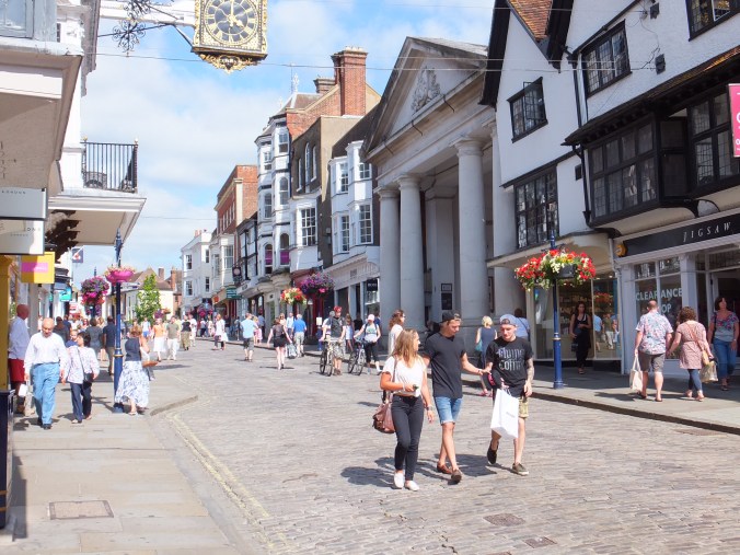
The winter street scene of Guildford is going to take me some time. Not only do I have to use my imagination, which is not my strong point, I also have to do a fair bit of research and also calculation, which I have to take my time over.
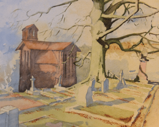
This does give me an opportunity to post something local which we visited not that long ago, which is Watts Cemetery Chapel or sometimes known as the Watts Mortuary Chapel.This is in the village of Compton, near Guildford in Surrey. I painted the above after our visit. Financed by the famous Victorian painter, George Frederick Watts, through his paintings,he donated it to the village of Compton.The Watts Gallery is also nearby. Recently restored after years of dilapidation, it houses a wonderful collection of his paintings and sculpture. The chapel was designed by his wife Mary Watts who also oversaw the building
In 1895 Mary started giving evening classes to the villagers at their home Limnerslease, teaching them how to model the local clay, and producing decorative tiles in terra cotta. They modelled the symbolic and beautiful patterns that she had designed, which would be used in the interior decoration of the chapel. The chapel she designed is in the Arts and crafts Style, the nearest we get in England to Art Nouveau, although I maintain many of the interior details are really Art Nouveau
In England, we never really had an architect who epitomised Art Nouveau, as they did in Scotland with Rennie Mackintosh. I sometimes think Mary Watts was our Art Nouveau heroine.
Close by, her husband’s gallery. A very famous Victorian painter, G.F.Watts, known for allegorical and symbolic works. His paintings hang all over the world, yet many are here at Compton, and this gallery is so worth a visit.
If I were to be asked to pick a favourite painting, it would be that very famous one “Hope”. There are many to choose from, but this female allegorical figure, clutching a wooden lyre with only one string left, is very poignant.
There were two versions painted and when we were last there, the version from the Tate was on loan to Compton.
This painting has been an influence on many great names. On Picasso during his Blue Period for his hunched figure The Old Guitarist, is one example. Martin Luther King referenced it in his collection of sermons. Nelson Mandela allegedly had a copy on the wall of his cell in prison on Robben Island.
Later in the 1980s the painting was the subject of a lecture by one Dr.Frederick Sampson in Richmond, Virginia who described it as a study of contradictions. One Jeremiah Wright apparently attended the lecture and in his sermon in 1990 on Hope, coined the phrase “audacity of Hope”. Having attended the sermon, Barack Obama adopted the phrase later as the title for his 2004 Democratic National Convention keynote address, and more well-known to most of us, as the title of his second book.
I think the quote runs something like : to have one string left and to have the audacity to hope that you can still make music
How some things echo down the ages!
Hope
Critics of the day called it Despair but obviously missed the point