I am starting to find cats interesting as subjects.
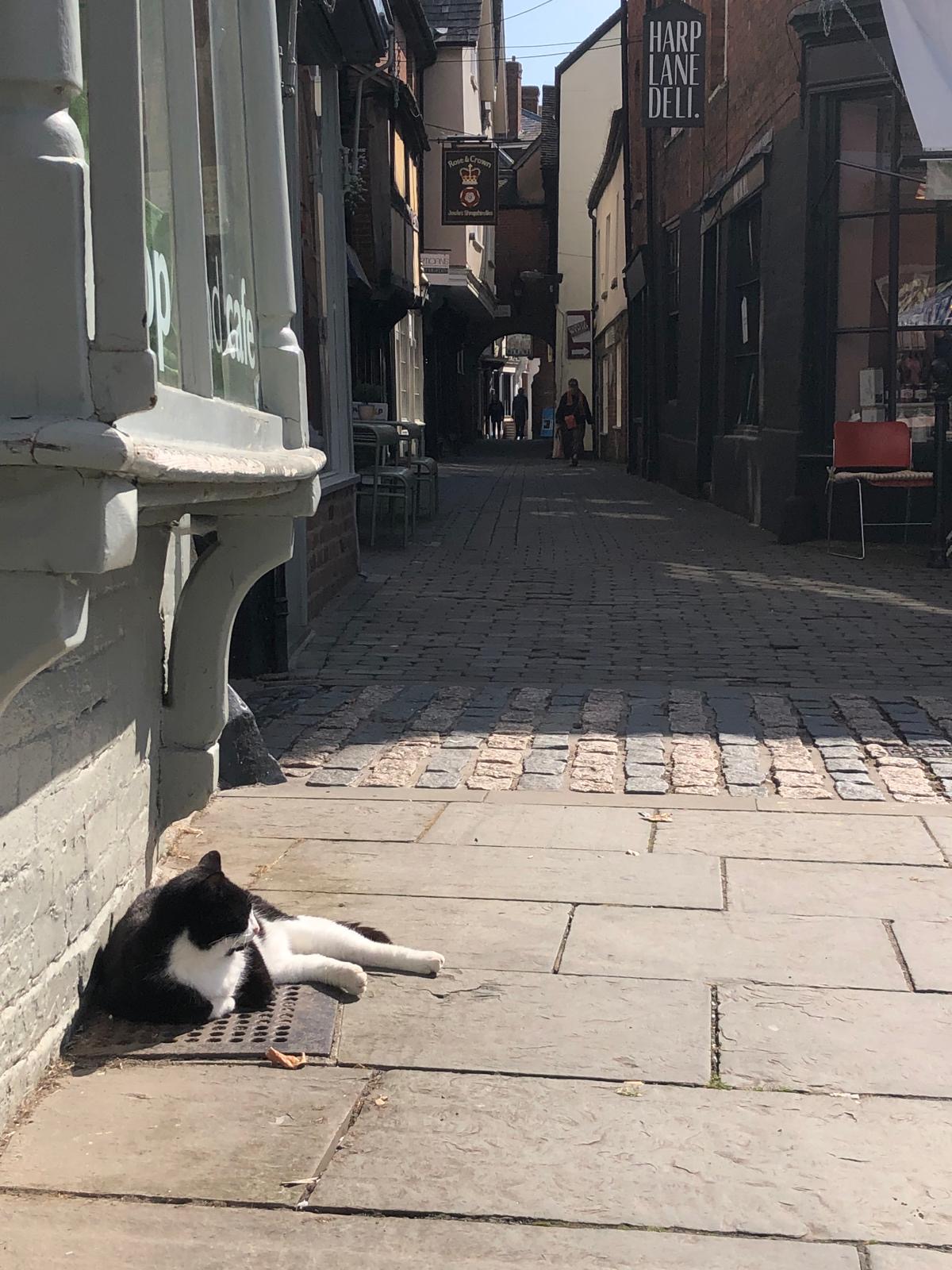
My son sent me a photograph a while back of this cat sunning itself on hot pavements, with a dark alleyway in the background. He had a cat at home which looked remarkably similar which was why he took the picture. They were on holiday in Shropshire at the time, and on this particular day were wandering round the historic town of Ludlow
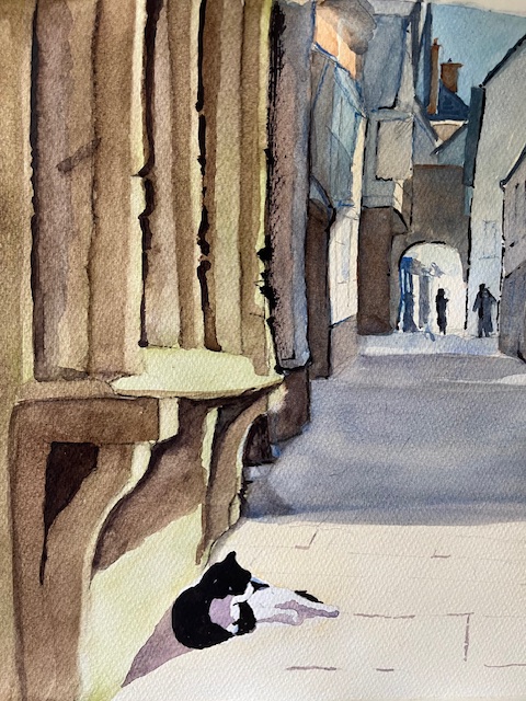
I had it in mind as a possible painting at the time, and reminded about it recently, decided to do it. I quite liked the result, as I don’t usually do cats. I used a mix of raw sienna and naples yellow for the pavement. I have a favourite mix for black, which gives a glossy black which is good for animal fur or feathers. This is a mix of blue like Windsor Blue and Alizarin crimson, with a dash of Sepia or Burnt Umber. You don’t need much of the dark brown, and that bit is pure trial and error
Since my last, which was my first attempt at a cat portrait, I have received another commission from a cat lover in the same family. Let’s hope I don’t disappoint
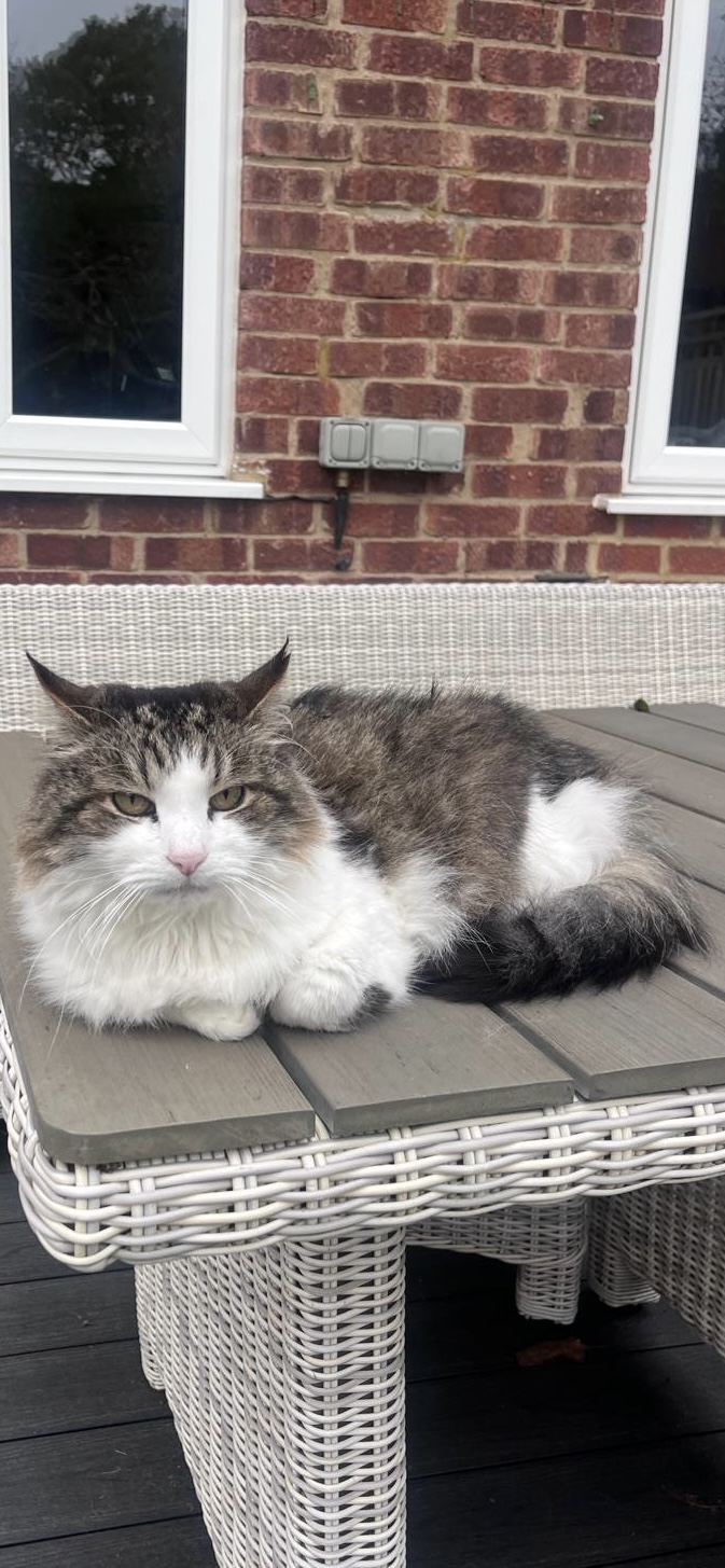
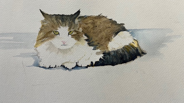
This is Pepe, a neighbour’s cat, a handsome devil, although getting old now. he is good natured but easily spooked, so you have to be careful how you approach him. Iwas asked to paint his portrait and tried to explain that animal portraits are not really my thing, but that I would try my best.
This my best shot
I liked what I had done, but does anyone want my opinion. As it happened his owner and my neighbour loved it, so all was well.
Following on from one cat portrait which I didn’t know I could do, I have decided to try another from a photograph my son sent me, showing a cat basking in the sunshine. He was walking round Ludlow at the time. he called it ‘chilling cat’. I prefer alley cat
Quite a lot in this picture to amuse a watercolour artist. A lot of shadows with a light source at the end of the alley as well as the cat itself. We’ll see how that turns out. It may be one of those pictures that needs a sample done first. Whichever, it will keep me amused
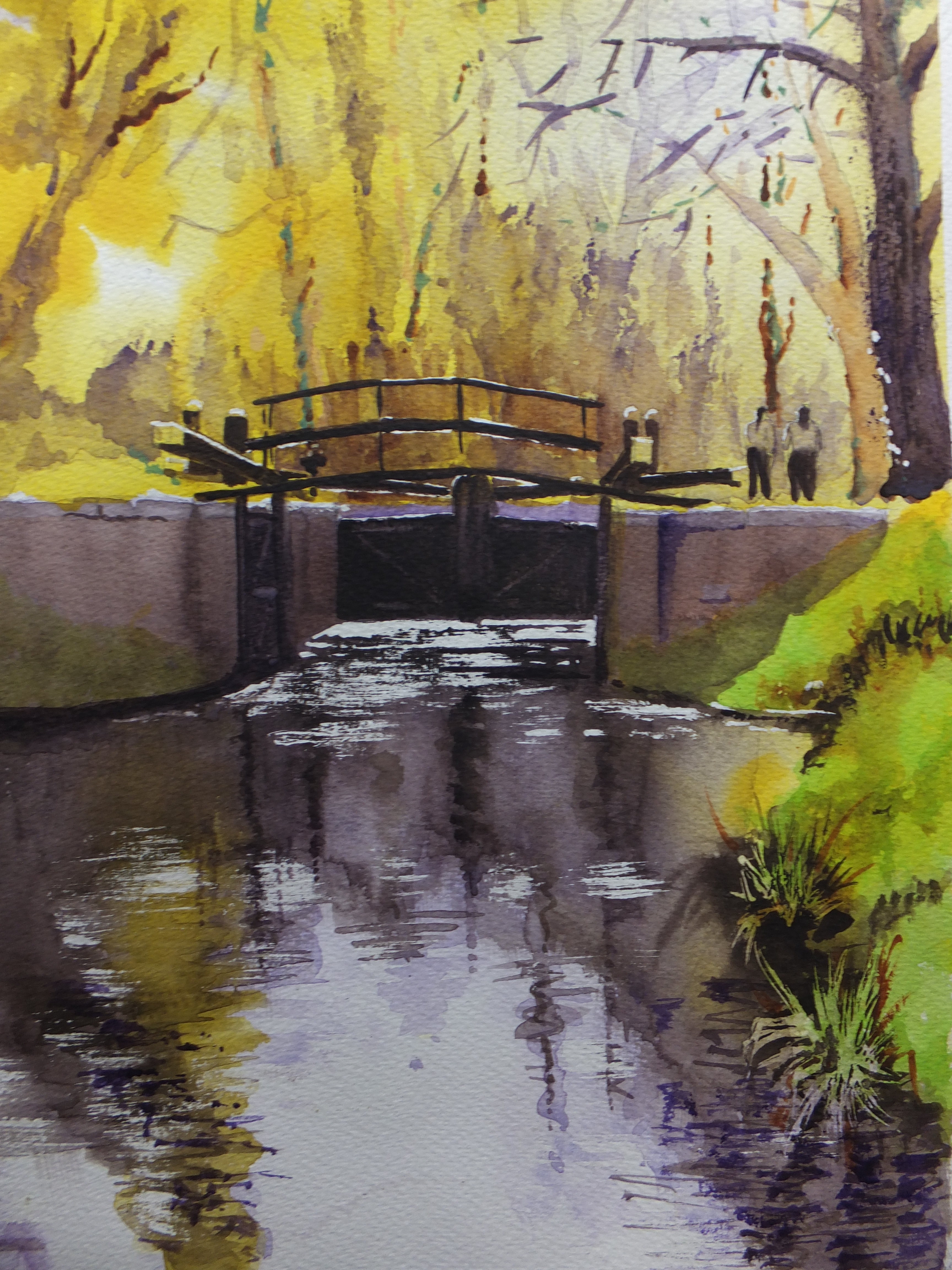
This is a really old favourite. The lock gates on the Basingstoke Canal, which flows quite near where I live. The canal is part of our industrial heritage, cut in the late eighteenth century to provide an inland link between London and Southampton, a major seaport. This was the time of wars or imminent wars with France, and transport by sea was fraught with risk, so the Wey was linked to the Arun by canal and extended to Portsmouth, which lasted for a short while, and this canal now called the Basingstoke was planned to reach Southampton. It never got there. It reached Basingstoke in the north of Hampshire, and then came the railways ,and canals were quickly redundant.
This painting went out to New Zealand by the way. It was bought by a young couple who’d come back to visit an elderly mother. They came to one of my shows, and took this painting home with them. That was years ago. I hope it’s still giving pleasure.
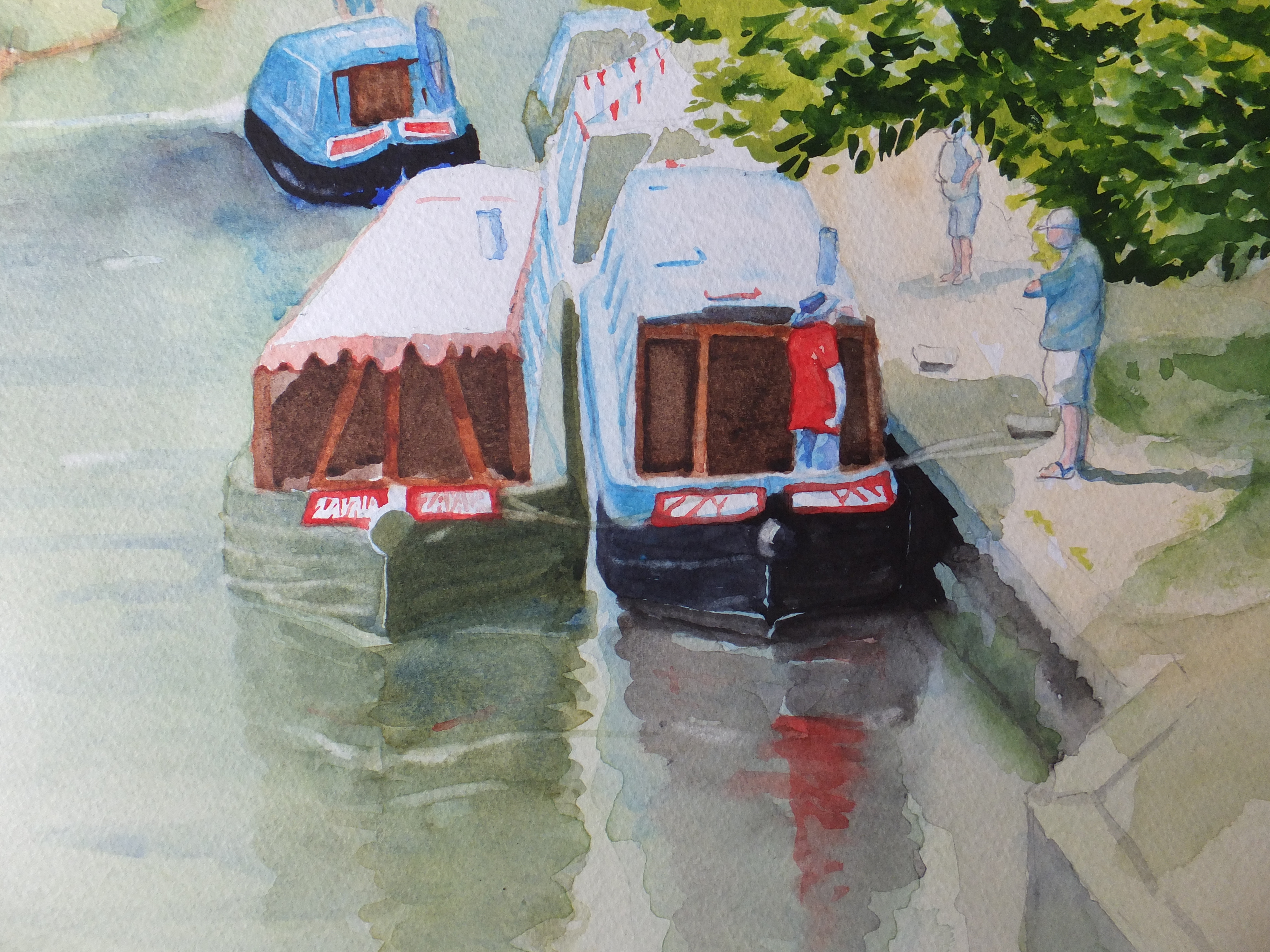
Today this canal is used for leisure only and is a haven for wildlife. It also gives artists and photographers subjects for their art. I’ll include a few
Barges gathering on the Basingstoke Canal
These are barges, of the type used for transportation in times gone by, which are now used for leisure purposes.Every so often there is a gala, when the barges get together as part of their social exercise. This is an ideal spot alongside one of the old wharves, which is outside our local Italian restaurant, which you can’t see, but is to the right of the picture. Delightful on a summer evening to sit outside with a glass of Cava and watch the activity on the water. The old boathouse is there too, long converted to a pharmacy.
I stood on one of the old bridges, Kiln Bridge, to take the reference picture for this painting
Kiln Bridge in winter sunshine
This is the bridge over the canal leading into the village of St John’s. Kiln Bridge, well the clue is in the name. When they were building the canal, they made the bricks as they went along. The village grew up around the canal in a shanty town sort of way, and most of the buildings are Victorian. The shop opposite in the picture is a restaurant today, but in its day was a haberdashers shop for a while, in those good old days when small shops could make a living selling everyday things, before being driven from the high streets.Today restaurants and beauty parlours proliferate but at least they aren’t empty
The village took its name from the church of St John’s which was built by the rector of Old Woking, as a chapel of ease for the villagers. Very considerate, as everything was a walking distance in those days, and a five mile trudge to church in bad weather would be offputting even to the most pious.
I haven’t painted this church yet although I do intend to. It is a handsome Victorian church by a very well known architect George Gilbert Scott, who was responsible for many new churches up and down the country, not to mention restoration of old churches and cathedrals. Not just churches but also remembered for the Midland Hotel outside St Pancras Station, which was derelict for many years and beautifully restored comparatively recently. There were three generations of architects. Giles the grandson, built power stations like Bankside now Tate Modern and Battersea finally developed into a magnificent shopping mall. He is especially remembered for the red telephone box, which now are collector’s items.
For the moment, that is enough for one post. An interesting journey for me which I hope you enjoyed as well. I am quite elderly now, so if I want to look back again, there is plenty for me to look at
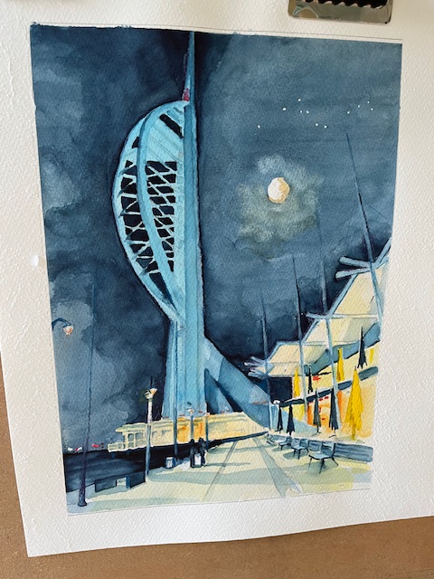
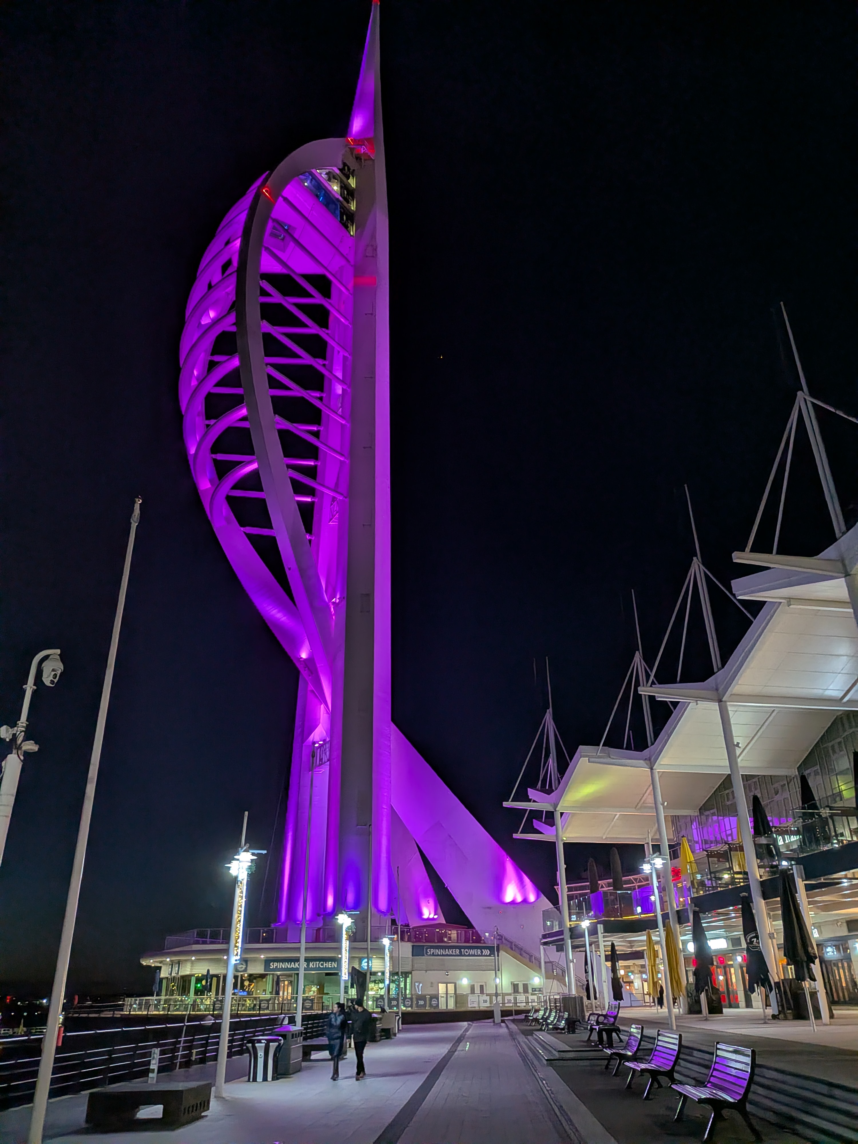
This is the finished painting literall hot of the easel. This was a commissioned painting which the client has previewed, and is delighted with. That is always a relief. I was happy with it, but art is subjective, so one is never sure. i don’t remember tackling a night time scene before one that is highly illuminated. It is quite tricky as so many light sources to take into account. Interesting nonethe less.
I used indigo for the night sky and introduced cloud and the moon to make it more interesting. An occasional dab of black where I wanted the sky to be really dark. Quite a lot of masking out on this one. The tower itself for one which was a big job, plus the gables over the restaurants. Also I had to do a lot of lifting of colour for example to produce the tall poles which are shown in deep shadow on the photograph. They worked well. I was pleased from some of the comments afterwards that the mood created was what I was trying to get. Some drama and some romanticism, bearing in mind that this was someone’s special place
As always I was privileged to be entrusted with something that is special to someone, and as always so pleased that it turned out well.
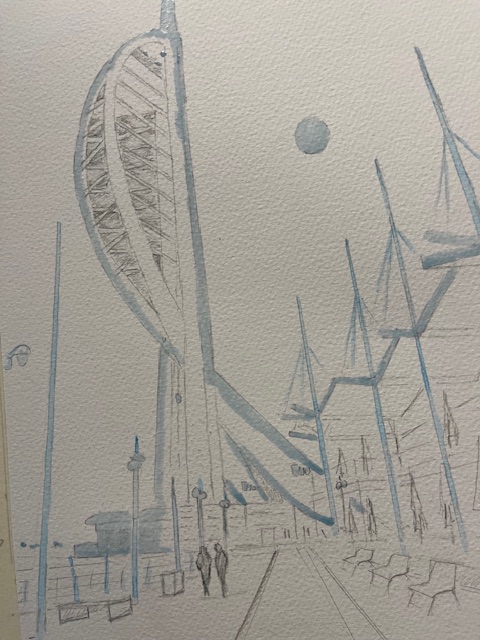
This is the drawing so far and even this took some working out. There was an awful lot of masking out to do. The tower itself has had to be protected as the night sky will be darker than the colour chosen for the tower itself.
Likewise the gables on the rooves over the shops on the right hand side have had to be protected. I don’t usually like a lot of sharp edges in a painting, preferring to let colours blend, but in this case it has been unavoidable. Plastic or metal edges really have to be shrp otherwise just look wrong imho.
I am apprehensive about starting the painting on this one, especially the sky. If that doesn’t work, and I have to start again, then I will have wasted a lot of time. Let’s not go there. I have retrieved worse situations
This must be one of the trickiest commissions that I have ever accepted, and one which questions my wisdom. Firstly working out a colour for night black, and it won’t be black ,has not been easy. Black in large quantities I find tends to flatten the painting, unless it is a raven glossy black which works for many things but not sky imho. Then what colour to use for the illuminated tower itself, and there we have a certain choice of watercolours that have a luminous quality, but which one to use against which night sky that is the question.
This is the client’s photograph btw and is a very good one in terms of composition. So many aren’t and refreshingly I have little or nothing to change other than possibly including the moon, which i have agreed with the client. Perspective is intriguing which I like. All those lines going towards the vanishing point will be fun to work with
I have done various trials and have shared these with the client. For the night sky I looked first at a midnight blue colour, definitely steering away from black per se. To mix a midnight blue I am using indigo with a touch of Payne’s Grey, which is a blue black colour, and is useful. A lot of artists avoid Payne’s Grey but I find it useful at times. in fact that was the other contender for the night sky, as it is not quite black, as I say more of a blue black colour. So that was my submission for the sky. Now for the illuminated tower. The colour needs to be luminous which is not that easy with watercolour. I chose in the end pthalo blue and as an alternative, permanent rose both of which would work. I also glazed pthalo blue over rose just to see what would happen and again the result was workable
The client came back quite quickly. She preferred the indigo version of midnight blue and also the pthalo blue for the tower. I was relieved about that, as both were my preferred option, and in neither case did I lead her in anyway
So I know which direction I am going in, and will proceed with the painting. I will come back about that although probably not too soon
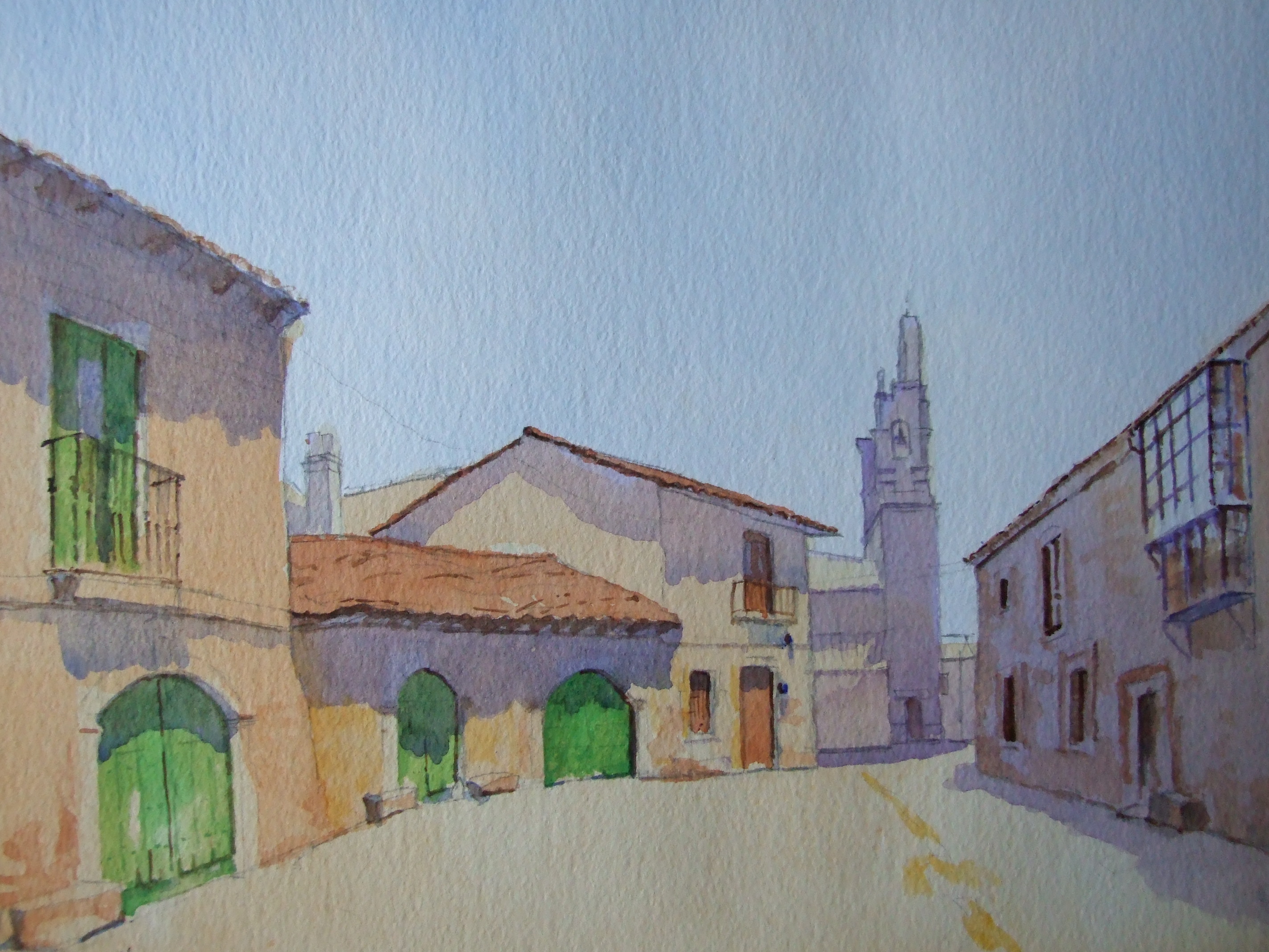
This is a painting that I made many years ago. We were on our way to Santiago de Compostela, and we broke our journey at this village. Unfortunately i couldn’t remember the name. It was about mid day and it was very hot. The street was deserted. Everyone was taking refuge from the sun. I took a reference photo and painted it later
I showed it once or twice, and eventually put it into store where it stayed out of mind. Just recently it sold on line out of the blue. The buyer was a lady who bought it for her father who comes from Galicia, so in effect it is going home, which is nice.
Looking at old paintings is rather like looking at old photographs, a pleasant reminder of a trip that one made some time ago. We flew into Madrid and travelled north by coach, stopping first in Rioja. When we got into Galicia, I was impressed by the green countryside which looked similar to the UK. Nice to see an old friend off to its new home
Back in the summer, we toured the Baltic. At one time we did eight shore excursions in eight days. Even by cruise ship, we found this tiring because of our age, especially my wife who has walking difficulties, so we might not attempt this sort of holiday again. Copenhagen was just one of the stops we made in Denmark
Touring the canal system was fun. i like painting boats and this was just one scene that I snapped for reference. Quite a lot of light and dark in this shot. The sun was very bright especially on the buildings in the background. Deep shadows were cast by the trees, which accentuated the boats. The figures on the canal side were reduced to silhouettes. It took me several glazes to get the water to be an acceptable colour, whilst at the same time still looking transparent. This was more of an exercise about light against dark, than anything else
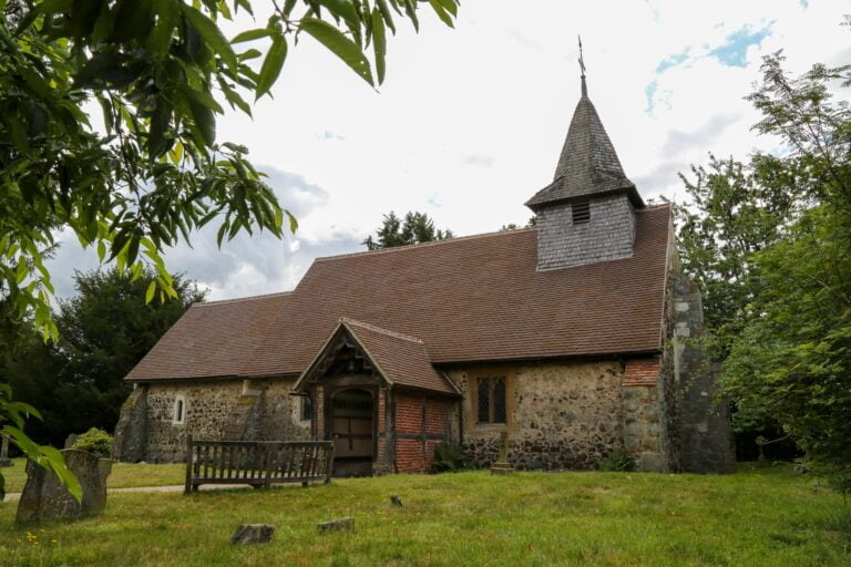
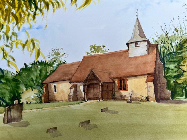
I have been commissioned to paint this church, the village church of Pyrford in Surrey. Ancient yet still in use as a parish church, it is set in a tranquil spot, and is quite charming. The lady who commissioned it no longer lives in the area. Her parents are buried here, so a meaningful place. I always feel very priviliged being asked to paint places that are so important in people’s lives. I am working on it at the moment and will post the result
This is how the painting turned out. I have put sunshine into the painting as the photograph was taken on a very dull day, so the colours are brighter. The lady who commissioned this painting was very pleased, which is always a relief
I have another commission now, quite different to the last, This one is a wedding venue, which I get asked to do from time to time. This one involves marqees and the newly wed couple strolling in the grounds around a lake, so quite a lot of different things to worry about, Still it’s good to have these commissions coming through as sales from my gallery are poor at the moment. Times are hard everywhere still and doubtless will be for some time
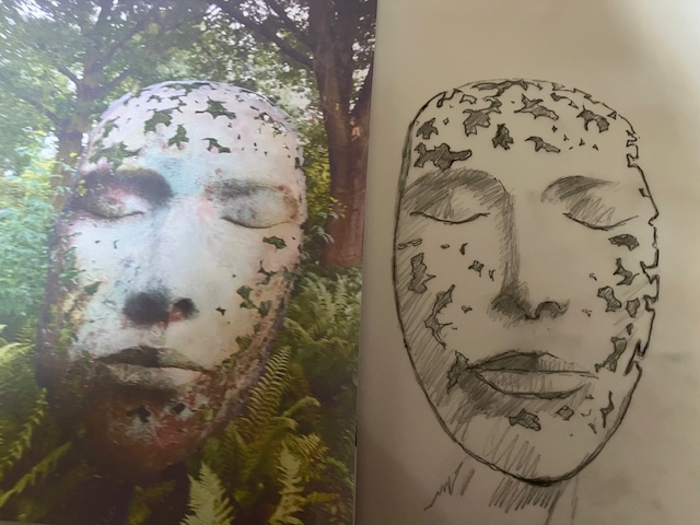
I have talked about this sculpture before. Leaf Spirit by the sculptor Simon Gudgeon, which is in Kew gardens. This isn’t the only example of this sculpture but the only one that I have seen. I did a blog about this some years back. It is in my opinion, an amazing piece of work, and I did wonder at the time whether I could attempt a painting of it, and in watercolour too, which will be a handicap in this instance.
This isn’t about the result, but more about the exercise and what I will learn from it. i suspect that it will be a steep learning curve, to coin a well worn phrase
I have found this to be a very hard year for selling paintings. I am not alone in this. There is a dearth of disposable income around the world. Competition for sales is fierce at the moment. Fortunately this is not my day job but for some artists life is tough. My mentor at our local art club has given me very good advice. Step out of your comfort zone, and paint things which challenge you. Don’t necessarily paint subjects that you expect to sell. So I have made a start on Leaf Spirit. I have done the drawing which has been surprisingly tricky. No matter how often I checked my measurements, the expression on my face is not quite the same as the one in the photograph. Mine looks more feminine for some reason, but it could change again with colour added.
I will go on with this at another date. I have some other projects queuing up and they too hopefully will take me in new directions. This could be the start of something totally different, a change of style even. For now, we will see where it takes us. Good I am starting to get inspired again
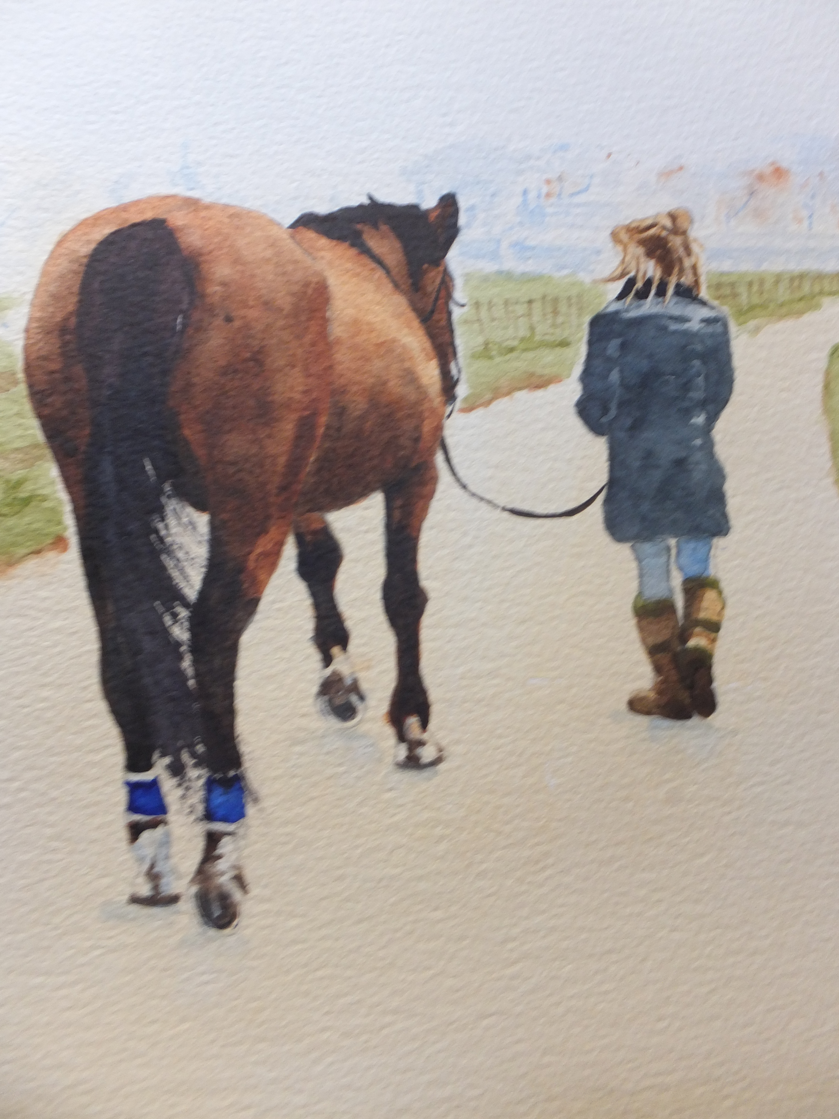
This is the type of commission that I enjoy doing. One of my favourite subjects, painting horses, and in this case, a charming composition, of a horse being brought in to the stables, possibly for saddling up, by her young owner.
One of the most difficult things to get right was the colour of the horse. A brown horse doesn’t sound very complicated but there are many shades of brown, and I needed to get close to the original reference photograph. This horse looked like a bay to me, with black mane and tail, and with black legs. I did the horse over several days, building up the colour and letting it dry overnight. Until the colour was dry, you just could not tell what it would look like. Eventually I was satisfied with the result
Most other things were relatively straightforward. I blurred out the background to increase the feeling of distance. Also in the photograph the background was in direct competition with the main subject.
The composition now worked well and told a story. I was a rider myself once long ago, and this picture reminded me of those days. My son and I would go north for a week to Northumberland, where there are some very open spaces. We would ride from place to place, and overnight the horses with local farms. They would stay out overnight, and in the morning we would have to go and find them, and bridle them up. Horses are cunning and when they saw you coming would make for the higher ground. You really worked hard to catch them. Once you got the bridle on, you could bring them down to be saddled for the day’s ride. This picture reminded me. Incidentally all this happened nearly forty years ago. My son is 53 now and me, well, I don’t ride anymore.