Leaf Spirit by Simon Gudgeon- a Tribute

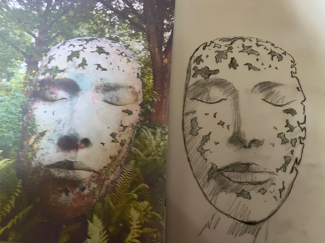
I have talked about this sculpture before. Leaf Spirit by the sculptor Simon Gudgeon, which is in Kew gardens. This isn’t the only example of this sculpture but the only one that I have seen. I did a blog about this some years back. It is in my opinion, an amazing piece of work, and I did wonder at the time whether I could attempt a painting of it, and in watercolour too, which will be a handicap in this instance.

This isn’t about the result, but more about the exercise and what I will learn from it. i suspect that it will be a steep learning curve, to coin a well worn phrase

I have found this to be a very hard year for selling paintings. I am not alone in this. There is a dearth of disposable income around the world. Competition for sales is fierce at the moment. Fortunately this is not my day job but for some artists life is tough. My mentor at our local art club has given me very good advice. Step out of your comfort zone, and paint things which challenge you. Don’t necessarily paint subjects that you expect to sell. So I have made a start on Leaf Spirit. I have done the drawing which has been surprisingly tricky. No matter how often I checked my measurements, the expression on my face is not quite the same as the one in the photograph. Mine looks more feminine for some reason, but it could change again with colour added.

I will go on with this at another date. I have some other projects queuing up and they too hopefully will take me in new directions. This could be the start of something totally different, a change of style even. For now, we will see where it takes us. Good I am starting to get inspired again
Recent Commission

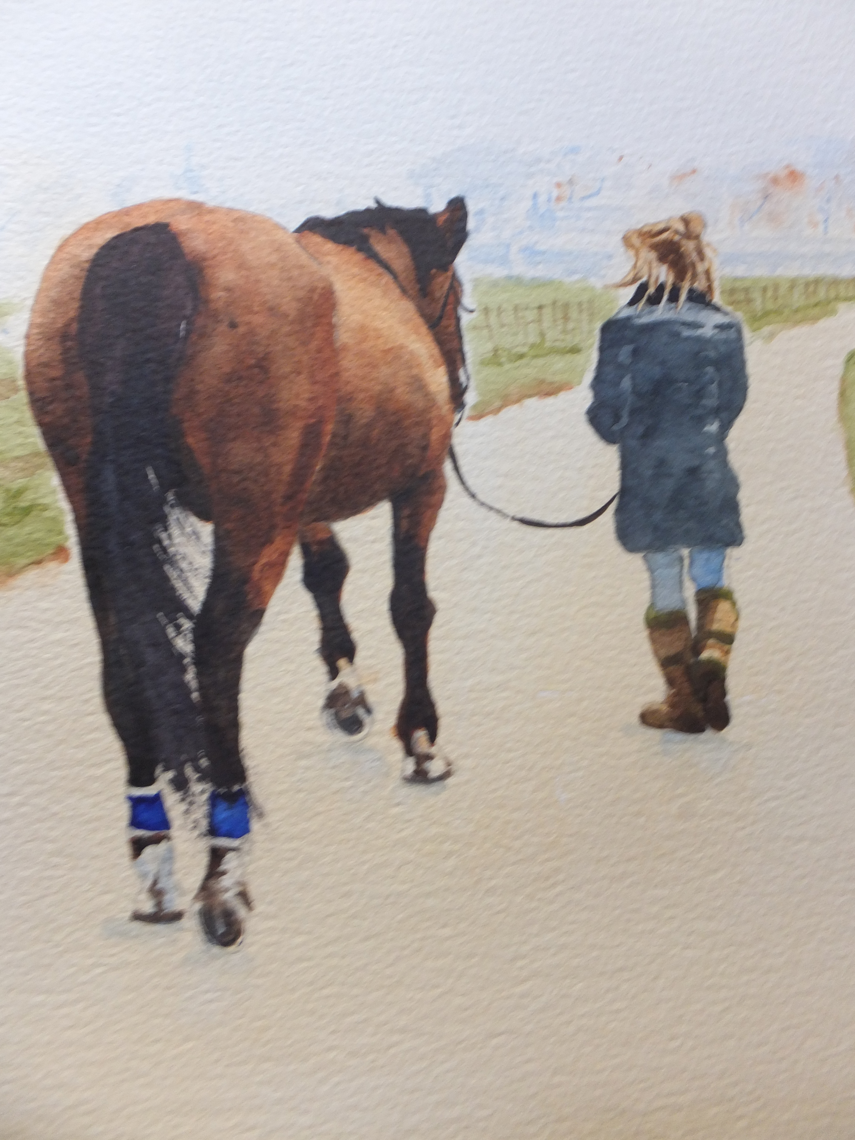
This is the type of commission that I enjoy doing. One of my favourite subjects, painting horses, and in this case, a charming composition, of a horse being brought in to the stables, possibly for saddling up, by her young owner.

One of the most difficult things to get right was the colour of the horse. A brown horse doesn’t sound very complicated but there are many shades of brown, and I needed to get close to the original reference photograph. This horse looked like a bay to me, with black mane and tail, and with black legs. I did the horse over several days, building up the colour and letting it dry overnight. Until the colour was dry, you just could not tell what it would look like. Eventually I was satisfied with the result

Most other things were relatively straightforward. I blurred out the background to increase the feeling of distance. Also in the photograph the background was in direct competition with the main subject.

The composition now worked well and told a story. I was a rider myself once long ago, and this picture reminded me of those days. My son and I would go north for a week to Northumberland, where there are some very open spaces. We would ride from place to place, and overnight the horses with local farms. They would stay out overnight, and in the morning we would have to go and find them, and bridle them up. Horses are cunning and when they saw you coming would make for the higher ground. You really worked hard to catch them. Once you got the bridle on, you could bring them down to be saddled for the day’s ride. This picture reminded me. Incidentally all this happened nearly forty years ago. My son is 53 now and me, well, I don’t ride anymore.

Bosham Harbour and Church- an old favourite

A pale evening glow in one of my favourite places, Bosham harbour, with the Saxon church in the background. The church is featured on the Bayeux tapestry. Harold Godwinson prayed here before setting sail on his ill-fated voyage to Normandy. The church is shown as a large arch, most likely the huge chancel arch still there today. Nave and tower would not have existed then

Reputedly too, the legend of King Cnut attempting to turn back the waves is also supposed to have taken place here. But that is only a story

I painted this view of Bosham as I needed another local painting for an exhibition in Chichester, which is very much a new area for me. I was invited by a local gallery to take part, and I took my paintings down this Monday. The exhibition lasts for three weeks so it will be interesting to see what happens

Chichester is the county town of West Sussex. Very old, its foundation was Roman, and which has a direct link to London by Stane Street which is typically a straight line, although known today as the A24 if I remember correctly. The town centre is beautiful, with its 13c cathedral and 14c market cross.

The painting hopefully shows the harbour with an evening glow. I used quinacredone gold which usually works well

Anyway it is on show with others, and we hope for great things

Two Camargue Stallions

Firstly I am indebted to Wendy Hodgkins Corniquet for her excellent reference photograph

I find it hard to resist Camargue horses and when I saw this picture, I felt that it would work well as a painting

The only thing I changed was the background. The photograph had a background more like a sunset, which I have changed to something plainer. I felt that concentrated more on the horses.

Camargue horses as you know, run wild in the wetlands in the Rhone estuary. They are always white, which adds to their impact as a herd, especially galloping through water.

I have painted them many times, as featured on my web site davidharmerwatercolour.co.uk

Southsea Pier Sunrise in Watercolour

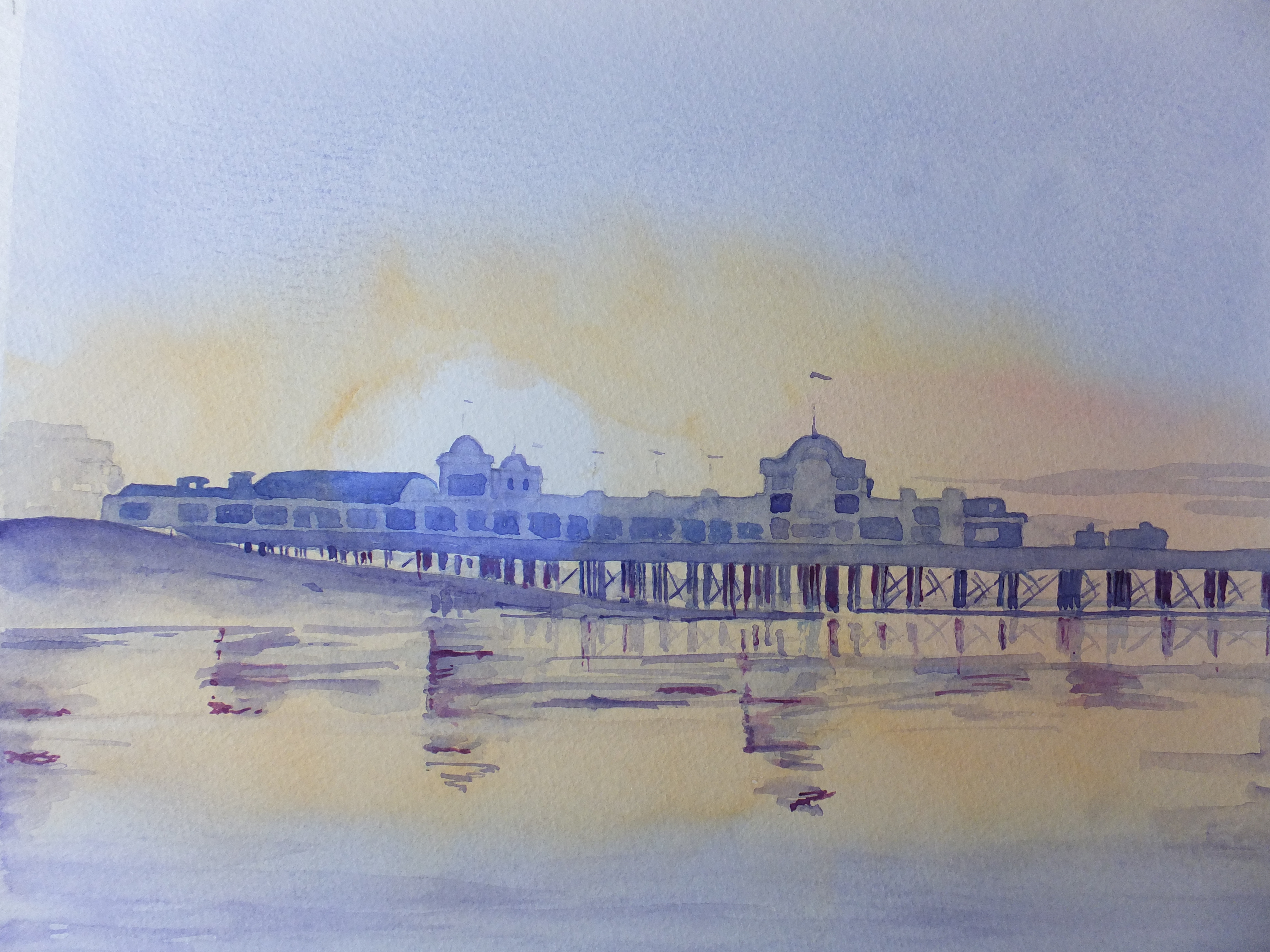
Sunrise over South Parade Pier in Southsea

A favourite place from my childhood. We were taken there and allowed to play on the gaming machines, which were not very sophisticated in those days. I remember putting in one old penny which was the pre-decimal currency, so value today, one half of a new penny. The aim was to flick a ball bearing round at speed and see where it landed, hopefully in a slot which gave you a payback. As I say, extremely unsophisticated

This painting relates to the reference photograph which I posted last time, which I was kindly allowed to use by Vicky Stovell of Smiley Sunshine Photography.

I used few colours. Cadmium Orange, Ultramarine Violet, Dark Mauve and Cobalt Blue. I combined the blue and the violet for the sky as well as the wet sand at the bottom of the picture. The uprights for the pier were in deep, deep shadow so i used the dark mauve, instead of black which I avoid where possible.

In order to get the bright sun image, I held a tissue in place with one finger, and then applied the first wash. There are probably better ways of getting that result, but that was the best I could think pf at the time

This painting will be going in my September exhibition at Denbies Wine Estate, so hopefully will freshen up the collection

I have another Istanbul painting in preparation so will post that at a later date

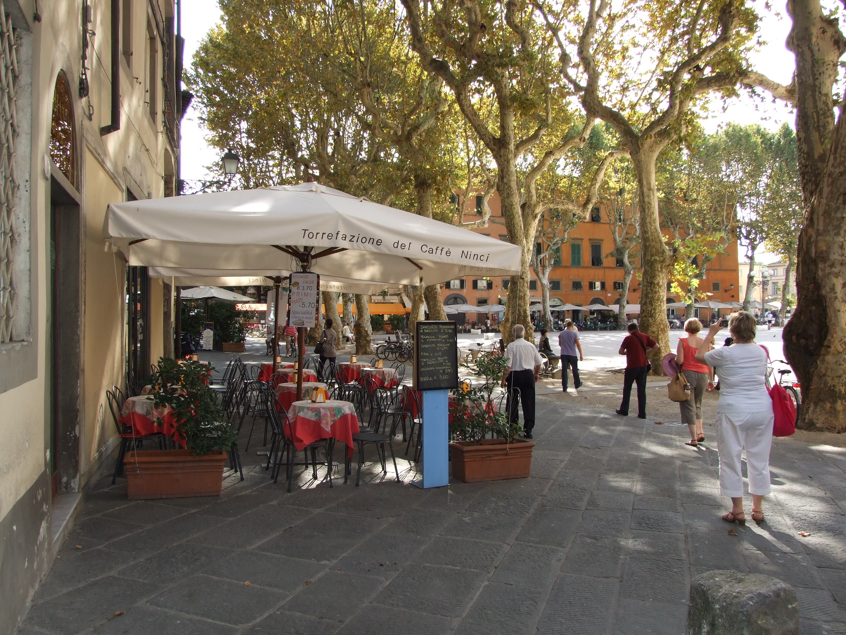
Lucca in Tuscany, looking at the Town Square

The town square in Lucca, Tuscany

I have just started looking at this picture with a view to producing a painting from it. We were here some years ago now. Lucca was one stop on a railway tour that we did of Tuscany. We were staying in Montecatini at the time which was lovely. All the towns we wanted to visit were on the same railway line which was very convenient

Florence, Pisa, Siena and Lucca were all very accessible. We combined a short visit to Lucca with a visit to Pisa. I would have liked more time in Lucca but as you can imagine Pisa with its cathedral and leaning tower was more demanding. This photograph of the old square reminded me that I wanted to paint it one day. Some years back I did paint another view of the square, and sold it last year to someone in Portugal, which sounds strange, but not really as so many buy my pictures as a souvenir of a happy visit.

I have started sketching in some of the larger features of the picture. The trees dominate. They are amazingly tall, dwarfing the buildings let alone the people. I am not sure what type of tree it is, maybe lime or plane. The bark colouring is distinctive, a sort of greenish gold which will be interesting to replicate. An empty restaurant doesn’t inspire, and cries out for a few diners and maybe a waiter.

It will be interesting to see what I can make of it

Horses of the Camargue: Preparing to Paint

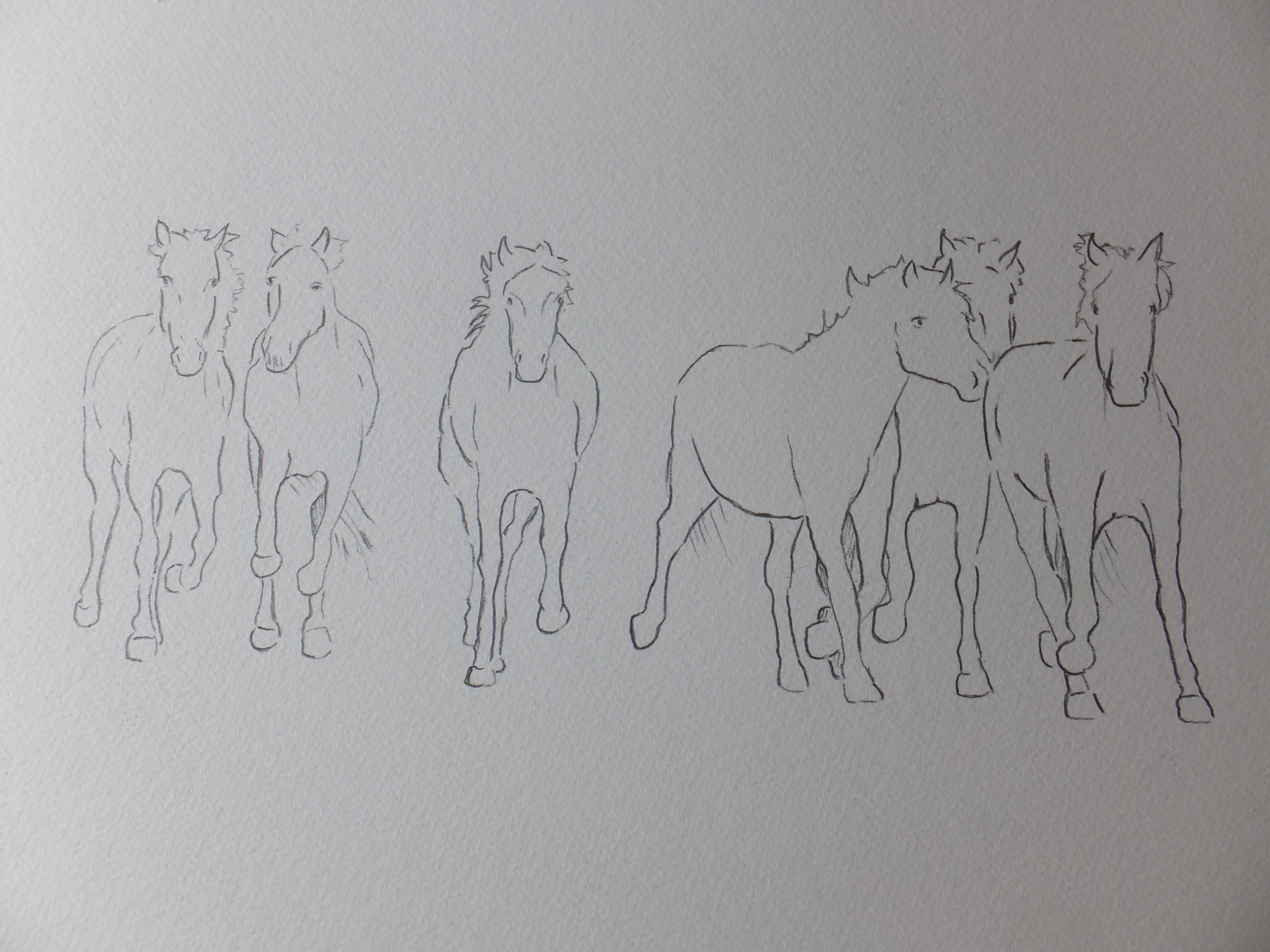
Line Drawing on Watercolour Paper

The Line Drawing on watercolour paper

I have transferred the sketch just as a line drawing onto the watercolour paper. The size of the image is roughly what I want, about 30×40 centimetres

The painting will be interesting to say the least. The horses should be lighter than the background, and as you know, you can only go from light to dark with watercolour and not vice versa. The manes and tails in the photographs seem to glow as though they have light behind them. I think they will have to be masked out for that to happen. I may have to put background in first, which will be amusing

I won’t have a lot of time this week as we are going away soon to Sicily, another wonderful source of material. I think before I go, I will hopefully have time to give the painting an all-over wash of Naples yellow and Raw Sienna, which should give the glow of low sunshine that I want. Fingers crossed on that one

So, it may be nearer the end of the month before I can finish the painting completely. This won’t be an easy painting to do for the reasons stated. We shall just have to see how it turns out


White Horses of the Camargue

Camargue Horses

White Horses of the Camargue

When we were in the south of France a few weeks ago, we finished our voyage down the River Rhone at Arles. I have already mentioned my walking tour of the city in the footsteps of van Gogh, as well as the magnificent Roman amphitheatre

Just south of the city, and in the salt marshes of the Rhone estuary, is the Camargue region, famous for its semi-wild horses, its black bulls bred for fighting and also flamingos, which breed there, the only breeding ground of that species in Europe.

I say the horses are semi-wild. They roam the region more or less at will until round up time, but also they are used for riding, and the tamer ones used by riding schools and trekking stations. They are, I believe one of the oldest breeds in Europe, and because of the remoteness of the area, the bloodstock remains undiluted

I wanted to paint them. I do paint horses occasionally, usually heavy draft horses as I find them intriguing, but the Camargue horses are something of a challenge, because of their colour as much as anything. You can always find one white horse or two perhaps in a herd, but a complete herd all the same colour is unusual, and would make a striking painting.

I took some pictures of my own, which were shot from the hip very often as an opportunity presented itself, and were ok but not the best. I bought a photograph from a local, which was much more impressive, and am using this to compose something which I hope will make an interesting painting

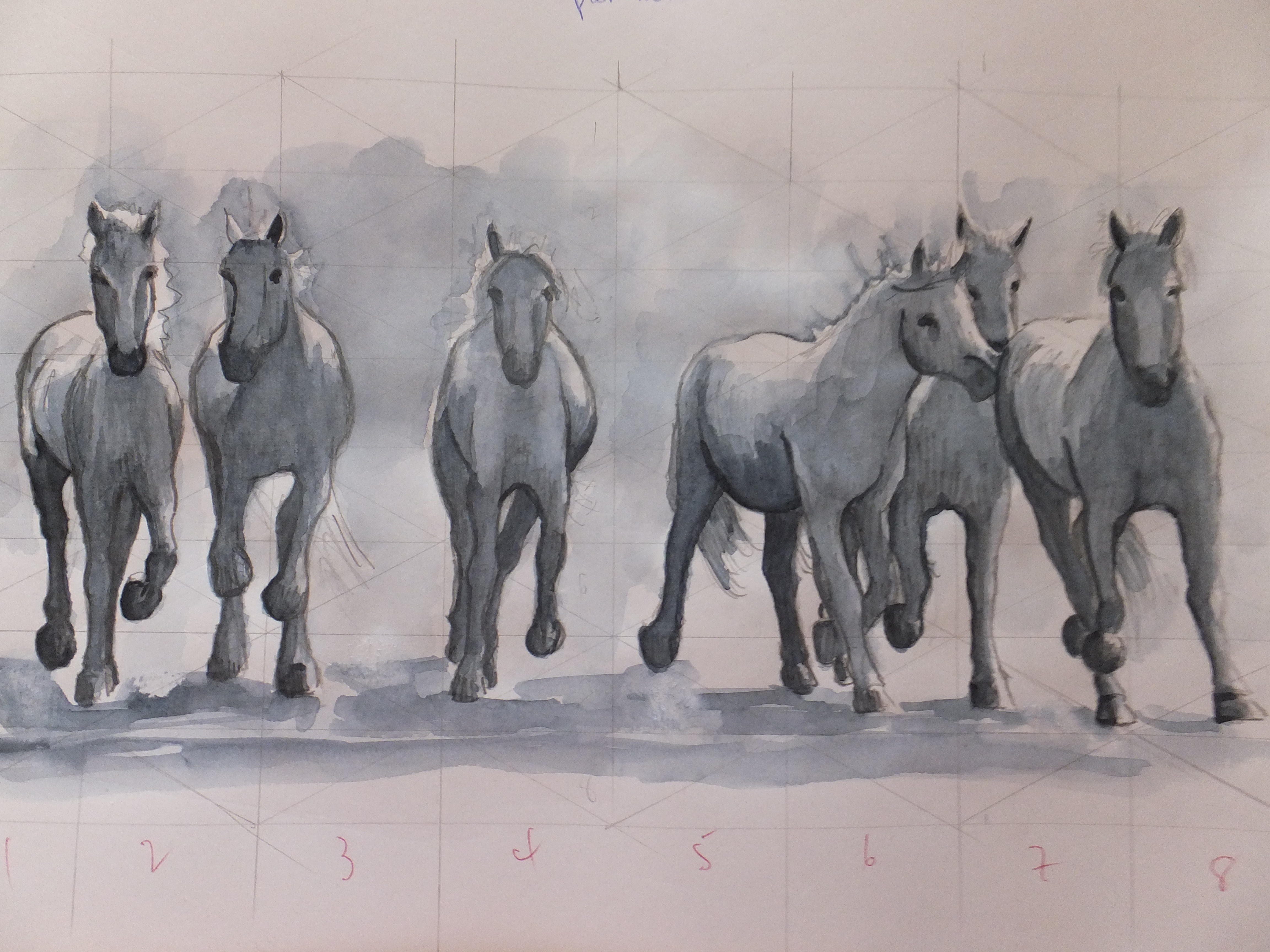
I have sketched something out as above, using Paynes Grey watercolour which I now prefer to ink, which I think will work. Quite a lot of shadow of course on white and how to make it stand out against white paper will be interesting too. I shall transfer this sketch onto watercolour paper and see how we get on

From Sketch to Finished Painting

Lavant Cottage

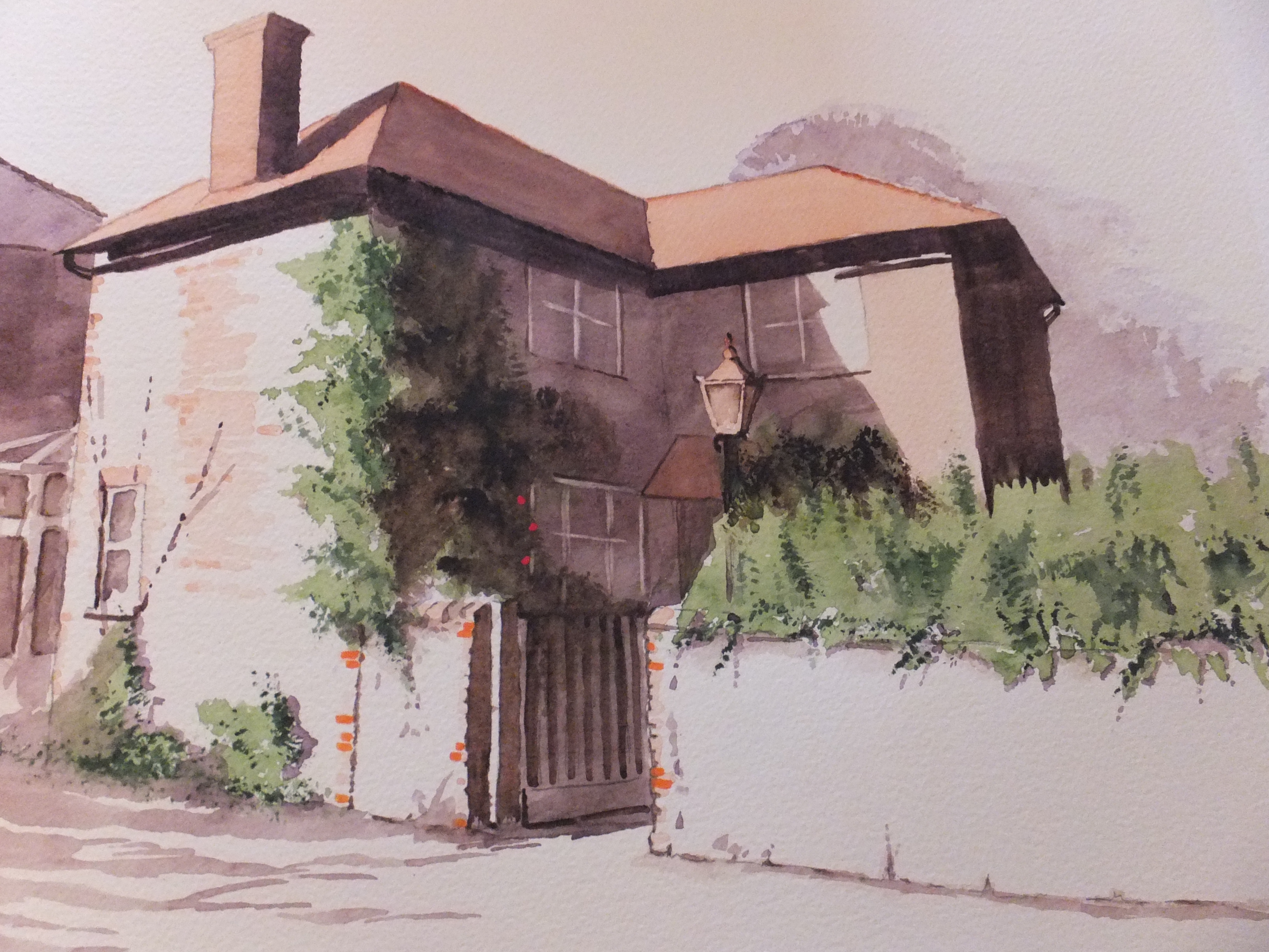
The finished house portrait

Just a pity that the camera leeches out some of the colour, try as I might to avoid it happening. The original has a much softer tone

This was an interesting commission, and of course follows on from the last post about the value of the preliminary sketch. The lights and darks from the tonal sketch were invaluable as a reference. What was so delightful about this subject was the strong light coming from the left and low at that.

After transferring the drawing onto watercolour paper, I bathed the whole thing in a mix of Naples Yellow and Raw Sienna. There was very little sky in the frame, so I saw little point in trying to introduce a sky colour. I have used this neutral sky on several occasions before and it works well, when you need to soften the subject, and also focus on a subject, so pertinent  when you are doing a house portrait.

I usually paint roof tops with Burnt Sienna over the Raw Sienna. This time, as it was a commission, and therefore being more careful, I did some research. Some people use Light Red and some too use Indian Red, I was told. After a couple of trials, I elected to use Light Red, which I found rather pleasing and closer to the reference photograph.

The dark shadow was a mix of Violet and Transparent Brown, always successful. Some orange brickwork and one or two red roses to lead the eye

I was pleased with the result. A nice soft portrait of a period house, which was not unlike a sepia photograph, evocative of the period and somehow timeless.

From here, I can rest from commissions. I love doing them as they challenge me with something new, but I have exhibition commitments from March, which seems a long way off but not really. I have stock enough to do an exhibition now, but most have been seen this year, those that I have left unsold that is.

That means a new collection, so best get started

Sketch Painting

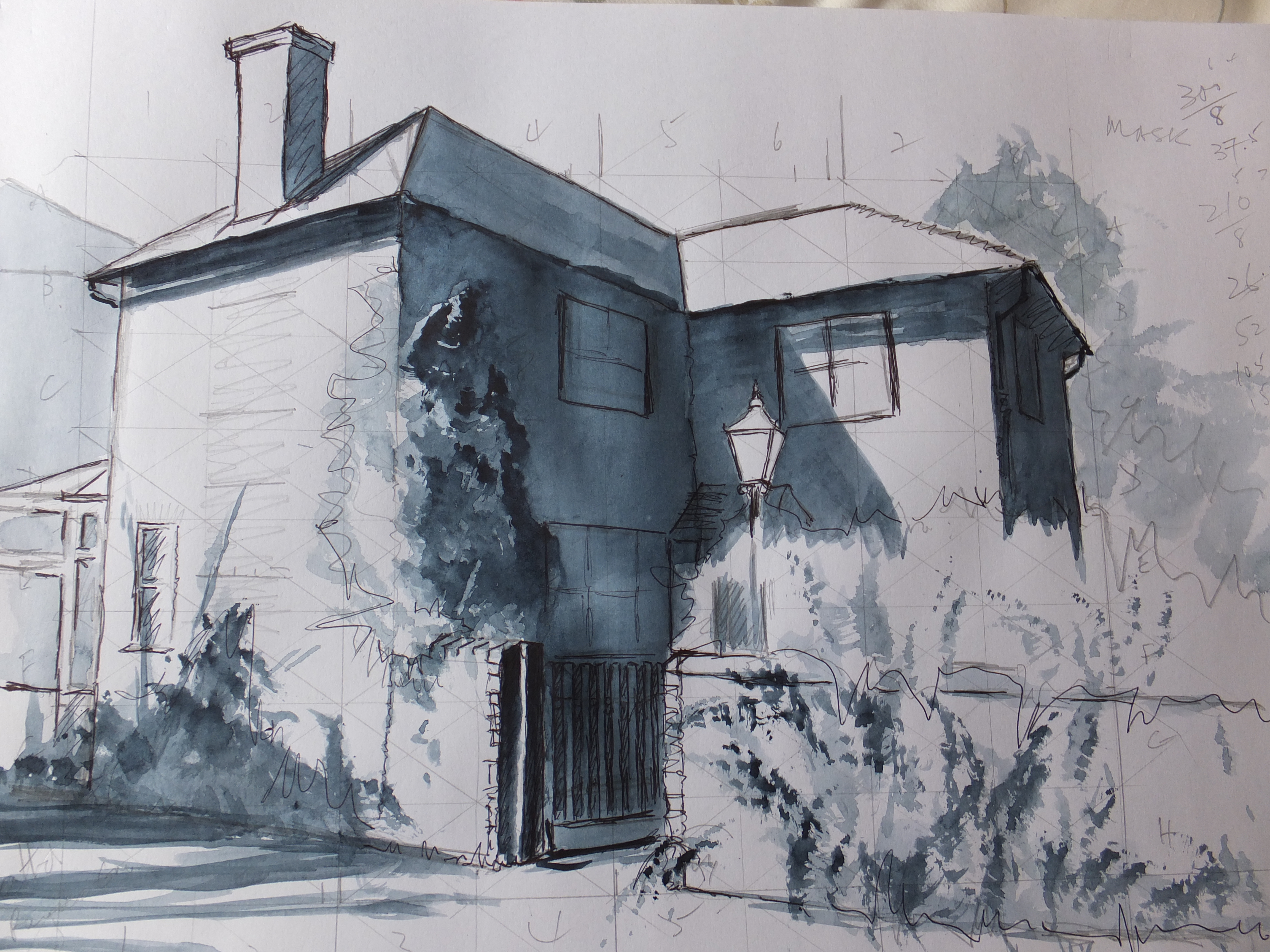
Lavant Tonal Sketch

This is a house portrait that I am working on at the moment, which just serves to illustrate the value of the preliminary sketch. The drawing is very loose, which I often think adds to the effect. Unnecessary detail has been removed. The power is in the tone. The dimensions are to scale. All I that I need is there for producing the final painting. Any changes that I want to make or mistakes that I want to correct, I can do now so that hopefully I won’t be rubbing out on sensitive watercolour paper.

What is it about black and white that captures atmosphere so well, perhaps better than colour?  Something in the drama of light and dark perhaps. In this sketch, I haven’t used black, which tends to flatten a painting as it drains all the light. Ink is even worse in my opinion, and although I like black ink for line drawing, I use watercolour for large blocks of dark. Instead of black, I have used Payne’s Grey, which is grossly undervalued in my opinion. It produces a beautiful blue/grey and the end result is a painting in its own right.

Purists tell us that we should mix our own greys, depending on the grey we want for a particular purpose. I agree and I do that too, but Payne’s Grey has its place. It makes superb skies giving pale greys through to black clouds, and I believe was the reason for William Payne inventing it. It also works superbly well as an alternative to ink for sketching.

William Payne, 1760-1830, Devonshire born, lived in Plymouth, until moving to London in 1790. He was a watercolourist and etcher, and above all, an innovator. His style, we are told, could be easily learnt and he became the most fashionable drawing master in London. His innovations include” splitting the brush to give forms of foliage, dragging the tints to give texture to his foreground, and taking out forms of light by wetting the surface and rubbing with rag and bread”

And of course Payne’s Grey.

Later in life he was surpassed by other artists, and sadly forgotten before his death in 1830