Constable was big in France : Part 2

This is the painting that we always think of and this was shown for the first time in Paris in 1824

This became the style that the French referred to as a la Constable, rustic cottages,wagons in ponds and open fields and skies.

In the light of his French success, Constable’s continues determination not to travel abroad seems nothing short of bloody-mindedness if not pure rudeness. In spite of all inducements from Arrowsmith, from his friend Fisher, and even despite his gold medal was about to be presented by King Charles X himself he was adamant about refusing to go to France.He was thrilled with the medal which was later presented to him in London by the French ambassador. But he was resolved not to go to France

“I hope not to go to Paris as long as I live” he said. ” I would rather be a poor man here than a rich man abroad”. Well, be careful what you wish for. All of a sudden, as quickly as it came,Constable’s moment of French fame passed. By the end of 1825 he had fallen out with Arrowsmith. When the French market crashed like the British one during the mid-1820s, Arrowmith and another of Constable’s dealers Claude Scroth, went out of business. Constable’s commercial conduit dried up. He had sold more landscapes in a short space of time than had been bought by British buyers in years, but now the HayWain came back and The Cornfield was sent back from the Louvre in 1827 unsold

And there it is. It is in the National Gallery now

Constable hadn’t been the only successful british Painter at the 1824 salon. In fact so many British painters were showing , that it was known as the Salon des Anglais, which was quite a coup for the national contingent. Two others like Constable were awarded medals, and another made a Chevalier of the Legion d’Honneur. There seemed to be widespread approval of the so-called “British style” in landscape painting. If only Constable had been more amenable to travel and doing some networking he might well have prolonged his popularity. Delacroix for one was anxious to meet him, but although Delacroix came to London in 1825, and met other painters, there is no record of him meeting with Constable. You can’t imagine Turner squandering an opportunity to make such an important relationship. Quite the contrary, Turner went to a lot of trouble to meet Delacroix in Paris, in either 1829 or 1832. The urbane Frenchman was underimpressed with Turner’s appearance. Constable he described as ‘an admirable man…one of the glories of England’. He recorded Turner as looking’like an English farmerwith his rough black coat and heavy boots, and his cold, hard expression’. Later on though we was to concede that both Turner and Constable were the ‘true reformers’ of landscape painting

So on that note, let’s bring Turner bck into the story. Did Turner also fly the flag for the British School in Paris. No he didn’t.

He was conspicuous by his absence. Despite his enthusiasm for European landscape and despite his frequent travels, and the way he reinforced the preeminece of European culture, he was never represented at the Salon.

He rarely exhibited outside of his own country, only on two occasions and both times probably wished he hadn’t. The first was a solo exhibition in Rome in 1828 when reaction to his work was vitriolic to say the least. There was a cartoon going round which said ‘O Charlatan excrement is not art’ ! The second occasion was in Munich in 1845. Turner was the only British artist showing at an exhibition called ‘Congress of European Art’ Again his painting horrified the locals. The Germans were appalled by the loose handling and lack of form and regrettably interpreted this as a satire upon their country. To add insult to injury the picture was returned to Turner damaged , with additional carriage costs to pay. He was furious and apparently fussed over it ‘like a hen in a a fury’

An interestin paradox then in Turner’s relationship with Europe. Despite his extensive travels and his European outlook, his paintings had limited appeal abroad during his lifetime. It was Constable who was the more prominent of the two. To this day, it remains one of the more unlikely developments in Western art history.

Out of my comfort zone part 2

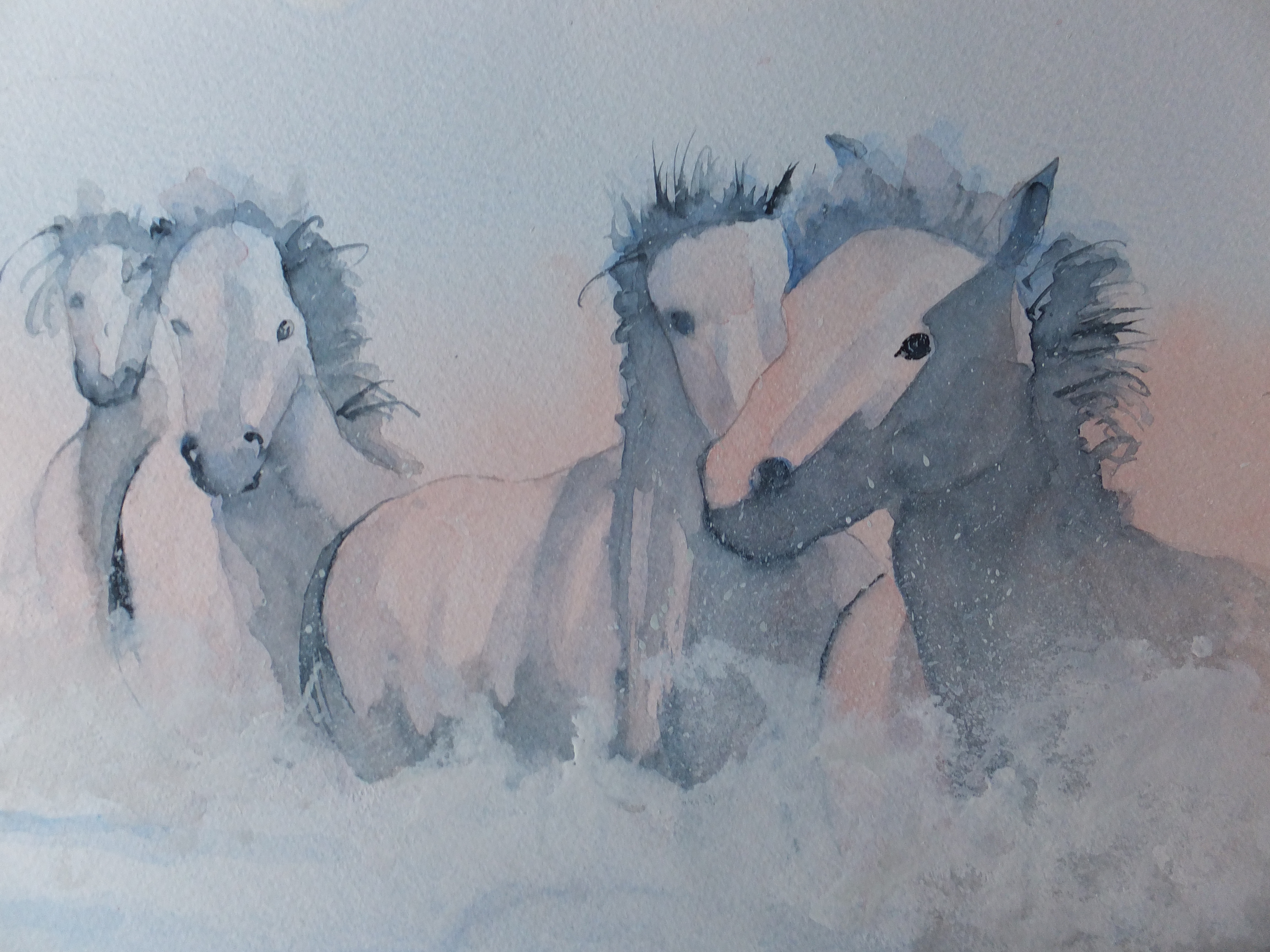
This is the finished painting which I have called Windswept

I have done quite a lot of work on the horses as you can see. One horse in a familiar grey colour whilst the other in deep chestnut with black mane and tail, whilst also with black legs. Manes are swept out in one direction, as well as tails. Powdered snow is being kicked up by their hooves. The general effect I like to believe, is one of storm and threat even of chaos. I will let others judge

I have, I hope kept the strong light coming in from the left. The snow heightens that effect.

Not an easy one to put together. At times I was tempted to abandon, but I usually like to finish before condemning a painting to the bin. I am generally happy with this one, and comments on social media have been enthusiastic

So I will leave it there

Out of my Comfort Zone

Usually I paint from some sort of photographic reference or even real life occasionally. I was advised to step out of my comfort zone when I was heard grumbling about not being able to think of something to paint. This is probably the closest that artists get to writer’s block.

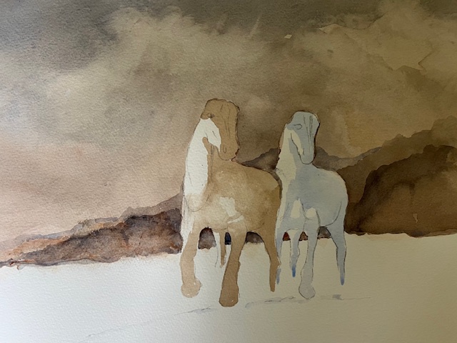
So I started with a reference of a single horse which I duplicated, changing the colour of the second one. I put them in in a rough form.

I started on the background which I began with a coat of burnt sienna, diluted down. I let that go hard overnight, and then gave a glaze of lamp black, dabbing some out with paper towel to give cloud shapes. Lamp black is quite smoky looking and I like the effect it gives to winter clouds. Again I let that dry naturally overnight.

The clouds needed to go darker. I mixed Ultramarine Blue and Light Red and started from the top, adding more red as I reached the horizon line. I let that dry hard whilst I figured out what to do next. Remember I was on my own with no safety net!

I felt that the horizon could do with storm clouds rising. I used another mix of the red and the blue. The clouds didn’t work so they turned into distant hills which worked better

And that is where we are for now

Recent Commission

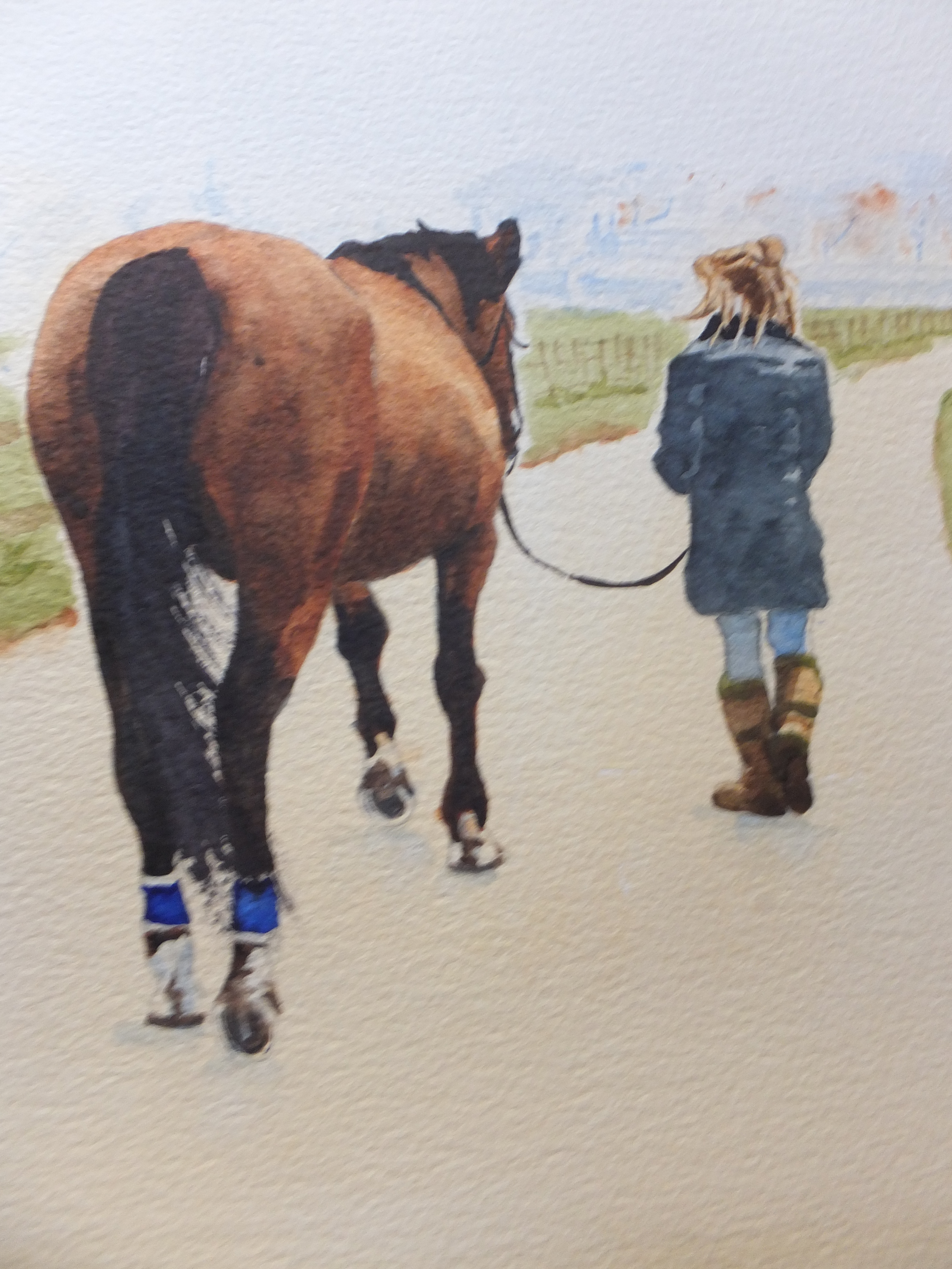
This is the type of commission that I enjoy doing. One of my favourite subjects, painting horses, and in this case, a charming composition, of a horse being brought in to the stables, possibly for saddling up, by her young owner.

One of the most difficult things to get right was the colour of the horse. A brown horse doesn’t sound very complicated but there are many shades of brown, and I needed to get close to the original reference photograph. This horse looked like a bay to me, with black mane and tail, and with black legs. I did the horse over several days, building up the colour and letting it dry overnight. Until the colour was dry, you just could not tell what it would look like. Eventually I was satisfied with the result

Most other things were relatively straightforward. I blurred out the background to increase the feeling of distance. Also in the photograph the background was in direct competition with the main subject.

The composition now worked well and told a story. I was a rider myself once long ago, and this picture reminded me of those days. My son and I would go north for a week to Northumberland, where there are some very open spaces. We would ride from place to place, and overnight the horses with local farms. They would stay out overnight, and in the morning we would have to go and find them, and bridle them up. Horses are cunning and when they saw you coming would make for the higher ground. You really worked hard to catch them. Once you got the bridle on, you could bring them down to be saddled for the day’s ride. This picture reminded me. Incidentally all this happened nearly forty years ago. My son is 53 now and me, well, I don’t ride anymore.

Latest Painting: Galloping Through the Surf

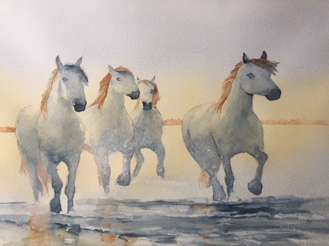
White horses galloping along the shore are always a stirring sight

I am getting paintings together for a new exhibition in March at Denbies Wine Estate near Dorking, and needed some new work. This one I am pleased with and will be putting it forward. This is the latest in my series of Camargue horses. I like this one more than previous horse pictures. perhaps I am getting better!

Recently I was given a commission to paint a horse with its owner. This will be given as a present so a special responsibility. I will let you know how I get on

Two Camargue Stallions

Firstly I am indebted to Wendy Hodgkins Corniquet for her excellent reference photograph

I find it hard to resist Camargue horses and when I saw this picture, I felt that it would work well as a painting

The only thing I changed was the background. The photograph had a background more like a sunset, which I have changed to something plainer. I felt that concentrated more on the horses.

Camargue horses as you know, run wild in the wetlands in the Rhone estuary. They are always white, which adds to their impact as a herd, especially galloping through water.

I have painted them many times, as featured on my web site davidharmerwatercolour.co.uk

More Horses in the Wetlands

I have trieed a different image and with it a different style

I was intrigued by this image, having decided in my mind to give horses a rest for a while. I was struck by the simplicity of the subject, and wanted to capture that. Detail has been kept to a minimum. Despite the activity, the horses seem calm. The water is churned up, yet the painting gives a feeling of peace

I think this is a painting that you can look at for quite a long time.

Others may disagree which is fair comment

Horse and Rider

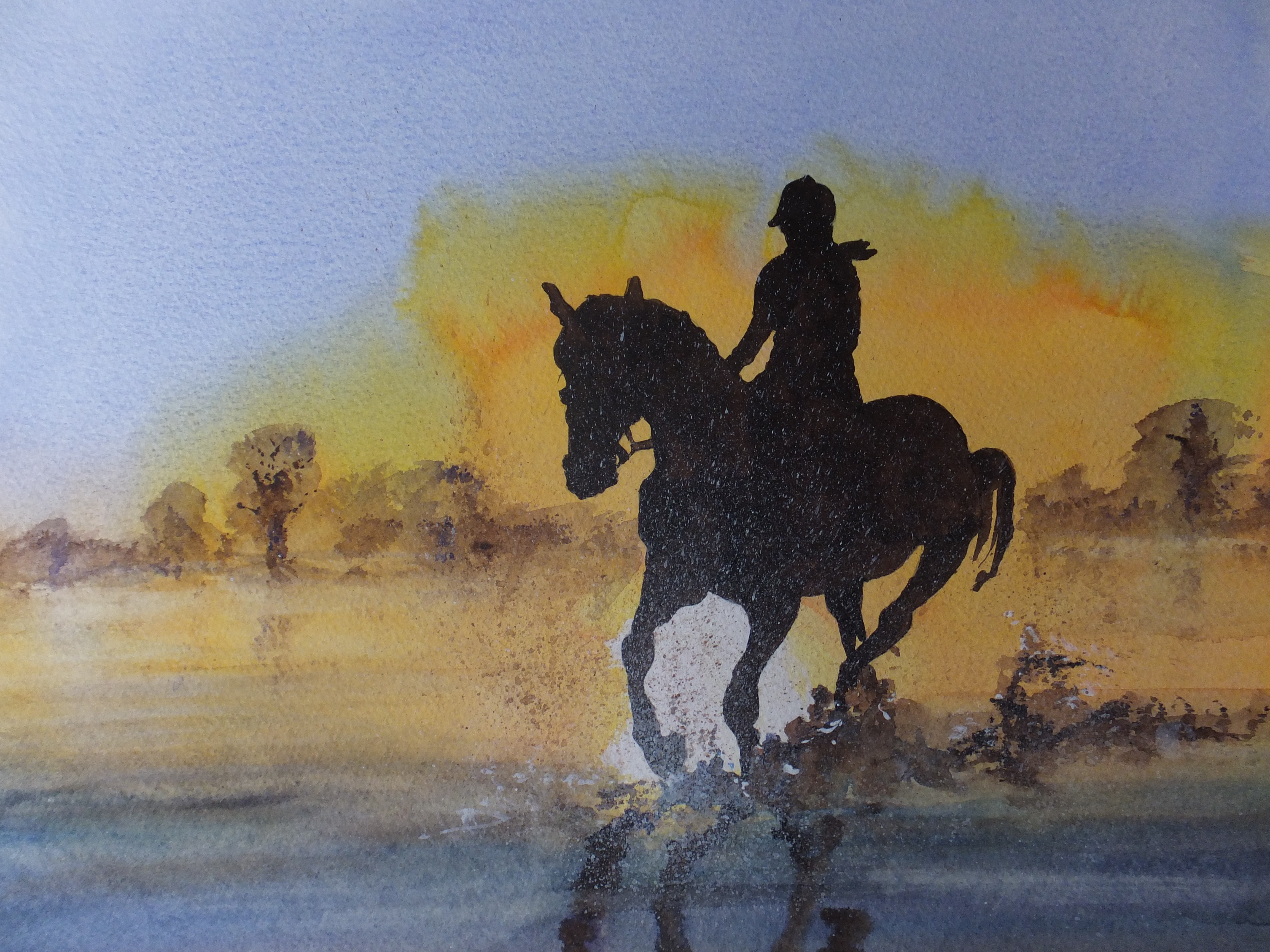
I would first like to acknowledge with thanks Rebecca Photography on Pixabay who kindly allowed me to use her reference photograph, when preparing this watercolour painting

I like, as many will know, painting horses and horses in water. This image intrigued me and presented problems from the start. Horse and rider were a complete silhouette. So? Well, there were no details to help me with the drawing or very few at least. It was difficult, if nigh impossible to check my measurements as I proceeded with the drawing. Likewise the rider, which I don’t normally include but they were the same image. They could not be separated. If you have ridden horses, and I have a little when I was younger, you will know that you have to adopt certain attitudes or body shapes, otherwise you will just fall off. Legs must be in the right place for example. You can’t see the legs in this image so what to do?

I ended up doing a separate drawing of the horse with rider showing her legs and stirrups. I had to match the correct leg position with the rest of her body. That took me some time. It was quite a long time of experimentation, before I was ready to paint. Sky and water were comparatively straightforward in comparison. I had to give horse and rider two coats of burnt umber before I had a perfect silhouette.

I must have done something right. The painting sold on its first announcement

I would have liked her for my current show at Denbies Wine Estate but you can’t have everything, and anyway you can only sell a painting once

I hope you enjoy looking and reading my blog

Horses in the Mist Painting Amended

Horses out of the Mist

When I posted this painting previously I thought the horses were floating which was not an effect that I had been trying to get. It was suggested that I add spatter so that it would appear the horses were kicking up mud. So that is what I have done, and I prefer the result. They do now look as though they have feet on the ground

That really finishes this painting, and I can move on to other things

I came across a photograph of Tower Bridge in London, which looks like early morning with very deep orange in the sky and reflected in the water. It is the sort of colouring that I like doing in watercolour. The bridge itself is silhouetted against this bright sky, so not too much detail in the architecture. There are a couple of large boats but little more. It will be very much an exercise in tonal values, which should be enjoyable

I will post some images on my next post

Horses in the Mist — the finished painting

My version

This is my finished version of the photograph for which I am grateful to Pixabay

I am not sure about the marbling, not that I have tried to emulate the original exactly. I have used more orange and more blue, which has made the painting brighter, rightly or wrongly. My eye at the moment, is going from one image to the other. I don’t think I have captured the same feeling of movement as the original . When I look at the original I can almost hear the hoofbeats. My horses seem to float on a cloud, which is weird or ethereal depending on your preference.

Still it has been an interesting exercise and one of the most taxing that I have tried for a long time. Certainly a change from architecture