Bosham Creek, the finished painting

Bosham Creek

This is the finished painting, which I happen to like, although I will admit to one or two scary moments

I have managed to keep to a rather limited palette. Cadmium Yellow which I mentioned before and Ultramarine Violet, together with Transparent Brown which I softened with Violet. This is still my favourite shadow colour. I used Vermilion for some distant red clouds behind the trees, and also for the red paint along the hull of the hulk on the beach.

After getting the sky about right or so I thought, as the dark clouds coming in from the sea might have been darker, I put in the distant buildings along the shore line of Bosham village. The steeple of the Saxon church, so well-known as to need little introduction, is probably the only building that needs to be recognisable, although I have done my best with the others, plunged in shadow as they are.

To the right are two beached boats, one clinker built and the other which looks as though made of fibre-glass, so not the easiest to convey in watercolour. The dunes with some coarse grass rise in front of them, and make a convenient break

The beached hulk is one of those things that are fun to paint. So many details and textures with rusting metal and flaking paintwork on the timber. I mentioned that someone had daubed white paint on the prow, which I could have left off but decided to include. I daubed masking fluid on and then overpainted several times with the dark brown mix. When the masking is removed, then that should look like white paint over rough brown planking. That was the plan. I hope it has worked.

The real test of course is getting the light right and the highlights in the right place. I hope I have done that. The camera again has bleached out the colours, try as I might, so in reality the shadows are much deeper, and appear more convincing. Oh well, in the scheme of things, not the worst problem one could have.

Going back to the Bosham Painting

Bosham Underpainting

We are going back now to before the last two commissions, which I was pleased to take on, challenging though the last one was. I still await the final judgement from the client on that one, as she comes back from holiday on the 16th only, so fingers crossed under the table on that one.

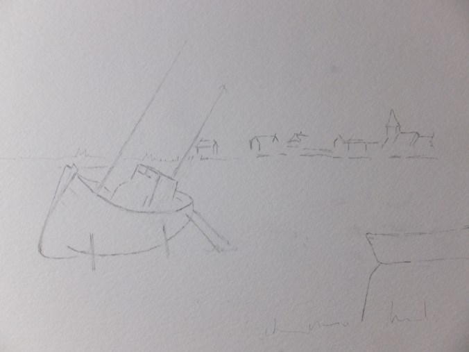
I had started this painting of Bosham Creek, or rather drawing, with just the main elements in place.

So far I have added two dilute coats of watercolour across the page. Violet running into yellow, mostly with a watery coat of vermilion over the whole thing when bone dry. I dashed some pure yellow pigment into the area where I think the sun is setting. In the photograph this yellow shrieks at you. In reality it doesn’t. I am often intrigued how the camera sometimes disagrees with the human eye. Possibly one of those paintings which won’t sell on the internet, alongside a few others.

The hulk on the beach, I am hoping will provide most of the interest. The detailing on this sort of subject is usually a lot of fun, and tends to draw the eye. I noticed in the photographic reference, that someone has daubed white paint along the prow. I have used masking fluid here in a dry-brush fashion. Going over this later with dark brown pigment, and then removing the masking, should leave the illusion of white painted roughly over dark brown. I hope that makes sense. We will see later if it works or not. I have done it successfully in the past, which is of course no guarantee of success in the future

Since taking this picture I have started to darken the clouds and will gradually go on, wet over dry until I like what I see, hopefully. That will be the judgement, not getting them too dark or yet too wishy-washy. We shall see, and much still to do.

The Finished Docklands Commission

Finished Dockland Commission

And this, I believe to be the final draft. I hope so. I am just starting to get tired of it being continually on the easel

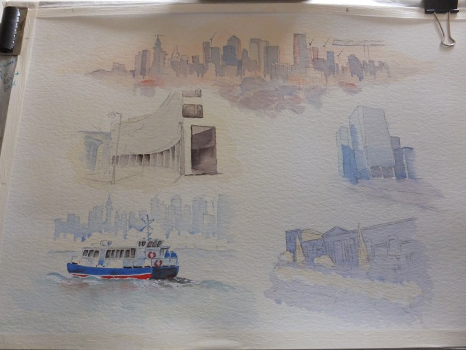
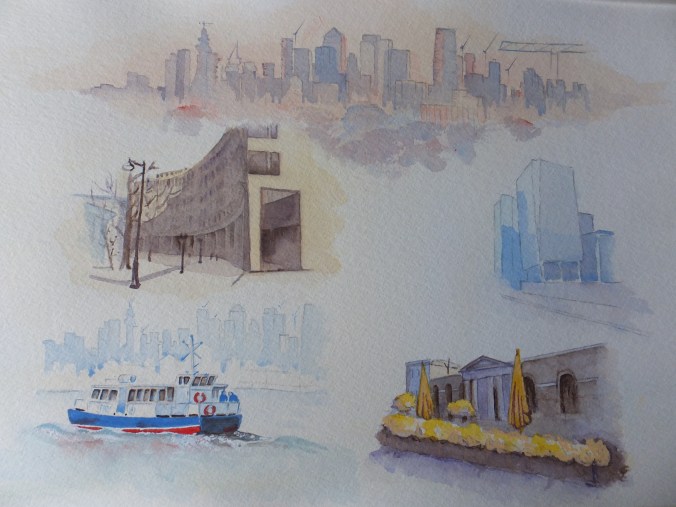
However as cautiously as I can say, I am happy with it. I have kept within the terms of the commission, which was not easy, whilst at the same time, adding something myself to stop this being five copies of five photographs.

The Canary Wharf skyline has had some shadows added which have helped the definition. The little cranes even give a feeling of distance

Lensbury Circus, the second picture, that was difficult. Never easy to make anything of office blocks with lots of windows, we usually have an interesting sky or something to alleviate the sterility of square buildings. Not in this case as we are working with five vignettes, so all I could think of was to put some extra shadow over the front of the building and abstract those windows. More of an impression really

Bottom right, the pub, I think worked well. I used Cadmium Yellow for the umbrellas and the plants, which I think worked in conjunction with the violet used on the front of the building

The other two images I talked about on the last post, and still the little ferry boat is my favourite

The client is away until the end of June, so I will present the finished work then with fingers crossed under the table

To Continue with the Docklands Commission

Five Image Docklands Commission Partway Only

Well, out of the mist, some definition is starting to appear here and there

They wanted the Canary Wharf skyline to run along the top. Incidentally I photographed this on the easel so I am sorry that the images appear slanted. Also there are some shadows and stuff which shouldn’t be there. Just to make Canary Wharf more interesting I have used sunset colours building up oranges and vermillion across the windows. I have used vermillion and cobalt blue blended for soft shadows, which works, I believe. Little cranes help the feeling of distance. I think that picture is pretty well there, and I was asked to make that image soft anyway. I like to take the client’s instruction into account if I can, but sometimes they have to be persuaded to do things differently.

I finished the little ferry boat. Once I started I just could not stop. I think she will be my favourite image of the five, probably because I like painting boats anyway. For the background I have repeated the Canary Wharf Skyline, which is geographically impossible, but infinitely more interesting.

The pub in the bottom right, is ready for its next coat, which will be Transparent Brown over the Violet, which will give more definition to the building itself. I think yellow for the umbrellas, but I just need to work out which one.

The image which scares me and which I have made a start on is the crescent shaped building of Lensbury Circus. At the moment it is looking rather bleak, as though the area is run down, which of course it isn’t, far from it. All those windows too. They may have to succumb to a sort of lost and found treatment

But there are more positives than negatives so I will get back to it, but not tonight. I have spent hours on this one, but there are five pictures instead of one, which I should have realised when I took it on. Luckily I’m not on piece work or I would starve.

London Docklands Commission

Canary Wharf Skyline

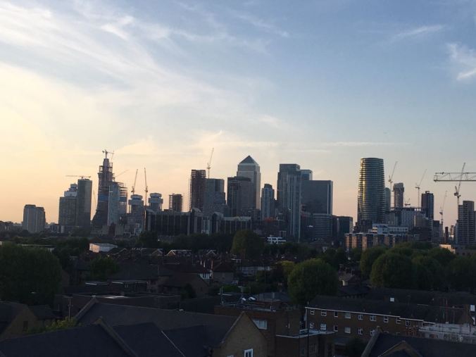
The iconic skyline of Canary Wharf which makes a nice silhouette against an evening sky. The sky has a dull orange glow which should take some pale blue outlines nicely, whilst at the same time, get some orange reflections into some of the windows.

This is only one of the images I have been asked to paint, and then arrange them on one sheet.

Probably one of the more testing commissions that I have been given. This is being commissioned for a work colleague who is returning to his native land in August, so one wants to get it right. Scale and perspective have been abandoned as I try to get everything to fit, but we are moving forward inch by inch

Two of the other images are office blocks, and I have to say that glass and concrete are subjects that I tend to avoid in watercolour. The only saving grace of glass buildings is that they mirror the sky and can appear dramatic. One of them has a tint of green in the glass which makes it more interesting

The pub where they all went has something about it in style, and so,  that I can make something of. The other shot is of the ferry that crosses the Thames from the Docklands Hilton Pier, and of course, anything to do with boats is always a good subject for painting

This has already taken me a long time and will take more. Basically five drawings instead of one, so I should have charged more but never mind

Bosham Harbour goes on hold yet again. Incidentally the lady collected her wedding venue painting and was thrilled with my interpretation, for which I am relieved and delighted.

Churchill place (1)

The Latest Commission

IMG_1723 (3)

This was the latest commission, received earlier this month, required for a wedding anniversary at the end of May, so a deadline to be kept to, which concentrates the mind splendidly.

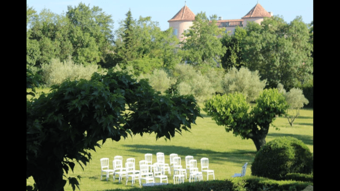
I am assuming this beautiful place was the wedding venue, but I am not really sure. It turns out to be a chateau in the south of France. Lovely to look at, but full of problems for the painter, not least the sea of greens which really take up the page. Just over the treetops, we can see pink rooftops of a building which I guessed might be a chateau, but only later was this confirmed

In the foreground, attractive conference chairs in white, laid out for some formal occasion. Amongst all the broad brush work, some very detailed work indeed. I do have now a very fine brush which points like a pen whilst retaining the capacity to hold quite a lot of water, so not running out continuously. I ended up masking these chairs, which was a tricky operation in itself, but I did use this brush for putting back the grass colour within the upright rails in the chairbacks

An express wish from the client was that the painting should be bright. The light is Mediterranean. No problem, we can do that.

The major change that I made was to cut down on the amount of green in the painting, and introduce some more red to give relief to the eye. I have exposed much more of the chateau than is shown in the photograph. This will be apparent from my photograph of the painting later, but suffice to say, I have taken over about 25% of the picture, with a red colour which I believe has helped the composition, and relieved the tedium of looking at virtually a monochrome image.

The client helped with this by providing an extra picture of the chateau showing the complete facade with its architectural details, and I was able to work from that. I believed this to be one of those occasions where the painting improved on the photograph. The client was delighted, which is always a relief.

As this commission finished I received another one, to paint different aspects of Canary Wharf for a leaving present, so I hope to do that justice. I don’t get that many so two in a month is heartening, especially as I had no sales at Leatherhead.

I attach the painting for interestWedding Venue Modified

I kept the chateau deliberately hazy to indicate heat and distance. As far as the greens are concerned I used four, sap green and raw sienna mix as a base for the distant trees, Antwerp blue and lemon mix for the bright greens, sap green and ultramarine blue for the darks, and green gold for the lawn

The details in the painting are more delicate than the jpeg represents but that is always the case

Art Exhibition at Leatherhead Theatre

Leatherhead Theatre Exhibition May 2018

A new venue for me in a new town, which is always exciting. Leatherhead is about twenty miles from the Woking/Guildford area where I usually exhibit, so this should be a good opportunity to address an audience which as yet is unfamiliar with my work

Leatherhead is a smaller town than Guildford, but prosperous nonetheless, a commuter town with a busy shopping centre. The theatre is in the middle of town, and open all day, so not just with performances but also with conferences, classes and clubs, so we are told quite a heavy footfall

I have entered six framed paintings and five folios. One thing about a new venue is that nobody has seen any of my work so I can give some previous paintings an airing. Galloping Horses is the only painting that hasn’t been shown at all. Certainly the organisers were very enthusiastic about my work, and expected great things, but then organisers always do. My own theory is to expect the unexpected, which seems to work every time. They actually contacted me, which is unusual and pleasing, having seen my website under Surrey Artists.  Maybe that was the unexpected bit!

The exhibition opened this Tuesday and runs until the 15th. I had an interim report on Thursday telling me which pictures were receiving most interest, namely the Flamingo painting which is one of the framed ones, as well as two of the folios, Sicilian fishing village and Cockerel with Hens. Exciting stuff. It could go either way

As I always say, one would be nice.

By the way, I have had to interrupt progress on the Bosham painting, as I have received a commission which is needed for a wedding anniversary towards the end of this month. I am on with this, but still some way to go, as some parts are tricky. I may well write about it later.

Itching to get back to the Bosham painting, though !!

Sketchwork on Bosham Harbour

DSCF4101

I have been away for the last five days or so, in Spain with perfect temperatures of around 20 with gentle sunshine plus sea air. I’m back now to something like 12 and wet so feeling cold. Yesterday I rescued my garden and allotment. Today I am catching up on other things like my blog

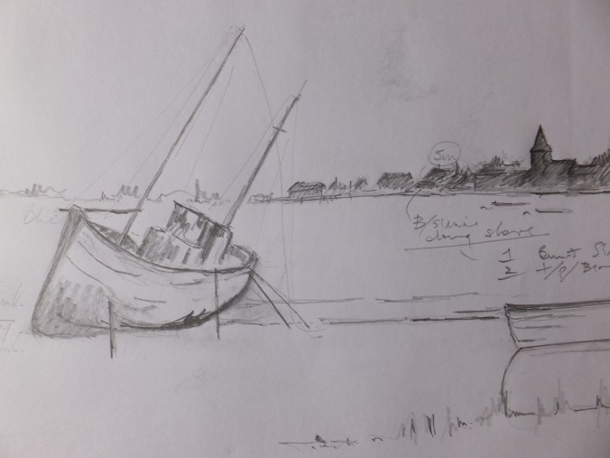
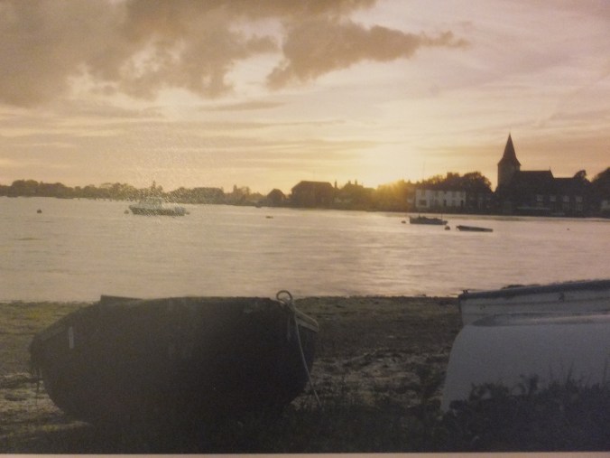
I started last time with an indistinct photograph of Bosham Harbour, which I have done so many times, but this time in evening colours.  Before I went away I prepared some sketches and finally decided on the one which I have illustrated.

I have kept the distinctive distant shore line without much detail. That broach spire identifies the village of Bosham unmistakably.  From my archives I have included a different boat, which will add something to the foreground.  There were beached boats in the photograph which in my opinion did little, although I did include a couple of these to close off the side of the painting to he right.

I think I will use a mixture of violet, yellow and brown for the painting. I am more interested in how the colours work, than in the actual image, so the result may look like an impression of Bosham rather than a record of the harbour itself.

Before leaving this subject, I will mention that I am setting up an exhibition in Leatherhead, in the theatre on Monday morning.  Leatherhead is a town about twenty miles distant, so new territory, which is always exciting

Coming back to the Bosham painting, I will finish with another image, which is the basic line drawing transferred to watercolour paper. We are now ready to paint.

DSCF4100

A different aspect of Bosham Harbour

DSCF3969

i think I may have mentioned ad nauseam that Bosham Harbour with its ancient church is a favourite subject for painting, and is widely known

If I am preparing for an exhibition, I usually like to have at least one view of this beautiful little place. The problem is that everyone wants the same shot, across the harbour with the church against the skyline, so painters, like me, are continually looking for a way to paint this view, and yet make it look different every time.

I came across the attached photograph a few months ago, which interested me. As you can see, it is a gentle evening shot, with some bright sky and some very deep silhouettes. The details are blurred, which is not something I usually do, but found myself intrigued nonetheless. The effect could be impressionistic, which again is not something I usually do. The other thing I liked, is that, when translating this into a painting, one could use a very limited pallette, which I find improves the effect very often. In this case, we are looking at yellow and violet basically, which generally work together very well.

I haven’t used these two colours for a while, so the idea is attractive

I am not sure about how I feel about the beached boats in the immediate foreground. They are certainly an aid to perspective, which I can appreciate, and yet in your face just a bit. I think I will draw some of these separately on tracing paper and chase them round the composition to see what I like best. I have been through my archives of boats too, and have sketched one or two of those, again to see what works.

Despite what I said about getting away from detail for a change, I don’t want meaningless shapes either, and unlike photographers, artists can choose what goes into a composition, which gives us an advantage, so I might be able to get away from that rather shapeless foreground.

I think there will be quite a lot of work with little bits of tracing paper, before we hit on the right composition, so we will see what happens. Yet another journey into the unknown.

Goathland ( or is it Hogsmeade ) Railway Station Finished Painting

Goathland or Hogsmeade Railway Station

The finished article

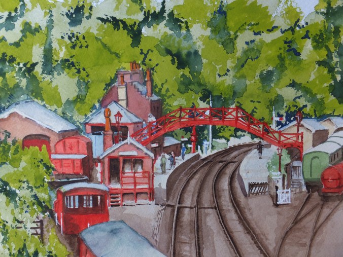
I had no idea how this might turn out. I was attracted by the colours at first. Whoever thought to paint the station and rolling stock in that bright red, and then place them all against all that greenery, certainly had an eye for colour

I am old enough to remember the old British rail rolling stock, which was long past its sell-by date, fifty years ago, perhaps without us knowing. In the 1970s I worked for a company manufacturing furniture, and remember sending consignments in the old British Rail B container down to Switzerland. They were cheap is about all you could say. The journey took several days and the containers let in water, because as I said, they were old. We changed to transport by road using a Swiss haulage company, and the service improved dramatically, but sad nonetheless.

The colours were familiar though. Perhaps more weather beaten which faded the colours, but nevertheless I remember the trucks either as a worn pink or perhaps a deeper browny red

In any event, I have left the colour of the goods trucks slightly on the bright side, in order to stand out against the trees. Who could remember what they looked like as new. We only ever saw them after wind, sun and rain had taken their toll, not to mention smuts from the steam engine, which would have been shunting them in those days

I ended up liking this painting. I can spot mistakes, of course, but enjoyed working on it. Whether the painting will prove saleable is yet to be seen. I have stopped trying to predict what will sell and what won’t, as I am wrong so often

I have the Leatherhead Theatre exhibition coming up, so may try to get it in there.

We shall see