London Docklands Commission

Canary Wharf Skyline

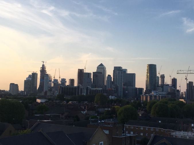
The iconic skyline of Canary Wharf which makes a nice silhouette against an evening sky. The sky has a dull orange glow which should take some pale blue outlines nicely, whilst at the same time, get some orange reflections into some of the windows.

This is only one of the images I have been asked to paint, and then arrange them on one sheet.

Probably one of the more testing commissions that I have been given. This is being commissioned for a work colleague who is returning to his native land in August, so one wants to get it right. Scale and perspective have been abandoned as I try to get everything to fit, but we are moving forward inch by inch

Two of the other images are office blocks, and I have to say that glass and concrete are subjects that I tend to avoid in watercolour. The only saving grace of glass buildings is that they mirror the sky and can appear dramatic. One of them has a tint of green in the glass which makes it more interesting

The pub where they all went has something about it in style, and so,  that I can make something of. The other shot is of the ferry that crosses the Thames from the Docklands Hilton Pier, and of course, anything to do with boats is always a good subject for painting

This has already taken me a long time and will take more. Basically five drawings instead of one, so I should have charged more but never mind

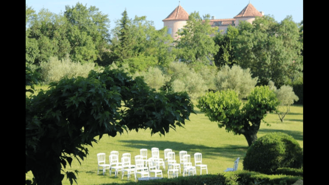
Bosham Harbour goes on hold yet again. Incidentally the lady collected her wedding venue painting and was thrilled with my interpretation, for which I am relieved and delighted.

Churchill place (1)

The Latest Commission

IMG_1723 (3)

This was the latest commission, received earlier this month, required for a wedding anniversary at the end of May, so a deadline to be kept to, which concentrates the mind splendidly.

I am assuming this beautiful place was the wedding venue, but I am not really sure. It turns out to be a chateau in the south of France. Lovely to look at, but full of problems for the painter, not least the sea of greens which really take up the page. Just over the treetops, we can see pink rooftops of a building which I guessed might be a chateau, but only later was this confirmed

In the foreground, attractive conference chairs in white, laid out for some formal occasion. Amongst all the broad brush work, some very detailed work indeed. I do have now a very fine brush which points like a pen whilst retaining the capacity to hold quite a lot of water, so not running out continuously. I ended up masking these chairs, which was a tricky operation in itself, but I did use this brush for putting back the grass colour within the upright rails in the chairbacks

An express wish from the client was that the painting should be bright. The light is Mediterranean. No problem, we can do that.

The major change that I made was to cut down on the amount of green in the painting, and introduce some more red to give relief to the eye. I have exposed much more of the chateau than is shown in the photograph. This will be apparent from my photograph of the painting later, but suffice to say, I have taken over about 25% of the picture, with a red colour which I believe has helped the composition, and relieved the tedium of looking at virtually a monochrome image.

The client helped with this by providing an extra picture of the chateau showing the complete facade with its architectural details, and I was able to work from that. I believed this to be one of those occasions where the painting improved on the photograph. The client was delighted, which is always a relief.

As this commission finished I received another one, to paint different aspects of Canary Wharf for a leaving present, so I hope to do that justice. I don’t get that many so two in a month is heartening, especially as I had no sales at Leatherhead.

I attach the painting for interestWedding Venue Modified

I kept the chateau deliberately hazy to indicate heat and distance. As far as the greens are concerned I used four, sap green and raw sienna mix as a base for the distant trees, Antwerp blue and lemon mix for the bright greens, sap green and ultramarine blue for the darks, and green gold for the lawn

The details in the painting are more delicate than the jpeg represents but that is always the case