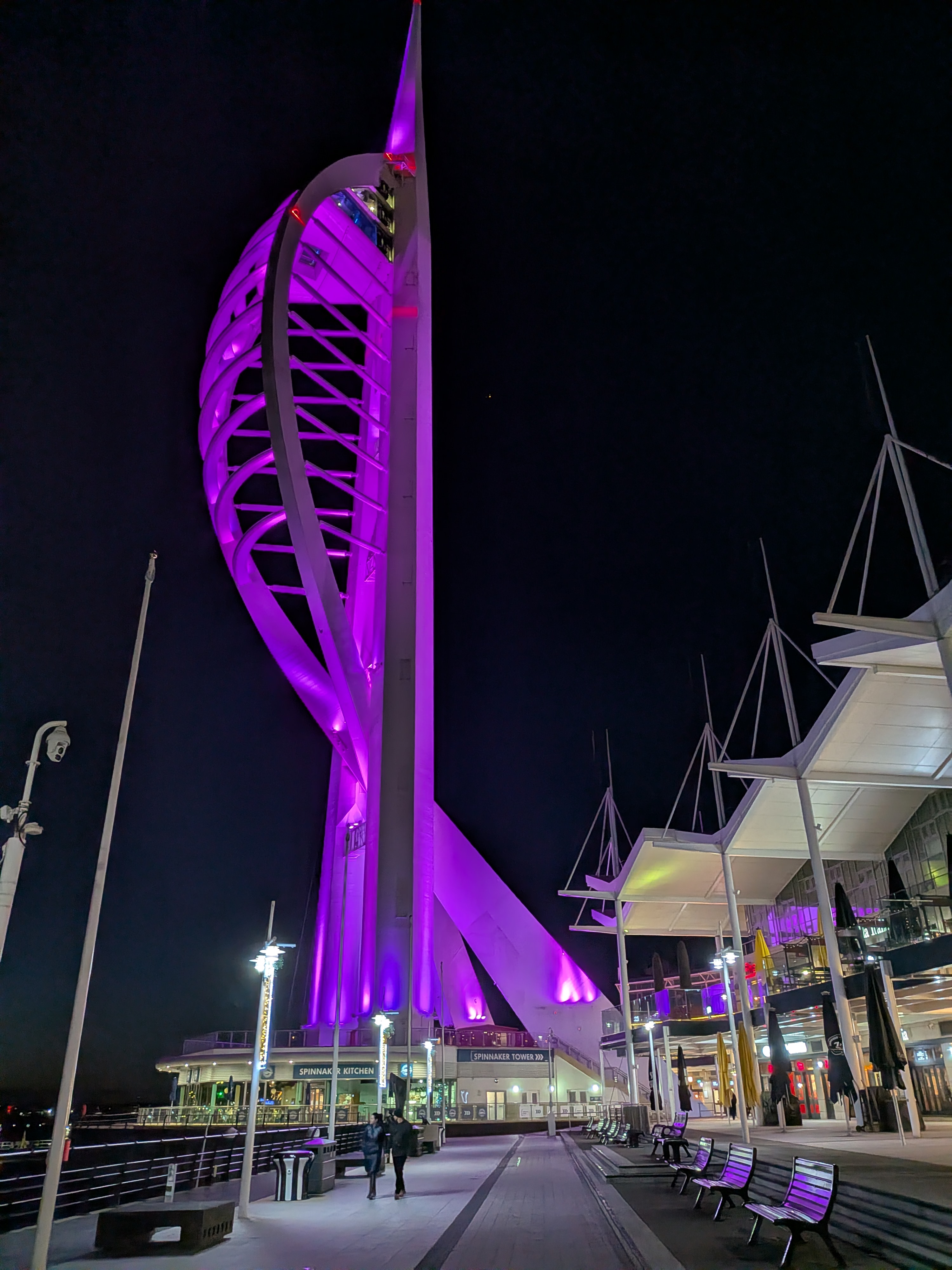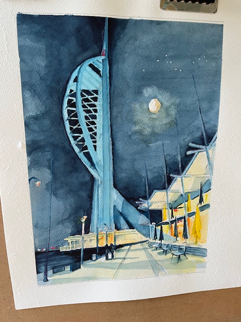
This is the finished painting literall hot of the easel. This was a commissioned painting which the client has previewed, and is delighted with. That is always a relief. I was happy with it, but art is subjective, so one is never sure. i don’t remember tackling a night time scene before one that is highly illuminated. It is quite tricky as so many light sources to take into account. Interesting nonethe less.
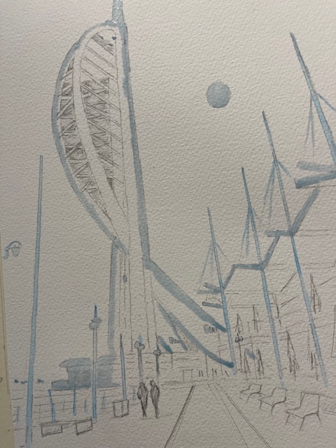
I used indigo for the night sky and introduced cloud and the moon to make it more interesting. An occasional dab of black where I wanted the sky to be really dark. Quite a lot of masking out on this one. The tower itself for one which was a big job, plus the gables over the restaurants. Also I had to do a lot of lifting of colour for example to produce the tall poles which are shown in deep shadow on the photograph. They worked well. I was pleased from some of the comments afterwards that the mood created was what I was trying to get. Some drama and some romanticism, bearing in mind that this was someone’s special place
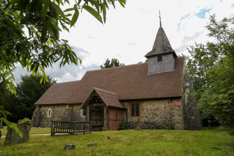
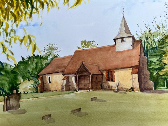
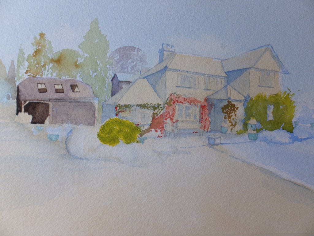
As always I was privileged to be entrusted with something that is special to someone, and as always so pleased that it turned out well.