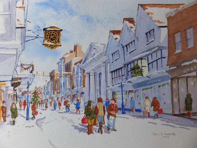
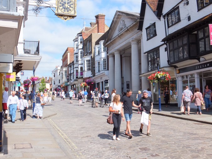
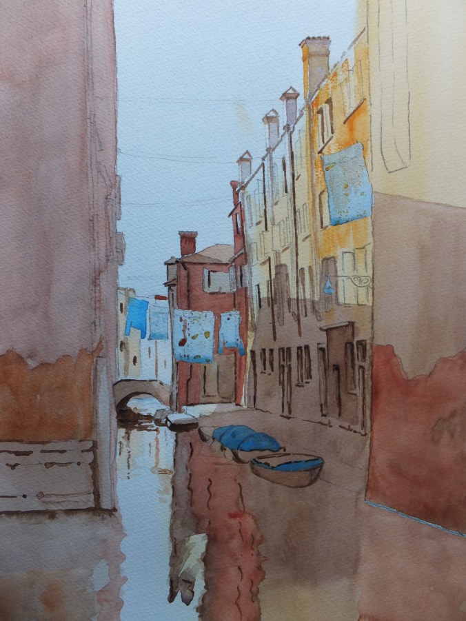
Usually I like to say that the painting is proceeding nicely. In this case it just isn’t. It is one of those paintings that is popular at exhibitions, or should be. A local scene which people recognise and identify with. The sort of scene I have painted so many times, and yet seem to have made mistake after mistake. Oh well, suitably chastened, perhaps I will be more careful as I continue
Just above the church spire, and out of the camera frame, the sky went awry, and left a large blue patch right in the centre, just where I didn’t want it. This type of cloudy blue sky has to be done wet-in-wet, as we know, and apart from lots of frenetic board tilting, there is only so much control you can exert over the finished item.
The roof over the lychgate came up much too bright, so I have scrubbed that back, and will add less colour next time
Likewise the figures in the foreground were disappointing, and these I have scrubbed back with a lifting out brush. When they are really bone dry, I will attempt them again. I don’t know why but I seemed to lose all sense of colour control. I applied paint too thickly and the shadow areas which I had already put in, just did not show through
The brick colour of the cottage on the left-hand side which usually works well, is almost acidic with the green foliage, or am I being paranoid. Perhaps I have been looking at it for too long
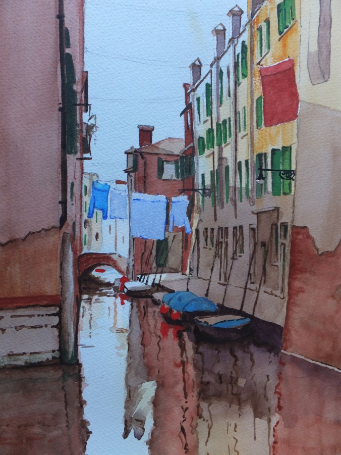
On both sides I have painted more of each building. The camera frame would only take the image shown, which looking at, I prefer. There is certainly a case for cropping top and bottom, and maybe quite a bit from each side, and making a smaller picture of it
I will see what I can salvage. I have some ideas now. Being humbled occasionally, never hurt anyone
Have you ever had a bad picture day? Always pleased to hear about it if you have