I would first like to acknowledge with thanks Rebecca Photography on Pixabay who kindly allowed me to use her reference photograph, when preparing this watercolour painting
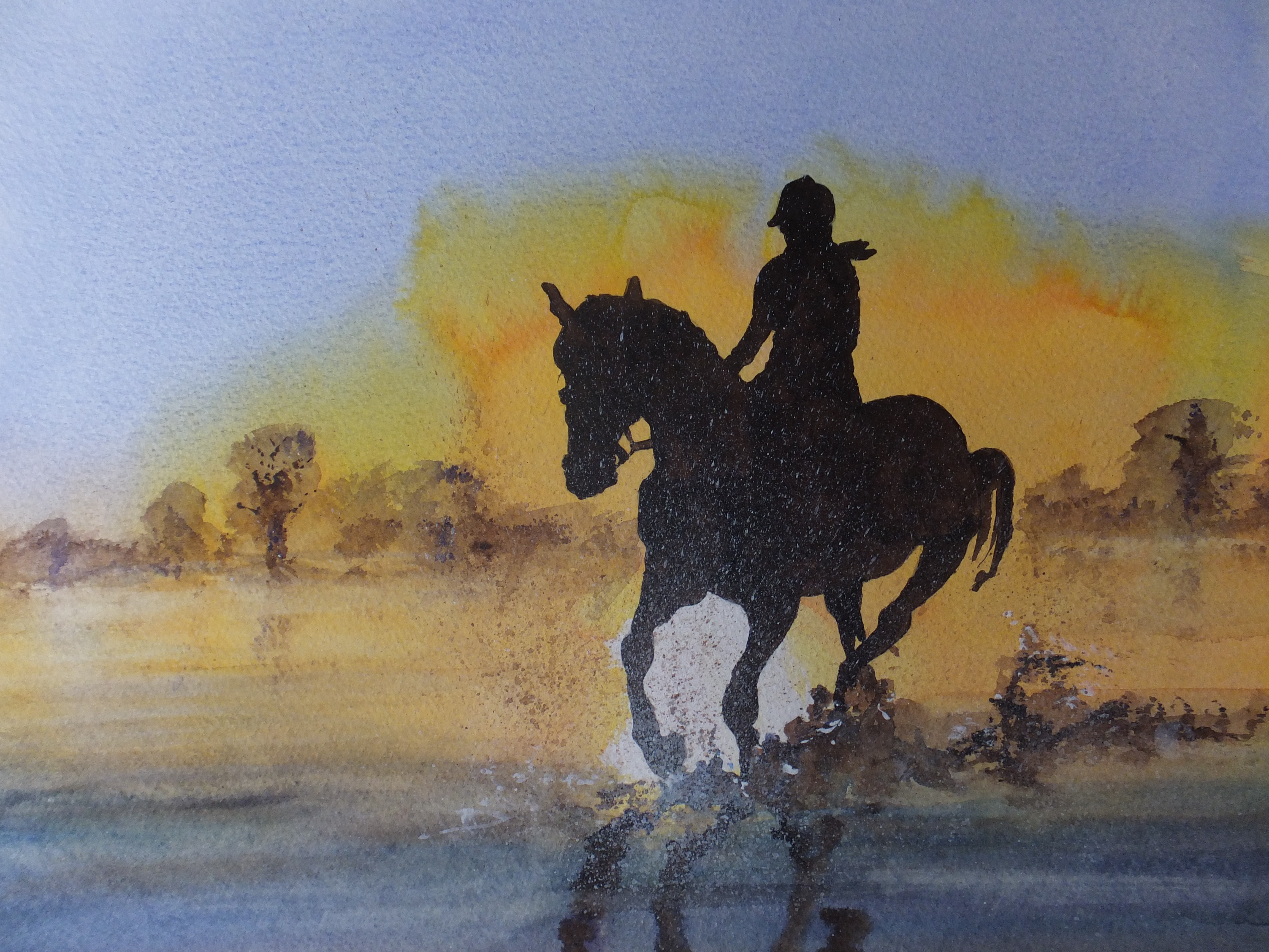
I like, as many will know, painting horses and horses in water. This image intrigued me and presented problems from the start. Horse and rider were a complete silhouette. So? Well, there were no details to help me with the drawing or very few at least. It was difficult, if nigh impossible to check my measurements as I proceeded with the drawing. Likewise the rider, which I don’t normally include but they were the same image. They could not be separated. If you have ridden horses, and I have a little when I was younger, you will know that you have to adopt certain attitudes or body shapes, otherwise you will just fall off. Legs must be in the right place for example. You can’t see the legs in this image so what to do?
I ended up doing a separate drawing of the horse with rider showing her legs and stirrups. I had to match the correct leg position with the rest of her body. That took me some time. It was quite a long time of experimentation, before I was ready to paint. Sky and water were comparatively straightforward in comparison. I had to give horse and rider two coats of burnt umber before I had a perfect silhouette.
I must have done something right. The painting sold on its first announcement
I would have liked her for my current show at Denbies Wine Estate but you can’t have everything, and anyway you can only sell a painting once
I hope you enjoy looking and reading my blog