Finished Bosham Panorama Painting

Finished Bosham Panorama

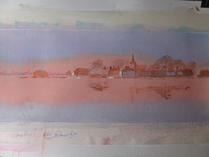
and there it is waiting to go into its long frame

That will then complete a collection of twelve paintings for the coming exhibition at the Guildford Institute from 19th of this month

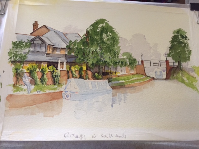
Since the last post, really the work was purely detailing, using dark brown, white and cadmium red. I have drawn in some buoys and odd details like that

I bought a new detail brush the other day, designed by Matthew Palmer. It has a large bole which holds a good supply of water, but the tip comes to a very fine point, which produces a line rather like you’d expect from a pen. I think it was designed for painting very thin branches and twigs. It also works well for fine rope work, and window frames

Huge sigh of relief now that the exhibition collection is finished, all but framing the last one

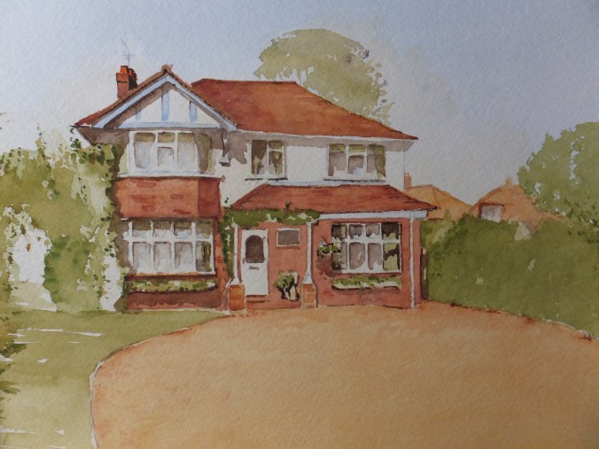
I can now look at catching up with a few paintings for pleasure. I love doing horses and have made some initial sketches, from which I think I can put an interesting composition together. I have gone back to drawing by eye instead of using a grid, which not only saves time, but also is comforting to know I can still do it ( or think I can)

I will publish the horse drawings at another time

Bosham Panorama for the Long Frame

Bosham Panorama Starting to emerge

Emerging from the sea mist almost

This is the start of the panoramic painting for the long frame which I mentioned recently, which I am hopeful for, but we shall see

For sky and sea I used a mix of phthalo blue and cobalt. For the sunset sky and reflection in the water, I have used a mix of Cadmium Orange and Permanent Rose. I was not pleased with the initial result, as the sky came up very orange indeed. I applied coat after coat of Permanent Rose, wet on dry, which when dry, appeared to have made very little impact. Eventually the sunset turned pinky red, and I quite liked the effect of the pink over the blue. Where the blue had gone on sparsely, the pink soaked in, and started to look like pink clouds on the blue sky. I am not sure whether this shows in the photograph.

In order to get the effect of the low sun on the rooftops, I will need to glaze the buildings with something like Light Red and if that goes too brown, then a thin wash of Cadmium Red. Sparingly, of course, as that is powerful stuff.

There is masking fluid to come off, where white buildings have caught the strong light. I should have mirrored that in the sea, but forgot, but I think I can rescue that with White Gouache.

Dark shadows to go in with dark Brown which will accentuate the light, I hope. Also some small boats for which I will use the same blue mix, and white masts, should add to the effect

I am hoping so, as exhibition time draws near

The Finished House Portrait

Finished House Portrait

Well, the portrait is finished and shown to the client who is delighted. I don’t usually allow myself satisfaction, but even I think that this one turned out well. It just has to be mounted, which I shall do in the new year. It isn’t required until the middle of January so that should work out nicely

Basically, all that I needed to do since the last post, was to put in the shadows. Half the gravel drive was covered by shade from a large tree just off-stage, which also darkened the hedge. Some intricate shadow underneath the porch gave shape to the covered interior, and even the cartwheel stands out more now from the wall

Some dark detailing was added to the shrubs on the left. Somewhere in the deep tunnel made by those shrubs is a white garden gate, which I have shaded. Most of this I had to guess, with the help of some alternative references

I enjoy house portraits. I’m not sure why. This one will go on my website one day

But for now to resume my exhibition work, as time does not stand still

At this time of year, may I wish all who read my blog,warmest greetings and good fortune in the coming year

House Portrait: Part Finished

DSCF3964

Getting there but not quite. Still some detailing to be done

Apart from changing some of the trees on the right-hand side, I have kept as faithfully as possible to the subject. I have left out some of the dark coniferous foliage that was intruding in the right-hand corner. I didn’t like it, and it was very much “in your face”, and so detracted from the house, which should remain the star of the show. I hope the client agrees with me, but I could always put some in, if she insists.

I put a distant tree in behind the ridge of the roof, just to alleviate that line. The sky itself is bland, as I wanted the building to come forward. For the roof colour I glazed burnt sienna over raw sienna, and then when bone dry, glazed light red over the burnt sienna. I did the same for the brickwork, hopefully to give an impression of bricks being sunlit.

I have just started to put in some of the shadow, but have by no means completed. As soon as you do that, the building takes on a third dimension, and I love watching the house come towards me. Once the shading on the house is complete, I shall put some dark shadow on the hedge to the right. As well as that, dark shadow on the gravel, about halfway, which will help to make the rest of the drive, look bright. That is the plan

On the left-hand side I see from other pictures, that there is a white gate deep amongst the bushes which is just visible, so I will need to include that, as well as some extra dark in the shrubs, as well as shadows from them.

Still some way to go, but being a mad time of the year, I am reduced to little and often, which I don’t mind, as I can judge each stage as it dries out. As we all know, the difference between the wet pigment and the dried-out colour is quite significant.

Every so often, I take pains to point out, that I am not formally qualified to teach painting, but if you like watching me work, and if you find what I do to be helpful, then I am very pleased to welcome you to my blog. Especially welcome are more recent followers, whom perhaps I haven’t addressed before

House Portrait

DSCF3956

I have interrupted the study of the bridge over the Basingstoke canal, as I have been lucky enough to be given a commission for a house portrait. This is the first this year and it is only December. Last year I was doing something from the web site every other month.

This will be a gift for a couple moving after 40 years in this lovely house, and a painting will make a lovely memento. I do always feel privileged to be entrusted with this sort of task, and naturally will give the job my very best attention

This will be presented by another family member, and will be a surprise for the couple concerned. My job will be to make it a pleasant one

Crazy time of the year, of course and many things happening, year end, which I am involved in, so I am working on the project during spare moments. Luckily I am not under much pressure to complete to a deadline

So far I have prepared a working sketch with tonal work, which will help me place the details in my head and also let me know where the shadows are. I will flash the sketch up next, so you can see where I have got to. Next, the tedious bit, moving the drawing onto watercolour paper, but it has to be done

By way of a PS, we had our annual art exhibition at the week-end. By we I mean the Pirbright Art Club, and I am pleased to say that I sold “Salt Mills at Trapani, Sicily”. The painting is somewhere in the archives if you wanted to check it out. So, after a very slow start, sales have not been too bad during the second half of the year

Working Sketch

Again, because of the importance of the task, I have used a grid to get architectural details in the right place, I hope

I love house portraits, and am looking forward to getting back to this one

Bikes and Canals: the Finished Painting

DSCF3952

The finished painting of bicycles, canals and houseboats in one frame

Since the last post, there is not a lot to add. The bicycles have been finished from the sharpest detail retreating backwards. I find it easier to adapt the focus doing it that way, so that the perspective works out correctly. This was a real jumble of mechanical detail to sort out, but amusing nonetheless

This will go towards my exhibition in the spring, in the Guildford Institute. The theme is Waterways in Watercolour, which on the face of it is straightforward enough, but trying to think of a subject that I haven’t done before, does make me scratch my head

I need twelve pictures within the theme. I think I have five so far. Ah well, press on

Bikes and Canals: Base Coat

Bikes and Canals Base Coat

This is the first coat on the bikes drawing, which looks like grey in the photograph, but which isn’t really. The definition between all the colours just isn’t great enough to show on this photograph

One of the watercolour painters I admire is David Curtis, and I looked at one of his exercises and thought I might try the same method here. I didn’t see the point of sticking to local colours on this occasion. The photograph was flat, and if not careful, the painting could be the same

What he did in a crowded harbour scene was to wet the paper thoroughly, so that the colours moved and merged, but most importantly not mix into one muddy finish. Mine haven’t by the way, even though the photograph looks grey.

Following as closely as I could to his example, I selected four strong colours, Alizarin Crimson, Ultramarine Blue, Violet and Cadmium Yellow. I then laid in, without much brushing, the four colours where I thought they would be most appropriate. I wanted the yellow in that misty background section and falling vertically. The pinks and violets falling on the buildings and the blue somewhere in between. Some control and some letting the colours find their own path.

I mix my colours on a large white dinner plate. I plant the pigment on the rim and as I add some water, the dilute pigment runs down into the centre of the plate. Sometimes that can be a nuisance but on this occasion, it was helpful as I also let some of the crimson mix with some of the violet which produced another shade for the buildings and also for the reflections

I have by now started to sharpen up some of the buildings and the houseboats. The whole thing is still looking a complete mess but hopefully will turn out well in the end. This one is a complete unknown. I can’t remember tackling such an awkward composition. You can’t get at the canal through the tangle of bikes, which with watercolour is very tricky. I thought about masking out but there is such a lot, so when the background is finished I shall lift paint off the bike frames and pray whilst I am doing it.

Could be a disaster but pleasing if it works

Bikes and Canals : Preliminary Sketch

Bikes and Canals Sketch Drawings

From the photograph on the last post, trying to make sense of the detail, some of which can be dispensed with, otherwise the composition will become a hopeless jumble

The bicycles, obviously need attention. I have left off the three at the back, as quite honestly, it is difficult to make out their shapes in the photograph, so a drawing would be difficult. I started with the bike in the foreground and have attempted some detail. I will probably go into more detail when I have transferred the image onto watercolour paper. The nice thing about bicycles in Amsterdam, is that they are simple, as bikes used to be. Handlebar with no gears that I can see, a bell which is welcome, a sit-up-and-beg frame and a parcel rack. Purely functional and fit for purpose. I can imagine a brisk trade in second-hand bikes, as I am told, several thousand have to be fished out of the canals every year

I will put in progressively less detail as I work through the pile.

Houseboats and reflections will help. I have extended the picture slightly to the right and have included an extra small boat. This takes the bicycles out of centre stage

The buildings at the rear of the picture, I think I will fade out slightly. Towards the left I have left a space for misty light which will work down the page. I will just have to make this up as I go along, and hope for the best. One should plan with watercolour, but sometimes you have to let instinct take control, and cross your fingers

The tedious part next, transferring the drawing and finishing it off onto watercolour paper. It has to be done


By way of a postscript, I don’t think that I have ever commented on the number of visits/views that I get each month. I don’t get an enormous traffic but certainly enough, and spread across all the continents, which is nice. This month I have had an amazing number of hits from Norway, which is nice. A staggering quantity, more than the UK and United States added together, which is just unprecedented. Thank you, Norway. I hope I continue to hold your interest

Basingstoke Canal outside Bellinis Restaurant in St.Johns: the Finished Painting

Basingstoke Canal St.Johns Finished

Well, the painting is finished, and it is what the photograph said it would be, a very traditional waterscape, with all the ingredients, water, barges, reflections and so on.

It is not exciting. I haven’t tried anything unusual or dramatic. Nevertheless it will make a useful addition to my February show, which is themed on waterways, and for which, I have little enough at the moment

I do wish that the sun had been shining into my lens when I took the picture, which would have given it an interesting contre jour look, with some dazzle coming off the water, but it could not be. I had to take what I was given. Not many barges use the Basingstoke Canal, and to see one tie up at St.Johns Village was a fairly rare event, and to see another in the distance coming through Kiln Bridge, rarer still. So I took the picture with the best light possible.

I have done contre jour along the canal in the past and the results are exciting even if the subject matter is simple. The other alternative is to go out early on a bright winter’s morning, when the shadows are long, which I might do on another occasion.

I have much to do before February, so I will move on. My son and daughter-in-law were in Amsterdam recently , and took some pictures along the canals on my behalf. Bikes, canals and tall buildings– all the ingredients which spell Amsterdam, so I think I can make a composition from these.

Quite an interesting one to tackle.

Basingstoke Canal: Watercolour Painting Part Finished Only

Basingstoke Canal Part Finished Only

I haven’t posted for a while, so perhaps now is a good time to publish what I’ve done so far.

I may have said last time that this painting is being based on a scene from my home village of St.Johns in Surrey. The Basingstoke Canal runs through the centre of the village, and in fact the village owes its existence to the canal, really. Cut in the late c18, the canal destined for Southampton, from London, only reached Basingstoke before the coming of the railway made it obsolete. A sort of shanty town grew up at first on the canal side, followed gradually by more prosperous houses as the village became commuter land. It is essentially a c19 working village, not pretty but charming nonetheless. The parish church of St.Johns built by the rector of Old Woking as a chapel of ease, to serve the people, gave the village its name

In the picture, the building in the background is Bellinis, our local Italian restaurant and one which attracts patrons from far afield. Lovely on a summer evening at one of the window tables looking out over the canal. In the painting, the barge is being tied up on the landing strip. The few barges that we get usually tie up here, possibly for coffee al fresco at Bellinis or perhaps access to the village shops.

So far, I haven’t done anything unusual. The palette I have kept simple, starting with my usual raw sienna and Naples yellow mix as a base. Some different greens for different plants. I favour a sap green and raw sienna mix for grass and trees rather than straight sap green. I have also used a yellow mix and also some terre vert for shadows. It was rather a dull day on that occasion, so little in the way of shadows which is a pity, in fact I have added more shadow than actually existed on the day. Warm shadows using Transparent Brown.

I have left the barge with its reflections to do, so something colourful amongst all that green and brown. That I think, will make an enormous difference. We shall see.

PS I had my first sale from my Artfinder site recently, which was the nice little painting of the Blue Mosque in Istanbul, so rather pleased about that. Will there be another, I ask myself? We live in hope, but quite a competitive site