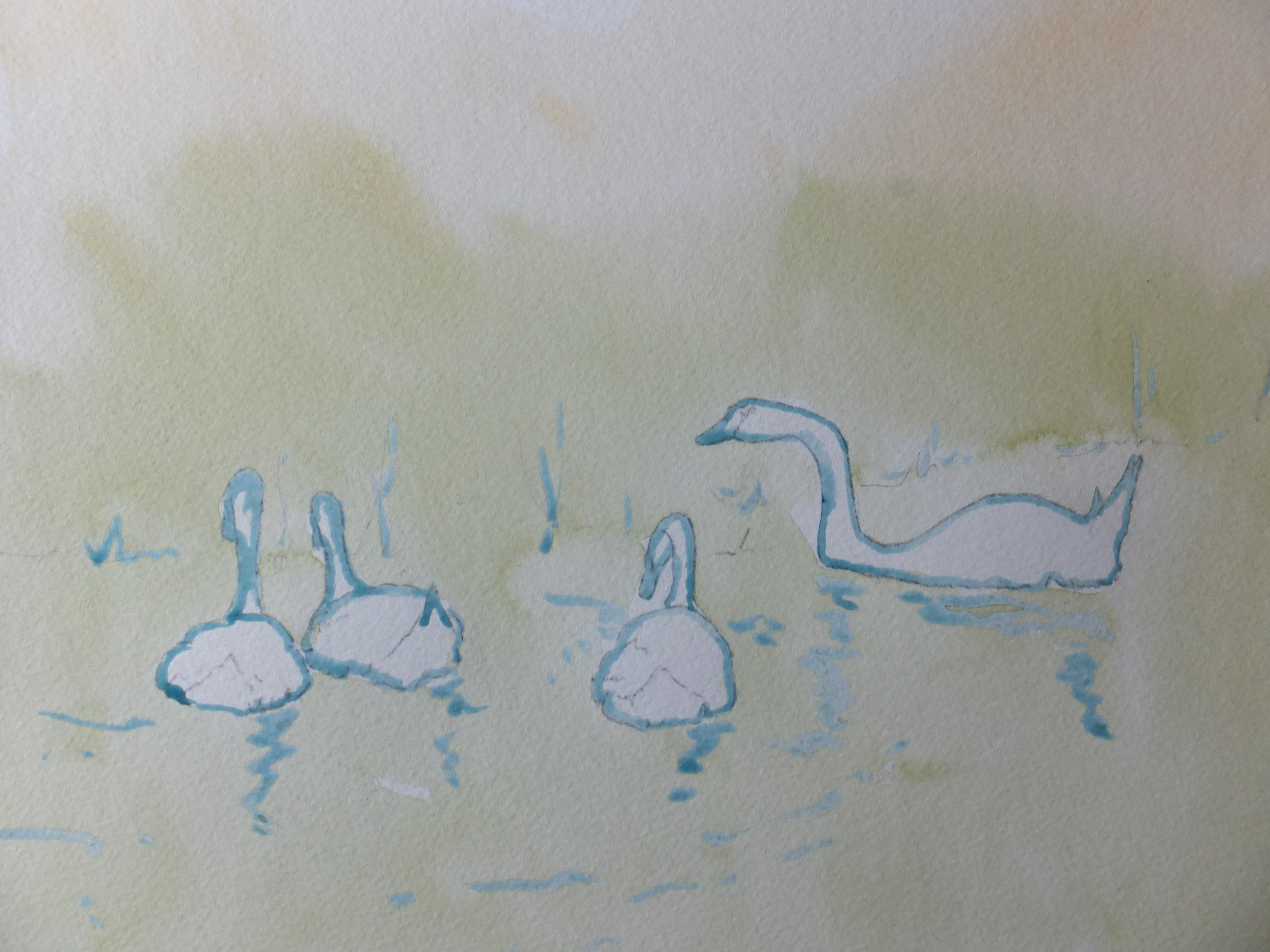
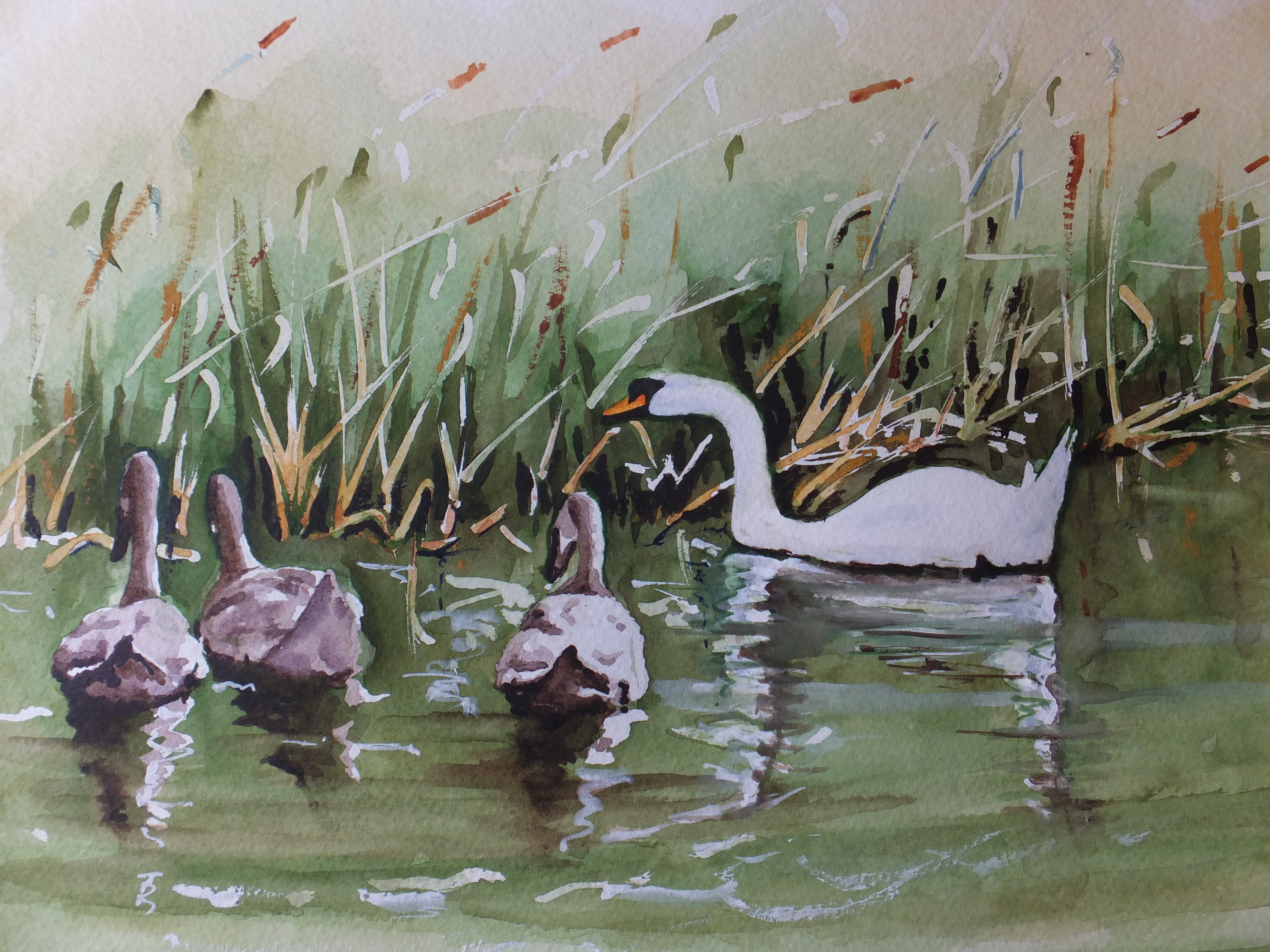
Just occasionally, and by way of a change, I quite like to paint a vignette of something, something small which lends itself to that style of finished painting. It is more immediate, rather like making a sketch, and it can look like that, but if successful, can work as a framed painting too.
They are quick which is what I like about them. I draw direct onto the watercolour paper which saves me so much work in the planning stage. Invariably the subject matter doesn’t need too much drawing, like these windmills, although having said that the sails were tricky
The painting itself didn’t involve wetting the paper, as there was very little sky or any other underpainting involved. Mostly the work was small brush detail, and put sky and water in afterwards. I am not going to pretend this result is brilliant but the image is charming and usable either as a reference for a larger work, or framed in itself as a finished piece.
They can too, be framed without mounting because of the white surround. Not sure whether I would do that but I have seen that done
I am still drawing paintings together for updating my website davidharmerwatercolour.co.uk which should be done soon. There are some vignettes on that, some sold and some still available.
Also pulling paintings together for my next solo show in April which is being held at the Guildford Institute.
This time I used the camera on my phone. I think I prefer the result. The colours seem more faithfully represented, or so I think
I have stopped working on this painting as I just don’t feel I can add any more. The ferry boat in the centre I have painted as sharply as I can, but as always when the paint has dried then some of the intensity goes with it. Sometimes that can be a good thing but on this occasion I would have liked the boat to be coming towards the viewer just a little more. I even finished off the waterline with dark pastel which has helped
Possibly I put too much definition into the background, but then I needed deep shadow to accentuate bright daylight. As always a slight dilemma. Maybe next time I will paint the foreground first and work backwards.
However I have another painting towards the next exhibition in April, and will soon have to think about my annual update of my own website davidharmerwatercolour.co.uk. Looking back over the year, a number of sales, certainly a quantity of amendments together with a collection of new work which always attracts attention.
Last year was very good for commissions, six in total, which for some artists I know would be unimpressive, but for me exceptional. We’ll see what 2019 brings!
This is very much work in progress. I have got as far as putting in the shadows with a mix of Cobalt and Phthalo Blue, the mix I like using in any scene that is southern European or nearby
I have done the sky in the same, and the sea also but over an orange wash which gives it a greenish hue, and as always I hope this works. I have put some more orange here and there into some of the buildings as highlights as the shoreline was getting monotonous. There will be some more shadows yet going in to the buildings and also the boats that are still tied up
The boat mid channel I hope to do in much more detail, as much as my shaky hand will allow, and I want to introduce some red into this boat to bring it forward from the shore. That is the theory anyway.
Annoyingly the camera has picked up the texture of the paper so that it looks as though I am painting on onion skin. I seem to get a better result with the camera on my phone these days so might use that for the finished image.
Since this photograph was taken I have done some more work on the painting. Nothing startling, just deepening the shadows, and deepening the sea colour in the foreground. The shoreline is starting to take on a cubist look, unintentionally but interesting nonetheless.
This one I quite like,as a reference, not my own but similar to the ones that I took of boats crossing the Bosphorus. I won’t be copying it as such but using the content for inspiration.
I think I will attempt to change the lighting. I have several Bosphorus shots of my own to refer back to, so will experiment a little and see what I end up with. The construction will remain much the same, as the composition would be difficult to improve on
It has all the ingredients, the mosque, the ferries and the water. No mistaking where it is. This is rather a dark shot, evening time and dramatic, quite a clever photograph, and all credits go to the photographer, if only I knew who it was
For the moment, I am just doing some free-hand sketches, and may just include those at the end of this blog. Those minarets are proving something of a problem to pin down. One minute they are leaning too far to the left, and when I correct that, too far to the right. The mosque building itself is a delightful exercise in geometry though, which may be forgiving because of the distance. I had the same problem when I painted the Blue Mosque which is in the archive somewhere
Both Istanbul paintings sold from my Artfinder site which was gratifying especially as I don’t have much success on that site, hence I need another Istanbul painting for my next exhibition which is in April, which will come round fast enough
The Fountain of Love commission was very well received, I am happy to report
Well, this painting is finally finished. Towards the end, although commissioned, it was starting to become a labour of love, no pun intended.
I found myself wondering whether I would finish or fall at the last hurdle. I feel pleased with it, which is dangerous to say, as the image for approval has only just gone to the client, and if it doesn’t match what he had in mind, then I shall be in difficulties. Worst case scenario, it will be rejected, but even then I would find this one useful for the web-site
In terms of technique, there isn’t much to add to the last post. The jets of water were achieved by flicking white gouache onto a blanked off section of the painting. Always a bit hit and miss, but mostly they have worked, and in some cases provided a realistic white mist
Unless I have to make any last-minute adjustments, I should be free to think of something else, for which I have built up a long list. I am at least at the end of my commissioned work ( for which I am truly grateful), and can now think of my next exhibition which is March/ April as I remember. I have paintings ready but will need more, and so we go on.
Not a very good photograph of where I am at the moment. The camera as usual has diluted the colours. I think next time I will use the camera on my phone, which I have found reproduces colour much more faithfully
However for now we have a record. The mask has been removed from the trees and from the figures. I have started to work some dark colour around the sharp edges of the statuary, in order to give them some definition. Details are tricky with a brush on this size of picture. I bought recently a fine detail brush which I can thoroughly recommend. It is one of a range designed by Matthew Palmer and available from SAA. It comes to a fine point, as fine as a pen nib, but is backed by a large bole, which holds a quantity of water. Unlike other fine detail brushes which run out of water, this one will run on and on, giving very fine detail lines so ideal for painting statues.
Nevertheless fingers, nipples and feathers are still difficult and need care.
The pinky orange colour of the marble shell made me think, and in the end, I have gone for very dilute Burnt Sienna, and have just trialed this around the top of the large shell, picking out the smaller shell and what looks like two large flowers
Over the years it looks like some sort of mineral, possibly iron, has been deposited by the water onto the flutes of the shell, as it runs down and off into the water. It looks unsightly but what to do. I can’t leave it out but at the same time it does look ugly. I suppose some sort of compromise and reduce the amount and depth of this almost black residue would be the only solution.
Something to think about between now and next time
Out of the blue, a sale from my Artfinder site. That makes two this year. Things are looking up
I am starting with a photograph which has been published before, as events forced me to abandon the blog on this particular commission, other paintings being needed more urgently. I thought therefore that repetition of the original reference made sense, to remind us all where this story starts.
This is the very ornate fountain in the grounds of Cliveden House in Buckinghamshire. The style is Baroque so the statues are extremely Mannered in their style. As an architect once said to me, “If statues on a building wave to you, then it’s Baroque”. Very detailed therefore and consequently tricky to paint
The drawing is done, and I have started to paint, just to get some form of definition into my head. I see that I haven’t filed my photograph of Work in Progress yet, so I will do that and then come back later
Well, this where I have got to, and it is a bit of a mess at the moment. The drawing was done a few weeks back, and as I said earlier, I have started to paint. I have masked out three trees in the background so that the trunks could be white as silver birch or pale green, whichever I think works best
I have also masked out the edges of some statues so that I get a really crisp edge and don’t lose any detail, having fought to keep it so far. No doubt this painting will be difficult. May even be my nemesis! Again I ask myself why I accept some of these commissions, except perhaps for the sheer challenge. Also the client is a regular who keeps coming back, so one wants to help
Since taking this photograph, I have sprayed masking fluid in certain areas to serve as spray from the fountain’s various jets. I kicked myself for not remembering right at the beginning, before I put colour into background foliage. Well, too late for that now. I will have to fall back on white gouache instead.
For now, that is all I can say. I shall remove the masking on the tree trunks and on the statues, so that I can define those edges. We will see how we get on
This took me about three weeks, working on it every now and then. I have come to prefer working that way, doing a little and then letting it dry right out, looking at it in different lights and revising my plan as I go along. All this wet weather has meant that even during the day, the natural light has been poor. Flat light is fine but all these dark skies have not been helpful.
I don’t think that I have included the original photograph, so I will do that at the very end. Apologies for that. I have kept to the photograph as much as possible, certainly for the boat which is what it is really all about.
The main difference is that I have removed completely the row of houses at the back, which cluttered the scene and made the composition very gloomy. Now we can see the evening light catching the stern ends of the boats and reflecting on the water. This was useful, too, introducing a little orange into what has become a very blue painting.
Also the masts and sails now stand out against the sky whereas in the photograph they are lost amongst the buildings.
Never before attempted a boat portrait, so I am pleased with the way it turned out, whether I should be or not. The client likewise pleased which is the main thing. I will end with the original photograph, and any different ideas on how to tackle this one would be gratefully received.
The boat subject in St.Katherine’s Dock
This is the image that I should have started with, so hopefully still makes sense
This is the drawing so far of the boat I was commissioned to paint. Rather faint I am afraid, not only because it’s in pencil but also because she has had a wash of phthalo blue and cobalt mix. Some orange and vermillion went in to the tops of the boats to give that evening sun look, but that will need strengthening
I have already sketched this scene just to realise the composition and to get that agreed. This is the real thing. Just a tad apprehensive, as although I have painted boats enough times, this would be the first boat portrait that I have tackled.
So much of the boat is white, and not even many shadows to relieve the situation. The vessel is beautiful, streamlined and highly polished, in fact all the things that don’t work so well in watercolour. A rough-textured old steamer, dirty and rusty, with plenty of smoke really lets the watercolourist’s imagination run riot.
But we don’t have that. We have a sleek yacht instead. In the background of the reference photograph which I haven’t published here, are a row of houses, which were not only superfluous, but actually crowded the composition, and didn’t look good against the boats. I have left them out altogether, and I have not regretted doing so. The depth of the painting has increased whilst still preserving the look of a marina
So for the moment I shall just carry on building up the colours on the items that matter. The yacht centre stage of course is the star attraction and needs to come forward
One of many well-known paintings by Sir Edward Burne-Jones featured in a special exhibition currently at Tate Britain until February 2019 which is the first major retrospective to be held for forty years. Inspired by the church and the medieval period, his work represented the antidote to the ugliness and the materialism of the Victorian period.
We went there recently. As always a superlative exhibition. To be seen if you can
There were seven rooms of drawings and paintings. Burne Jones was a superlative draughtsman . The second room deals with his time in Fulham, when he finally had space enough to embark on major projects for which he needed countless preparatory drawings, each one of which could be considered a work of art in its own right.
Renaissance art and four visits to Italy encouraged his approach to the body. His male figures appeared troubled while women were portrayed beautiful yet sinister. About this time he was experimental with media, using gouache with chalk and later metallic pigments.
His attitude to the male figure caused him to resign from the Old Watercolour Society which had been shocked by his work. . He was becoming known as one of the most daring artists of his time. After a blissful period of working to his own pace, his exhibition pictures started to take London by storm, and later Paris, so that he became known throughout Europe.
Most impressive were the rooms containing his Series Paintings, massive works commissioned by serious clients with rooms that can show these works as they should be shown. This was of course the era of the seriously wealthy patron who could command works like these., such as the Perseus series, commissioned by the young future prime Minister Arthur Balfour for his London residence. Curiously Balfour was later to be president of Woking Golf Club, close to where I live. The only prime minister to be president of a golf club. I wondered what these wonderful paintings would look like in the golf club lounge, but that was me being facetious.
I cannot describe the paintings of the Perseus Story, as they were too magnificent. Like wise the Briar Rose which is really the story of Sleeping Beauty. Wonderful illustrations of knights and princesses. Burne Jones I think today would have been in his element illustrating Game of Thrones or the Harry Potter stories.
He worked closely with William Morris, from whom he derived the bulk of his income. He became especially well-known for designing stained glass windows for churches and cathedrals the breadth of the land and indeed the old Empire.
One of the last great figures of the Pre-Raphaelite movement. This is a wonderful collection gathered together for a short time