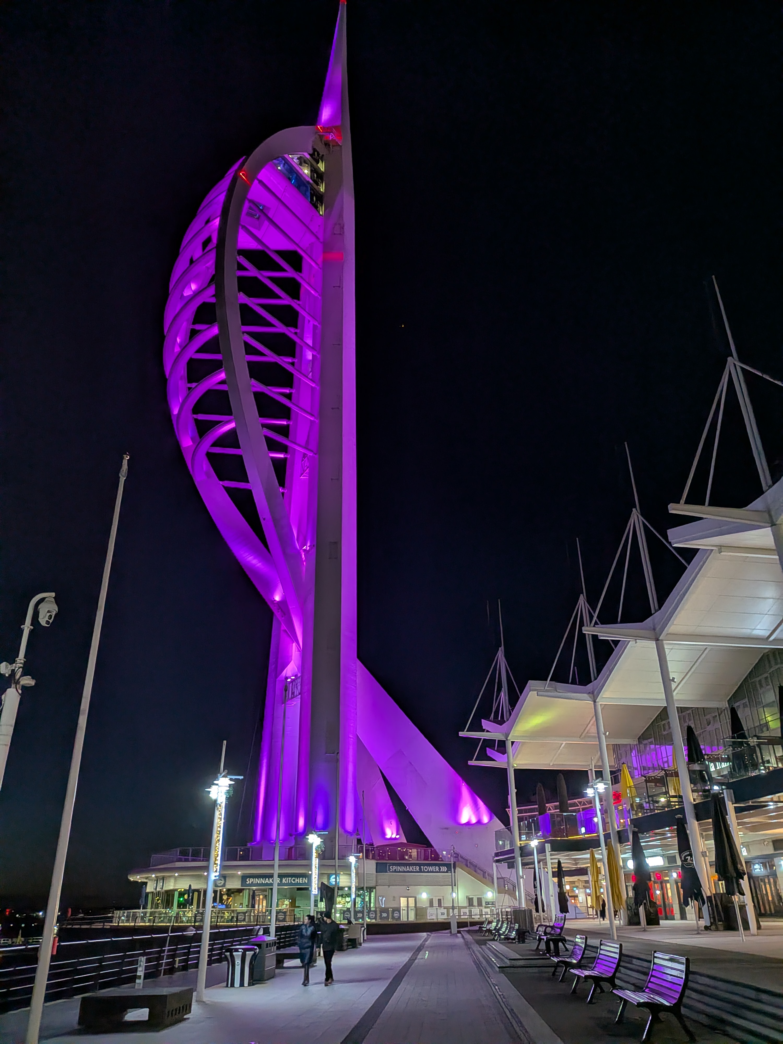
Horse and Rider

I would first like to acknowledge with thanks Rebecca Photography on Pixabay who kindly allowed me to use her reference photograph, when preparing this watercolour painting

I like, as many will know, painting horses and horses in water. This image intrigued me and presented problems from the start. Horse and rider were a complete silhouette. So? Well, there were no details to help me with the drawing or very few at least. It was difficult, if nigh impossible to check my measurements as I proceeded with the drawing. Likewise the rider, which I don’t normally include but they were the same image. They could not be separated. If you have ridden horses, and I have a little when I was younger, you will know that you have to adopt certain attitudes or body shapes, otherwise you will just fall off. Legs must be in the right place for example. You can’t see the legs in this image so what to do?

I ended up doing a separate drawing of the horse with rider showing her legs and stirrups. I had to match the correct leg position with the rest of her body. That took me some time. It was quite a long time of experimentation, before I was ready to paint. Sky and water were comparatively straightforward in comparison. I had to give horse and rider two coats of burnt umber before I had a perfect silhouette.

I must have done something right. The painting sold on its first announcement

I would have liked her for my current show at Denbies Wine Estate but you can’t have everything, and anyway you can only sell a painting once

I hope you enjoy looking and reading my blog

Marzamemi in Sicily- a different view

Fishing Boats in Marzameni Sicily

I have painted a view of Marzameni before some years ago. It is a delightful fishing village, where we stopped just for a coffee break, and then wandered down to the water’s edge. Many of the boats were obviously old and maintained by their owners, Some of them were hand painted, just bright Mediterranean colours, vivid reds and blues, together with dazzling whites.

The sea was the brightest blue, and as always I hope I do the colours justice. I used Pthalo Blue modified with Cobalt Blue for the sky and the sea, which seemed to work. The same colour strengthened seemed to work for the boats as well, although I did get an opportunity to use Windsor Blue for a really deep blue stripe on one of the boats

As we watched ,the boat with the umbrella hove into view and rowed slowly by, eventually finding a place to tie up. This boat was smarter but the colours were more muted

I enjoy painting Sicily. Always the colours are so vibrant, and the shadows so pronounced

I am exhibiting at the moment at Denbies Wine Estate near Dorking, and have sold a painting of Horses in the Wetlands, another favourite subject

Art Exhibition at Leatherhead Theatre

Leatherhead Theatre Exhibition May 2018

A new venue for me in a new town, which is always exciting. Leatherhead is about twenty miles from the Woking/Guildford area where I usually exhibit, so this should be a good opportunity to address an audience which as yet is unfamiliar with my work

Leatherhead is a smaller town than Guildford, but prosperous nonetheless, a commuter town with a busy shopping centre. The theatre is in the middle of town, and open all day, so not just with performances but also with conferences, classes and clubs, so we are told quite a heavy footfall

I have entered six framed paintings and five folios. One thing about a new venue is that nobody has seen any of my work so I can give some previous paintings an airing. Galloping Horses is the only painting that hasn’t been shown at all. Certainly the organisers were very enthusiastic about my work, and expected great things, but then organisers always do. My own theory is to expect the unexpected, which seems to work every time. They actually contacted me, which is unusual and pleasing, having seen my website under Surrey Artists.  Maybe that was the unexpected bit!

The exhibition opened this Tuesday and runs until the 15th. I had an interim report on Thursday telling me which pictures were receiving most interest, namely the Flamingo painting which is one of the framed ones, as well as two of the folios, Sicilian fishing village and Cockerel with Hens. Exciting stuff. It could go either way

As I always say, one would be nice.

By the way, I have had to interrupt progress on the Bosham painting, as I have received a commission which is needed for a wedding anniversary towards the end of this month. I am on with this, but still some way to go, as some parts are tricky. I may well write about it later.

Itching to get back to the Bosham painting, though !!

A different aspect of Bosham Harbour

DSCF3969

i think I may have mentioned ad nauseam that Bosham Harbour with its ancient church is a favourite subject for painting, and is widely known

If I am preparing for an exhibition, I usually like to have at least one view of this beautiful little place. The problem is that everyone wants the same shot, across the harbour with the church against the skyline, so painters, like me, are continually looking for a way to paint this view, and yet make it look different every time.

I came across the attached photograph a few months ago, which interested me. As you can see, it is a gentle evening shot, with some bright sky and some very deep silhouettes. The details are blurred, which is not something I usually do, but found myself intrigued nonetheless. The effect could be impressionistic, which again is not something I usually do. The other thing I liked, is that, when translating this into a painting, one could use a very limited pallette, which I find improves the effect very often. In this case, we are looking at yellow and violet basically, which generally work together very well.

I haven’t used these two colours for a while, so the idea is attractive

I am not sure about how I feel about the beached boats in the immediate foreground. They are certainly an aid to perspective, which I can appreciate, and yet in your face just a bit. I think I will draw some of these separately on tracing paper and chase them round the composition to see what I like best. I have been through my archives of boats too, and have sketched one or two of those, again to see what works.

Despite what I said about getting away from detail for a change, I don’t want meaningless shapes either, and unlike photographers, artists can choose what goes into a composition, which gives us an advantage, so I might be able to get away from that rather shapeless foreground.

I think there will be quite a lot of work with little bits of tracing paper, before we hit on the right composition, so we will see what happens. Yet another journey into the unknown.

Preliminary Sketches of Galloping Horses

Galloping Horse Drawing

I’ve transferred the drawings to watercolour paper now, and kept them as line drawings only, which is why they are faint. I have assembled the individual drawings that I had and strengthened, I hope , the composition into a more horizontal arrangement.

Since posting this drawing, I have liberally spattered with masking fluid, around the lower regions of the horses to look like, again hopefully, the spray that the lead horse was throwing up

I have put on a base coat of colour. A band of pthalo blue modified with cobalt for a sky colour, followed by a pink horizon, followed by a ground colour the same as the sky. For the pink, I have used something I bought long ago from SAA called Vermillion Hue, a colour outside of my experience. It was described as very good as a warm grey when mixed with Cobalt, and a very good shadow colour on snow. Likewise, without the Cobalt  it can provide a warm glow. No snow here I know,  but plenty of water and grey horses. The horses in the photograph were just catching the light on one side from a very watery sun

So this is an experiment and could fail, but I am hoping to catch this pink light on the horses, if I can

That is as far as I have got

House Portrait

DSCF3956

I have interrupted the study of the bridge over the Basingstoke canal, as I have been lucky enough to be given a commission for a house portrait. This is the first this year and it is only December. Last year I was doing something from the web site every other month.

This will be a gift for a couple moving after 40 years in this lovely house, and a painting will make a lovely memento. I do always feel privileged to be entrusted with this sort of task, and naturally will give the job my very best attention

This will be presented by another family member, and will be a surprise for the couple concerned. My job will be to make it a pleasant one

Crazy time of the year, of course and many things happening, year end, which I am involved in, so I am working on the project during spare moments. Luckily I am not under much pressure to complete to a deadline

So far I have prepared a working sketch with tonal work, which will help me place the details in my head and also let me know where the shadows are. I will flash the sketch up next, so you can see where I have got to. Next, the tedious bit, moving the drawing onto watercolour paper, but it has to be done

By way of a PS, we had our annual art exhibition at the week-end. By we I mean the Pirbright Art Club, and I am pleased to say that I sold “Salt Mills at Trapani, Sicily”. The painting is somewhere in the archives if you wanted to check it out. So, after a very slow start, sales have not been too bad during the second half of the year

Working Sketch

Again, because of the importance of the task, I have used a grid to get architectural details in the right place, I hope

I love house portraits, and am looking forward to getting back to this one

Still Life with Conkers: Finished Painting

still-life-with-conkers

This is the finished painting. Rather laborious but we got there in the end! Every now and then I quite enjoy tackling something like this, not botanical painting exactly, but painting a specimen of fruit or flowers, with some expression thrown in. Textures are tantalising, and making an object look solid on a two-dimensional plane likewise.

I hope I have succeeded. One or two conkers, I feel, I can pick up, but I will let others judge

I talked about the story of conker-playing when I last posted, and how sadly, the gentle art has disappeared amongst schoolchildren, thanks to the interference of the health and safety police. No need for me to dwell on that anymore, only to lament the passing of part of our heritage, which had continued effortlessly from generation to generation. Too easy to blame the iPad! Children that I know like traditional games and playing with their iPads

But enough ranting. Let’s get back to the painting and how it takes shape. I remembered to take a picture of an interim stage, so let’s have a look at that

dscf3502

This is the stage following on from where I left the last post. I have completed a couple more of the conkers, this time with their husks, just to make sure the recipe is actually working. It seems to be!

As a base coat, I painted all the conkers with a bright orange, leaving a soft white spot on each, where the bright light is being reflected. I had already used a pale green for the husks, and had they been fresh from the tree. I could have continued with more green, but they had already gone a yellowy-brown colour, so true to nature, that is what I am doing.

The finished conker colour, I achieved using a succession of reds and browns. I did this wet-into-wet, so it is hard to give a blow by blow account. It is rather like sculpting. Do a bit, stand back and do a bit more

I can tell you, that I used light red, burnt sienna and burnt umber. At the very end, I gave nut and husk a unifying wash of light red, which I think gave them the colour I was looking for. And there it is

Thinking ahead, I have two projects taking shape in my head. One is to carry on with the painting of Bosham Harbour which I drew up and went no farther with. The other is to look back at Notre Dame with Pigeons, and redo the whole thing, removing that ghastly marquee on the left, and also improve the weather, and make the whole thing brighter and sunnier, albeit still winter time

I could also be going to Germany soon for the Christmas markets, so may be able to bring some interesting subject matter back with me

All for the future………….

Conkers:producing the painting

dscf3500

I managed to dig back into one of my old reference books and remind myself how I painted my first conkers still-life originally. As you can see, I have just drawn the nuts with their husks from the photograph. I have also put a base coat of yellow/green over the husks, and for this I have mixed sap green with raw sienna, which I find produces quite a natural green, for want of a better word

They look unassuming, and quite uninteresting, do they not. So I thought, what I would do, would be to finish off one conker, one nut, completely just to see if I could still do it.

This was the method I used.

I gave the nut, a base coat of bright orange, in this case Cadmium Orange with a touch only of Cadmium Red, and then let it dry hard. I should have said that I left a soft spot of white paper, working from the photograph, to simulate the point where strong light bounces off a glossy surface.

I then worked a succession of reds and browns wet-in-wet, almost sculpting the shape of the conker, finishing with Burnt Umber for the very dark surfaces. I also put in the shadow and darkened up the right-hand side. I let that dry hard, and put a unifying wash of Burnt Sienna across the whole of the conker, and left it until the following day

The next day, I felt quite pleased with the result. This was probably the nearest that I had come to trompe-l’oeil, where something painted in two dimensions looks solid enough to be picked up. I am not saying that every artist would be pleased with this, but I was, and confident enough to go on

The paper I am using is worth a mention. It is made from pressed rag, and I believe comes from Pakistan. It is similar to hot pressed paper, so that the surface is smoother than the cold-pressed paper that I normally use. It was sent to me as a sample some time ago, and I never used it, but it has proved perfect for this type of work

I shall probably finish the painting completely now and post again when it is done

Venice Painting: Halfway Through

Venice Painting Halfway

About halfway through the painting, and if I were smart I would wait for the painting to be finished completely, before showing it. However there are things to be talked about before they are covered by further work.

We left the picture as a drawing with some items masked out, namely the washing on the line. The sky in my usual mix of phthalo blue and cobalt blue, I washed down through the bridge and used for the water. I scrubbed out the distant buildings and painted them in with their reflections.  The tricky bit was the shadows which I had worked out with the sketch. I painted them in twice to get some depth whilst still allowing some transparency and continued into the reflections in the water.

In the photograph you may remember the building at the end was red. I have painted that in using Venetian Red appropriately enough, and have taken that through the reflections.

Venetian Red goes back to the days of the Renaissance. It is a warm red earth colour derived from Ferric Oxide, which always sounds like rust to me. It was used by Renaissance painters mixed with white to make skin tones. It was also called Sinopia, because the best quality pigment came from Sinop in Northern Turkey

It was expensive. If your house was painted in this colour, then you were a man of some means.

Francesco da Mosta in his lovely book, Francesco’s Venice tells us that the art of mixing pigments in Venice was something akin to alchemy. The secrets were closely guarded. Venice was a city of painters, who demanded the best

Still some shadow to be deepened, as well as detailing to be done. I need to work out a green for the shutters, which should also work with the red buildings. So more to do!

Someone phoned with a commission today which is always welcome. Someone who has bought my paintings before wants me to paint somewhere memorable, so something to look forward to.

Langstone: Underpaintings

I mentioned in the last post that I would give the painting a coat of burnt sienna. In fact, I changed my mind and used raw sienna with Naples yellow mixed to give some brightness against the darks that would come.

I did mask out the white-walled buildings, as well as two metal posts jutting out of the water, and for good measure masked out some gulls to give the scene a sign of life.

I also put in some tree shapes as guidelines in sepia ink

DSCF2766

Rather a pale wash, so a pale photograph I am afraid. I think you can see where I have masked out in blue, the white buildings, the posts and also the flag as well as the windows on the old mill tower. The tree shapes I put in after this picture was taken but you will see them on the next image.

I gave this coat 24 hours to dry hard. Had I been in a hurry, I could have used a hair dryer, but I prefer natural drying, as then the paper returns to its flat condition. I find if you rush the drying, then the paper retains any cockling that may have taken place whilst wet.

I then mixed a dilute solution of Phthalo blue and Cobalt blue and washed this over the sky and sea. I blotted out some clouds. This coat also had 24 hours to dry.

The next step was to mix up a solution of French Ultramarine blue and Light Red. The trick is to get it not too strong yet not too wishy-washy. That is not easy. I worked this in from left to right, simulating, I hoped, gathering storm clouds. The colour varies depending on the mix from blue-black to deep red. In some places I put pure pigment along the top of a cloud edge to give the impression of strong light behind. To accentuate this, I scrubbed with a bristle brush and clean water, the area the other side of this pigment line. In other words, I scrubbed off the blue to reveal the sienna / yellow. I worked on the clouds adding some colour here and removing some there. I will show the image next

DSCF2774

Sadly the camera has taken some of the strength out of the colours, no matter how many times I took this shot, which spoils the light against dark effect

Always an act of faith to go on, at this stage, as mid-painting always looks a bit of a mess, which is why it is essential to finish

Next to put in the trees behind the roof-tops and the shadows on the buildings which will give them their form. I still have to do that, so will post again