The comment was made, quite fairly, that I didn’t include the original painting, before it was reduced.
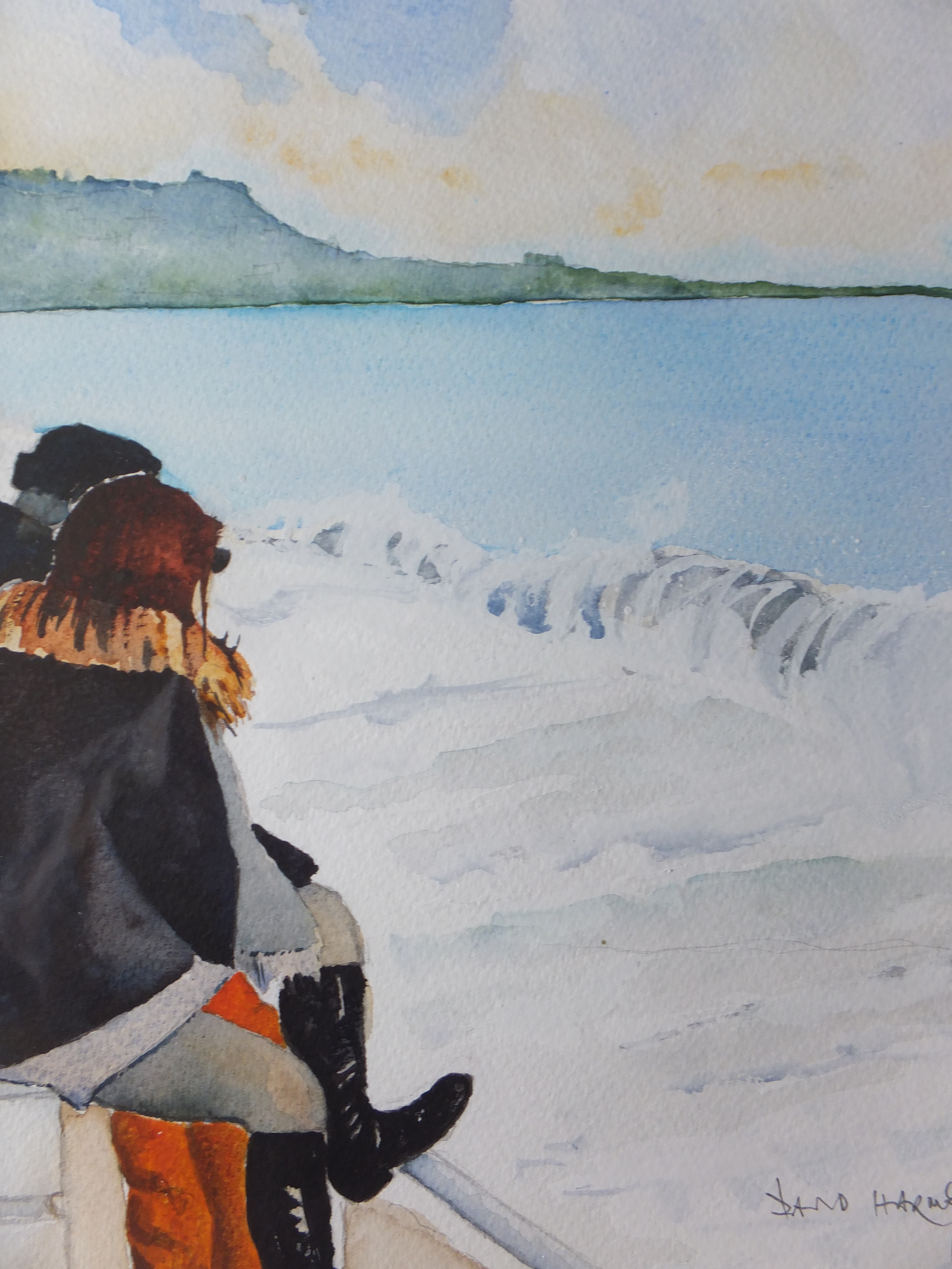
This is it. As I said, I felt the eye ran off the page to the right, and was possibly rather boring anyway. By removing the right hand side, I effectively made more of a central group with the figures and the distant headland.
I found the breakers rather strange here, as they rolled in, roughly the same size each time, so rather monotonous, really
Please feel free to comment, should you want to. Your opinions are important to me
Sometimes a painting creates no interest whatsoever, even though I might have been pleased with it at the time. Occasionally, and only when I think appropriate, I remove a section of the painting, which perhaps detracts from the overall composition, and reduce the image to a smaller painting. Hopefully an improvement.
So it was with this picture, Sea Gazers in Nice. We were in Nice for New Year, a few years ago. The weather was mild compared with the rest of Europe, which was deep-frozen. We walked along the famous Promenade des Anglais, and watched the sea and watched people watching the sea. This couple were alone with their thoughts and almost mesmerised by the breakers rolling in.
They kindly kept motionless, unaware of me sketching them and taking photographs. Not often that sitters are so obliging. I did the painting some years later, but then I included a long expanse of sea and breakers to the right of the couple. It was a mistake, looking back, as the eye of the viewer went right off the page.
I showed the painting a few times, but it impressed no-one. I prefer this version, so will see if others do
I have used this method only a few times. Occasionally only a central detail from a larger painting, seems to work. The last time I rescued a painting in that way, was to cut a small scene about the size of a postcard, and this worked on its own. The rest wasn’t worth keeping. The reduced painting, of the London Embankment, with a small section of London Eye, I sold, so that was worth doing.
I have used successive coats of darker and darker green amongst the reeds and grasses of the river bank. Towards the end I was mixing the green with a dark blue still trying to get that feeling of deep shadow amongst the reeds
I have now removed all the masking fluid, which took me a little while as there was a lot of it. Also I had to go carefully in case I tore the paper. I am happy to say that I didn’t , which was good because often when masking is left on for a while, it can prove difficult to remove.
The result is still a mess, but as I always say, finish the painting
The swans need tidying and finishing in detail. The painting is about them after all
Likewise the reeds where I have gone back to the white paper, need finishing in a light but realistic colour, raw sienna probably or a pale green
If I cannot get sufficient definition using just watercolour, then I could use some gouache or even pastel if absolutely necessary
Still Life as far as it will go and now to be abandoned
As the title says, this is really as far as I can go with this painting, which was only supposed to be a learning exercise, and I have learned from it. There was no question of producing a finished piece of work, unless by happy accident.
I have sharpened up some of the detail and also removed the mask since the last post. The highlights were a bit blobby and needed tidying up, and I am far from happy with them even now. The mask needs to be applied with a pen for this sort of subject, which I didn’t have with me at the time. The metal cap on the lamp on the right is meant to be copper. I could not remember how to portray copper in watercolour, but found a website that told me, burnt sienna and a little raw umber. An example of a painting was shown which was beautiful. Hmm, I need to practice this, as the result is far too ginger for my liking
I prefer of the three, the glass cylinder on the left. Not sure whether it is a candle holder or a piece of laboratory equipment. A group of glass items from a laboratory would make a very interesting composition for a still life painting.
The real lesson that I have learned is not to attempt this sort of painting without the proper references, either the items themselves or an accurate photograph. Going from an old painting, and trying to remember where the highlights were, really dooms you from the beginning
I will return to my comfort zone next with a subject I am more used to, but useful to do something like this from time to time,(not to mention humbling)
Not by a long way. On this occasion I am the student, and am preparing to follow a demo on Thursday at our local art club. We have been told to prepare in sketch form, a group of objects, and if we wanted to, put in some basic colour. The demonstration is to show how to provide an effective background wet-in-wet, which will one hopes transform this rather ordinary little group of objects into a painting
One of the many advantages of belonging to an art club, is that it gives you the opportunity to experiment with something totally different. Normally I paint town or seascape, so with this I shall be out of my comfort zone as it is called
More after Thursday
More work has been done
Still a lot more to do
We had the demonstration yesterday which really centred around negative painting. The spaces around the glass bottles were made wet, but only a manageable space at a time. Pigment was dropped in and allowed to spread, which gave quite a pleasing effect. Of course, as my subjects were glass, I had to allow the shadows to be visible through the bottles. My problem was that I didn’t have actual bottles to refer to, only a sketch from twenty years ago. I went darker than anyone else, looking for something dramatic, presumably.
The edges are finely masked with Frith masking fluid.
This exercise is by no means finished. Some more shadows need to go in around the base of the jars. The top of the lamp on the right is copper so some red needs to go on which will alleviate the green, and of course the masking needs to come off
I think I will try and finish it, although I don’t have to. it is one of those exercises where learning the method is the aim, not to produce a finished piece of work
Some more interesting topics to come from the art club, including painting with acrylic inks which I haven’t done for many years, so something to look forward to.
Not a very good photograph of where I am at the moment. The camera as usual has diluted the colours. I think next time I will use the camera on my phone, which I have found reproduces colour much more faithfully
However for now we have a record. The mask has been removed from the trees and from the figures. I have started to work some dark colour around the sharp edges of the statuary, in order to give them some definition. Details are tricky with a brush on this size of picture. I bought recently a fine detail brush which I can thoroughly recommend. It is one of a range designed by Matthew Palmer and available from SAA. It comes to a fine point, as fine as a pen nib, but is backed by a large bole, which holds a quantity of water. Unlike other fine detail brushes which run out of water, this one will run on and on, giving very fine detail lines so ideal for painting statues.
Nevertheless fingers, nipples and feathers are still difficult and need care.
The pinky orange colour of the marble shell made me think, and in the end, I have gone for very dilute Burnt Sienna, and have just trialed this around the top of the large shell, picking out the smaller shell and what looks like two large flowers
Over the years it looks like some sort of mineral, possibly iron, has been deposited by the water onto the flutes of the shell, as it runs down and off into the water. It looks unsightly but what to do. I can’t leave it out but at the same time it does look ugly. I suppose some sort of compromise and reduce the amount and depth of this almost black residue would be the only solution.
Something to think about between now and next time
Out of the blue, a sale from my Artfinder site. That makes two this year. Things are looking up
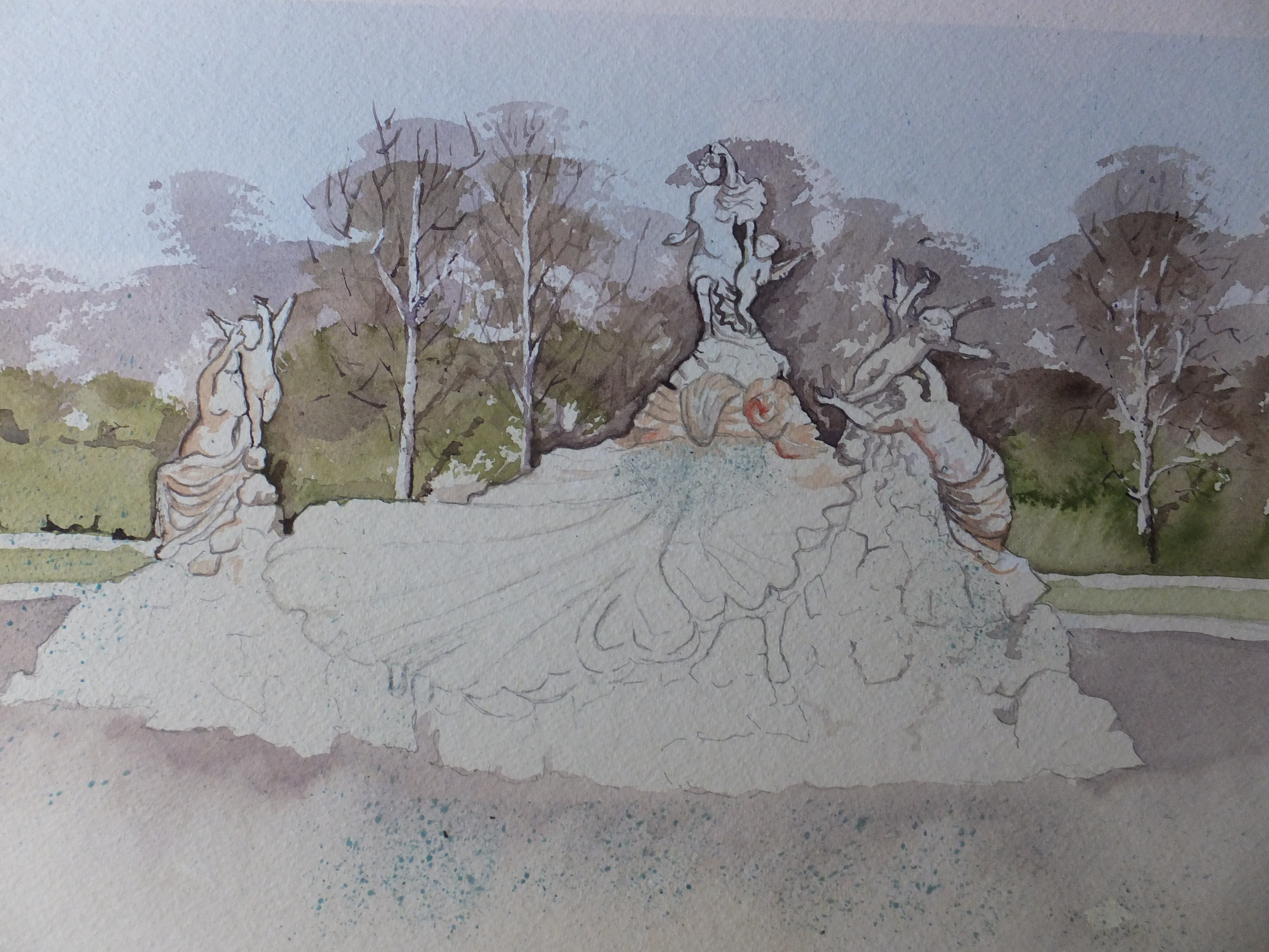
I am starting with a photograph which has been published before, as events forced me to abandon the blog on this particular commission, other paintings being needed more urgently. I thought therefore that repetition of the original reference made sense, to remind us all where this story starts.
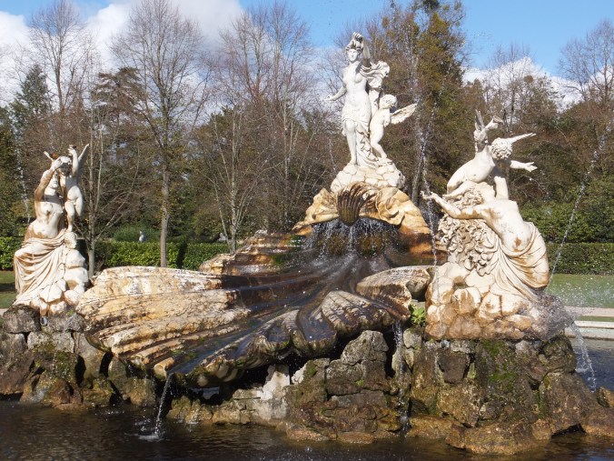
This is the very ornate fountain in the grounds of Cliveden House in Buckinghamshire. The style is Baroque so the statues are extremely Mannered in their style. As an architect once said to me, “If statues on a building wave to you, then it’s Baroque”. Very detailed therefore and consequently tricky to paint
The drawing is done, and I have started to paint, just to get some form of definition into my head. I see that I haven’t filed my photograph of Work in Progress yet, so I will do that and then come back later
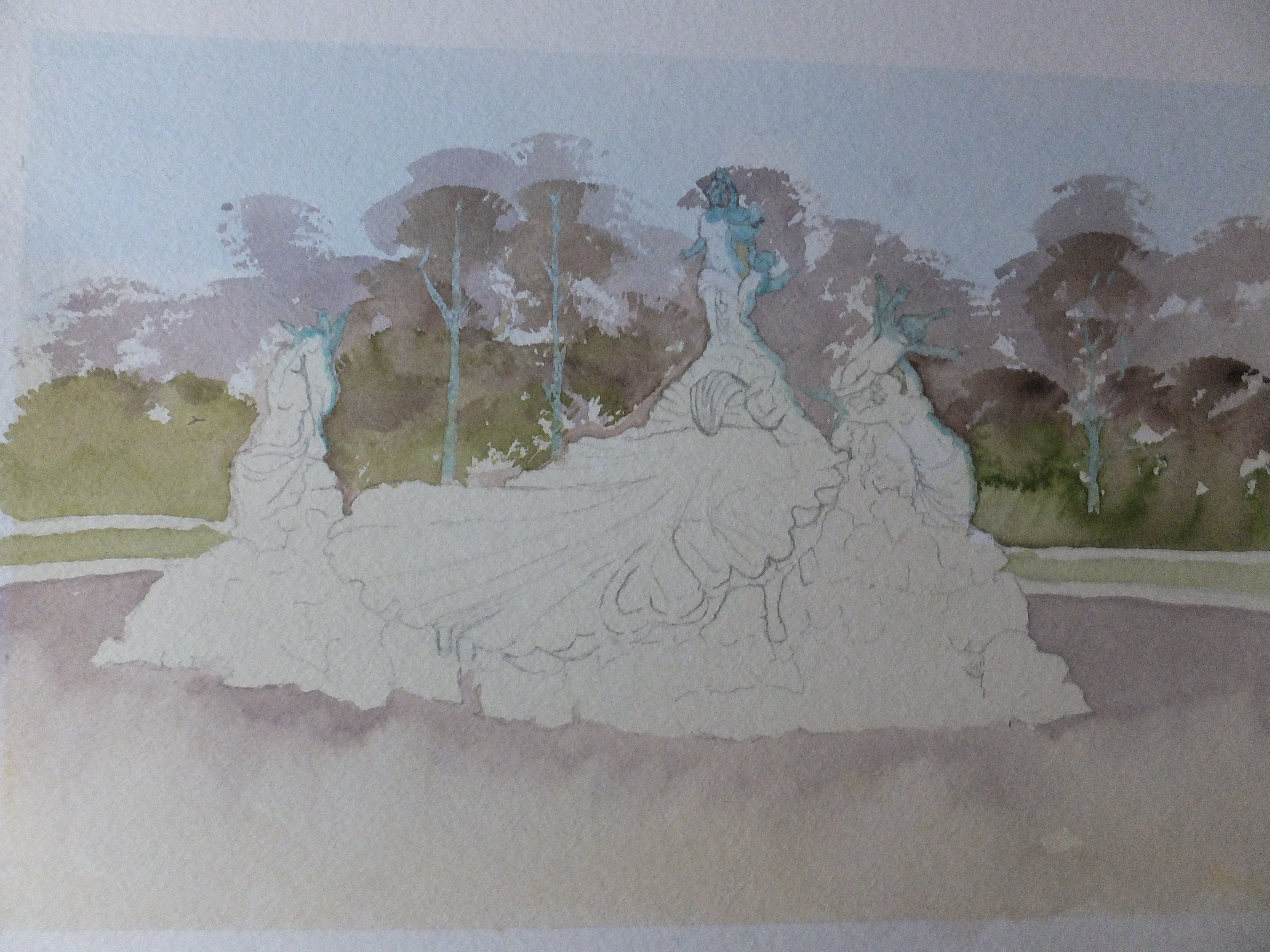
Well, this where I have got to, and it is a bit of a mess at the moment. The drawing was done a few weeks back, and as I said earlier, I have started to paint. I have masked out three trees in the background so that the trunks could be white as silver birch or pale green, whichever I think works best
I have also masked out the edges of some statues so that I get a really crisp edge and don’t lose any detail, having fought to keep it so far. No doubt this painting will be difficult. May even be my nemesis! Again I ask myself why I accept some of these commissions, except perhaps for the sheer challenge. Also the client is a regular who keeps coming back, so one wants to help
Since taking this photograph, I have sprayed masking fluid in certain areas to serve as spray from the fountain’s various jets. I kicked myself for not remembering right at the beginning, before I put colour into background foliage. Well, too late for that now. I will have to fall back on white gouache instead.
For now, that is all I can say. I shall remove the masking on the tree trunks and on the statues, so that I can define those edges. We will see how we get on
This took me about three weeks, working on it every now and then. I have come to prefer working that way, doing a little and then letting it dry right out, looking at it in different lights and revising my plan as I go along. All this wet weather has meant that even during the day, the natural light has been poor. Flat light is fine but all these dark skies have not been helpful.
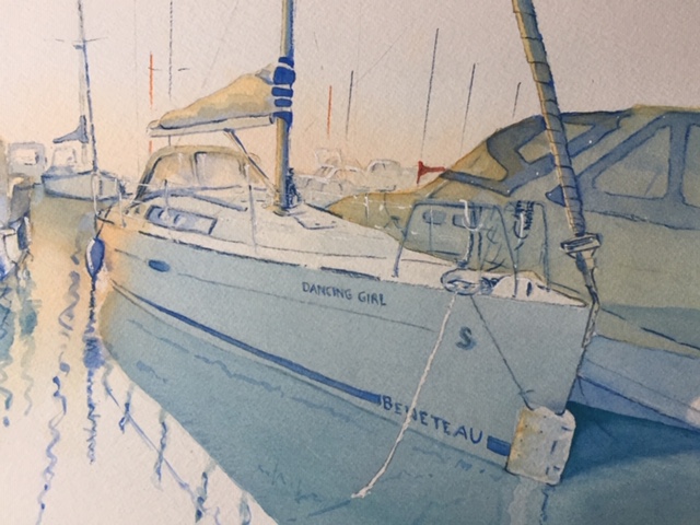
I don’t think that I have included the original photograph, so I will do that at the very end. Apologies for that. I have kept to the photograph as much as possible, certainly for the boat which is what it is really all about.
The main difference is that I have removed completely the row of houses at the back, which cluttered the scene and made the composition very gloomy. Now we can see the evening light catching the stern ends of the boats and reflecting on the water. This was useful, too, introducing a little orange into what has become a very blue painting.
Also the masts and sails now stand out against the sky whereas in the photograph they are lost amongst the buildings.
Never before attempted a boat portrait, so I am pleased with the way it turned out, whether I should be or not. The client likewise pleased which is the main thing. I will end with the original photograph, and any different ideas on how to tackle this one would be gratefully received.
The boat subject in St.Katherine’s Dock
This is the image that I should have started with, so hopefully still makes sense
This is the drawing so far of the boat I was commissioned to paint. Rather faint I am afraid, not only because it’s in pencil but also because she has had a wash of phthalo blue and cobalt mix. Some orange and vermillion went in to the tops of the boats to give that evening sun look, but that will need strengthening
I have already sketched this scene just to realise the composition and to get that agreed. This is the real thing. Just a tad apprehensive, as although I have painted boats enough times, this would be the first boat portrait that I have tackled.
So much of the boat is white, and not even many shadows to relieve the situation. The vessel is beautiful, streamlined and highly polished, in fact all the things that don’t work so well in watercolour. A rough-textured old steamer, dirty and rusty, with plenty of smoke really lets the watercolourist’s imagination run riot.
But we don’t have that. We have a sleek yacht instead. In the background of the reference photograph which I haven’t published here, are a row of houses, which were not only superfluous, but actually crowded the composition, and didn’t look good against the boats. I have left them out altogether, and I have not regretted doing so. The depth of the painting has increased whilst still preserving the look of a marina
So for the moment I shall just carry on building up the colours on the items that matter. The yacht centre stage of course is the star attraction and needs to come forward
When this is finished I hope the misty look will still be apparent. I would like the painting to have an early morning look, the problem being, the more detail that one adds, the sharper the image becomes. All I can do is finish the painting and see which way it goes.
As you can see, colour has been added since the last post. I have used two pigments initially, Vermillion and cobalt blue, and also a mix of the two to produce a grey blue for the shadows. I have also brought in good old Burnt Sienna for the brickwork.
To the right, out of shot are three small sailing ships waiting to be finished. I have deliberately not put in an horizon line, to accentuate the mistiness of the scene. That is the plan anyway.
Details still need to be added to the buildings like verandahs etc, and soft interrupted reflections in the water. Masking fluid wants to come off, revealing the marker posts which are red and white like barber’s poles, as well as the flag post which will be white with a red flag. The boats might get a red pennant each. Not forgetting the seagulls which have to be added, as the only sign of life in this remote spot at a very quiet time of day.
If that works I will be quietly amazed!
A pleasant surprise a couple of days ago! I made my first international sale from my Artfinder site, Bosphorus Waterfront, which has been bought by a client in the US of A. It has only taken me two years to achieve this! The painting can be found on my website davidharmerwatercolour.co.uk should you wish to look
Now I am on tenterhooks about it arriving safely, and am tracking periodically. The package is currently at New York City Gateway, and needs to be transshipped mid west. They estimate delivering on Monday so fingers crossed for a rapturous welcome. The client has 14 days to return the painting if not delighted, which must be really demoralising for the artist, but we will see