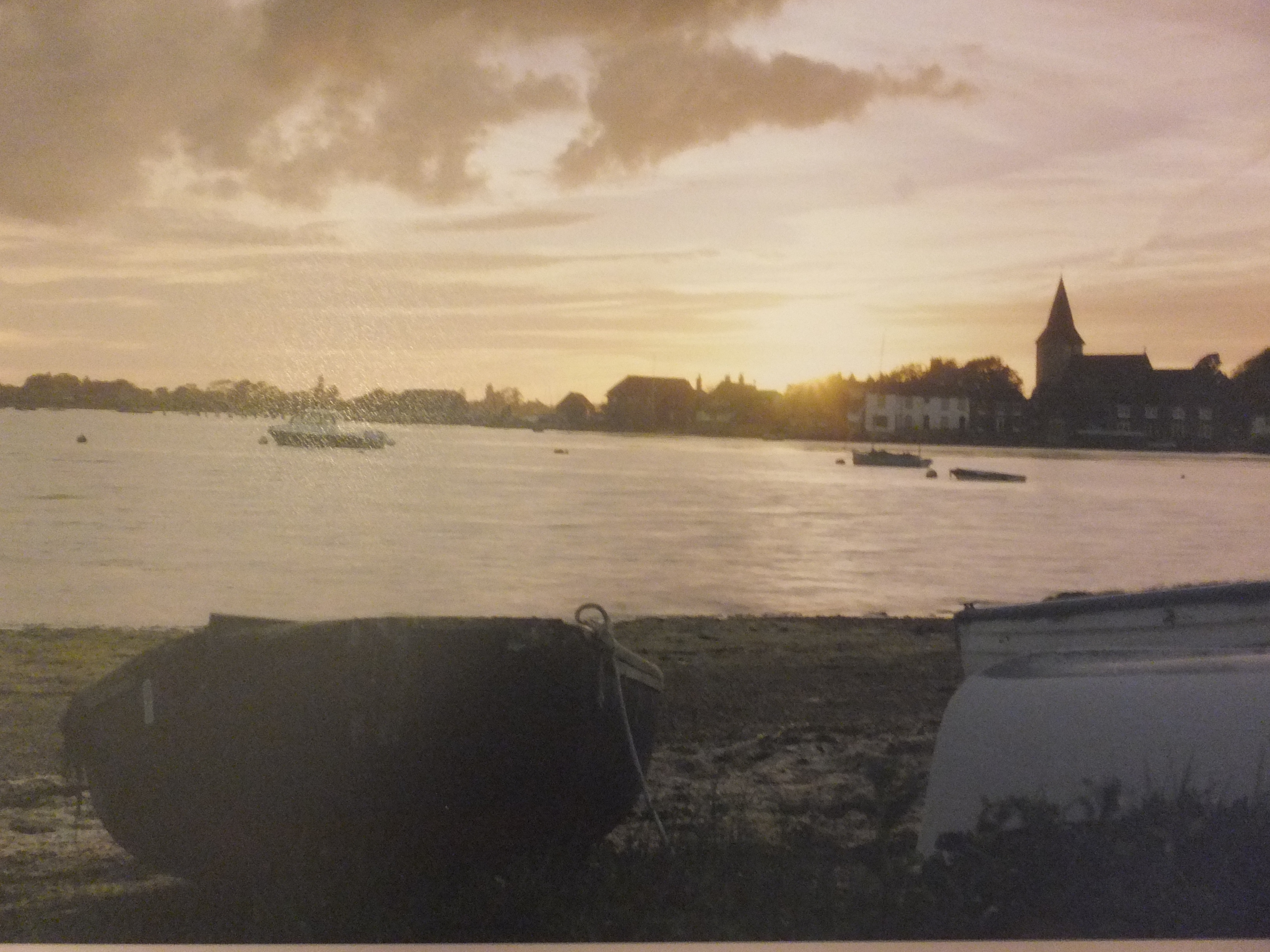
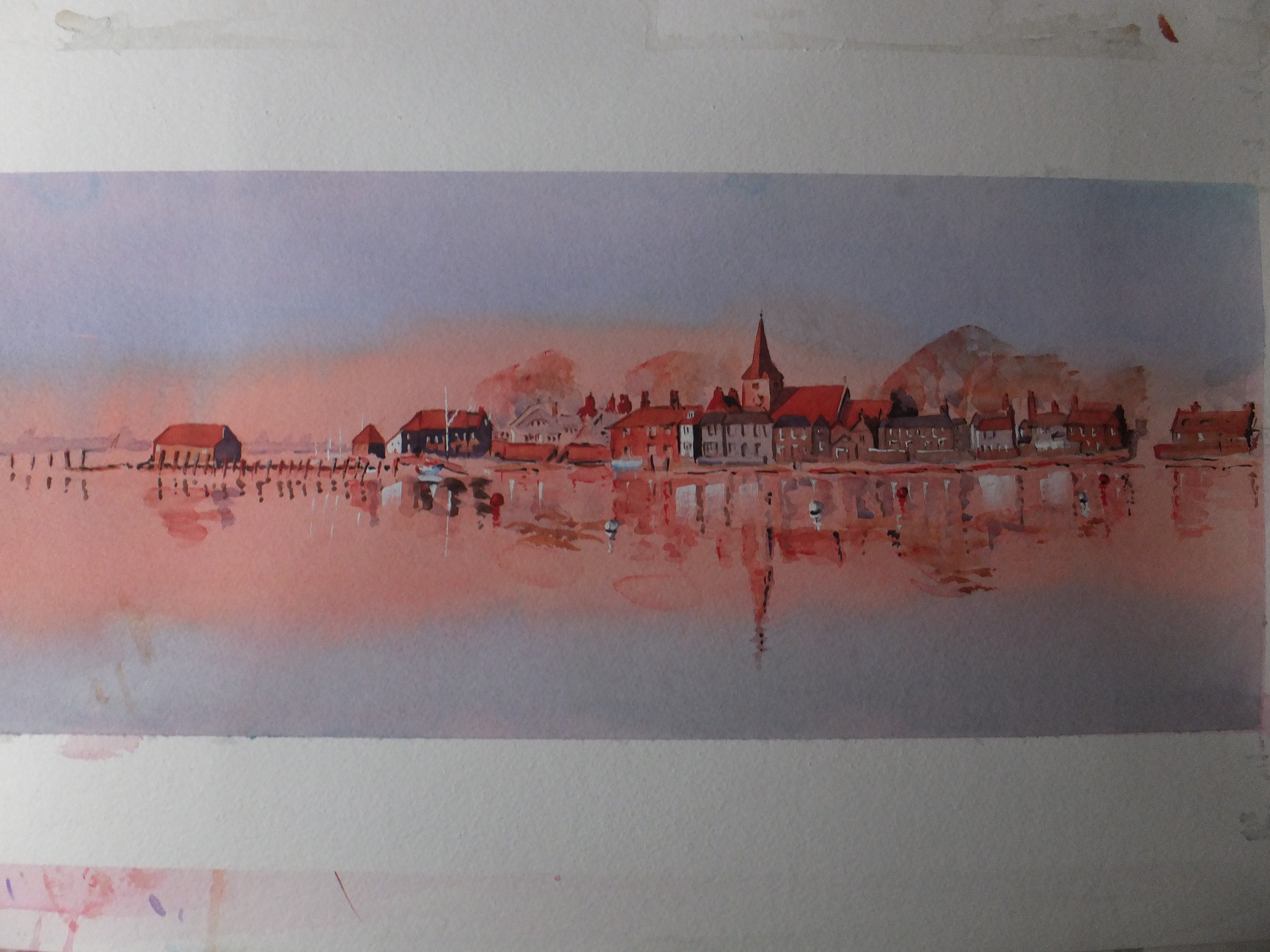
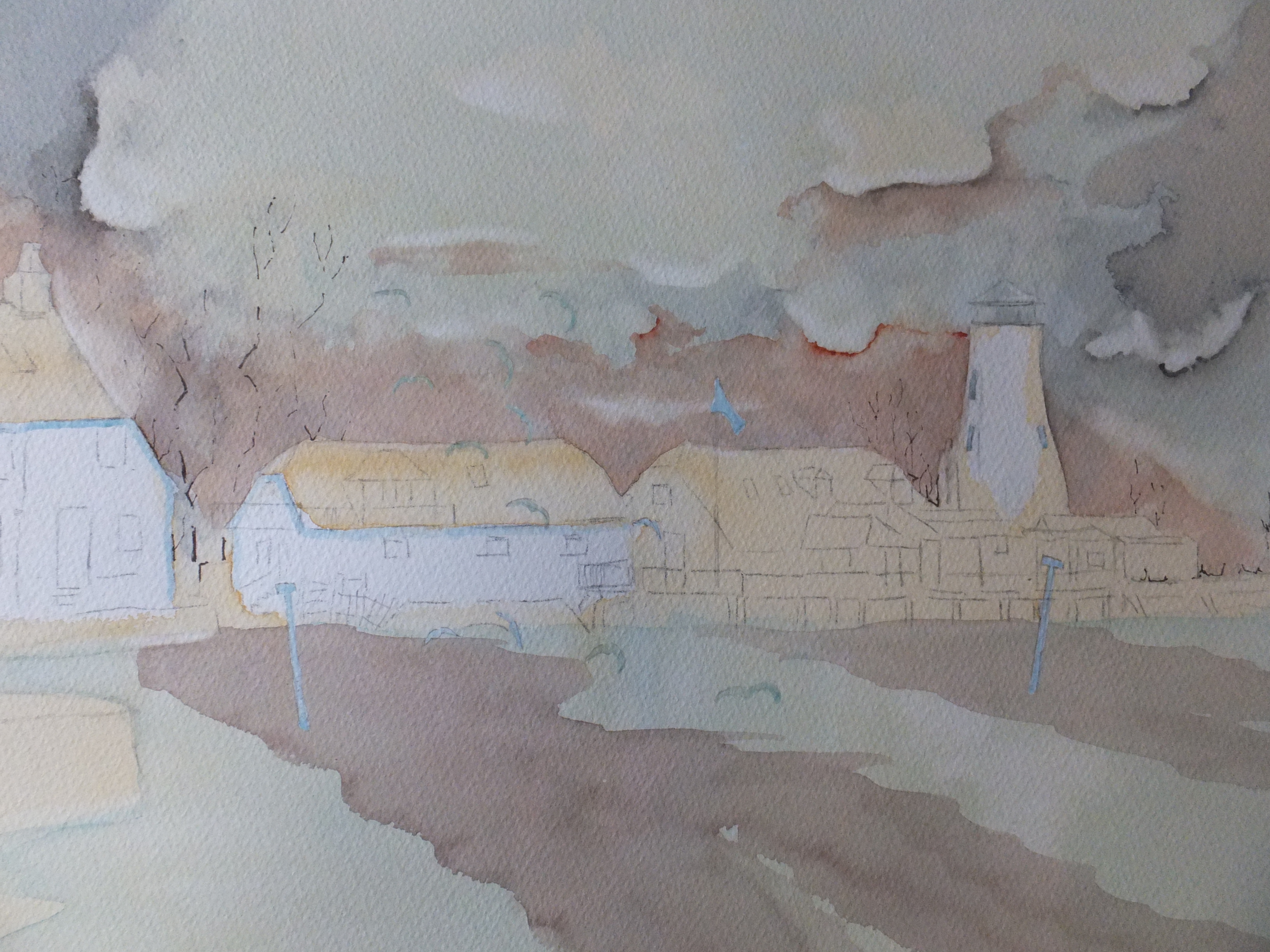
This is the painting so far, which wants tidying up, and at the moment I am just looking at it, and wondering the best way to go
I’m thinking that the nearest boat needs some more detail, but it is also supposed to be in deep shadow, so detail obscured which contradicts
I am going to work on the spinnaker, which needs beefing up. I am not a sailor, but even to me, the spinnaker is rather puny. Quite a lot of sail gets wrapped around this so it needs to look a good deal fatter than I have shown it
In the shadow of the nearest boat, I would like to see more red, which won’t necessarily be correct, but I would like relief from the grey. I have tried to convey the sun catching the stern
Other than that I shall just keep looking, whilst all the time trying not to fiddle, which is a cardinal sin in watercolour.
I am also itching to start on something fresh, a castle in a loch, which I saw in Scotland a couple of weeks ago, which is very dramatic, so I may wrap Bosham up and move on soon
- Alhambra
- Amsterdam
- Ancient English Ports
- Ancient Greek Temples
- Andalucia
- Andy Warhol
- Animals
- Arles
- Art Exhibitions
- Art Nouveau
- Artfinder
- Arts and Crafts
- Aubrey Beardsley
- ball Point Pen
- Barcelona
- Barges
- Baroque
- Basilica of Sacre-Coeur de Paris
- Bath
- Beach
- Bicycles
- Boat Paintings
- Book Illustration
- Bosham
- Bosham Harbour
- Bosphorus
- Brittany
- Buildings/Architecture
- c13 woollen industry in Britain
- Camargue
- Camden Art Group
- Canal Bridges
- Canals
- Castles
- Cathedrals
- cats
- Cefalu
- charity auctions
- Chichester
- Chinoiserie
- Christmas Street Scene
- CLASSICAL aRCHITECTURE
- Competitions
- Conkers
- Constable
- Copenhagen
- Corfu
- Cornwall
- Correcting mistakes in watercolour
- Country Churches
- Country House Hotels
- Country Houses
- Danube
- David Hockney
- Devon
- Dewdrop on Leaf Detail
- dog portraits
- Donkeys
- Dorich House Museum
- Dragons
- Eagle Comic
- Education
- Egypt
- Egypt Equine Aid
- Eifel Mountains
- Elizabethan Country Houses
- English Country Gardens
- Equipment and work space
- Ferry Boats
- Figures in Streetscape
- Fishing
- Fishing Boats
- Flamingos
- Florence
- Fountains
- Fountains Abbey
- France
- French Impressionists
- Frog
- Frogs
- Galicia
- Garden Statuary
- Gardens/Floral
- George Gilbert Scott
- Georgian Architecture
- Georgian Gazebo
- Germany
- Gondolas
- Granada
- Grayson Perry
- Guildford in Surrey, UK
- Harry Potter
- Henry Moore
- Holland
- Horses
- House Portrait
- Hungarian Cattle Country
- India
- Islamic Art and Architecture
- Istanbul
- Italian Chapel
- Italy
- Jane Austen
- Kew gardens
- Kew Gardens
- Knights Templar
- Langstone Mill
- Leaf Soirit
- Leatherhead Theatre
- Life in the 1950s
- Light and Dark
- Lightbox, Woking
- Lock Gates
- London
- London Docklands
- Louis Philippe
- Ludlow
- Marinas
- Maritime History
- Marsala
- Mary Wollstonecraft
- Marzamemi
- Medieval Undercroft
- Mediterranean
- Mice
- Mosques
- National Trust
- Night Sky
- North Sea
- Notre Dame de Paris
- Opera
- Orkney
- Ostrich
- Oxford
- Pagoda
- Painshill Park, Cobham
- Painting Snow
- Pallant House Art Gallery, Chichester
- Paris
- Pattle Sisters
- Paul Nash
- Payne's Grey
- Pelican
- Period House
- Photography
- Plas Newydd, Anglesey
- Ponte Vecchio
- Portsmouth Harbour
- Post Impressionists
- Pre Raphaelites
- Preliminary Sketch
- Properties of Watercolour Paints
- Ragusa
- Railway Stations
- Reviews
- Rex Whistler
- Richmond Hill
- River Wey
- Rome
- Rossetti Family
- Royal Surrey Hospital
- Sagrada Familia
- Sailing Boats
- Saxon England
- schooldays
- Schools
- Scotland
- Sculpture
- Seascapes
- Sicily
- Sickert
- Sidney Sime Gallery
- Simon Gudgeon
- Simon Gudgeon
- South Africa
- Southampton Art Gallery
- Spain
- Spinnaker Tower
- St Johns near Woking
- St Katherine's Dock
- St Thomas a Becket
- Stanley's Grave
- Still Life
- Sunset
- Surrealism
- Surrey Villages
- Swans
- Syracuse
- Tate Art Gallery
- Terra Cotta
- Textbooks
- Textured Finishes
- Thames
- Tower Bridge
- Townscapes
- Transylvania
- Tudor Houses
- Turner
- Twickenham
- Uncategorized
- Van Gogh
- Venice
- Vignette Style
- War Artists
- War Graves
- Water Birds
- Watercolour
- Watercolour Painting
- Waterscapes
- Watts Gallery
- Wet-in-wet
- Wey Navigation
- William Blake
- William Payne
- Windmills
- Winter Street Scene
- Wisley Gardens
- Women Painters
- Working to Commission
- World War 1
- World War 2
- World War 2 Architecture
- Yorkshire