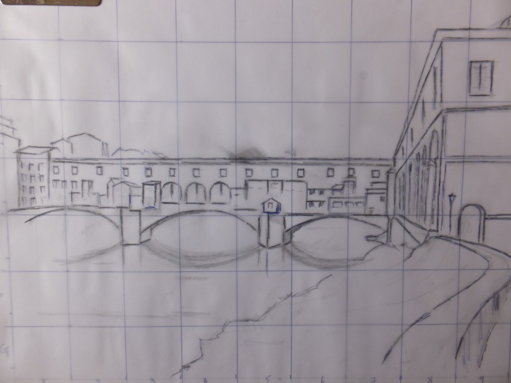
I wasn’t overly happy with the first painting of the Ponte Vecchio, as I may have said. I didn’t like the grass bank, which although attractive in real life, meant that I had to introduce another colour which I didn’t want to do. Also it cut out a large section of river, which I think was a pity
Instead of the grass bank, I have constructed a wharf with boats. Fictitious I know and offensive to some. The bridge however remains intact, and is still the subject of the painting.
I much prefer this composition. Not only do I keep my limited palette, but also brings something into the foreground, which is useful
Plenty of time for things to go wrong though. With the gentler colours that I’m using, this is more sunrise than sunset, but I still have to make up long shadows which I find tricky. Where exactly will they fall, and will they look convincing?
Time will tell
I was asked to quote for a commission yesterday, so there is some life in the market, which is of comfort, with all the bad news at the moment
- Alhambra
- Amsterdam
- Ancient English Ports
- Ancient Greek Temples
- Andalucia
- Andy Warhol
- Animals
- Arles
- Art Exhibitions
- Art Nouveau
- Artfinder
- Arts and Crafts
- Aubrey Beardsley
- ball Point Pen
- Barcelona
- Barges
- Baroque
- Basilica of Sacre-Coeur de Paris
- Bath
- Beach
- Bicycles
- Boat Paintings
- Book Illustration
- Bosham
- Bosham Harbour
- Bosphorus
- Brittany
- Buildings/Architecture
- c13 woollen industry in Britain
- Camargue
- Camden Art Group
- Canal Bridges
- Canals
- Castles
- Cathedrals
- cats
- Cefalu
- charity auctions
- Chichester
- Chinoiserie
- Christmas Street Scene
- CLASSICAL aRCHITECTURE
- Competitions
- Conkers
- Constable
- Copenhagen
- Corfu
- Cornwall
- Correcting mistakes in watercolour
- Country Churches
- Country House Hotels
- Country Houses
- Danube
- David Hockney
- Devon
- Dewdrop on Leaf Detail
- dog portraits
- Donkeys
- Dorich House Museum
- Dragons
- Eagle Comic
- Education
- Egypt
- Egypt Equine Aid
- Eifel Mountains
- Elizabethan Country Houses
- English Country Gardens
- Equipment and work space
- Ferry Boats
- Figures in Streetscape
- Fishing
- Fishing Boats
- Flamingos
- Florence
- Fountains
- Fountains Abbey
- France
- French Impressionists
- Frog
- Frogs
- Galicia
- Garden Statuary
- Gardens/Floral
- George Gilbert Scott
- Georgian Architecture
- Georgian Gazebo
- Germany
- Gondolas
- Granada
- Grayson Perry
- Guildford in Surrey, UK
- Harry Potter
- Henry Moore
- Holland
- Horses
- House Portrait
- Hungarian Cattle Country
- India
- Islamic Art and Architecture
- Istanbul
- Italian Chapel
- Italy
- Jane Austen
- Kew gardens
- Kew Gardens
- Knights Templar
- Langstone Mill
- Leaf Soirit
- Leatherhead Theatre
- Life in the 1950s
- Light and Dark
- Lightbox, Woking
- Lock Gates
- London
- London Docklands
- Louis Philippe
- Ludlow
- Marinas
- Maritime History
- Marsala
- Mary Wollstonecraft
- Marzamemi
- Medieval Undercroft
- Mediterranean
- Mice
- Mosques
- National Trust
- Night Sky
- North Sea
- Notre Dame de Paris
- Opera
- Orkney
- Ostrich
- Oxford
- Pagoda
- Painshill Park, Cobham
- Painting Snow
- Pallant House Art Gallery, Chichester
- Paris
- Pattle Sisters
- Paul Nash
- Payne's Grey
- Pelican
- Period House
- Photography
- Plas Newydd, Anglesey
- Ponte Vecchio
- Portsmouth Harbour
- Post Impressionists
- Pre Raphaelites
- Preliminary Sketch
- Properties of Watercolour Paints
- Ragusa
- Railway Stations
- Reviews
- Rex Whistler
- Richmond Hill
- River Wey
- Rome
- Rossetti Family
- Royal Surrey Hospital
- Sagrada Familia
- Sailing Boats
- Saxon England
- schooldays
- Schools
- Scotland
- Sculpture
- Seascapes
- Sicily
- Sickert
- Sidney Sime Gallery
- Simon Gudgeon
- Simon Gudgeon
- South Africa
- Southampton Art Gallery
- Spain
- Spinnaker Tower
- St Johns near Woking
- St Katherine's Dock
- St Thomas a Becket
- Stanley's Grave
- Still Life
- Sunset
- Surrealism
- Surrey Villages
- Swans
- Syracuse
- Tate Art Gallery
- Terra Cotta
- Textbooks
- Textured Finishes
- Thames
- Tower Bridge
- Townscapes
- Transylvania
- Tudor Houses
- Turner
- Twickenham
- Uncategorized
- Van Gogh
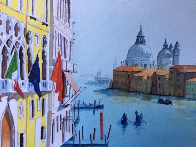
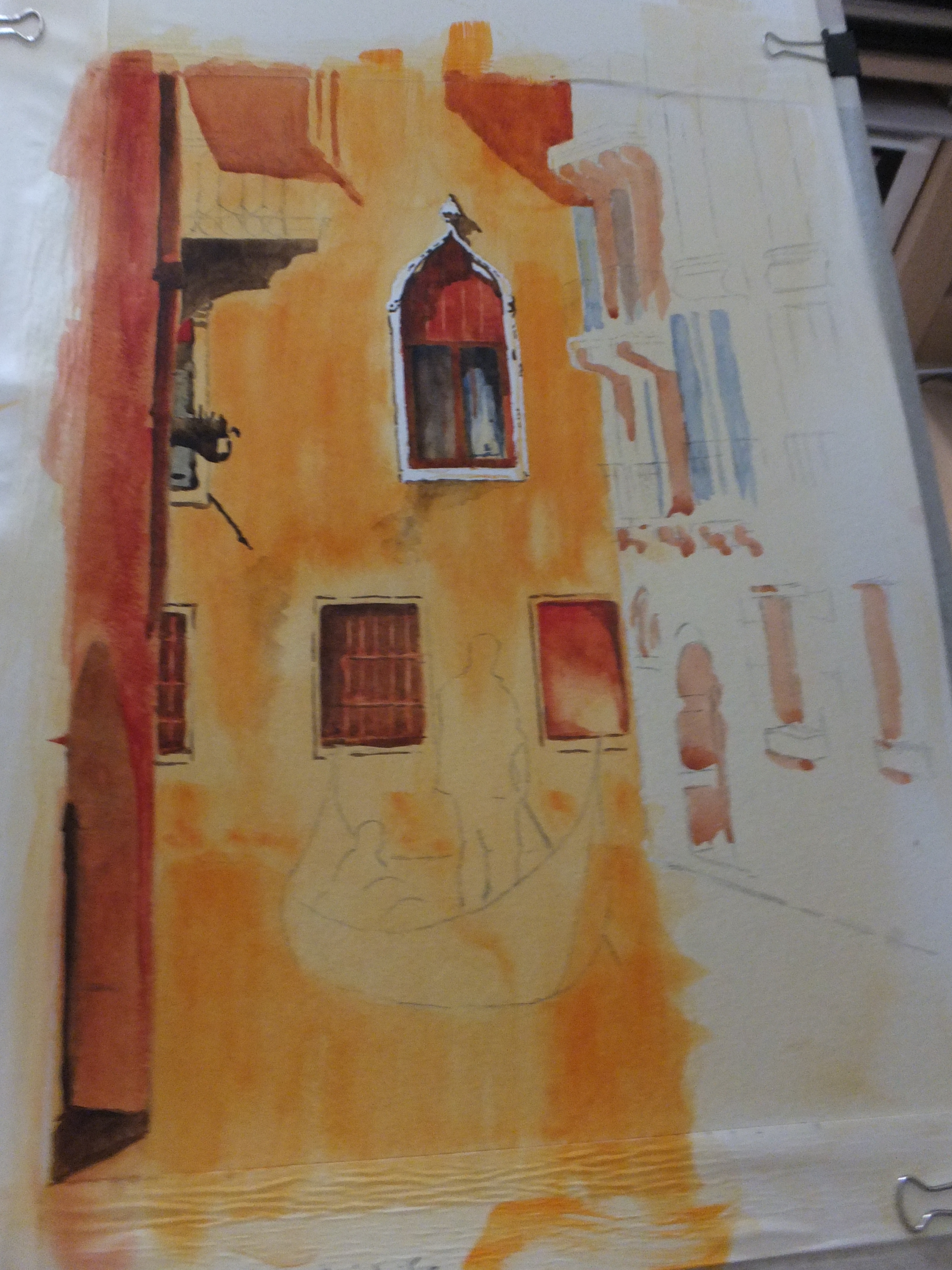
- Venice
- Vignette Style
- War Artists
- War Graves
- Water Birds
- Watercolour
- Watercolour Painting
- Waterscapes
- Watts Gallery
- Wet-in-wet
- Wey Navigation
- William Blake
- William Payne
- Windmills
- Winter Street Scene
- Wisley Gardens
- Women Painters
- Working to Commission
- World War 1
- World War 2
- World War 2 Architecture
- Yorkshire