Langstone Painting Emerging

The painting emerging

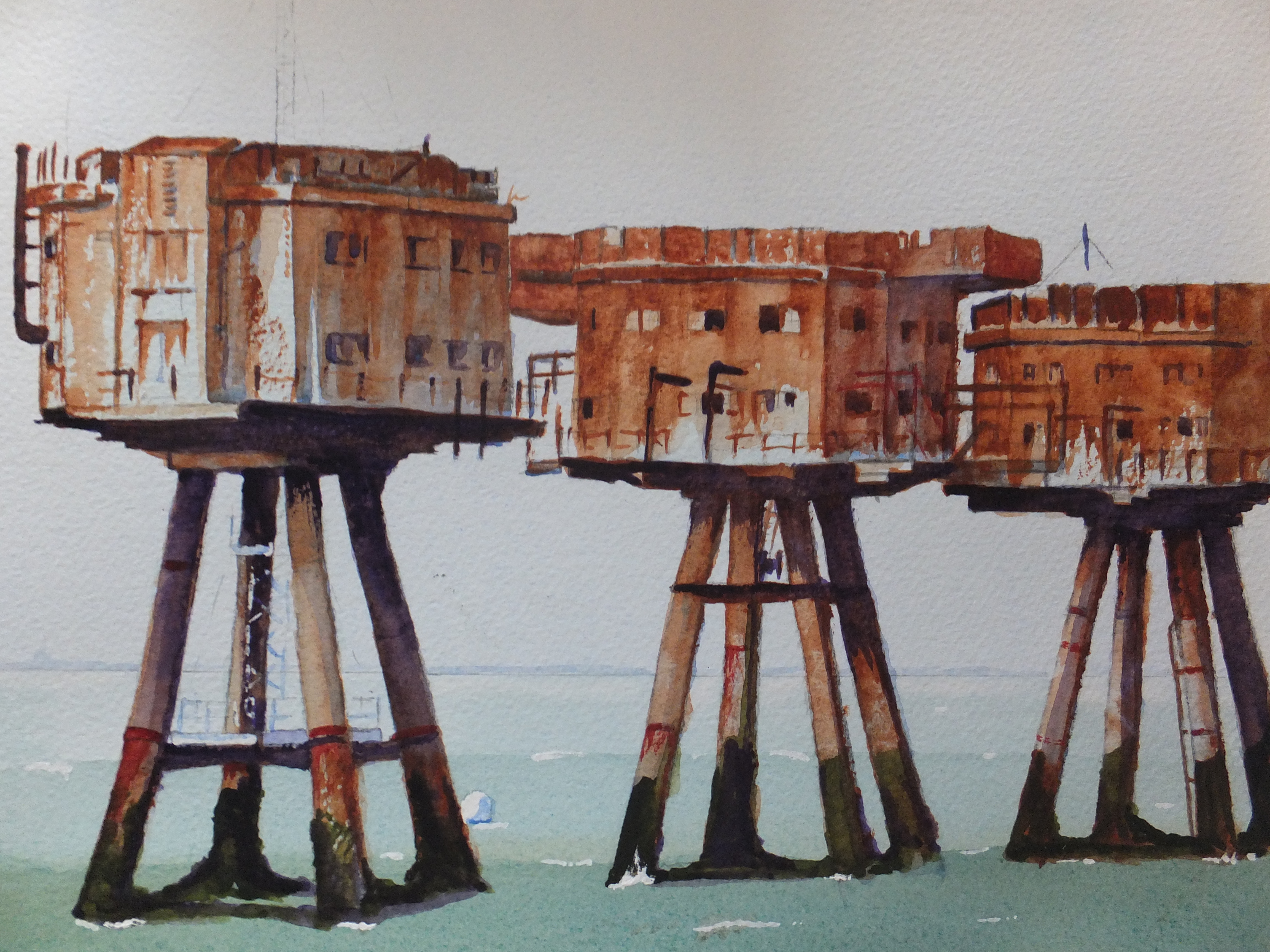
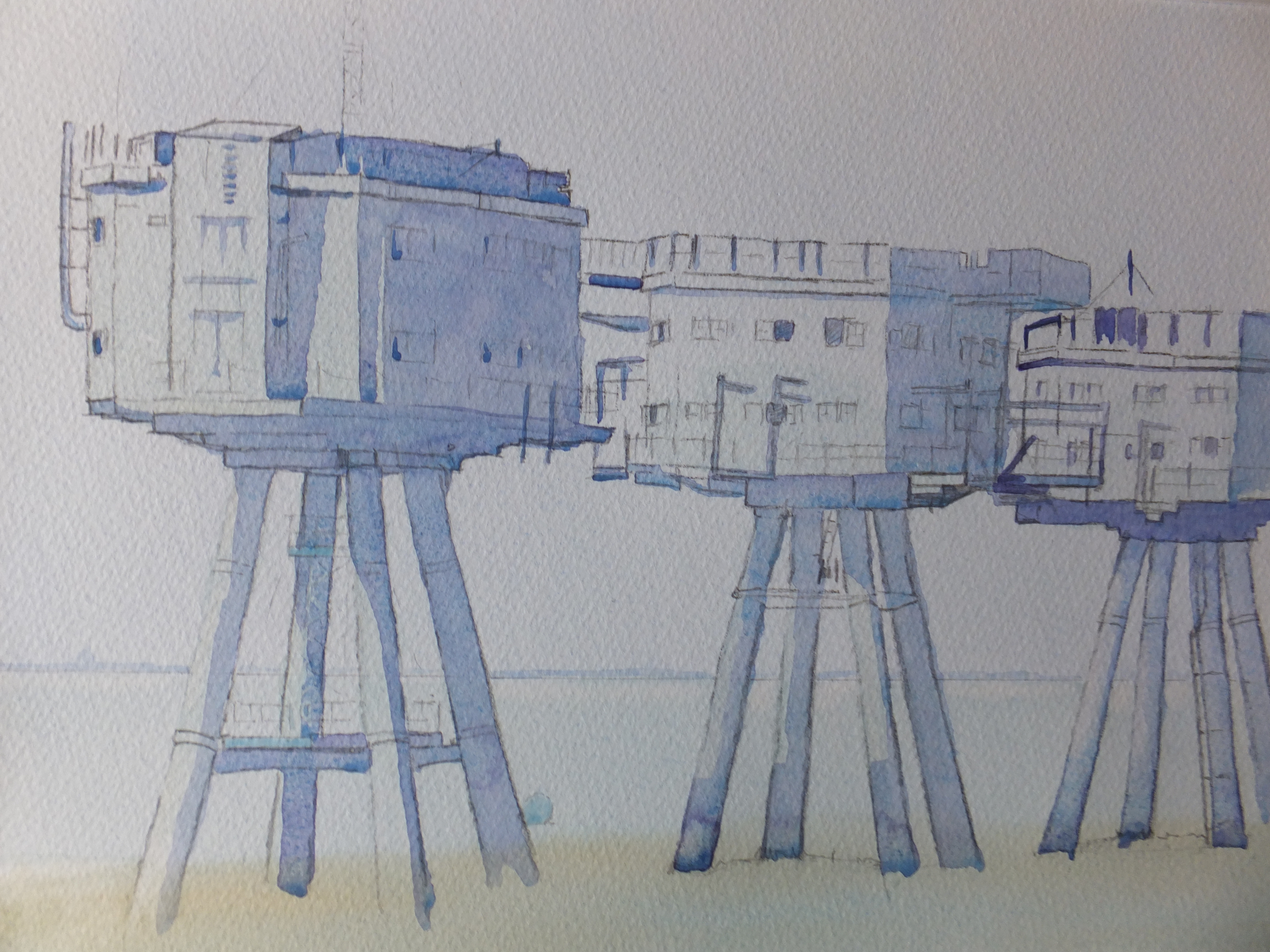
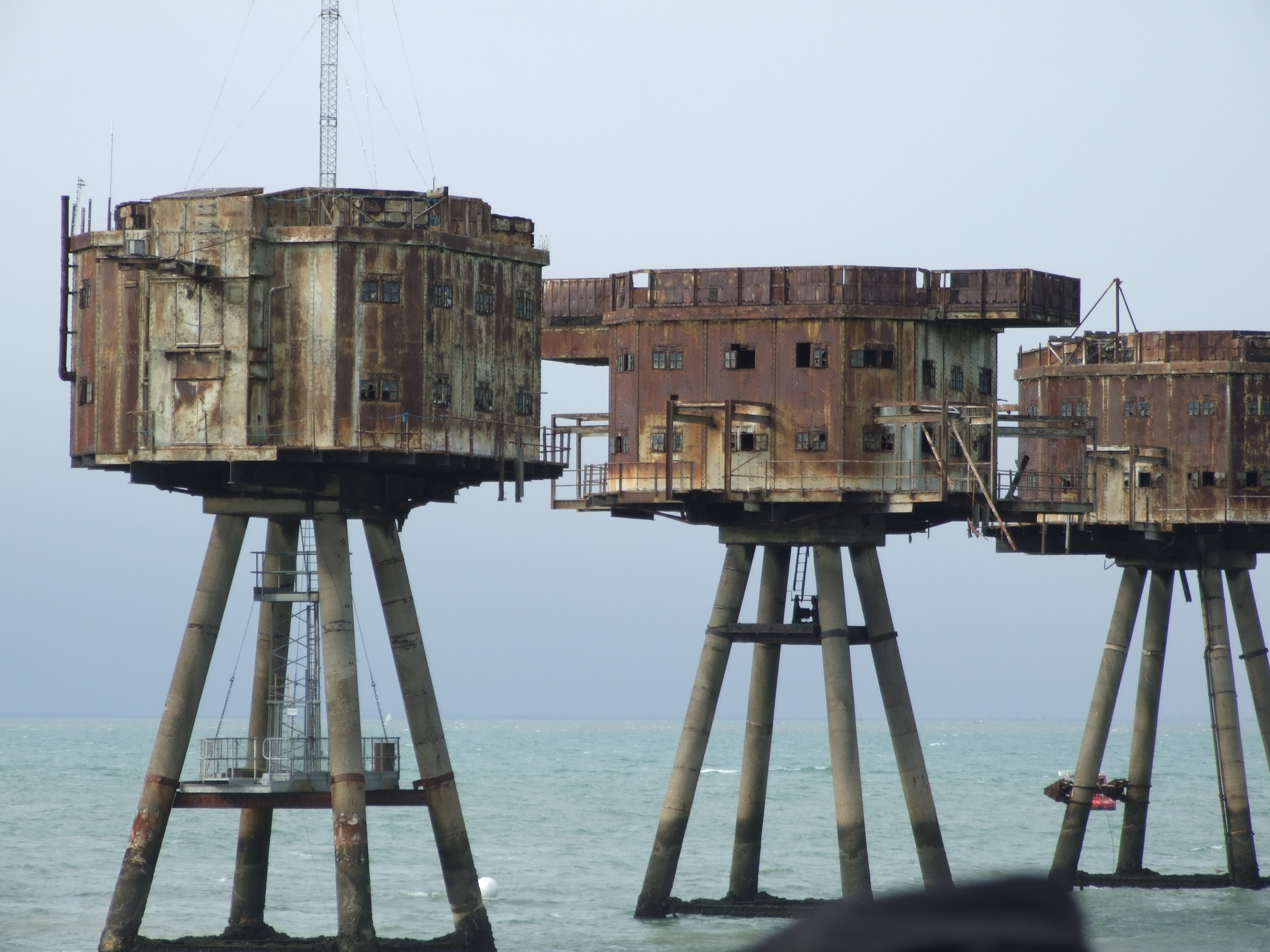
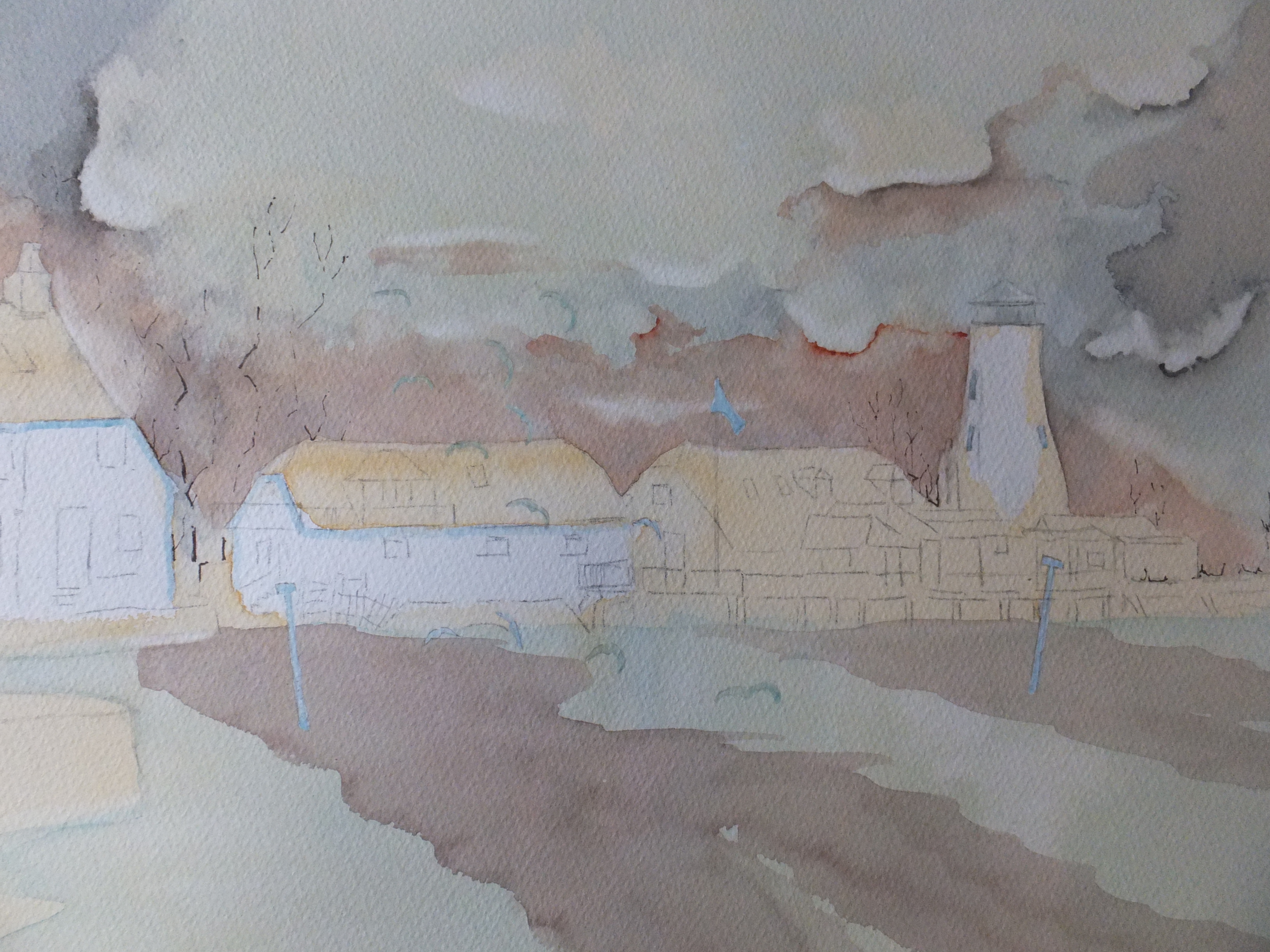
This is the moment when the painting starts to emerge from the mist, quite literally for a painting by the sea.

My big problem was the hard line between blue and pink at the bottom of the painting. It was impossible to eradicate. I tried a small section and it was worse if anything

One of the marks fortuitously formed the shape of a stern of a small boat. That was something of a gift and I painted in the bottom right hand boat with canvas cover. Ok, what next? I think I have already said that I painted in the two dinghies in tow from the sailing boat, and the last one does help to cover that hard line.

That still leaves the left hand side of the picture. I scoured my files for images, and found one that would work. The boat is not afloat, rather propped up in the shallows, so the bottom length of painting will now be shallow water, about ankle deep. That will be amusing, trying to give that illusion. The propped up boat will help and I have made a start. A ladder is alongside and so are props. You will be able to see the keel standing out of the water. After that, I haven’t worked out

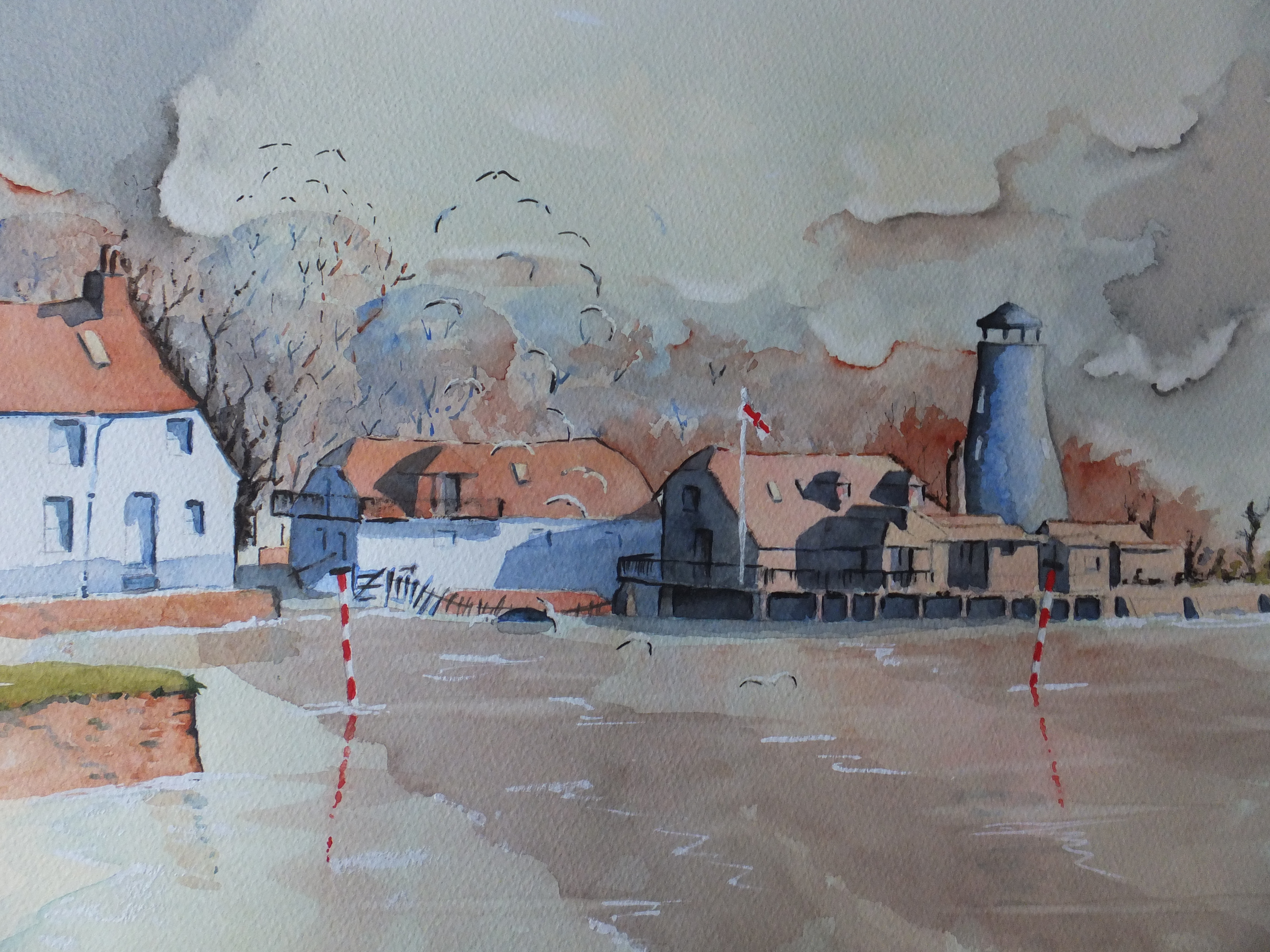
I have started to deepen the colours of the mill buildings. They look quite brightly lit now by a low sun. The photograph doesn’t do it justice, but then does it ever.

Still plenty to do

Thames Estuary Sea Forts: Finished Painting

Sea Forts Thames Estuary

This is the finished painting

I had intended to post another work in progress shot, but as I got into the rhythm of the painting, it was as easy to finish, and more interesting to look at anyway

I had one false start, which normally I wouldn’t admit to. I decided the sea looked too pale and insipid, so I scrubbed back the bottom half of the platform legs, so that I could paint over the sea again and deepen the colour. Especially the area around the platforms needed to be darker even though it wasn’t in the photograph. I used Viridian mixed with a little Lamp Black for the sea colour, which works well I always think, with a nod of thanks to Rowland Hilder.

This alteration did leave me with two hard lines which normally I would have been able to blend. I have disguised them a bit with white caps, so not too bad

As for the structures themselves, I used Burnt Sienna with a little Crimson to get close to the colour of rust, and drybrushed as much as possible to look like rusty paintwork. The very deep shadows on the platforms I did with Ultramarine Violet, neat straight out of the tube with as little water as possible and straight over the rust colour. The barnacles at the bottom were painted with Olive Green, but still not dark enough, so I overlaid with the Violet.

There were some red marks where brackets had been fitted, which was probably red oxide base coat in its day. Again some Crimson, with a little free expression, seemed to get that effect.

This turned out better than expected, I am pleased to say. I have learned from it, and it was a welcome change from the usual scenes. Not a painting anyone is likely to buy, so pure self-indulgence really.

Sea Forts Work in Progress

DSCF2988

So far, I have put down a base coat of Cobalt Blue/Phthalo Blue mix right across. I fixed the horizon with a vague idea of coastline. One or two small details were masked out. There is a small buoy next to one leg of the first fort, which will be white eventually. One or two girders or rails facing the light will be pale blue when the mask is removed.

It may not appear so in the photograph but I have washed over the sea, with a dilute Cobalt green, and then rubbed in Raw Sienna at the base of the towers, as the sandbank is visible through the water

With the shadows on the metalwork, I have allowed myself to experiment and used a mix of Cerulean Blue and Ultramarine Violet, a combination I have not used before, but only read about. This makes a pleasant shadow colour, although whether it suits old ironwork is another matter. Some people put shadows in afterwards, and it is a personal choice. I find putting in shadows first gives me a dimensional image to start with, which I find helpful

I couldn’t get near the pale green colour of the paintwork on the towers. I used the Cobalt Green over the original blue wash, and will hope for the best. Time now to work on those delicious rust shades, which I hope will bring a touch of reality

I have absolutely no idea how this painting will end up

Estuary Sea Forts: Sketch

Estuary Sea Forts

This is the preliminary sketch from the photograph. Very quickly done, as I have dropped behind with this particular picture, probably because there is no deadline on this one. As I said before, I am just painting these forts for my own amusement

There is very little detail drawn in so far. This is just a basic framework put in with the grid ready to transfer onto watercolour paper, which hopefully will ensure that the perspective is correct, and that everything goes into the right place. I quite like finishing the drawing straight onto the surface that is going to be painted. It just feels more immediate that way

I have started to have a few thoughts on colour. I think I will go right across with a mix of cobalt and pthalo blue. Let that dry hard and glaze the sea with another coat of pthalo blue. The horizon line is quite low, so there won’t be too much of that

When that is hard, I could put in the shadows perhaps this time with a mix of cerulean blue and violet, just to show where they are. When that,too, is hard, give the metal work a glaze of pthalo green as a base colour. That should set me up for having a crack at all that rust and dirt and seaweed. The shadows can be deepened up with a dark brown

Once I get those base colours in, then things will get more interesting, I am sure

Thames Estuary Sea Forts

Pirbright 098

I have just finished the work for my second exhibition which I set up tomorrow in the Royal Surrey Hospital in Guildford, for anyone living close enough to go, this will be on for a month. All new work, so hopefully enjoyable

With that said and with a couple of weeks spare before I start my next commission, I am going to indulge myself and tackle something totally different, namely the Maunsell Sea Forts in the picture above. These are in the North Sea about nine miles out from the Thames Estuary, and loom like ghosts in the mist as you approach them

They were designed by a civil engineer called Guy Maunsell, and had a short but intense life during WW2. Built in 1942, they were erected on sandbanks, and commanded the estuary of the Thames, so they protected London and the Kent coastline from low-flying attacks by the Luftwaffe.

After a spell as a pirate radio station in the 1960s, they relapsed into disuse and as far as I know nothing is being done with them, probably because they are out of sight and so out of mind. There were seven of them, but one was hit by a Norwegian vessel and had to be taken down

We went to see them some years ago on a one-off trip organised out of London. This was on a paddle steamer called the Waverley, which originated from the Clyde as I remember, but would sail round the British coast and would organise excursions from various ports. This one was from London. We started in the Pool of London, sailed through Tower Bridge which was novel at the time, although I think cruise ships do this quite often now, and then chugged down the Thames, stopping only at the end of Southend Pier to pick up some more passengers. The voyage continued out into the North Sea , passing a surprising number of ferry boats at anchor, mothballed until they were needed. The forts slowly came into view through the sea mist. Very atmospheric indeed

I thought I would paint them one day, and have finally got round to it. Not something that is commercial, although I may get a surprise, but that doesn’t matter. This will be an interesting project in itself, tackling all those rusty surfaces, and hopefully capturing something of the mood which the photograph has missed somehowPirbright 091


Langstone Mill Reworked

Langstone Mill Reworked

Once again, the colours are deeper in the actual painting, but this is the reworked version, which, I believe, to be a great improvement on the first version. But, of course, that is my opinion

I have deepened the shadows enormously, which exaggerates the light coming from the right-hand side. The effect, I feel, is much more dramatic.

In the water, I have introduced more of the orange brick colour to look like reflections. Also I have added some current swirls and some flecks of white to look like movement in the sea.

The red posts and flag have been refreshed with Cadmium Red. I think they come forward now, which is good, and take the eye towards the mill

More seagulls add some life, plus too some distant rooks over the tall trees. The birds are spooked by that bad weather coming in from the background!

I keep looking from the screen to the painting. The colours are richer in the painting, of that there is no doubt, but little more that I can do about it

Time soon to move back to Istanbul, and work on that small painting of the Blue Mosque which will be fun to do, I think

Langstone: Underpaintings

I mentioned in the last post that I would give the painting a coat of burnt sienna. In fact, I changed my mind and used raw sienna with Naples yellow mixed to give some brightness against the darks that would come.

I did mask out the white-walled buildings, as well as two metal posts jutting out of the water, and for good measure masked out some gulls to give the scene a sign of life.

I also put in some tree shapes as guidelines in sepia ink

DSCF2766

Rather a pale wash, so a pale photograph I am afraid. I think you can see where I have masked out in blue, the white buildings, the posts and also the flag as well as the windows on the old mill tower. The tree shapes I put in after this picture was taken but you will see them on the next image.

I gave this coat 24 hours to dry hard. Had I been in a hurry, I could have used a hair dryer, but I prefer natural drying, as then the paper returns to its flat condition. I find if you rush the drying, then the paper retains any cockling that may have taken place whilst wet.

I then mixed a dilute solution of Phthalo blue and Cobalt blue and washed this over the sky and sea. I blotted out some clouds. This coat also had 24 hours to dry.

The next step was to mix up a solution of French Ultramarine blue and Light Red. The trick is to get it not too strong yet not too wishy-washy. That is not easy. I worked this in from left to right, simulating, I hoped, gathering storm clouds. The colour varies depending on the mix from blue-black to deep red. In some places I put pure pigment along the top of a cloud edge to give the impression of strong light behind. To accentuate this, I scrubbed with a bristle brush and clean water, the area the other side of this pigment line. In other words, I scrubbed off the blue to reveal the sienna / yellow. I worked on the clouds adding some colour here and removing some there. I will show the image next

DSCF2774

Sadly the camera has taken some of the strength out of the colours, no matter how many times I took this shot, which spoils the light against dark effect

Always an act of faith to go on, at this stage, as mid-painting always looks a bit of a mess, which is why it is essential to finish

Next to put in the trees behind the roof-tops and the shadows on the buildings which will give them their form. I still have to do that, so will post again